

Quarantine Zone: The Last Check
Client: Devolver Digital
2025
Client: Devolver Digital
2025
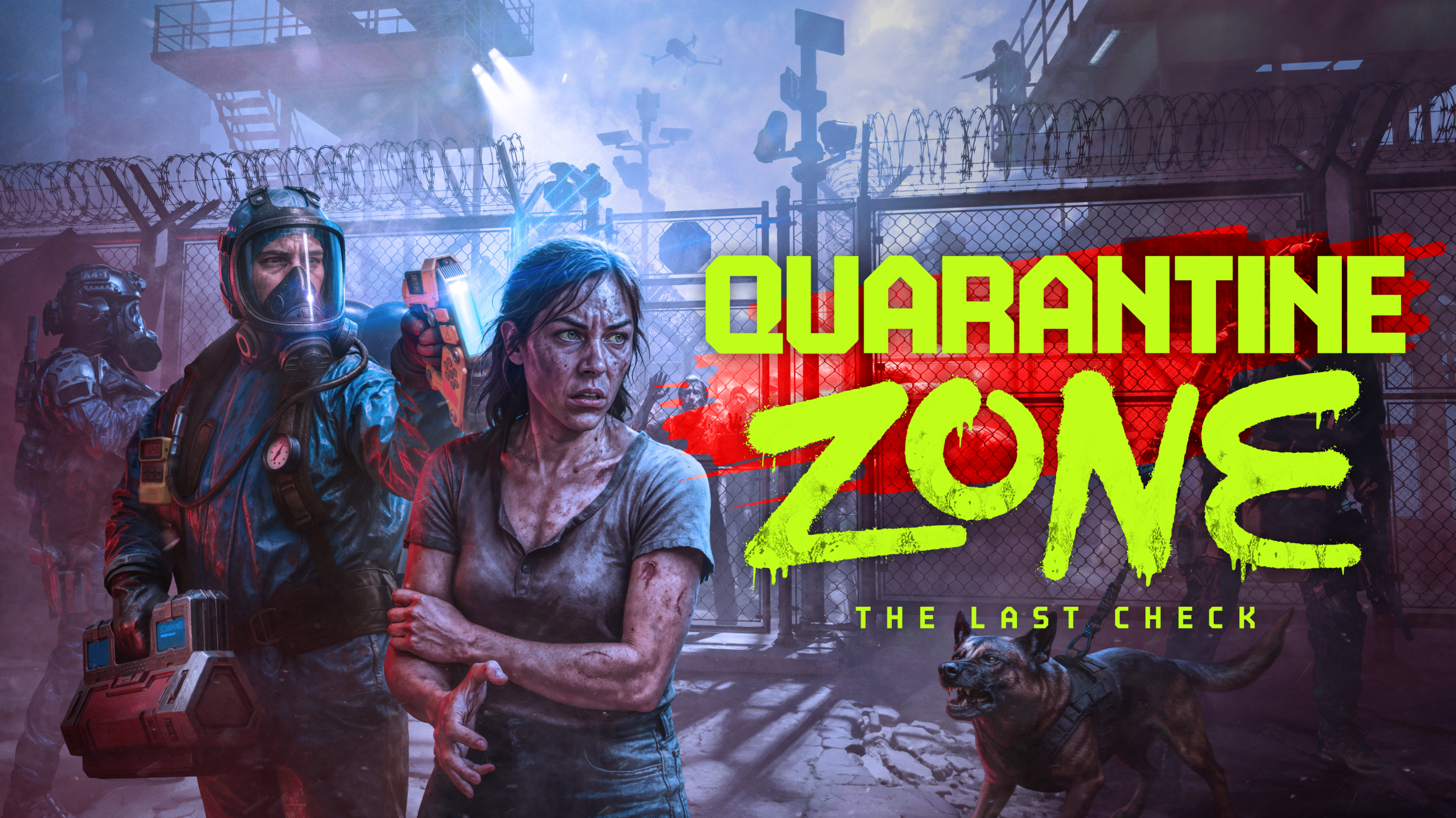
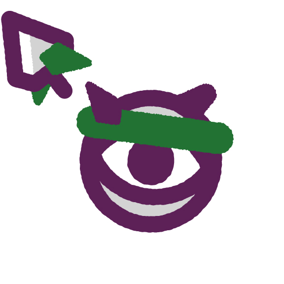
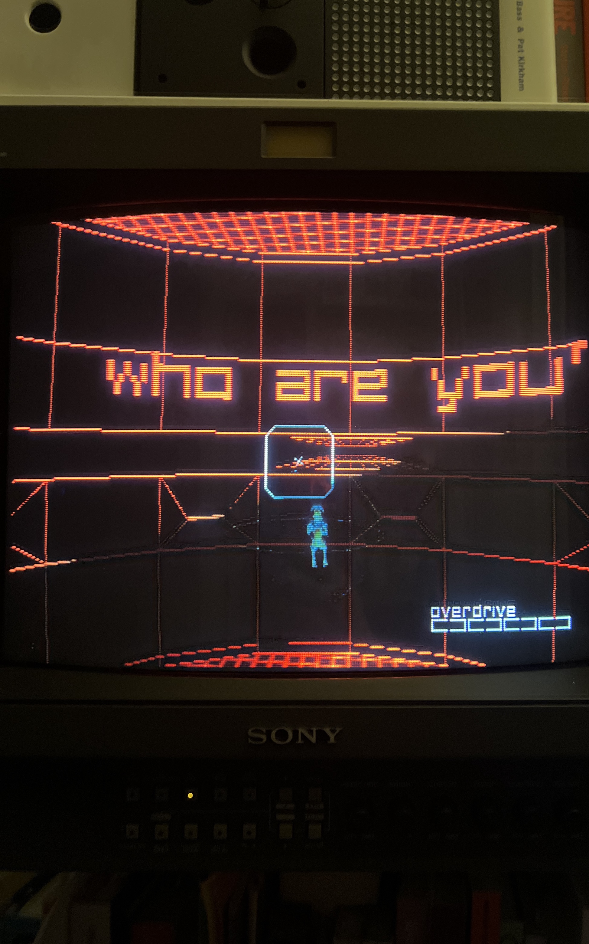
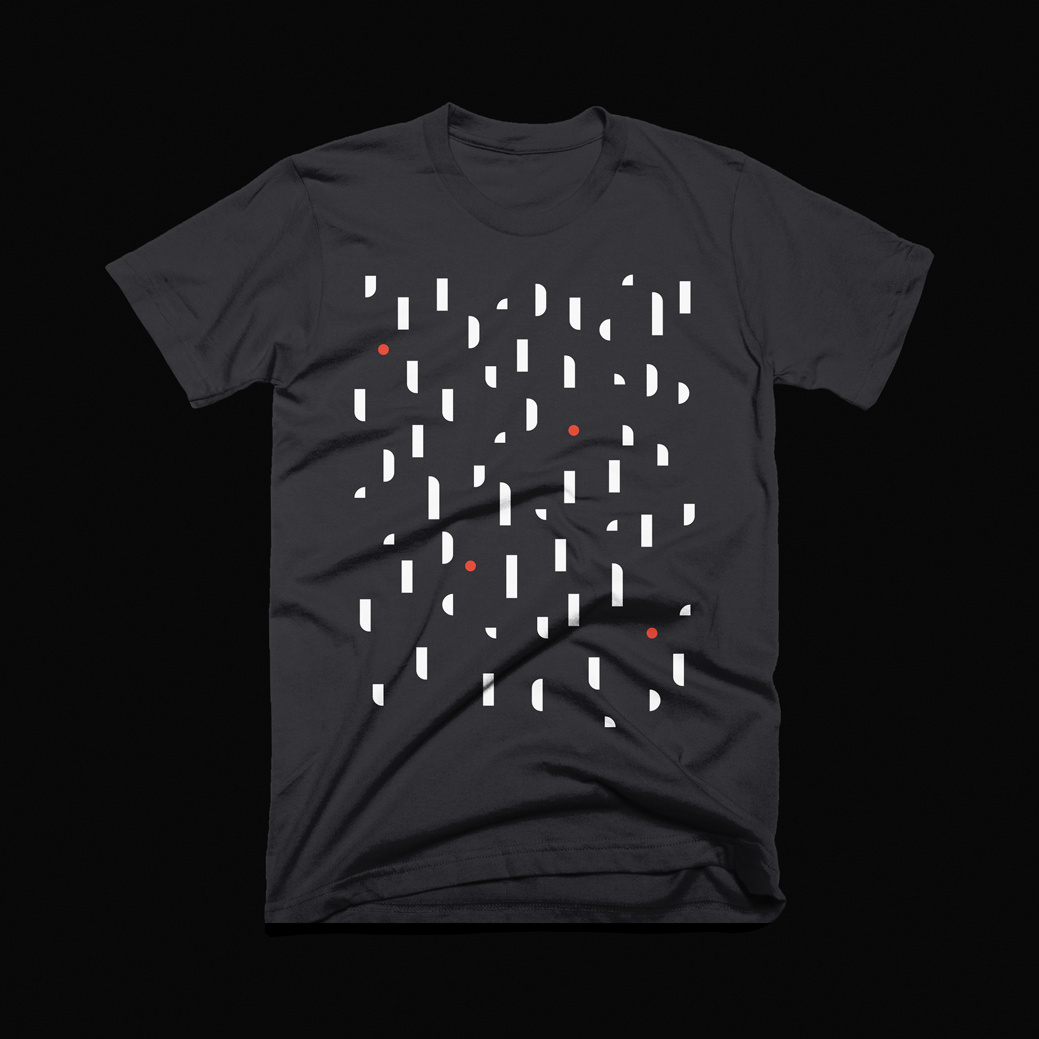
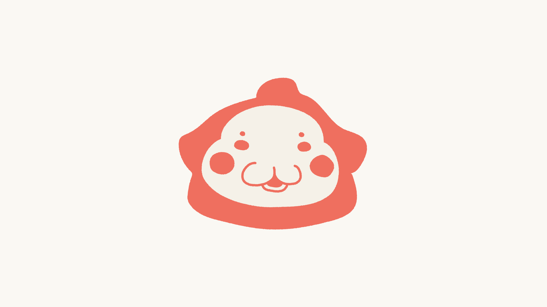
Logo for Quarantine Zone: The Last Check, the game by Brigada Games in which you command a checkpoint during a zombie outbreak.The logo uses a mix of military-inspired type and spray painted lettering. I wanted the logo to look like something an in-game character could theoretically spray onto a wall.
I drew some custom type for this one, and ended up building out the rest of the alphabet and turning it into a typeface called Quarantine Sans.
Quarantine Zone is available on Steam.


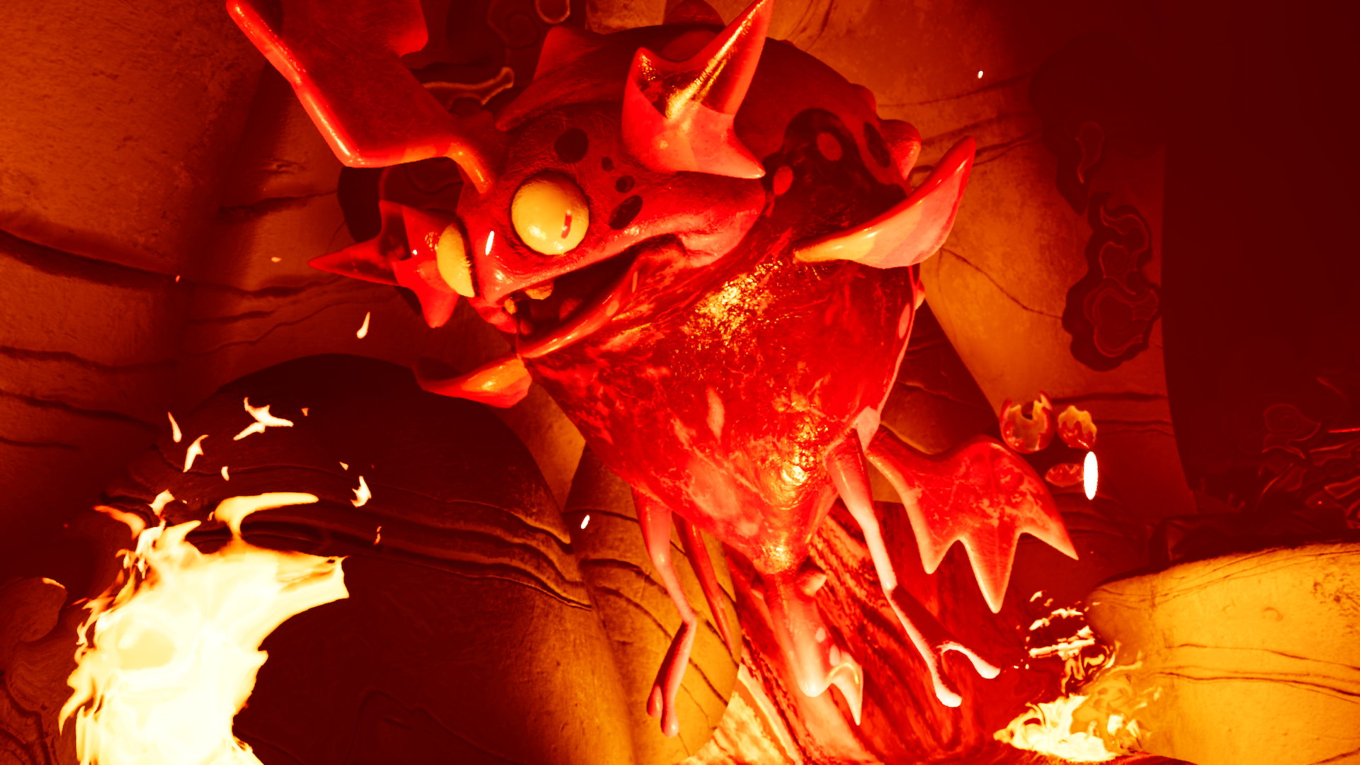
Quarantine Zone key art by Gregory Pedzinski / Brigada Games ↯
Similar Projects
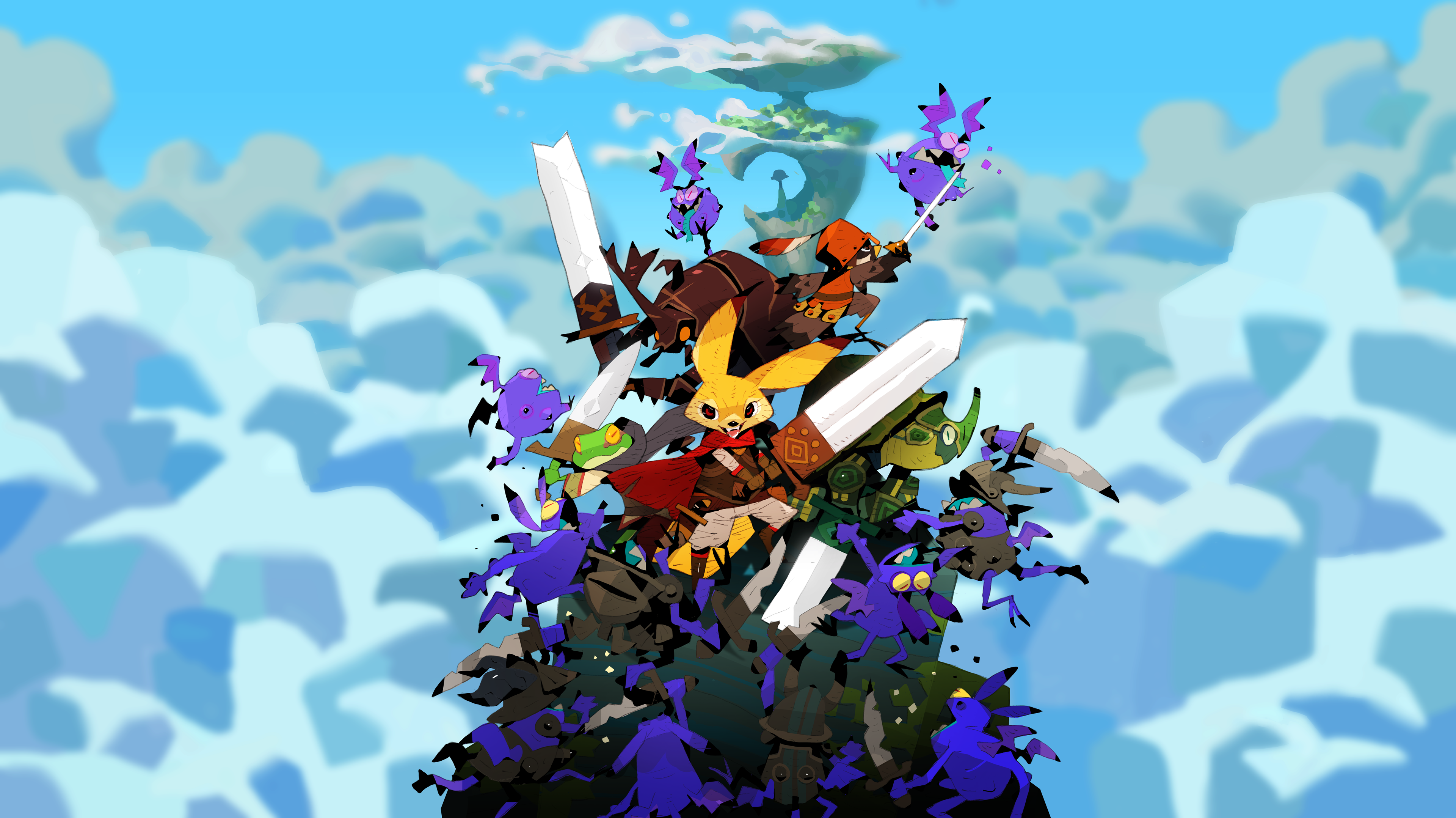
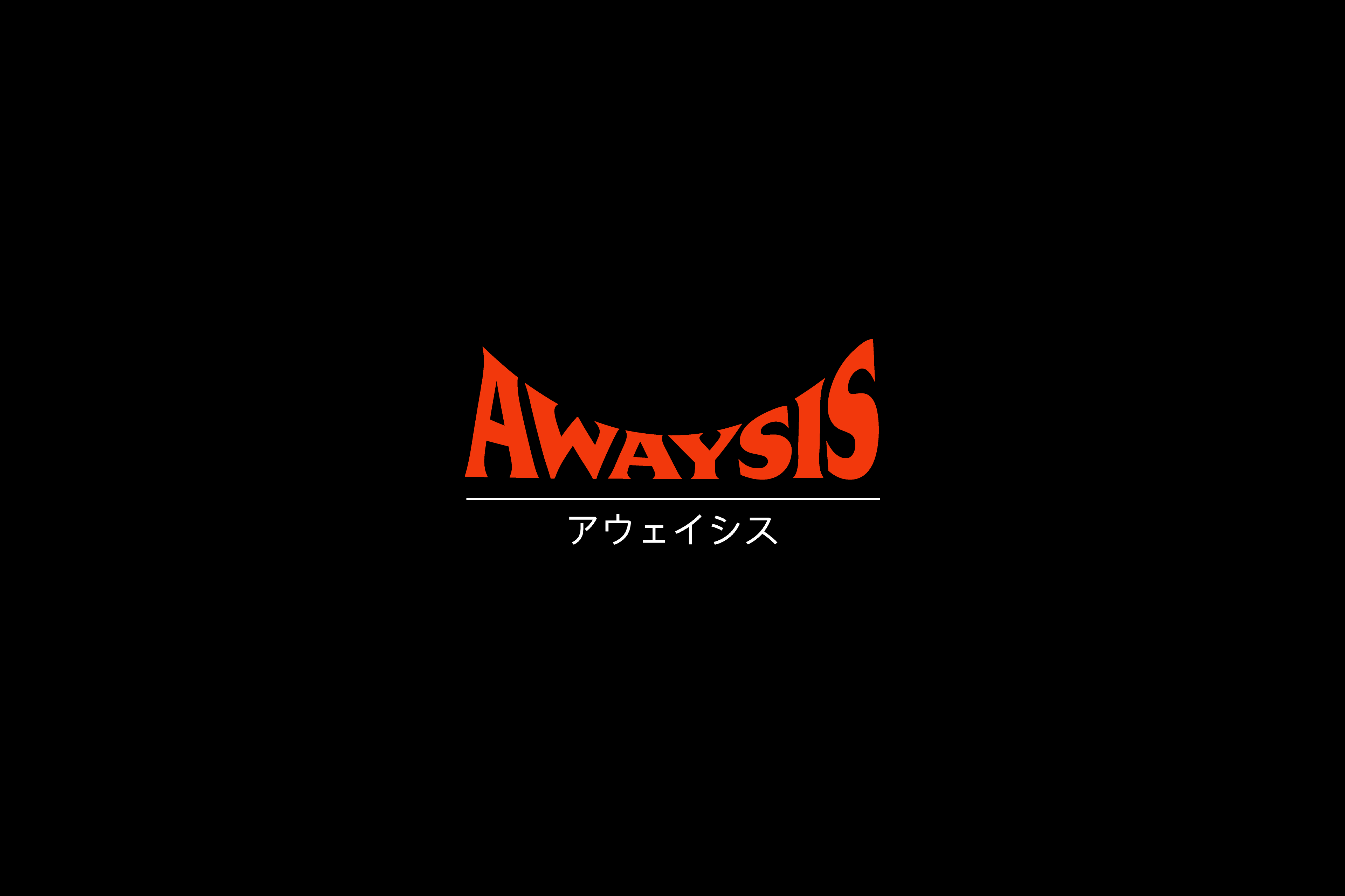
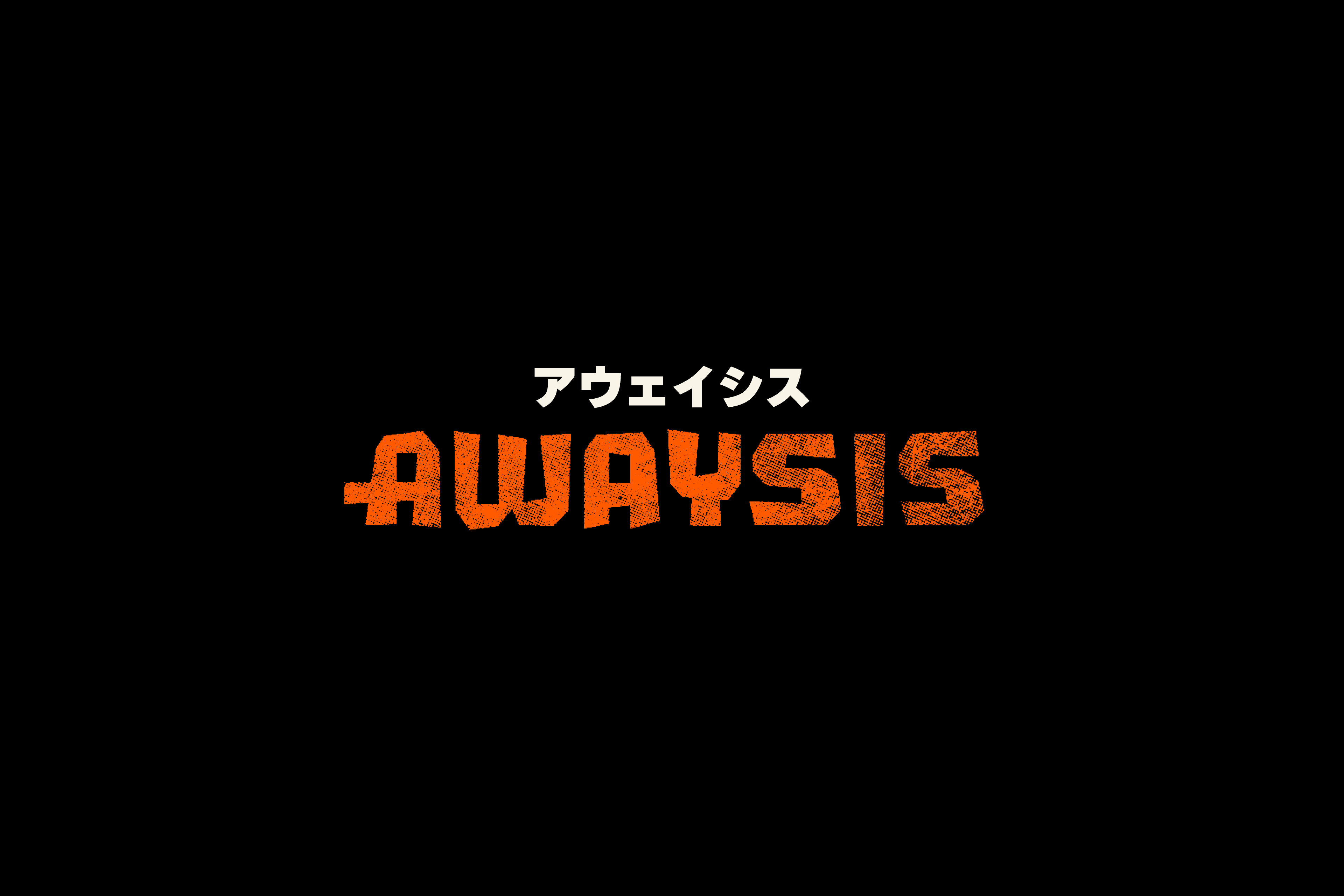
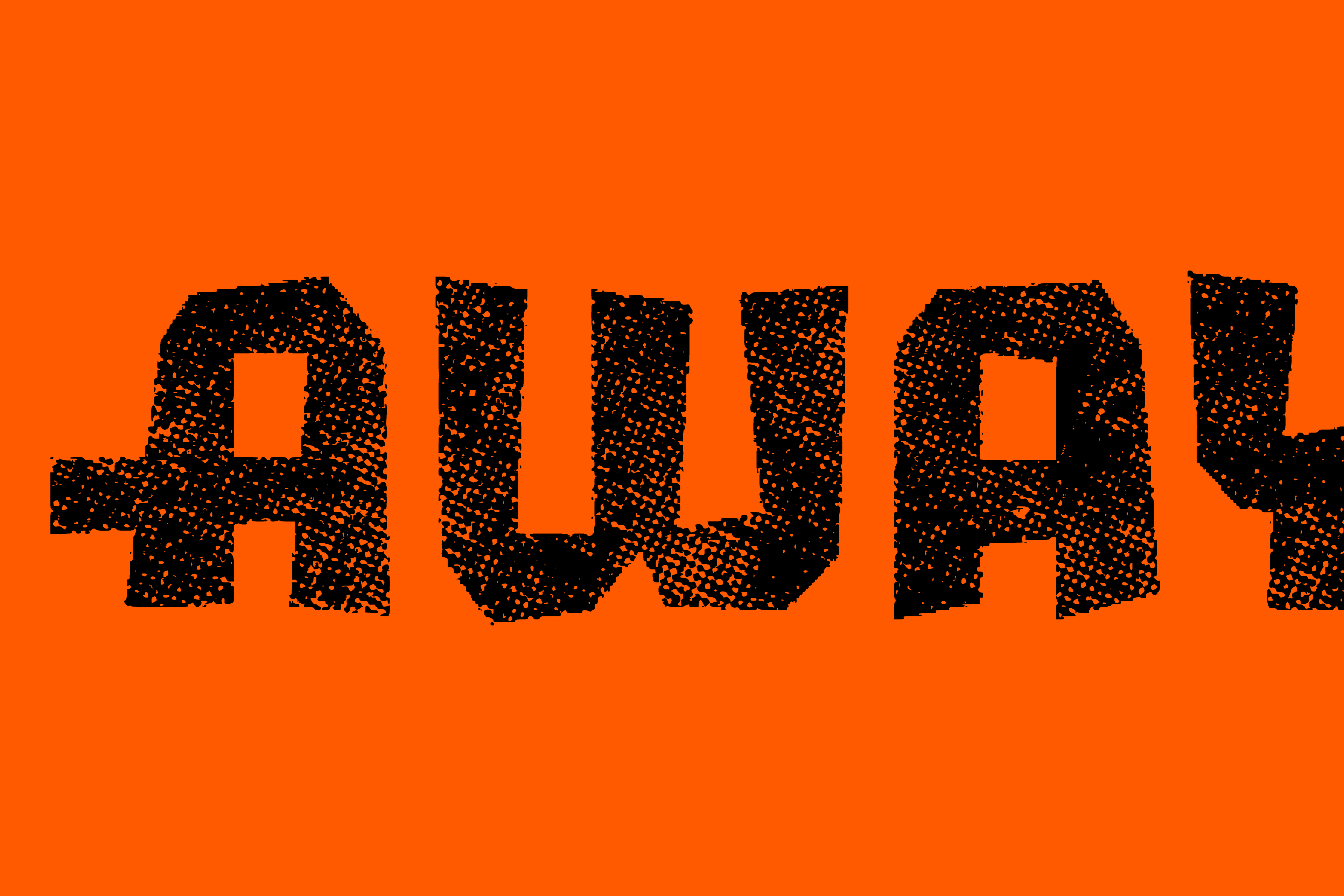
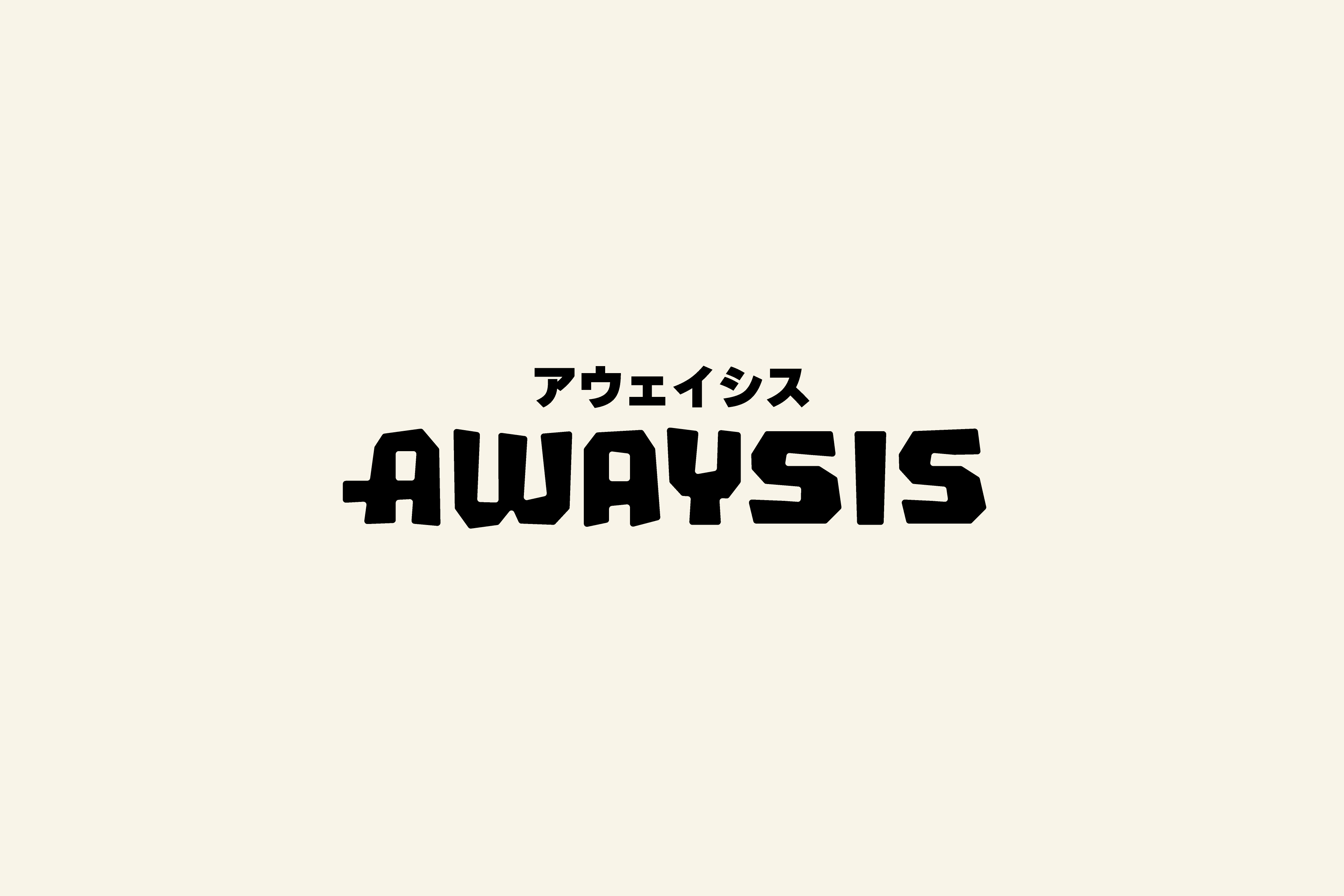
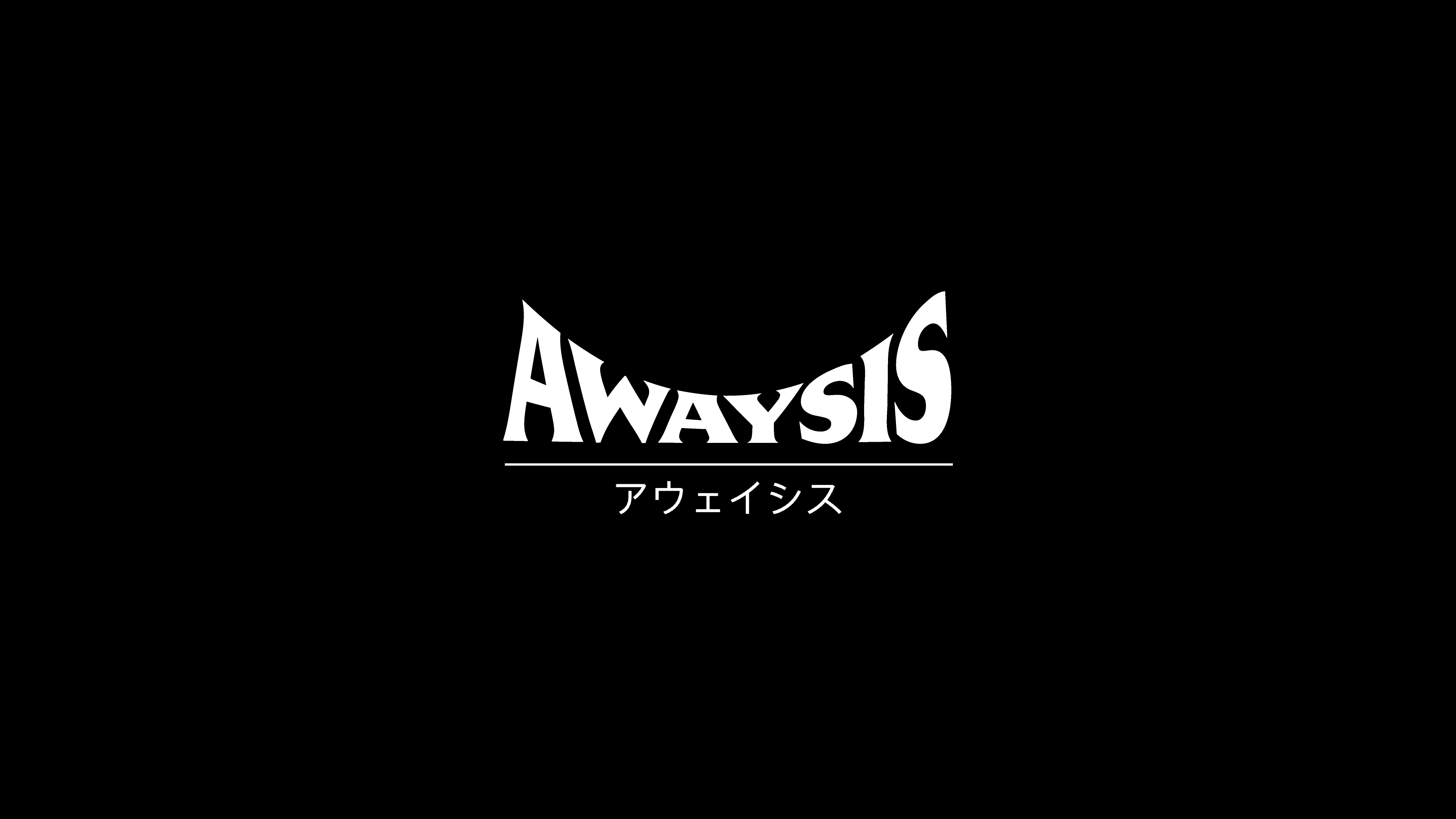
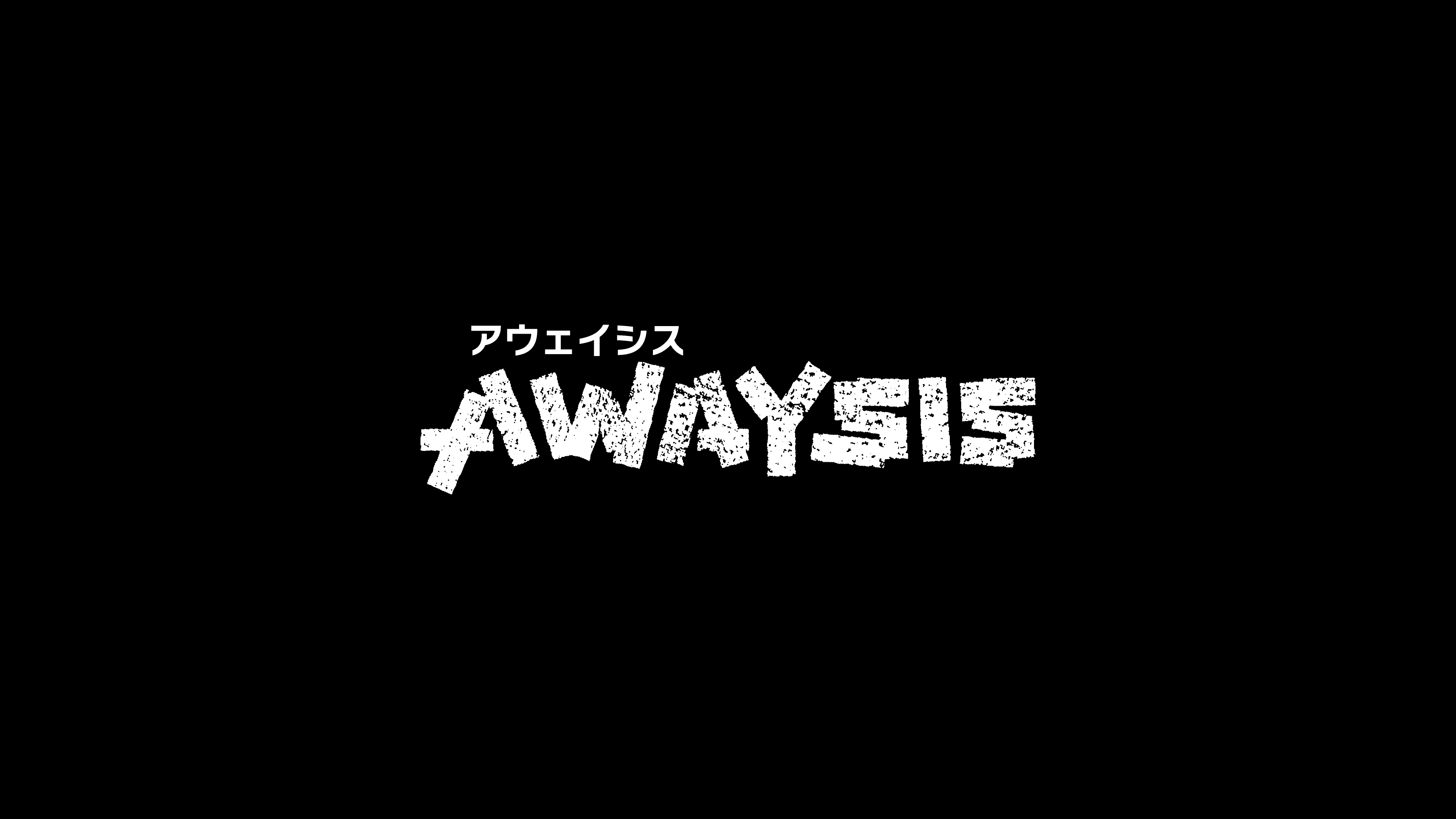
Logo exploration work for Awaysis, the new game from 17-BIT. Working closely with game director Jake Kazdal, my objective was to create a title treatment for Awaysis that would capture the game’s vibrant fantasy theme and sense of adventure. We also wanted something that felt timeless and sophisticated, like the Japanese logos for the Legend of Zelda series or Studio Ghibli’s Laputa: Castle in the Sky.I produced several different logo options, trying to cover as much thematic ground as possible. Ultimately, none of my concepts were chosen for the final logo, but I was honored to contribute to the project. With permission from the client, I’ve shared a few of my favorite title treatments below.
Awaysis is coming soon and can be wishlisted now on Steam.


Overview ↯


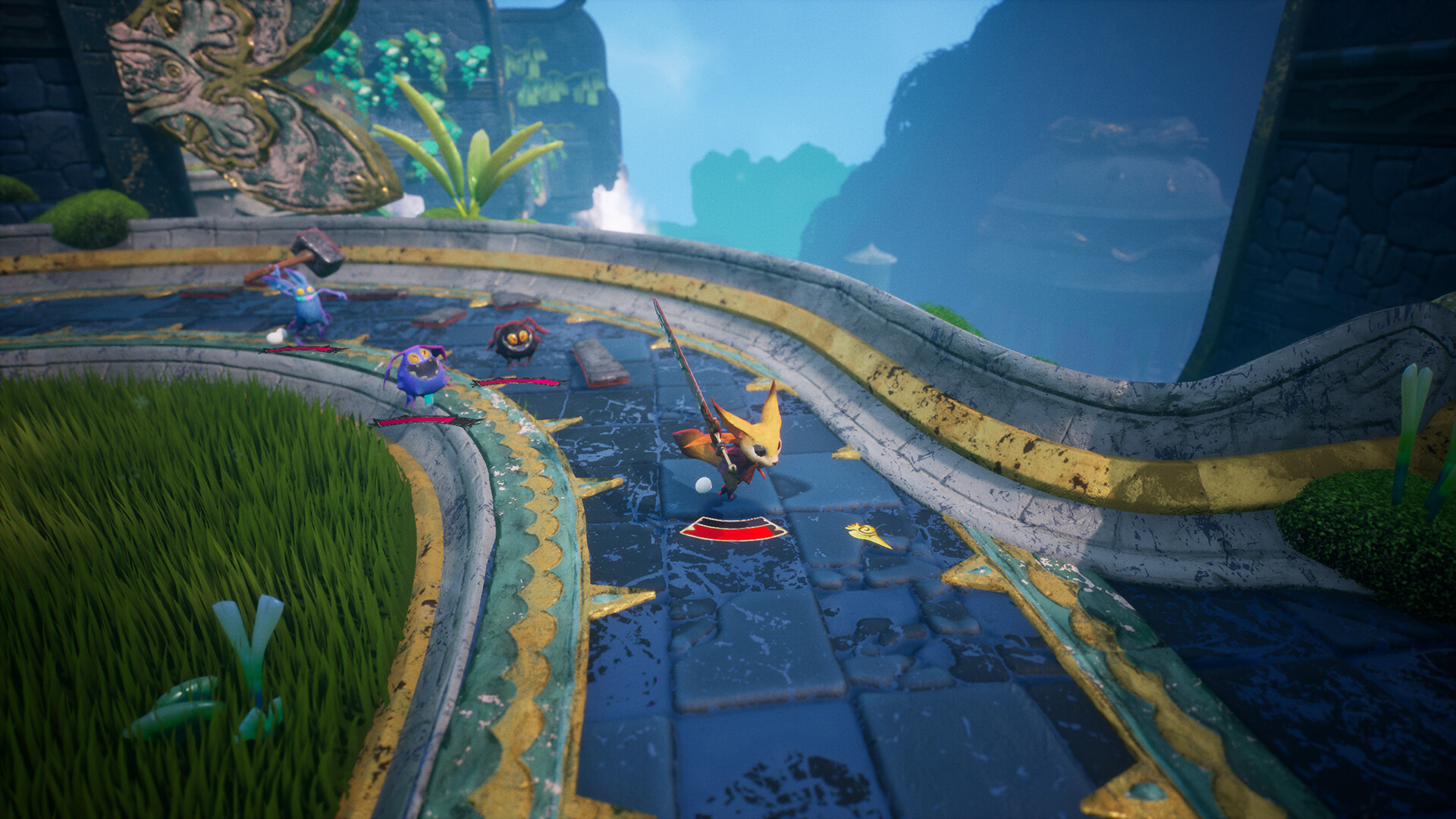
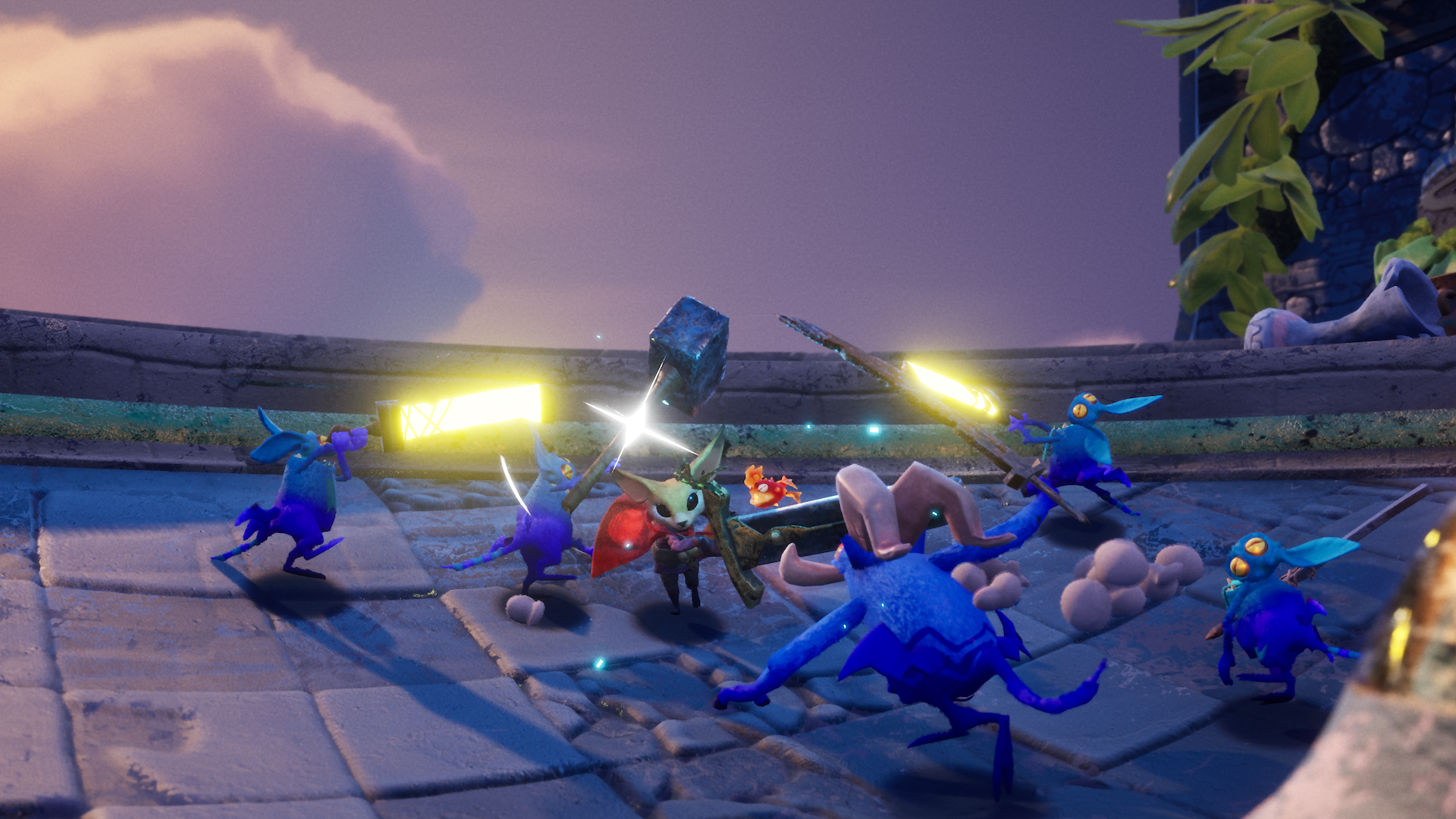
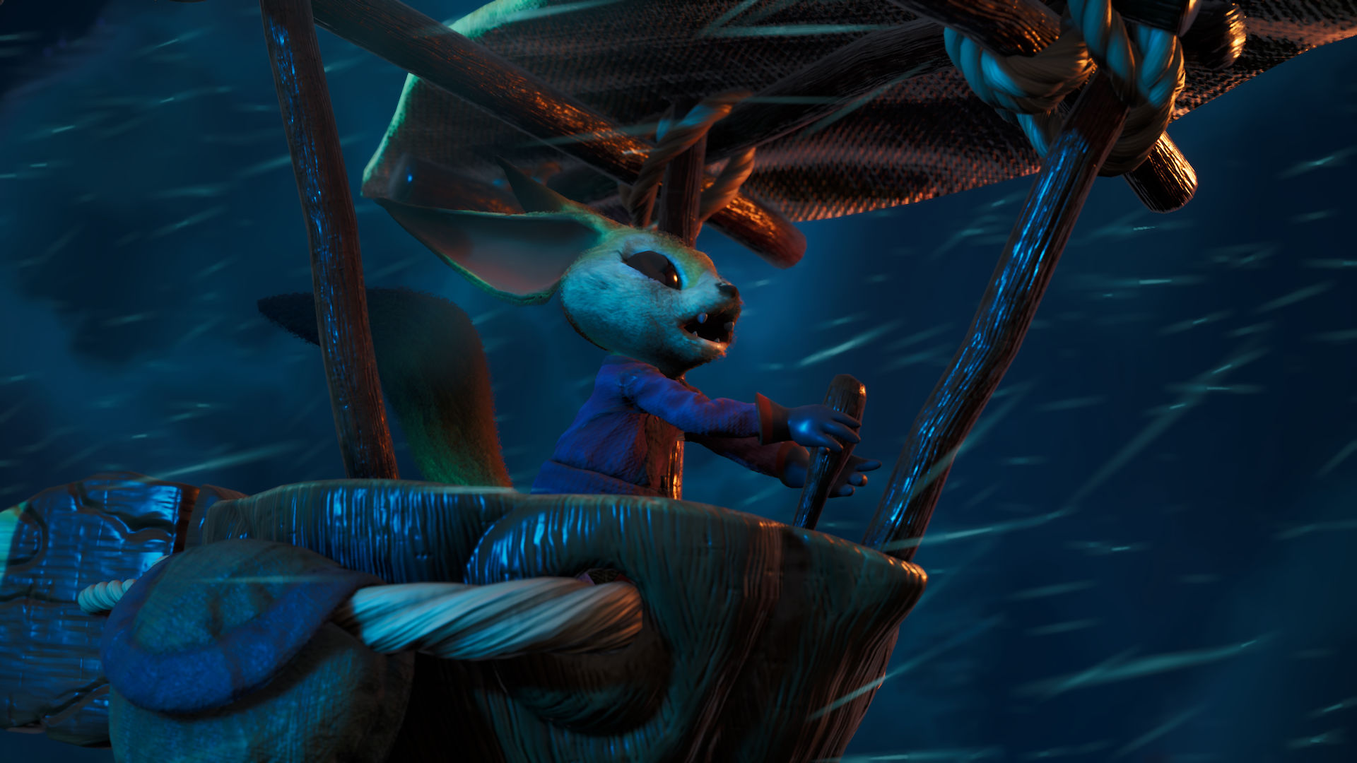
Awaysis game screens by 17-BIT ↯
Creative Direction
Jake Kazdal
Key Art
Satoshi Matsuura
Special Thanks

Call of Duty
Koto / Activision
2024
Koto / Activision
2024
Marketing and design work for Call of Duty, including identity development work for Call of Duty: Black Ops 6 (2024).I worked for six months with a team of designers (under Harrison Dew’s creative direction) from Koto’s LA office on a variety of projects for Call of Duty. My reponsibilities covered each stage of the creative process, from concepting to production of final marketing assets.
Call of Duty franchise logo and brand system designed by Koto.
Call of Duty: Black Ops 6
2024
2024
Brand identity exploration for Call of Duty: Black Ops 6. I worked as part of a team of designers at Koto to help develop Black Ops 6’s visual identity.
This included exploration of visual motifs, type treatments, texture usage, and application.
2024 COD recap video by Koto ↯
Black Ops 6 game screens by Treyarch / Raven Software ↯


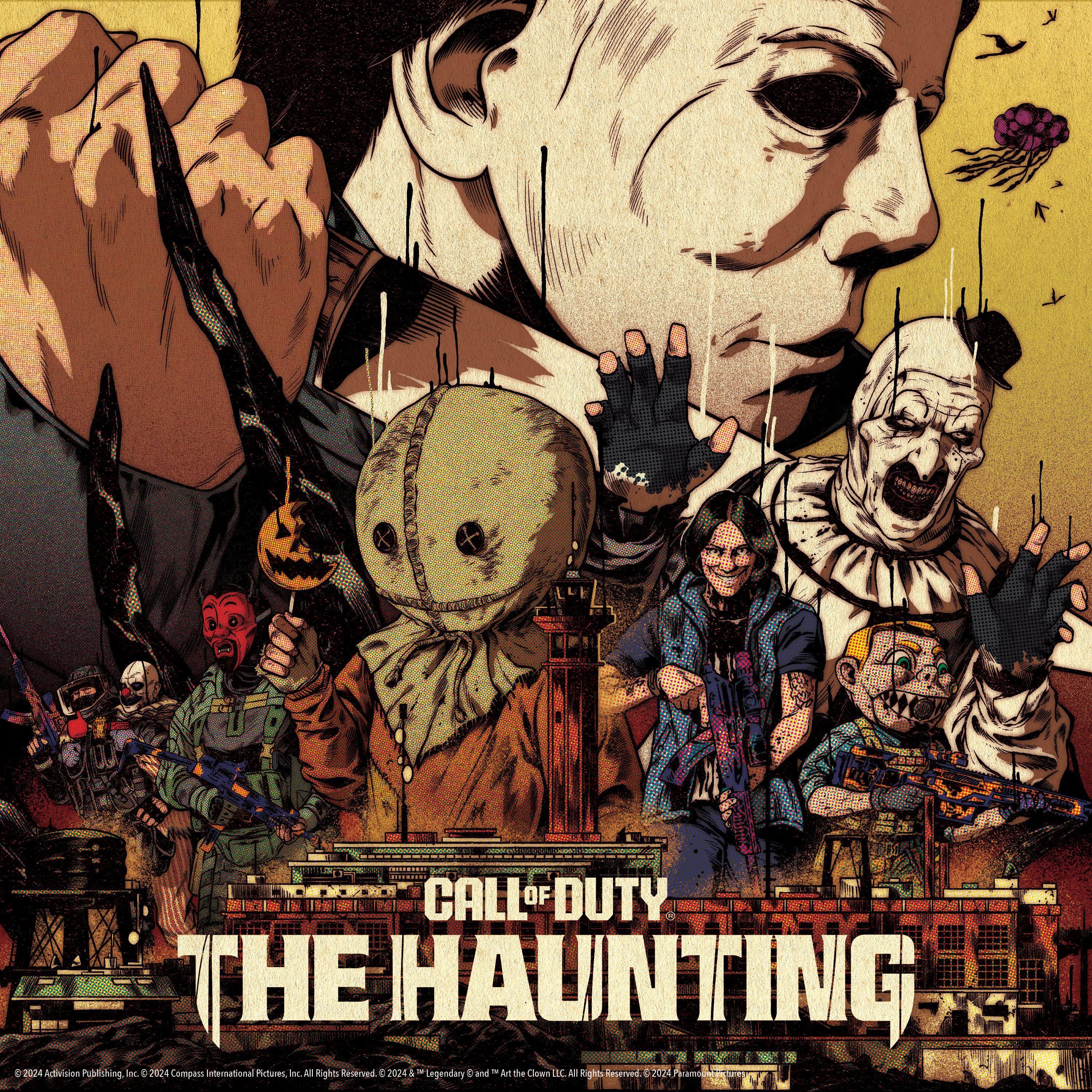
The Haunting
2024
2024
Logo for The Haunting, Call of Duty’s 2024 Halloween event.The logo uses a customized version of Hitmarker (COD’s brand typeface), adopting sharp serifs, knife blades, and vertical tendrils in reference to the visuals of Halloween, the crossover franchise featured in 2024’s The Haunting event. Collaboration with Claudio Rodriguez Jr. Creative direction by Harrison Dew.
The Haunting key art by Petrol Advertising / Activision ↯
 The Haunting game screens by Treyarch / Activision ↯
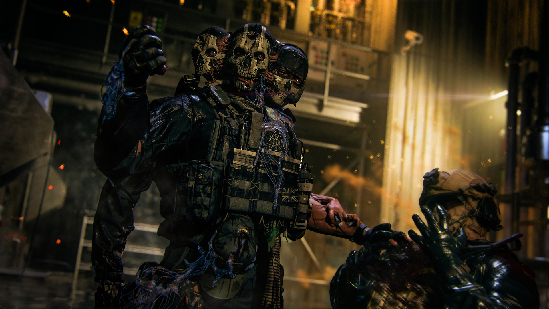

Credits (Koto)
Design Direction
Harrison Dew
Graphic Design
Claudio Rodriguez, Jr.
Jack McEntee
Daniel McKinney
Michael Auer
Robert Loeber
Charlie Nash
Tong ZhaoMotion Design
Tomasz Wysocki
Charlie Smith
Harrison Dew
Graphic Design
Claudio Rodriguez, Jr.
Jack McEntee
Daniel McKinney
Michael Auer
Robert Loeber
Charlie Nash
Tong ZhaoMotion Design
Tomasz Wysocki
Charlie Smith
Special Thanks
Similar Projects


Logos & Marks
Various Clients
2016 → Ongoing
Various Clients
2016 → Ongoing
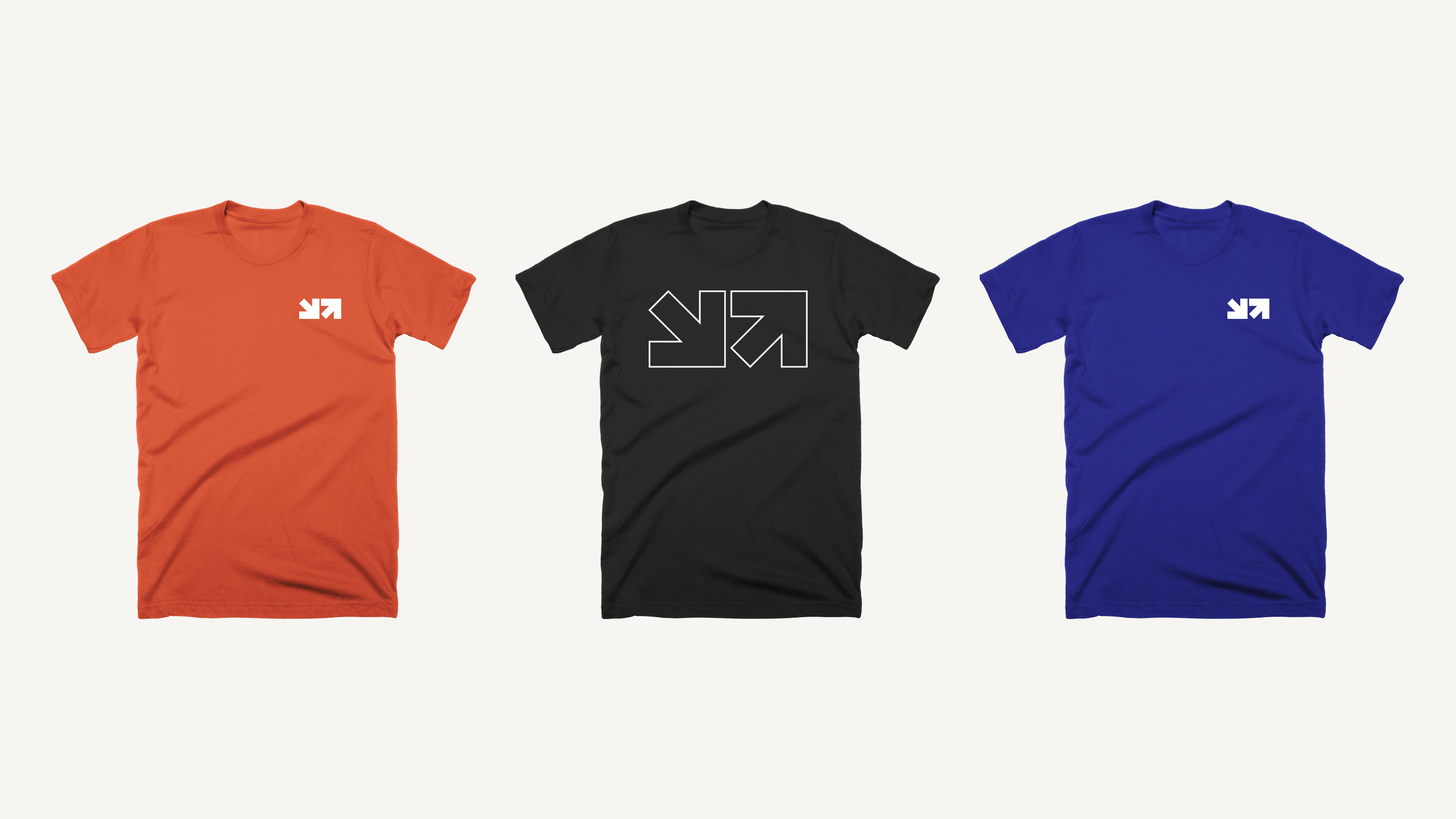
Library of logos and logomarks drawn for various clients and personal projects.
Updated periodically.
- Quarantine Zone (2025)
- Wiggins Family (2025)
- Tango Gameworks (2025)
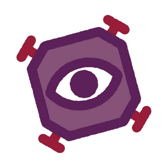
- ??? — Unused (2025)
- Racing Logos (2024)
- Call of Duty: The Haunting (2024)
- My Famicase Exhibition → bit•pivot (2024)
-
Goofy Industries (2023)
- Banzai (2023)
- My Famicase Exhibition → Ploomish™ (2023)
- Pendant (2023)
- RAID v2 → 1P2P (2022)
- My Famicase Exhibition → fuchsia 800 (2022)
- My Famicase Exhibition → fuchsia 400 (2021)
- My Famicase Exhibition → Plastic Tactics (2020)
- MinnMax (2020)
- ??? — Unused (2020)
- Maridia (2018)
- Sego Awards (2018)
- Banzai Manager (2018)
- So Many Damn Books (2016)


Wiggins Family
Client: Wiggins Family
2025
Client: Wiggins Family
2025
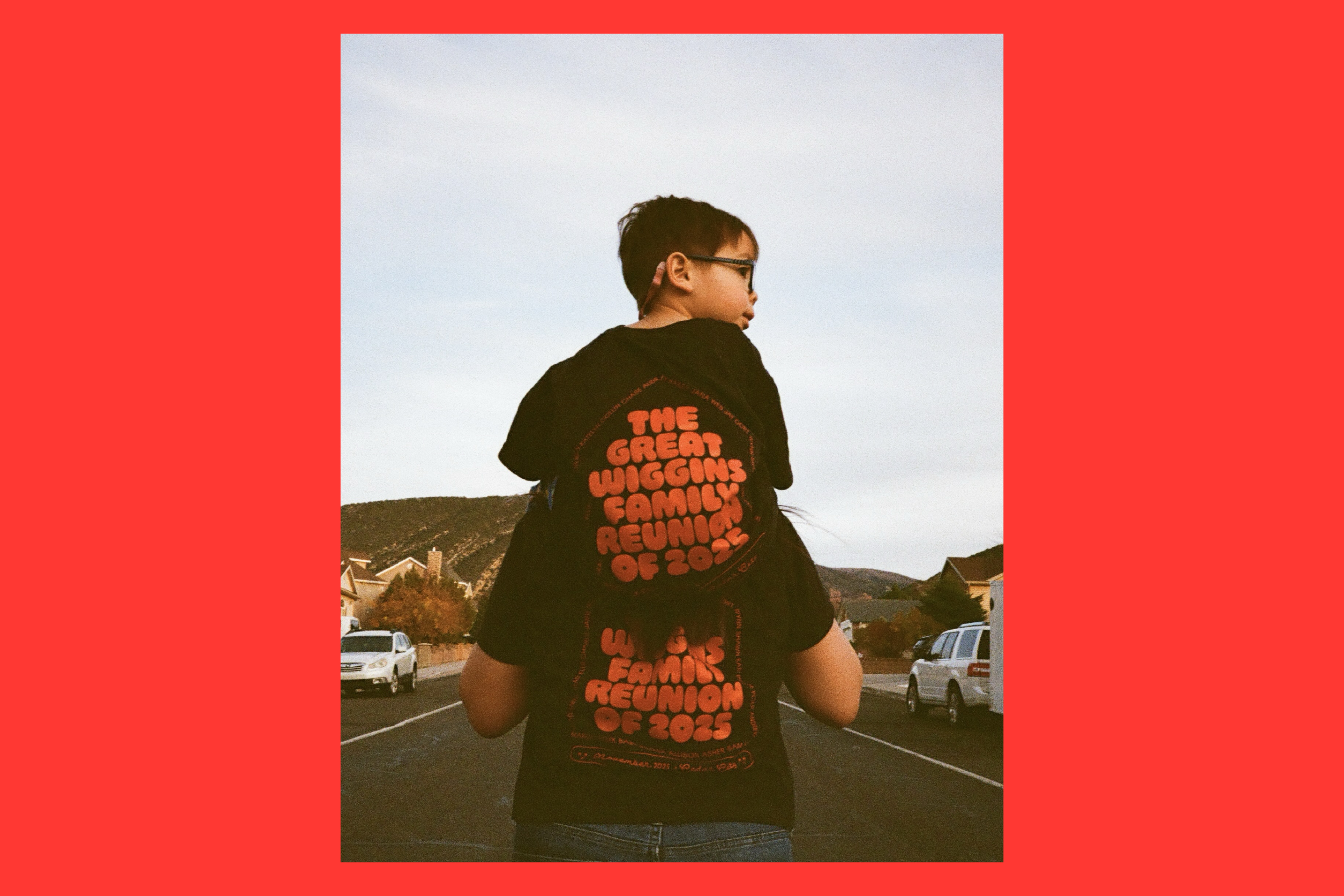
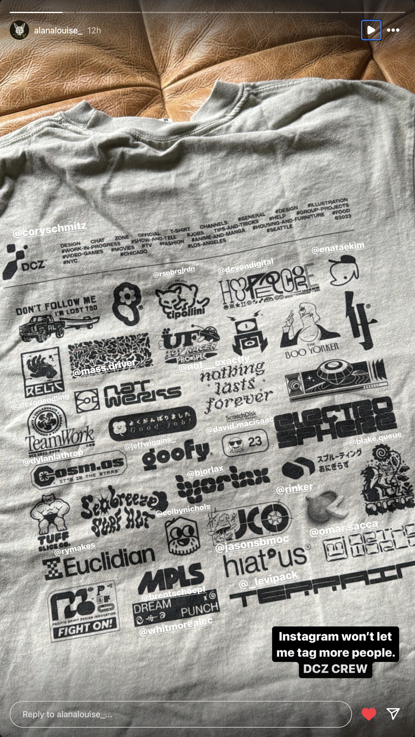
Logo and t-shirt design for the Wiggins family to celebrate our 2025 family reunion.The logo on the front of the shirt is made of three 5-pointed stars, a reference to our family crest. By removing and rearranging the side stars’ inner points, a ‘W’ is formed in the negative space.
Typeset in Ohno Softie by Ohno Type Co. and Spoof by Polytype.
Typeset in Ohno Softie by Ohno Type Co. and Spoof by Polytype.


Related Projects
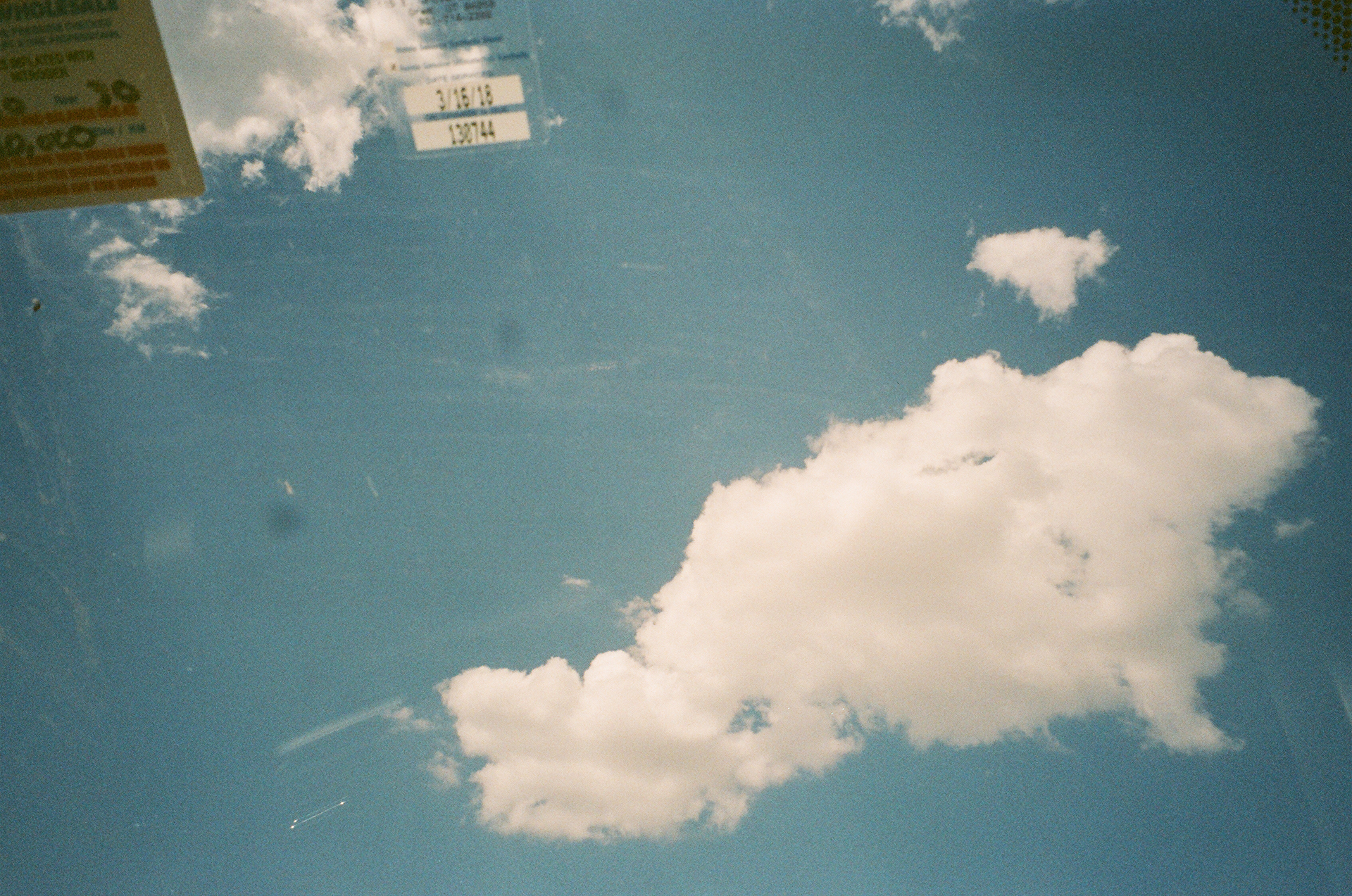
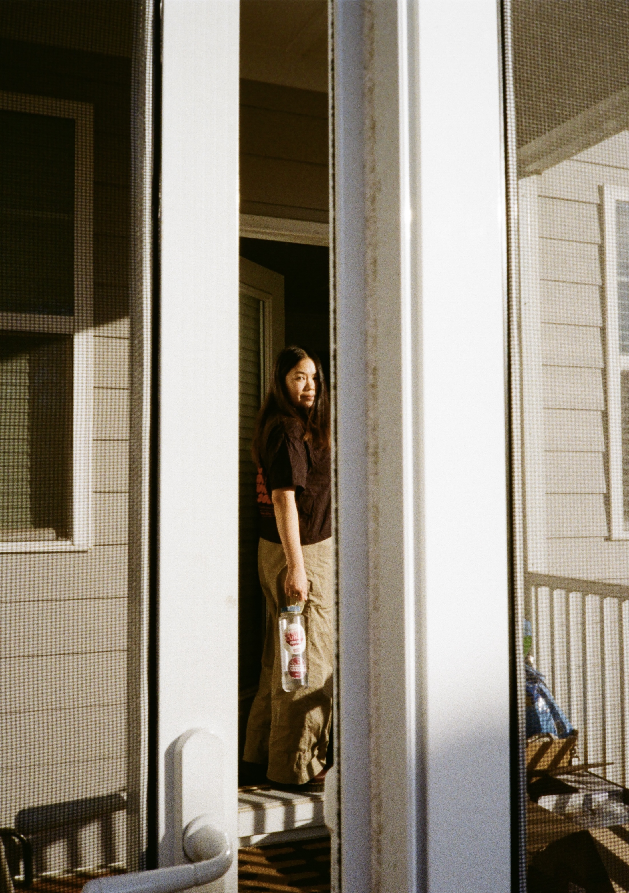
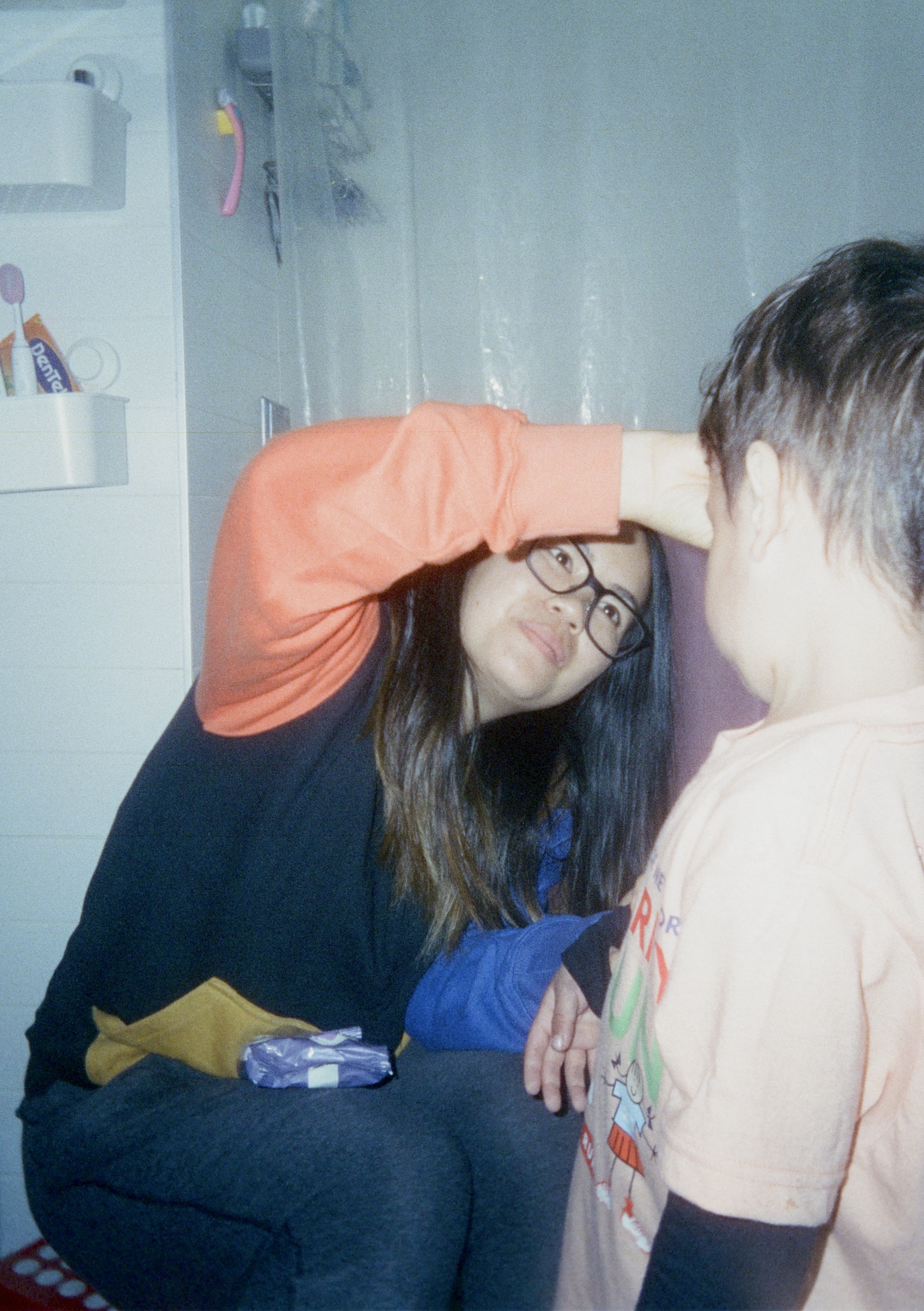
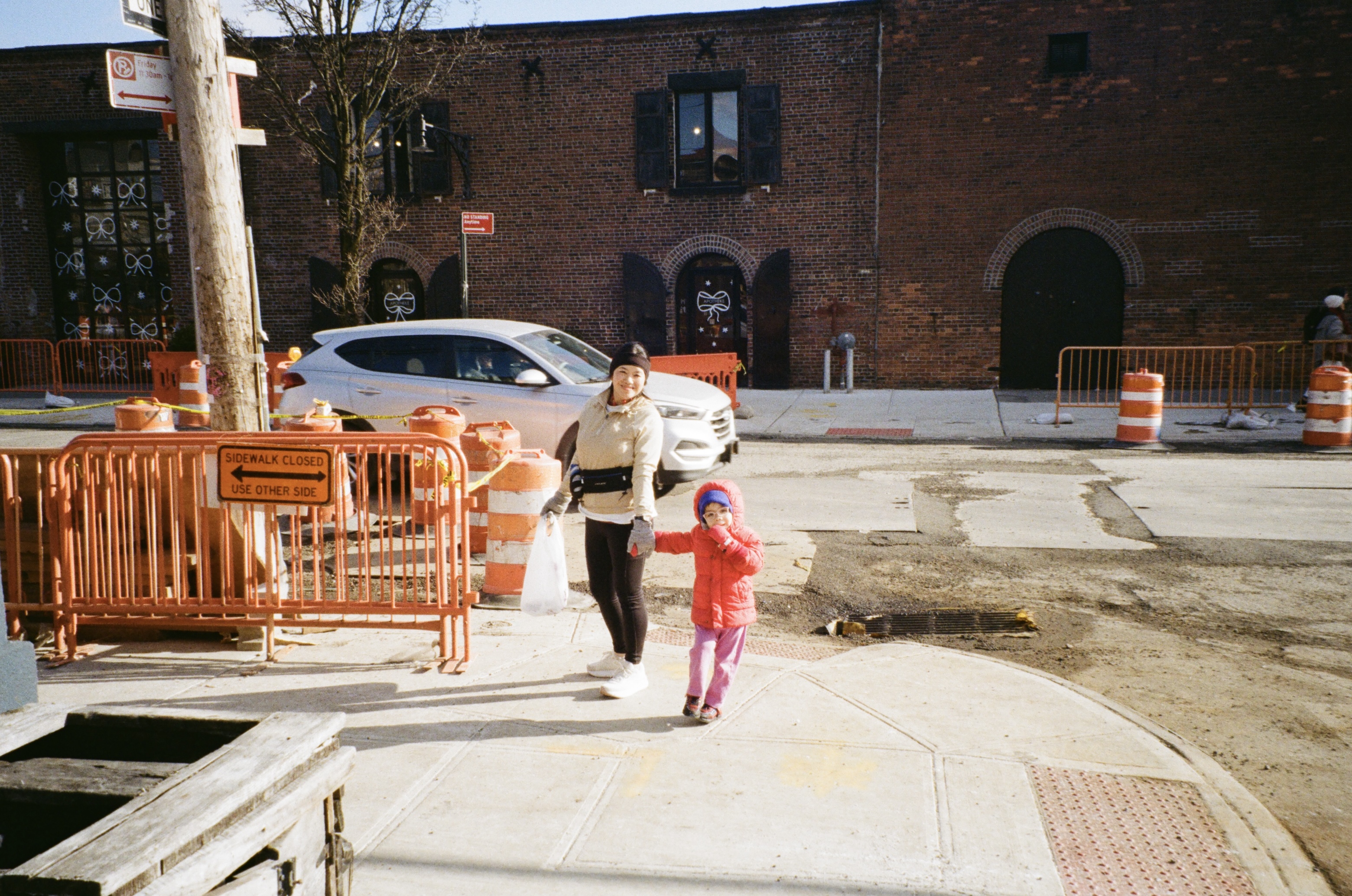
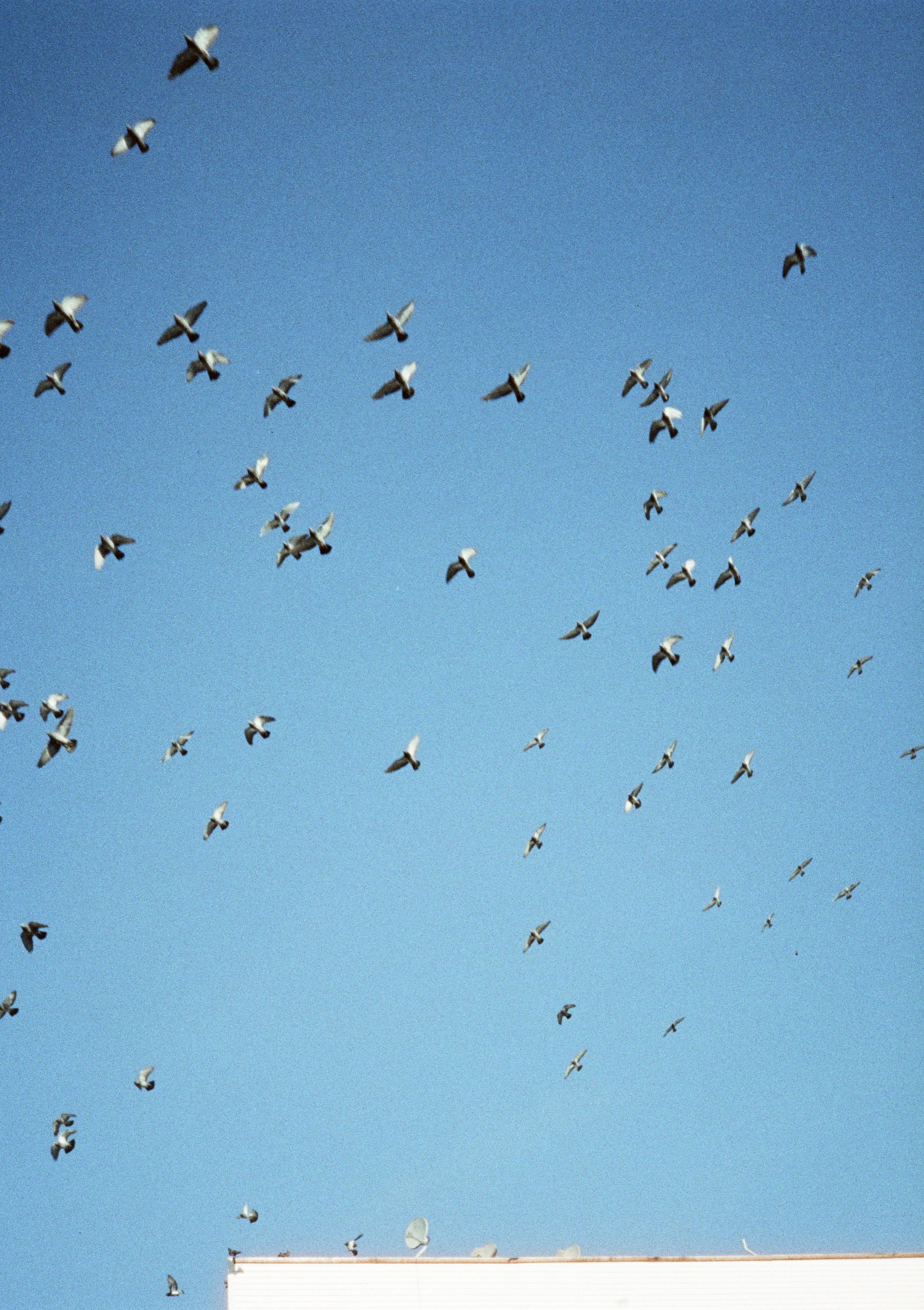
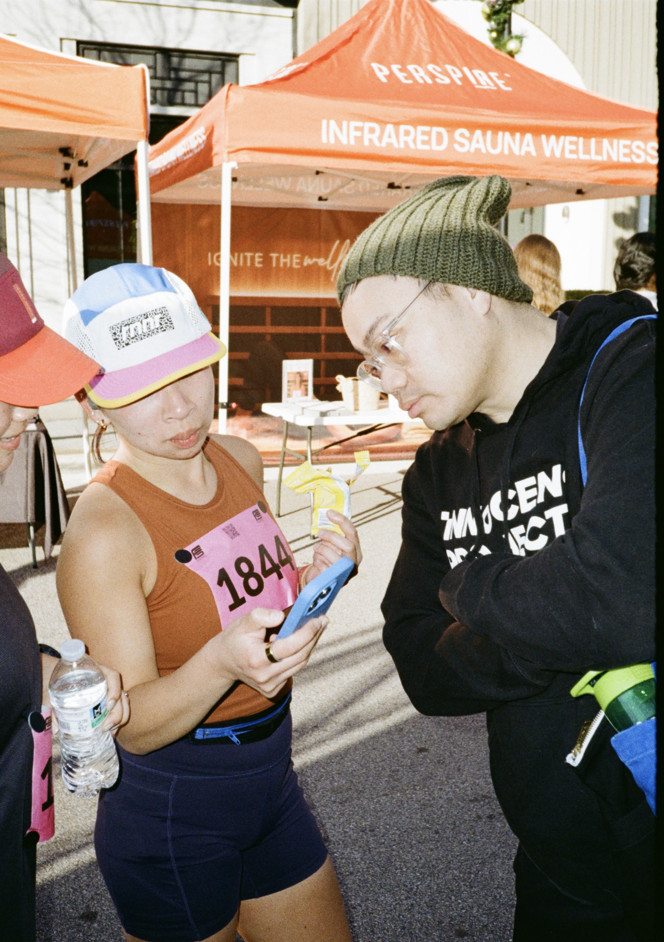
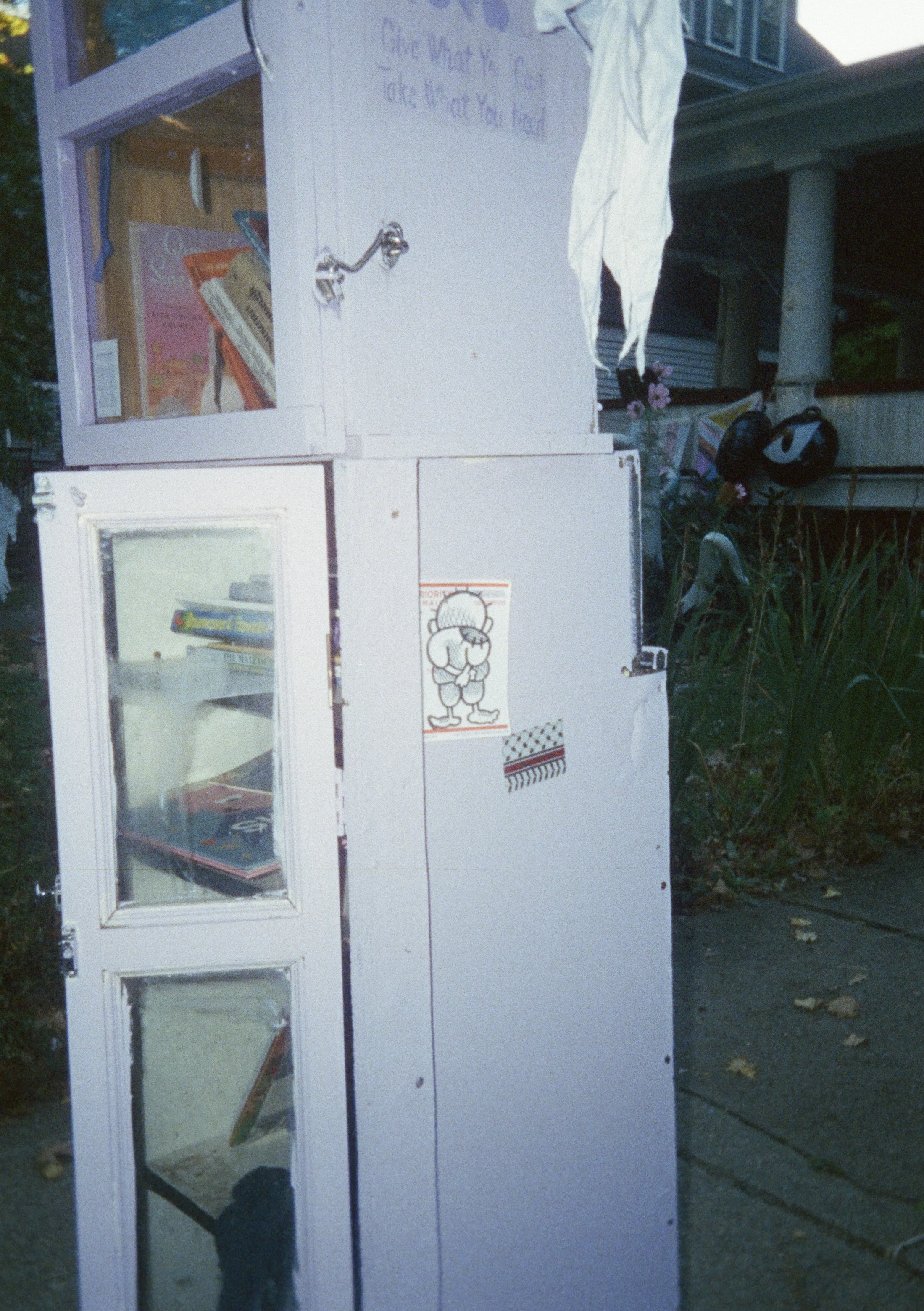
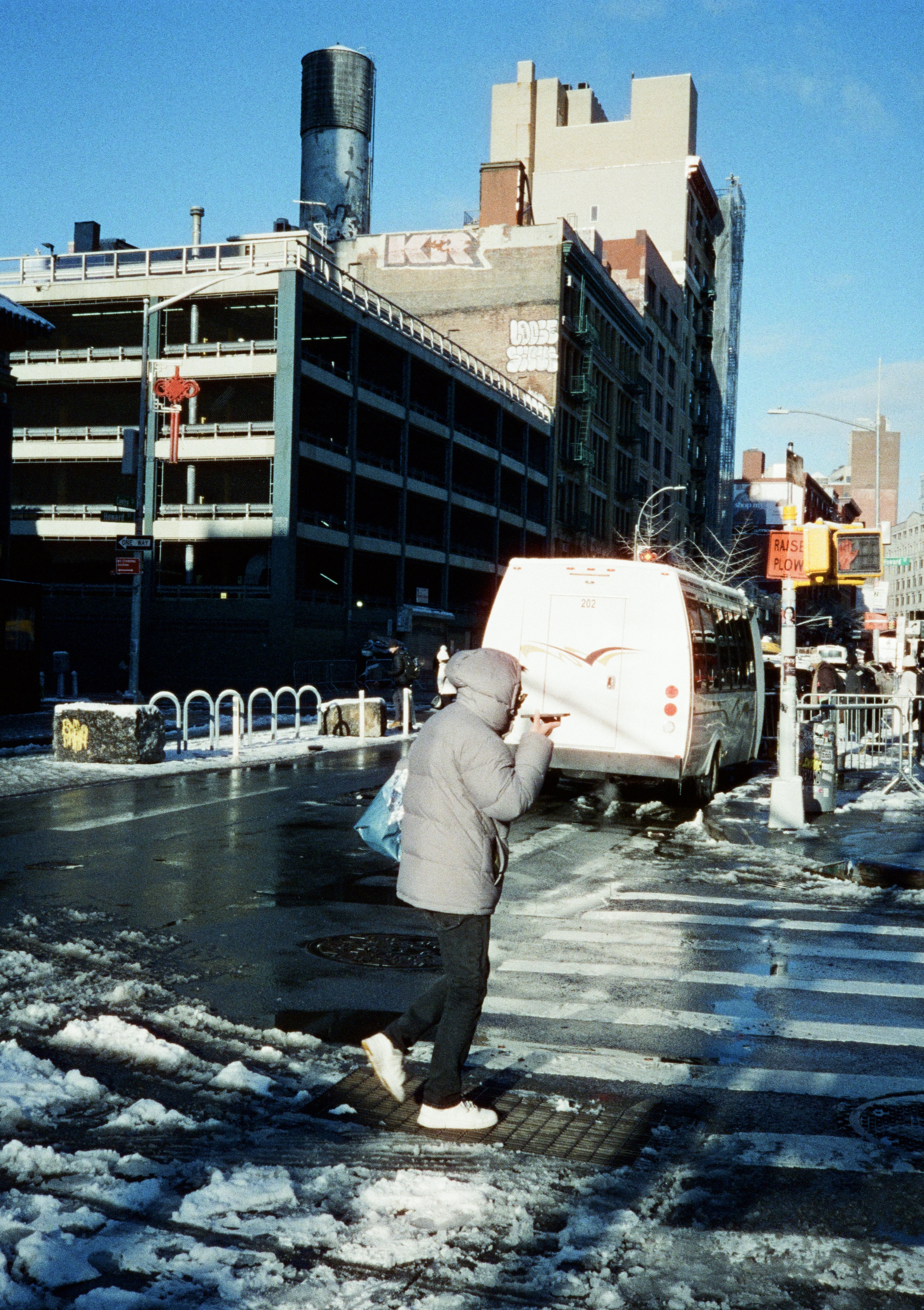
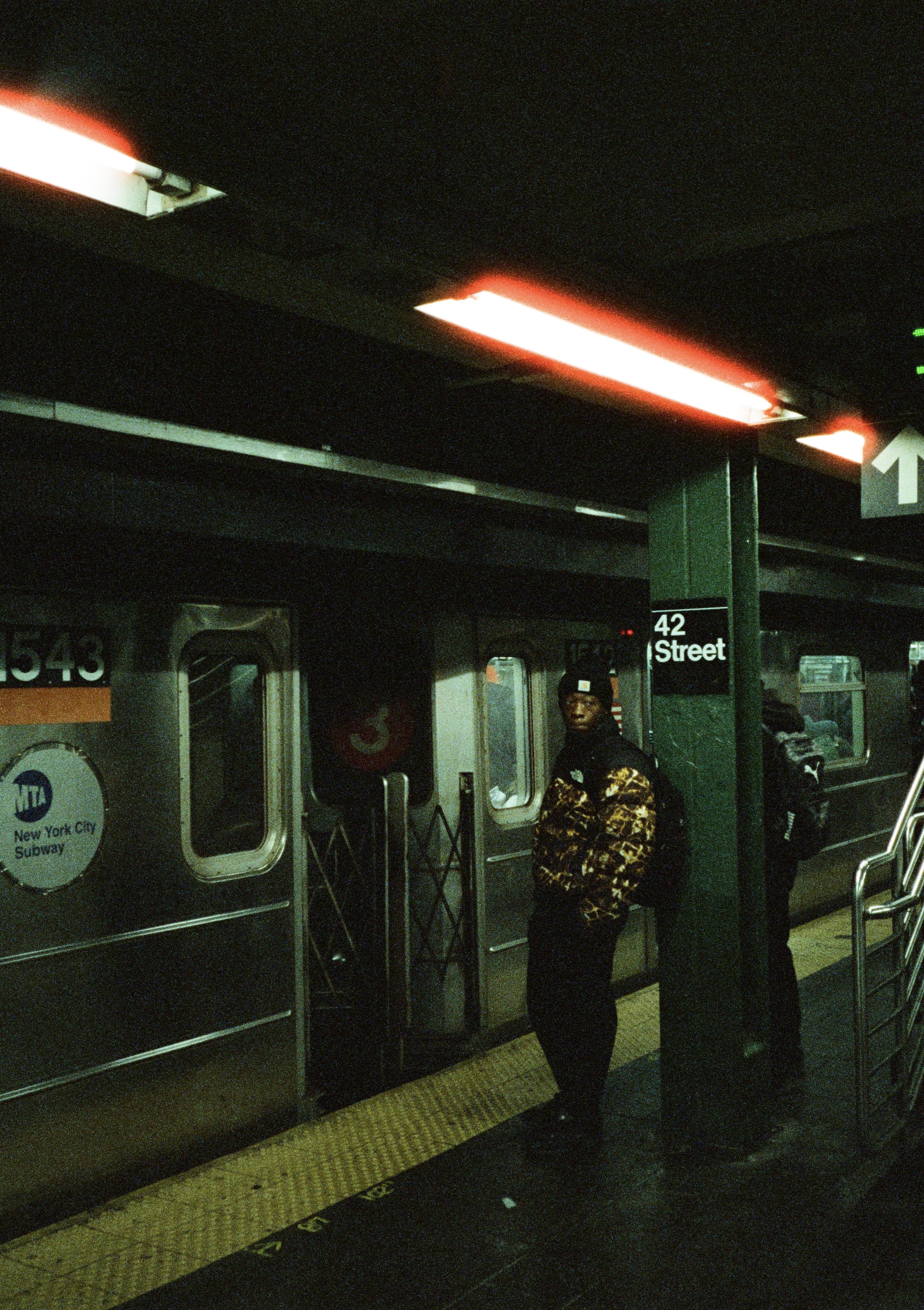
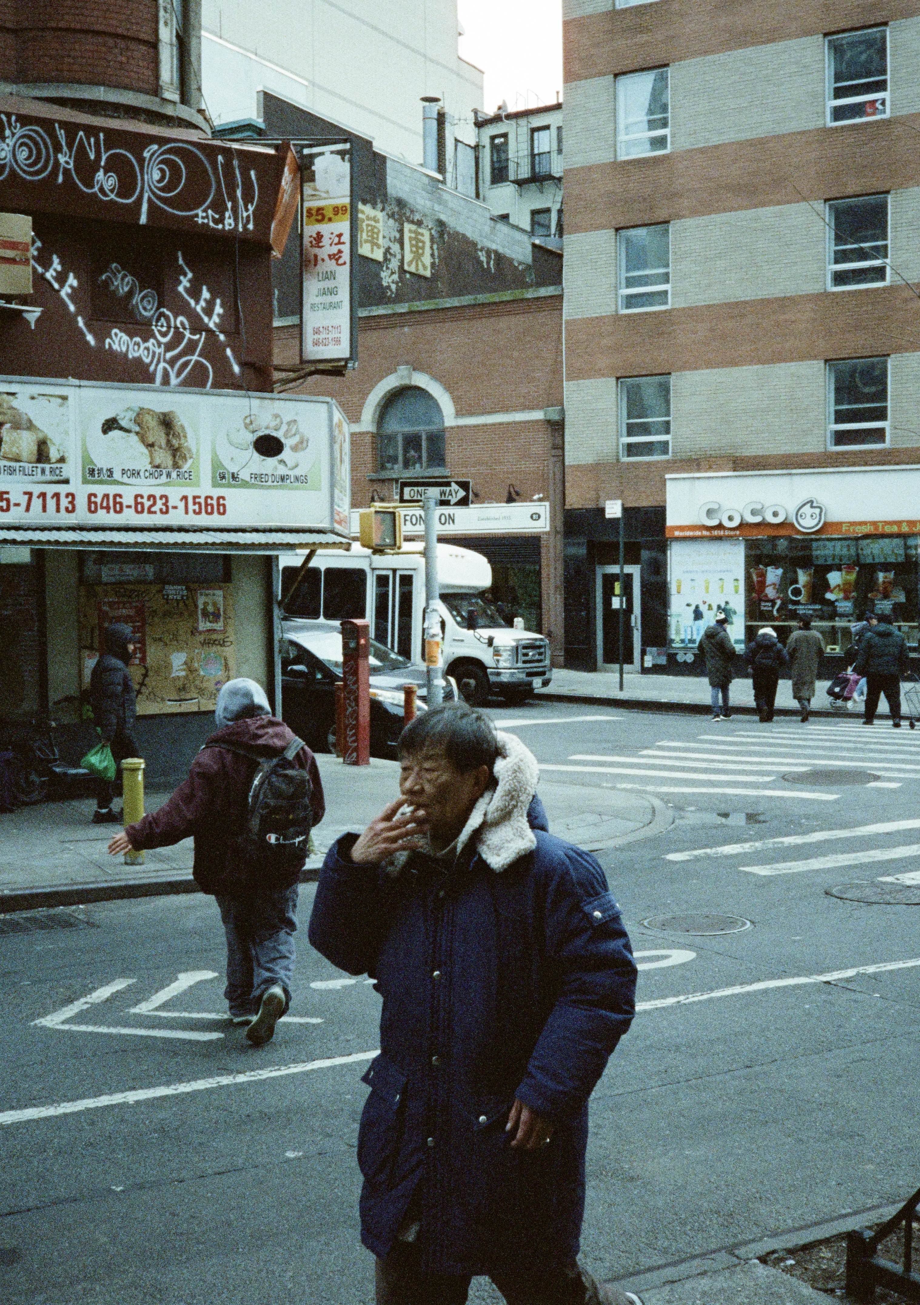
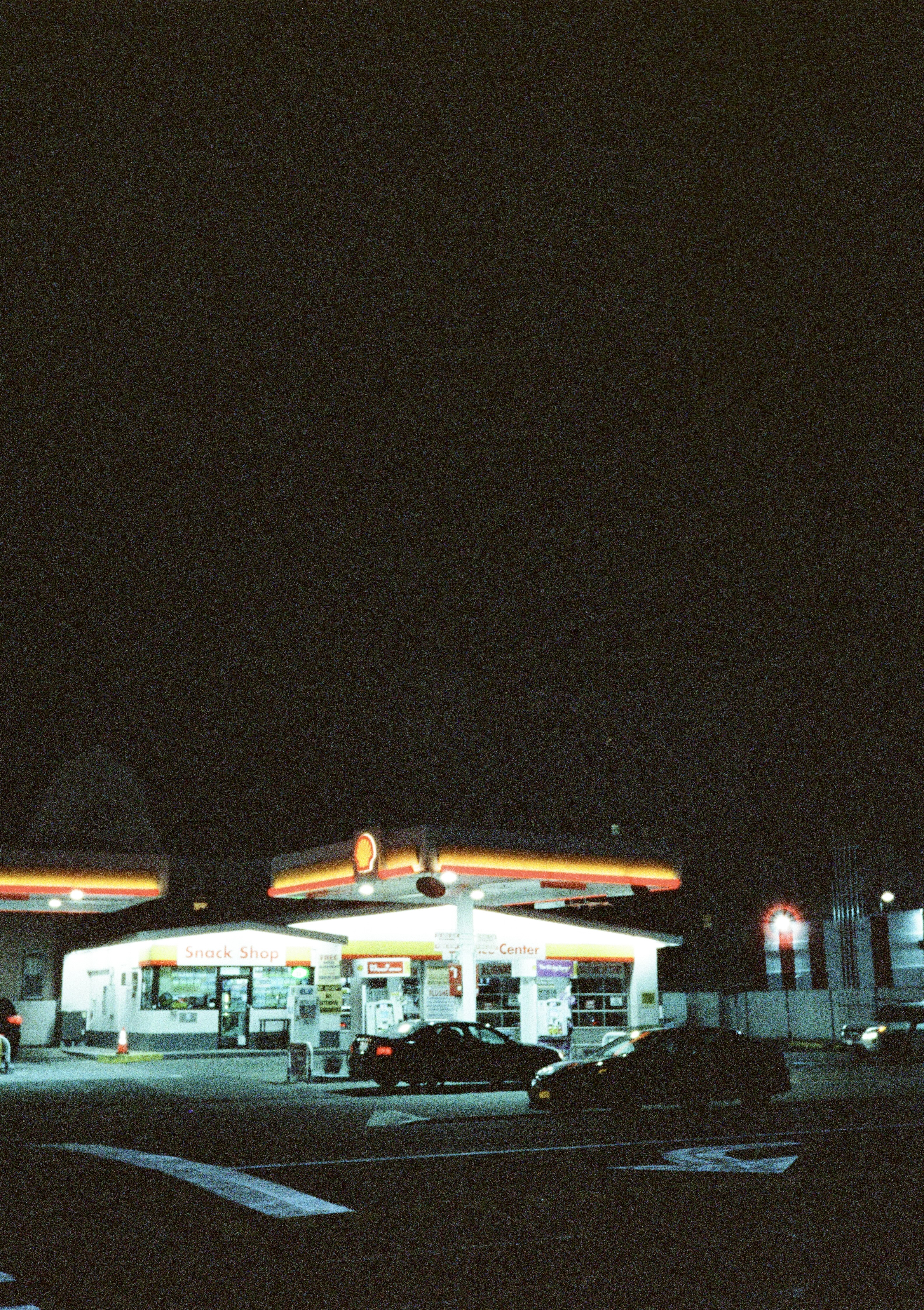
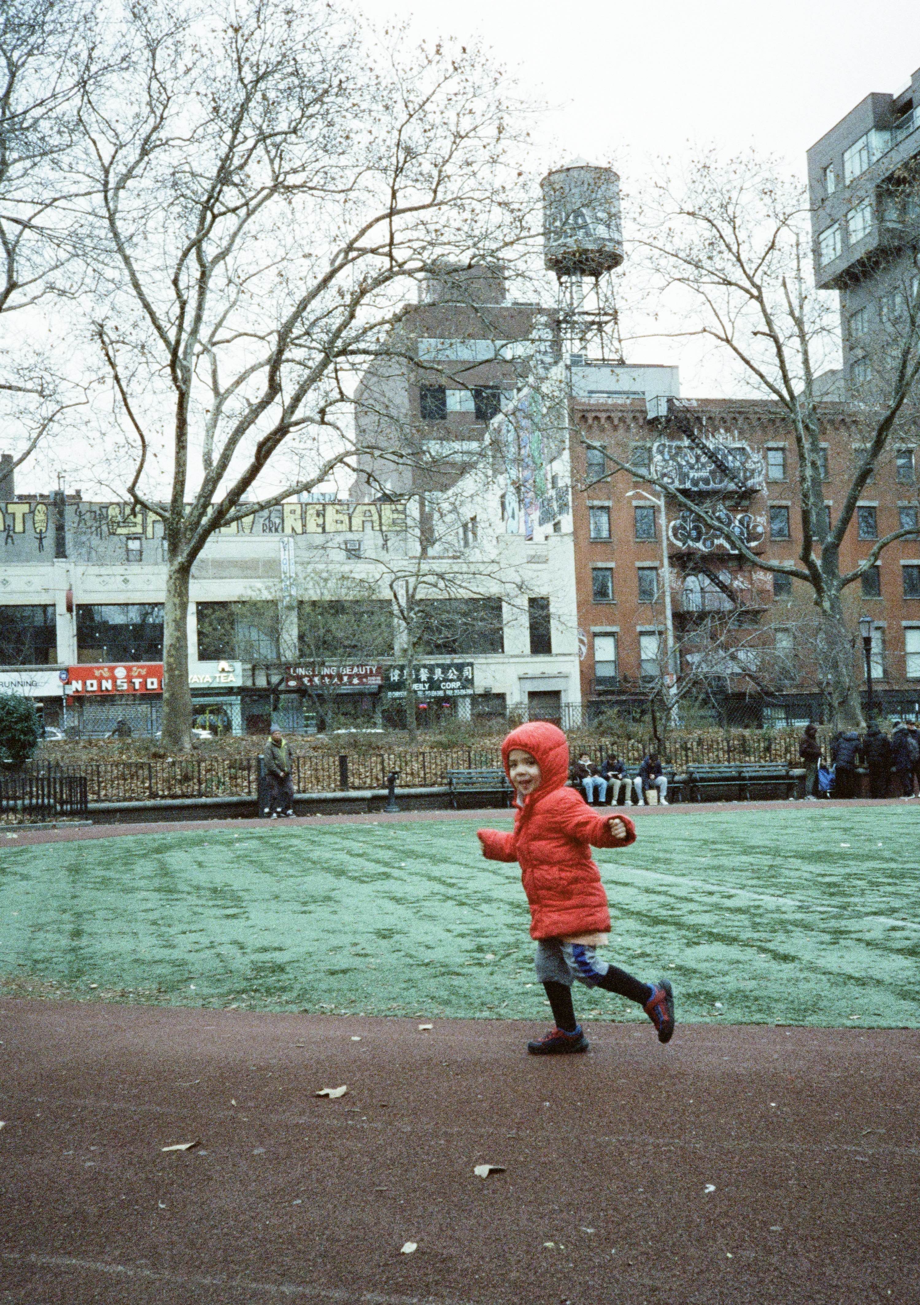
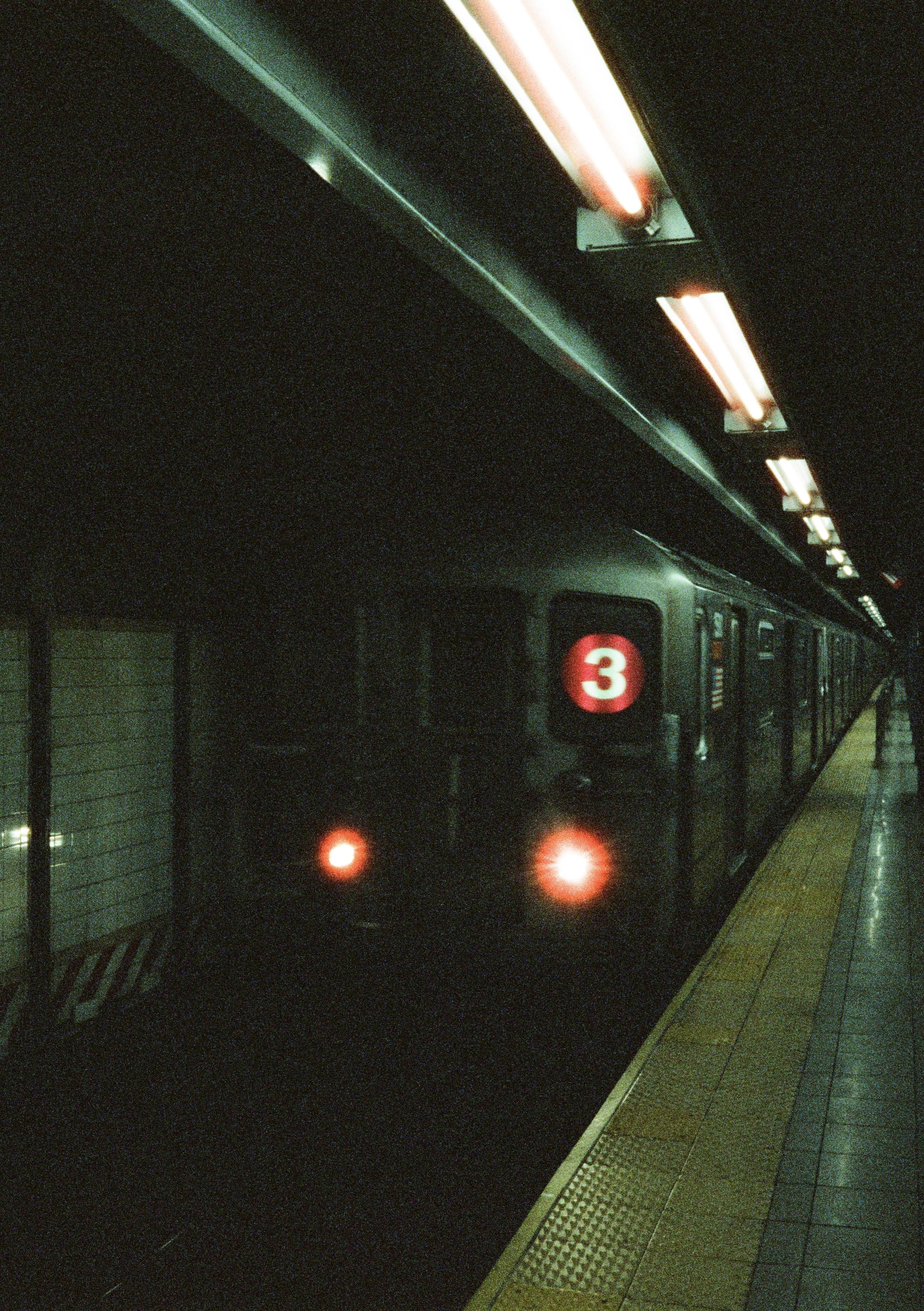
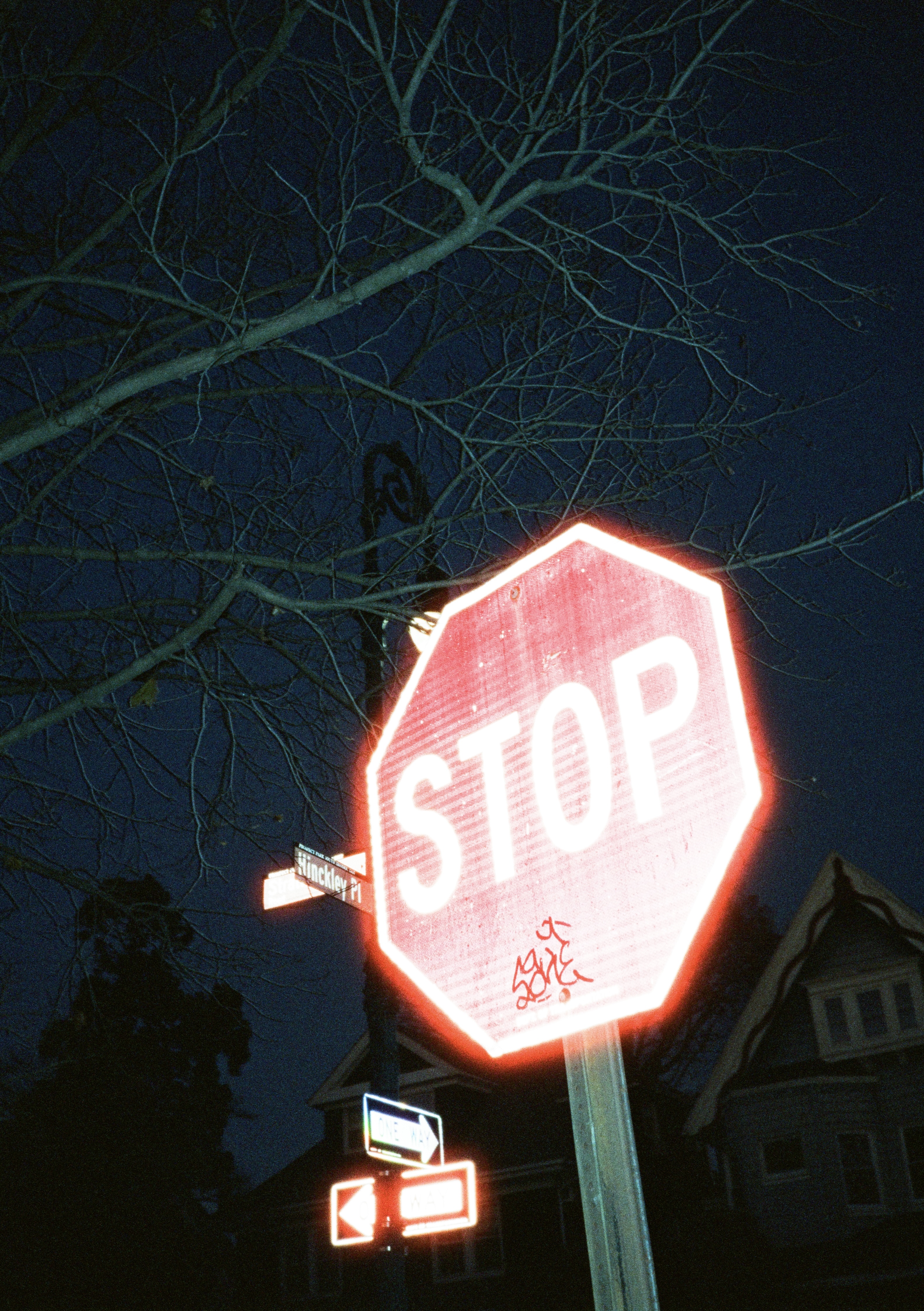
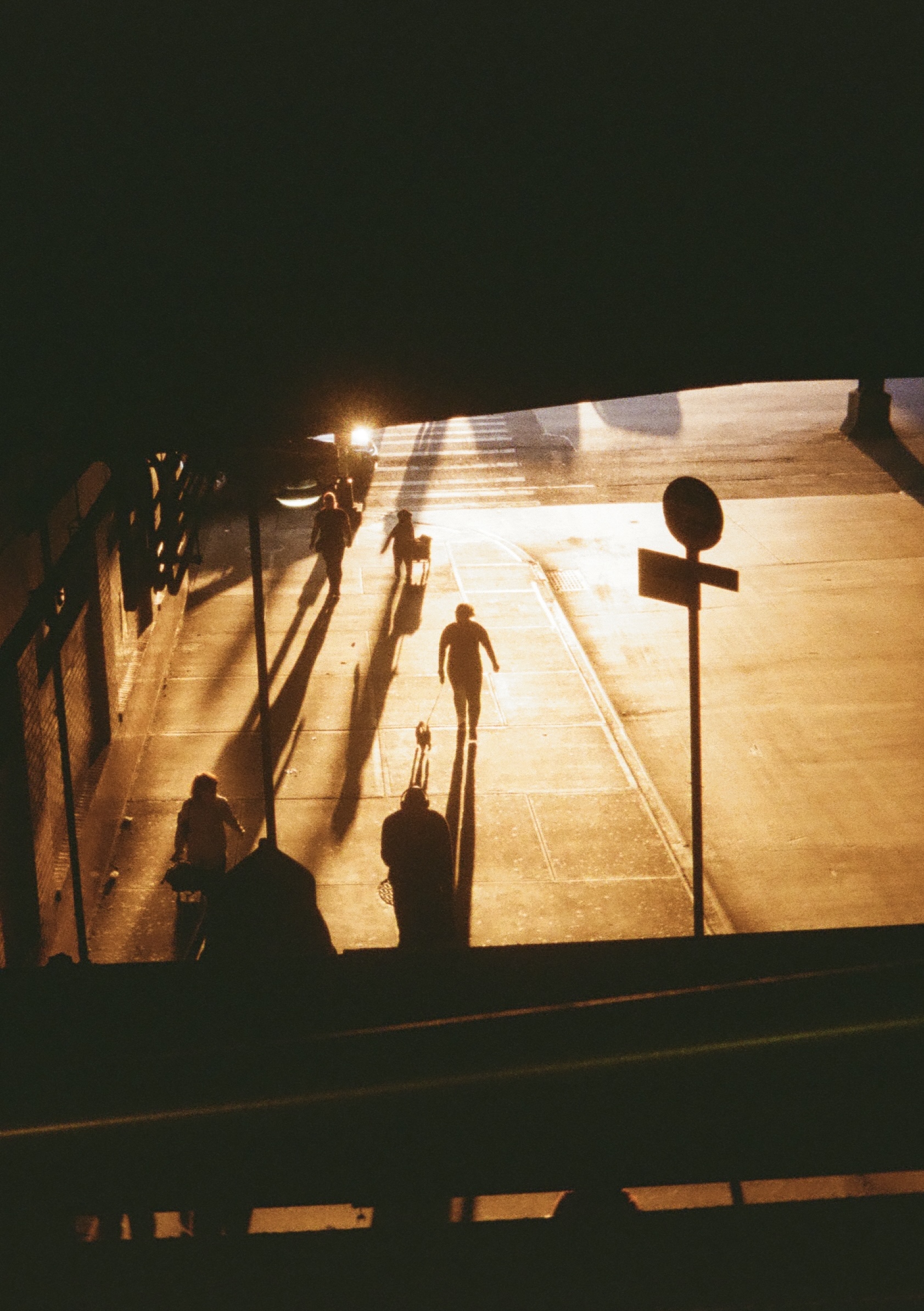
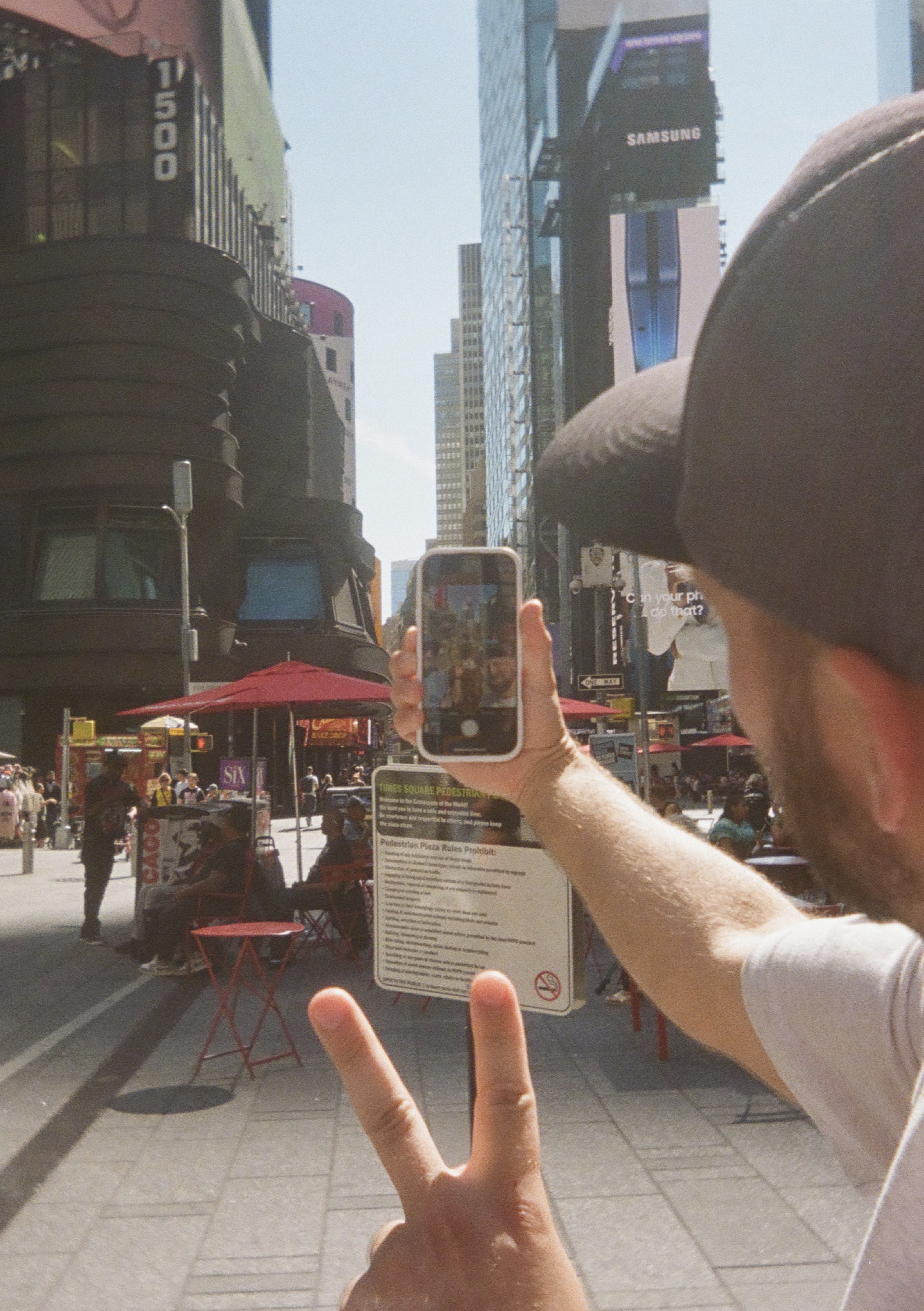
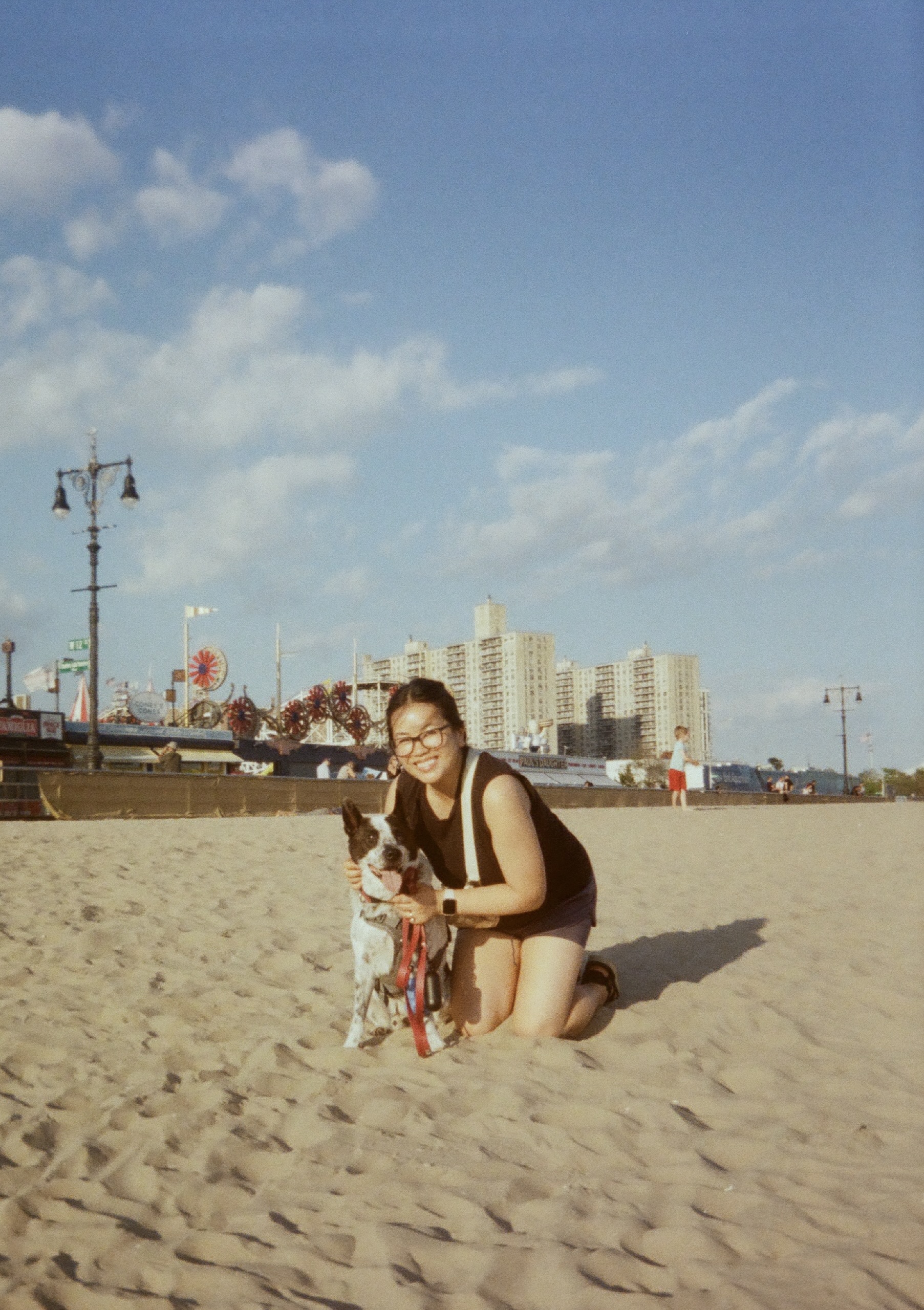
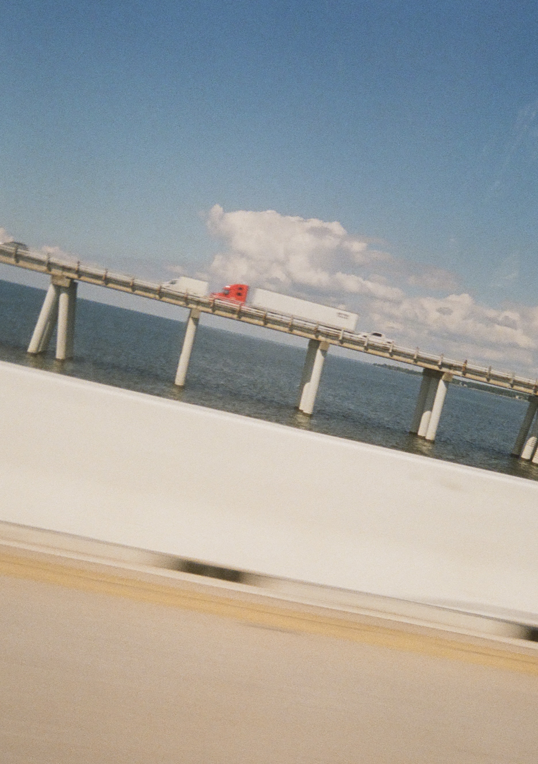
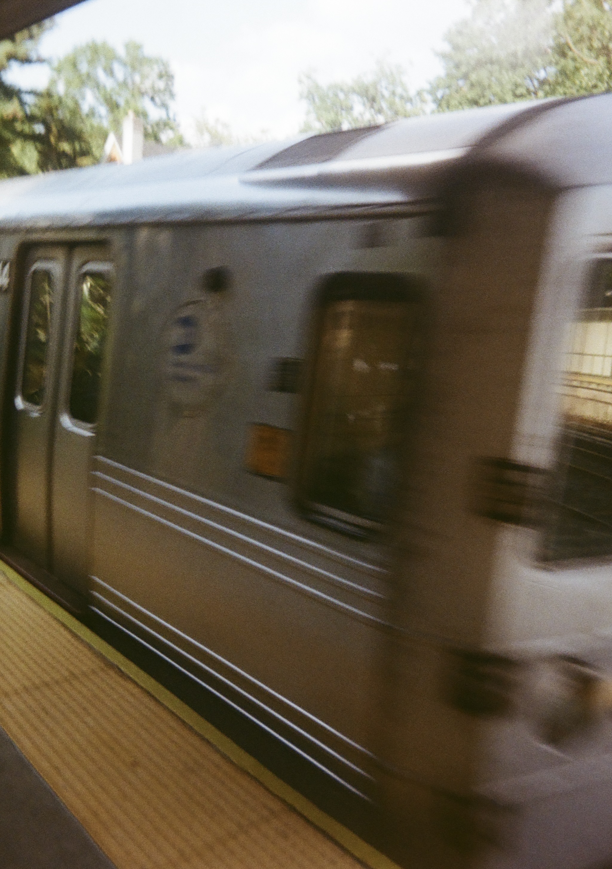
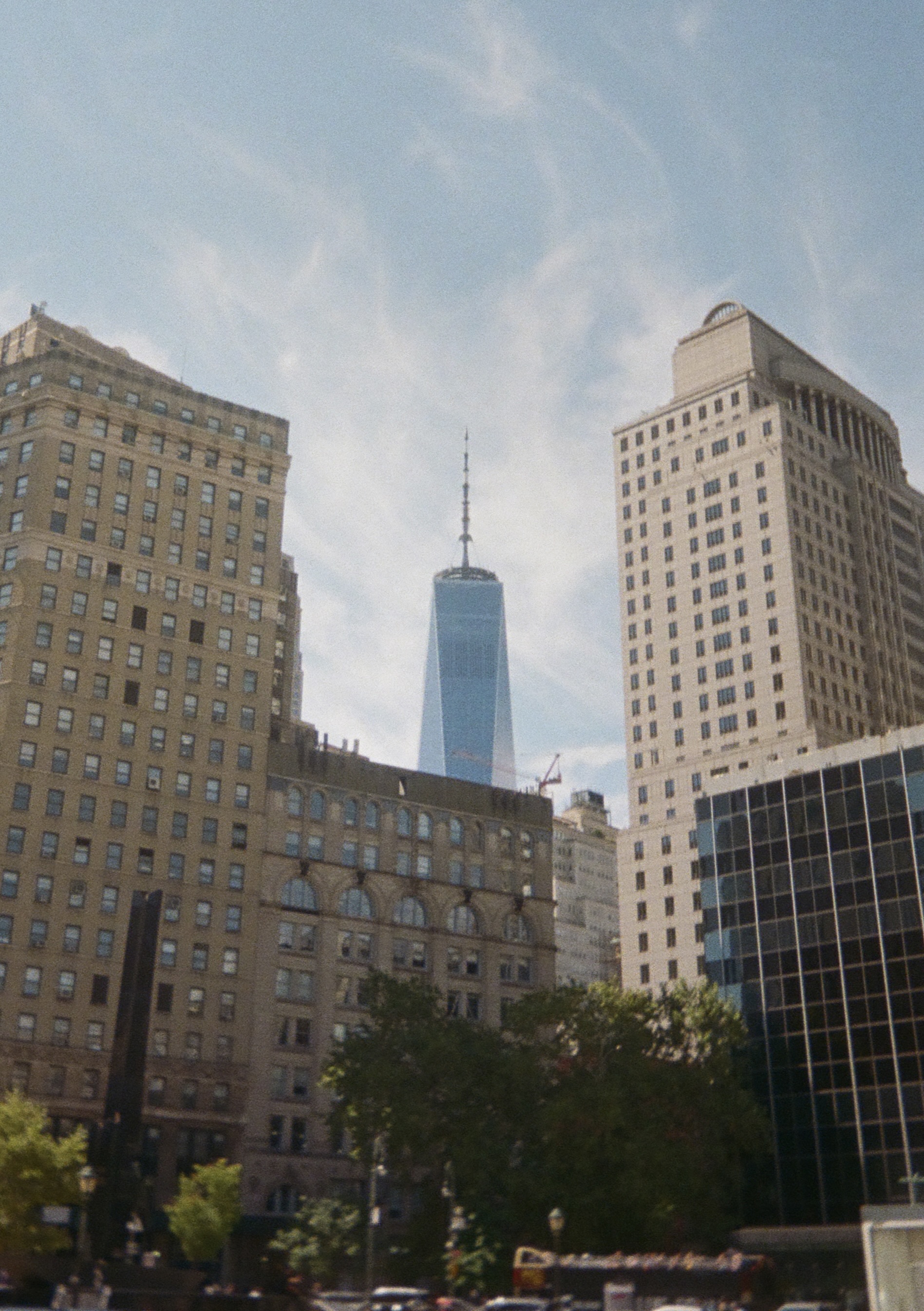
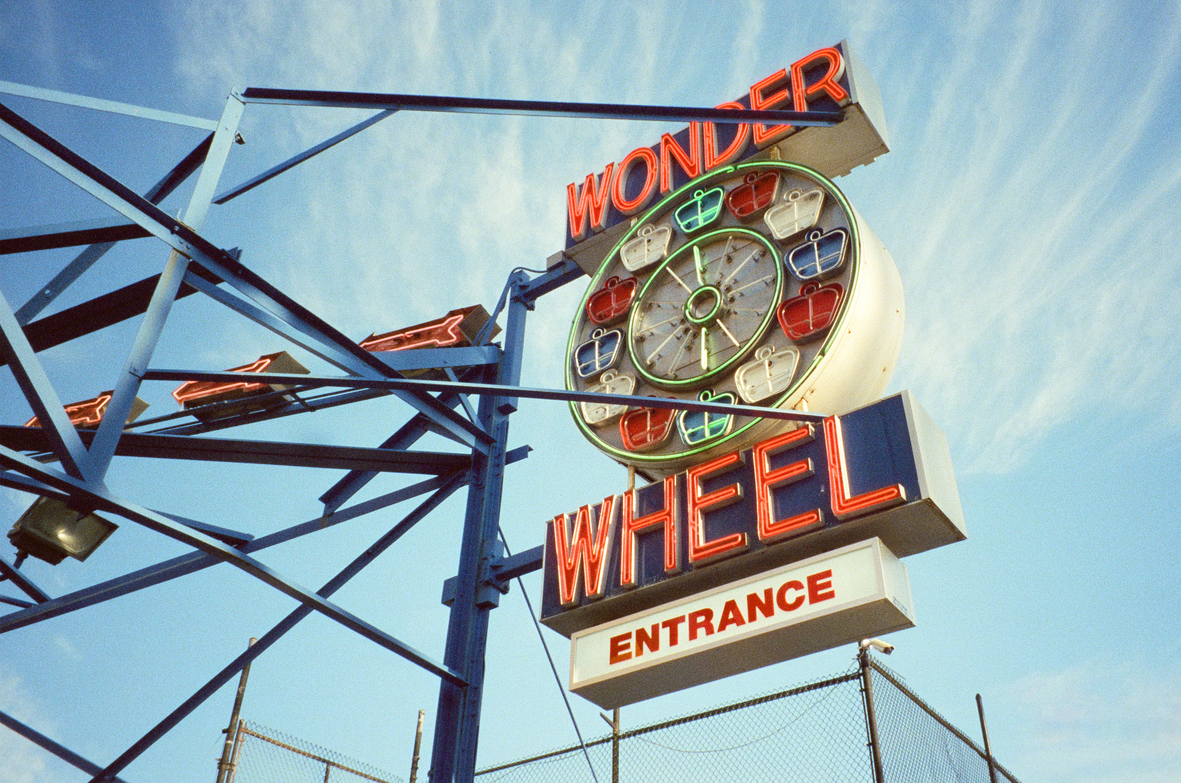
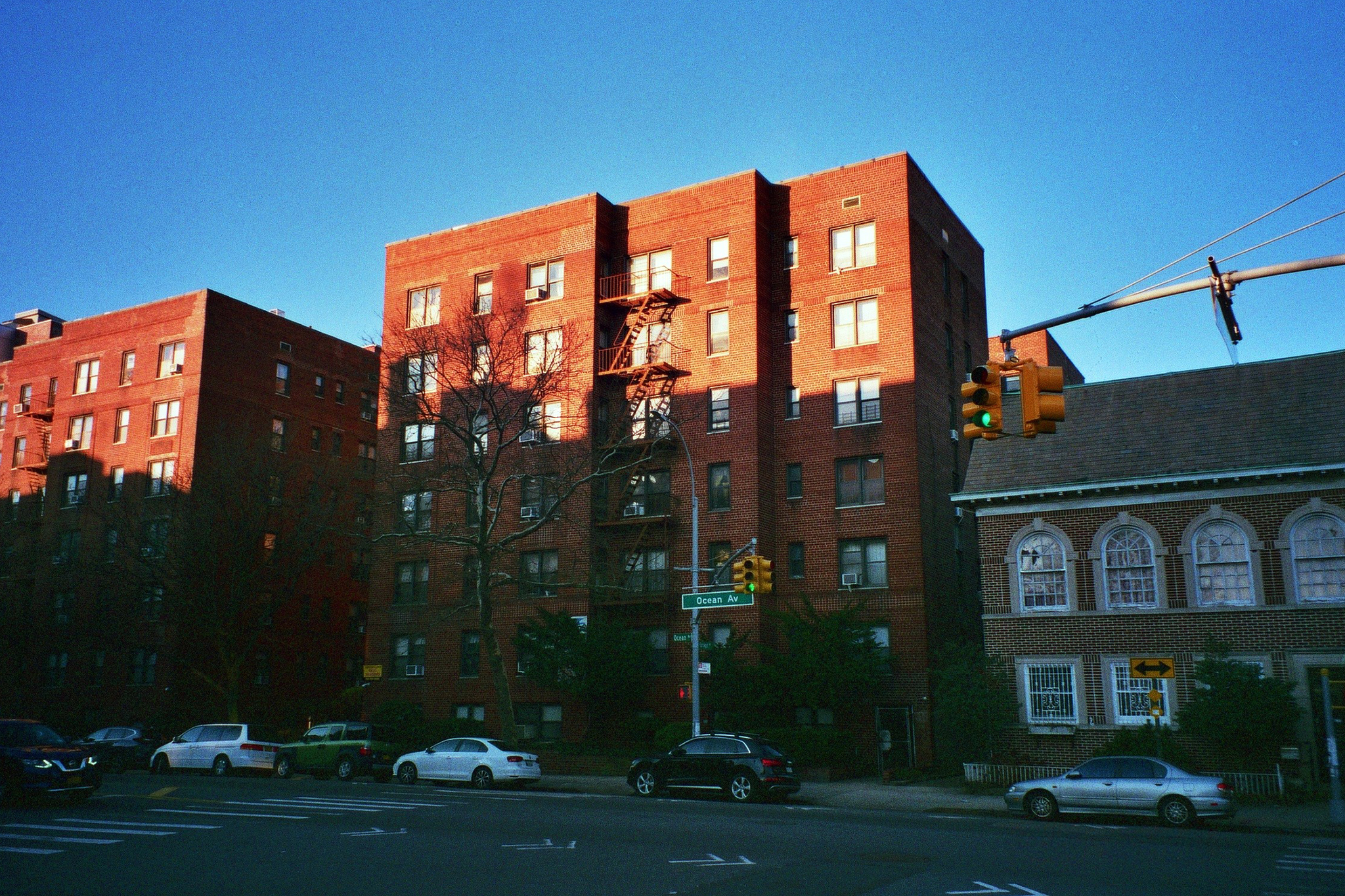
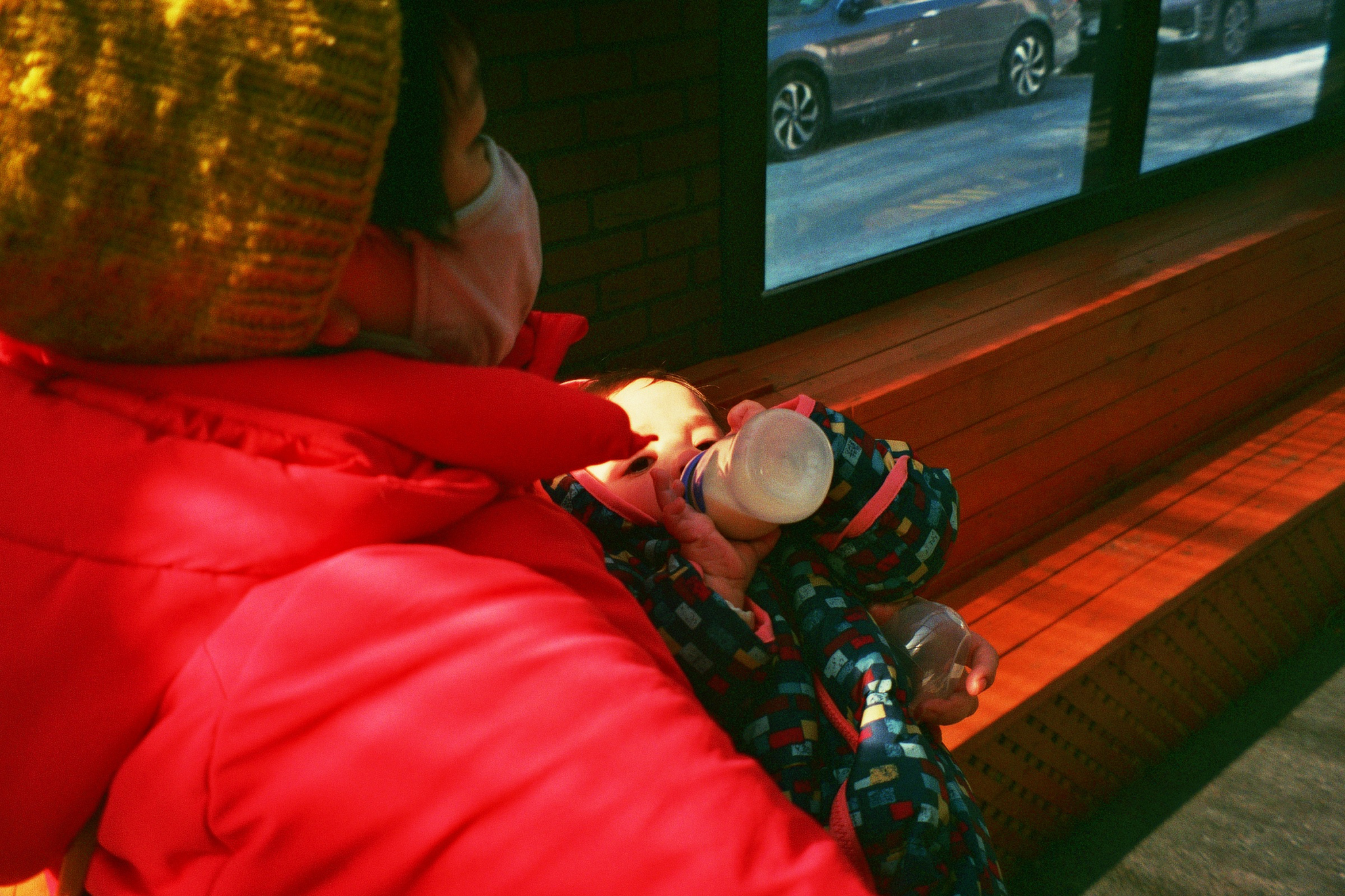
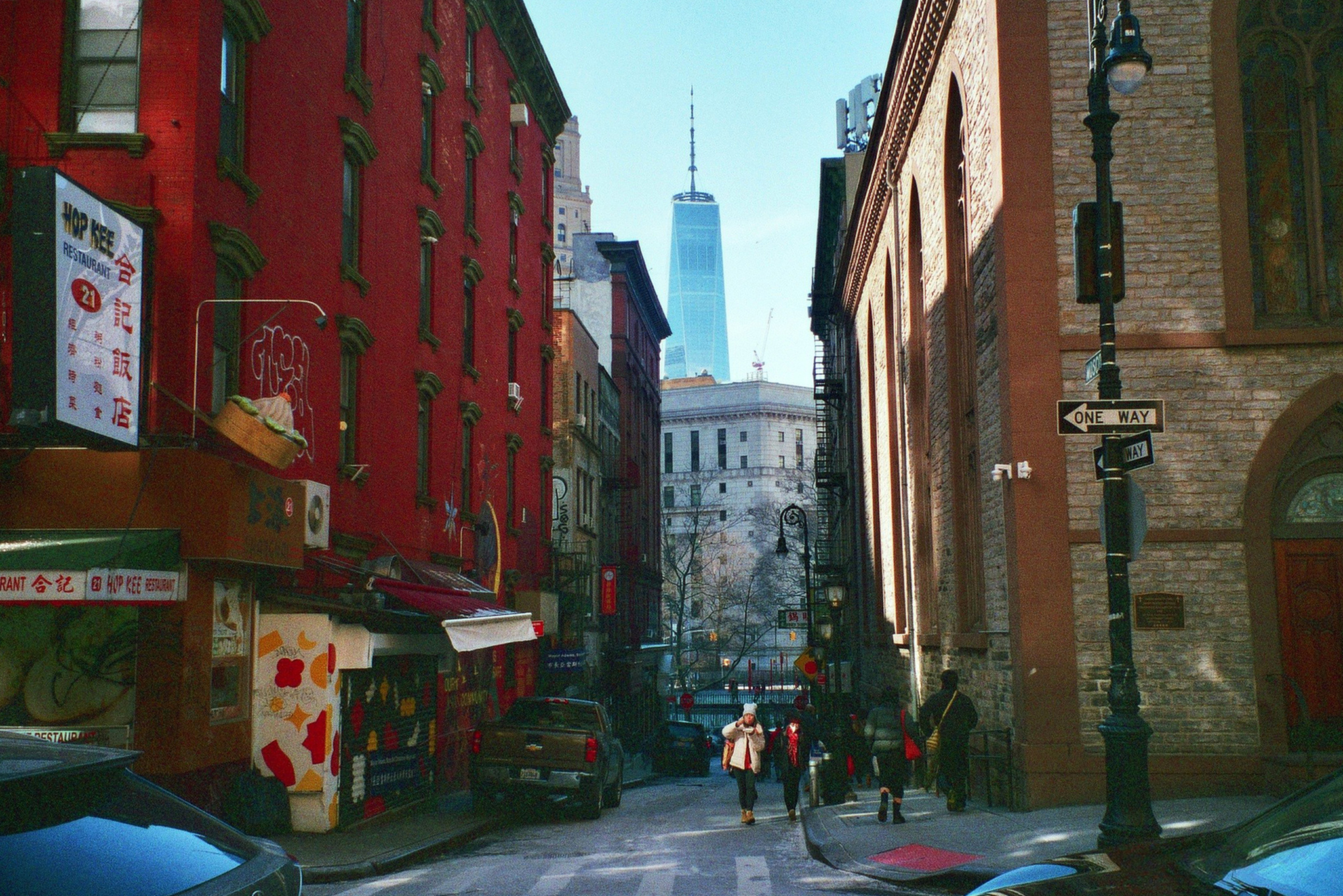
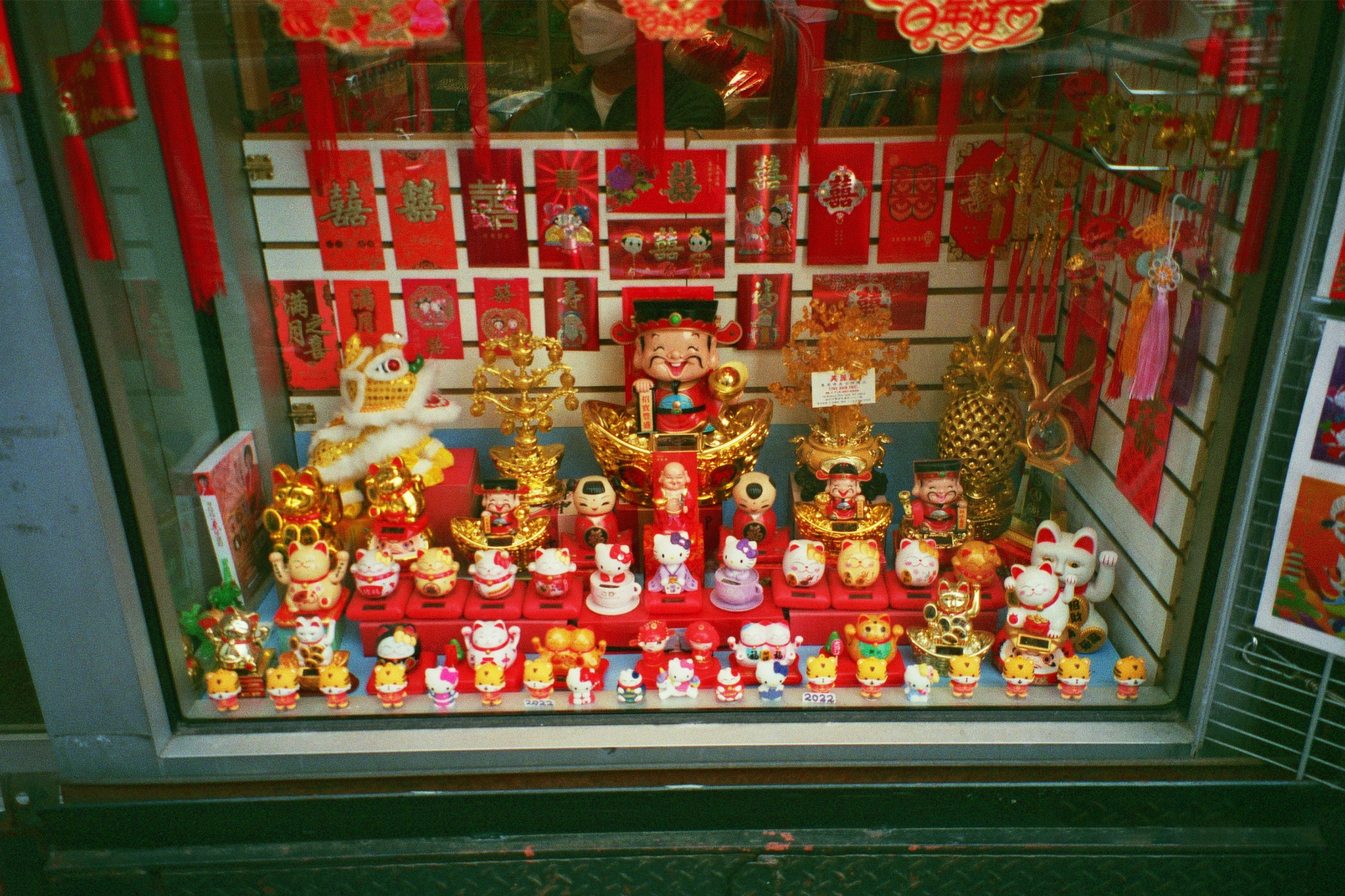
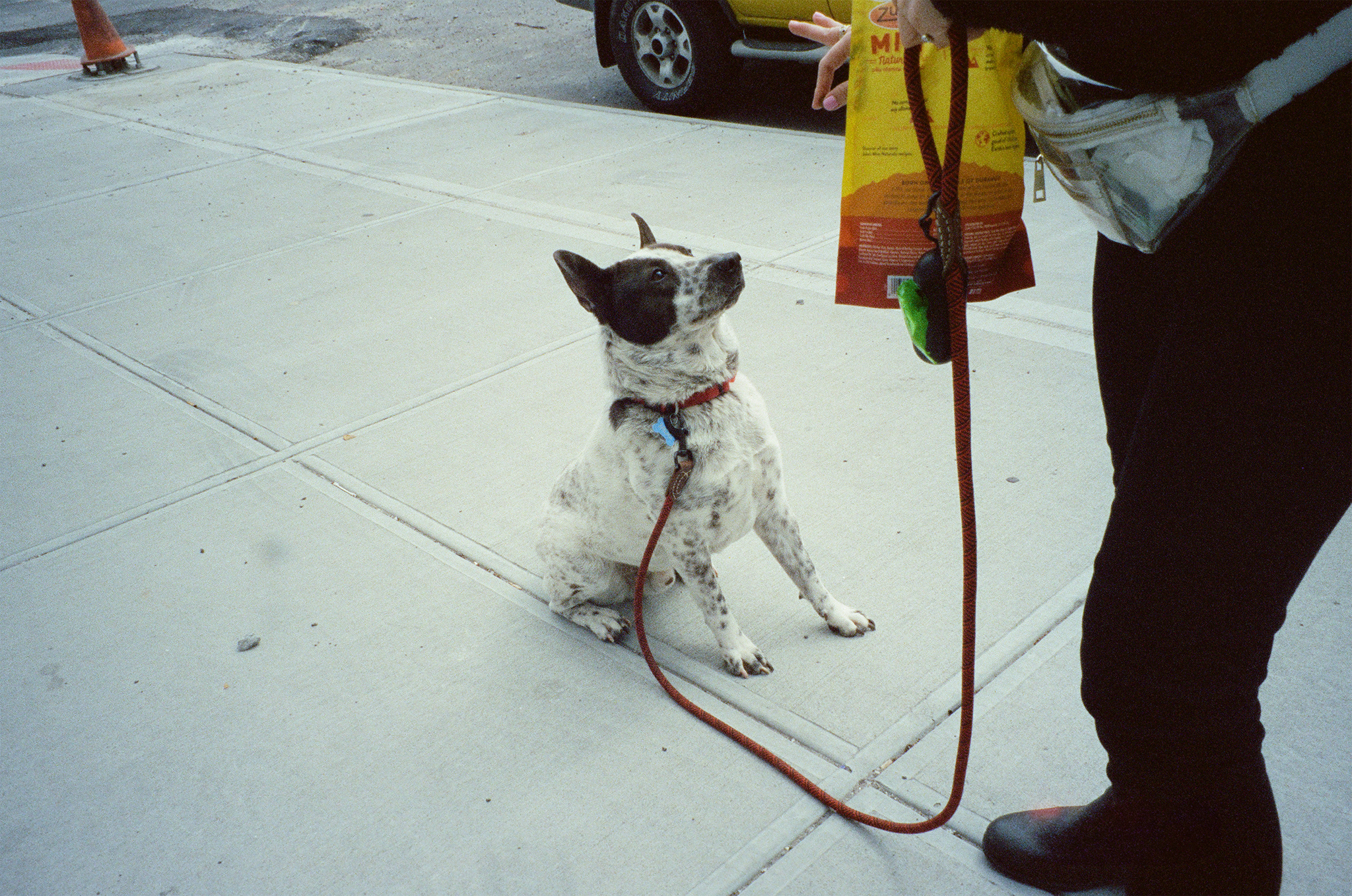
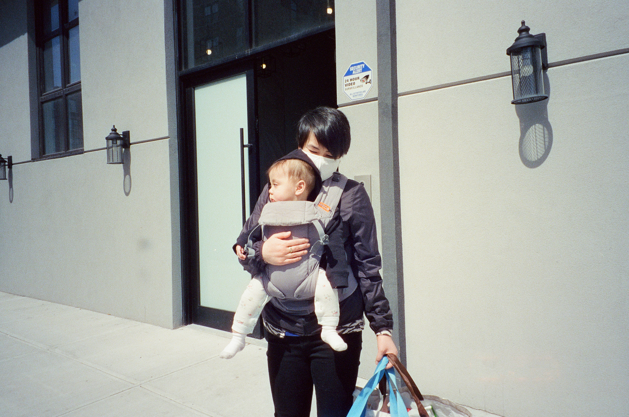
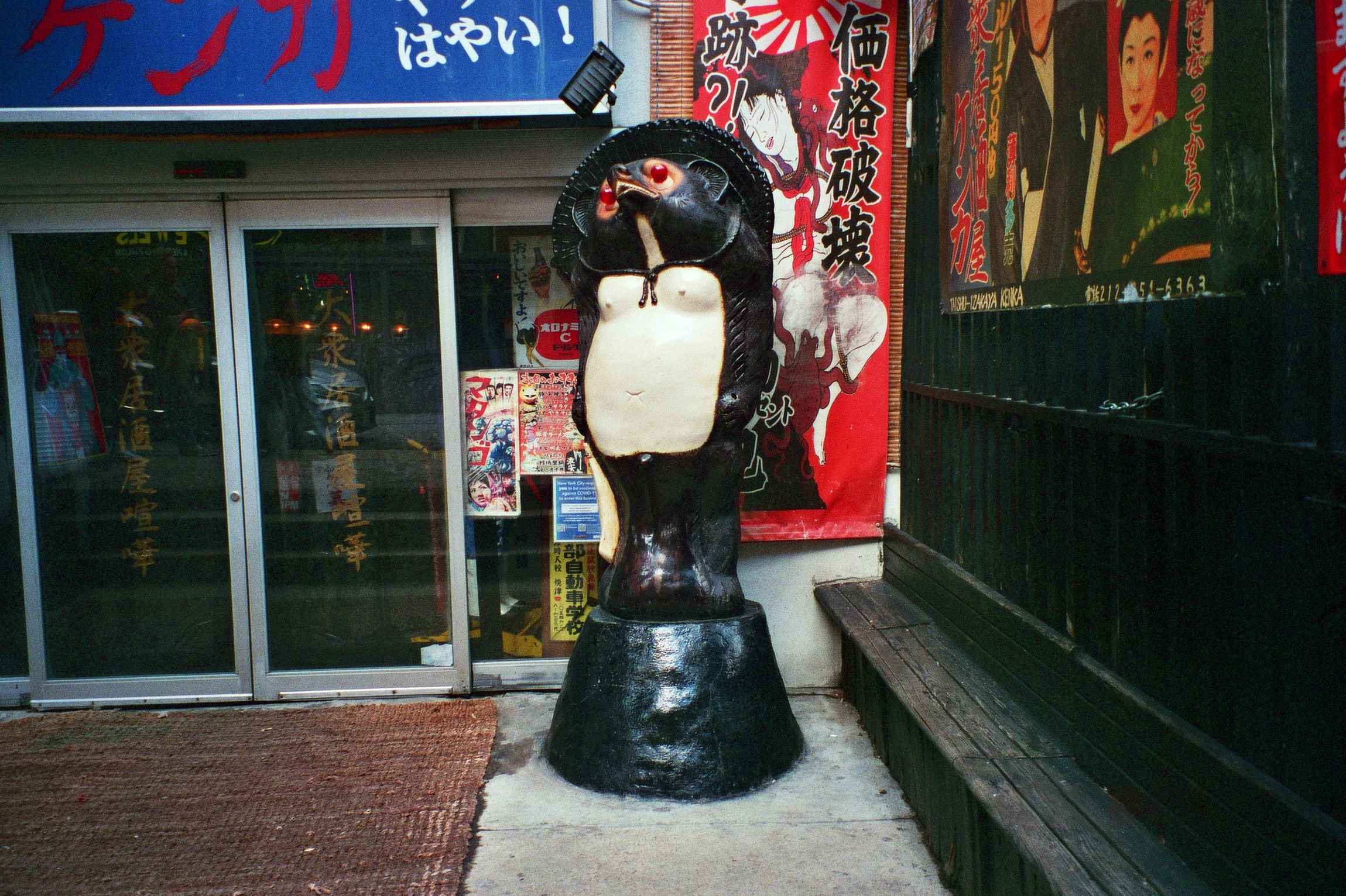
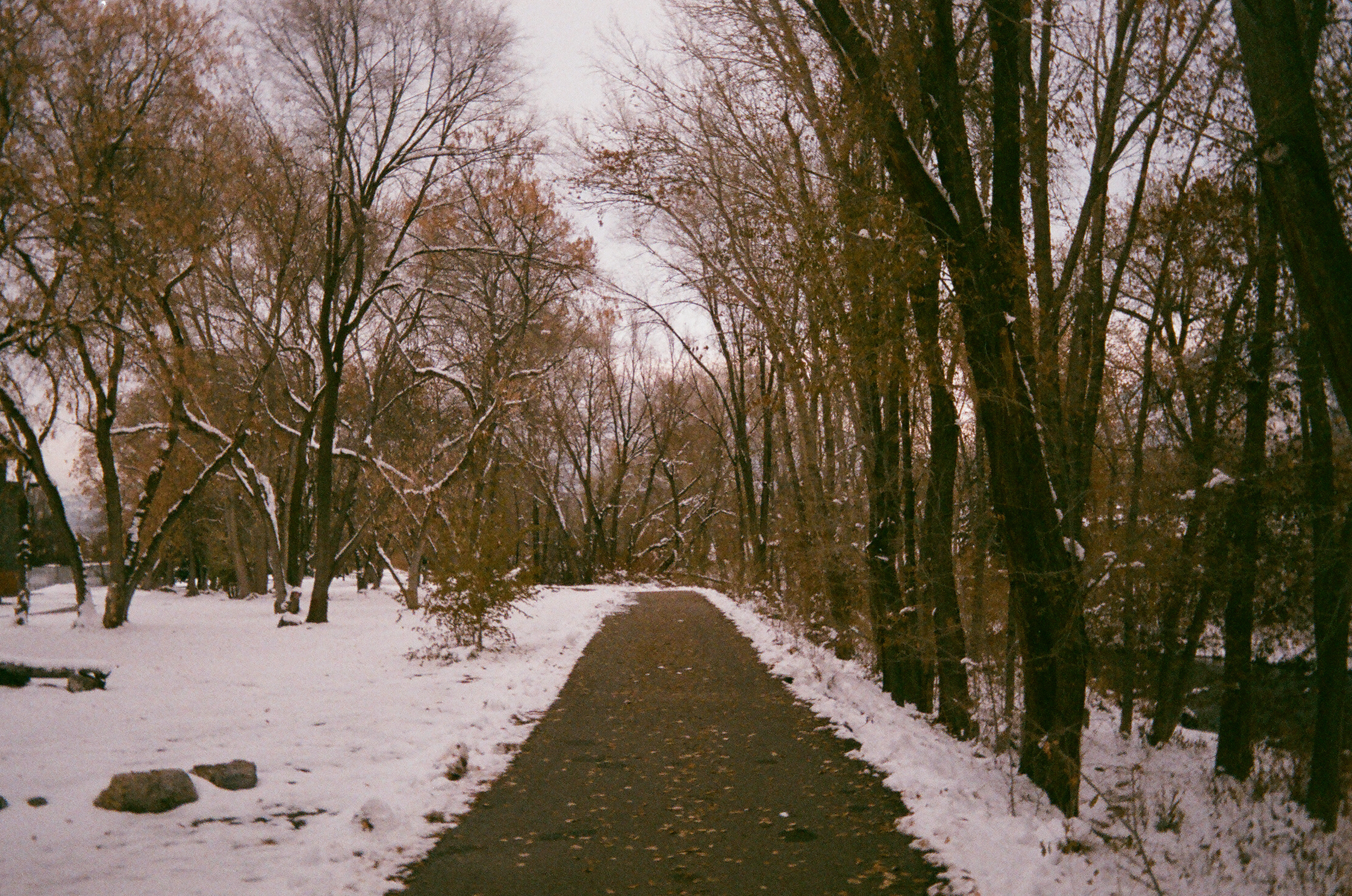
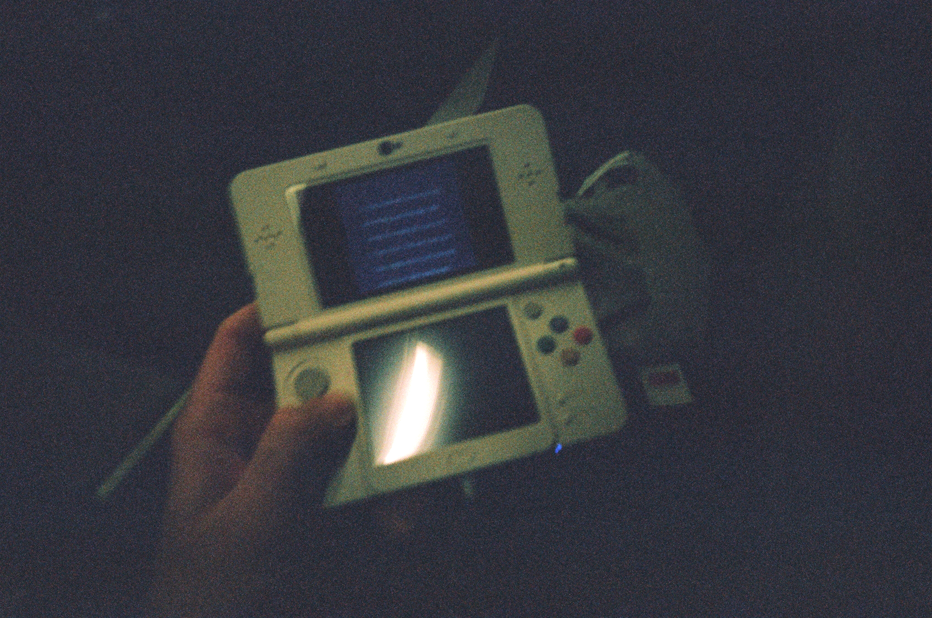
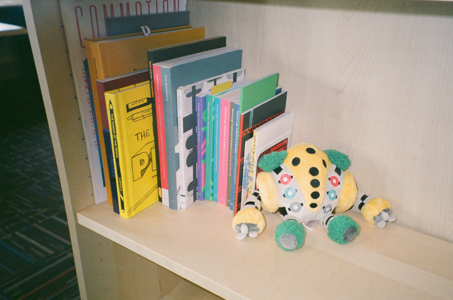
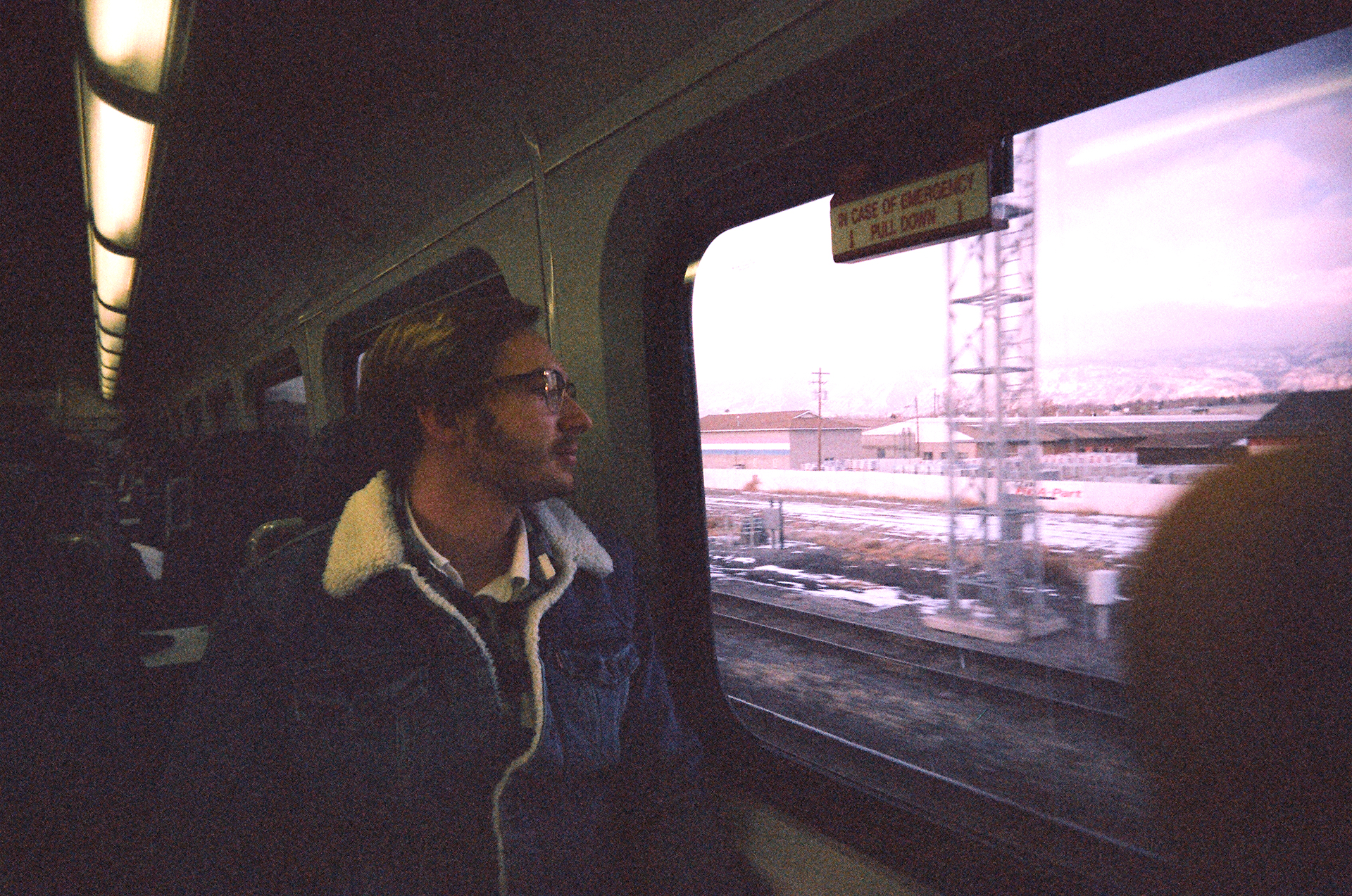
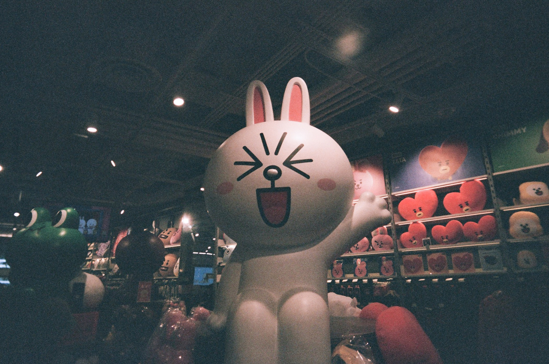
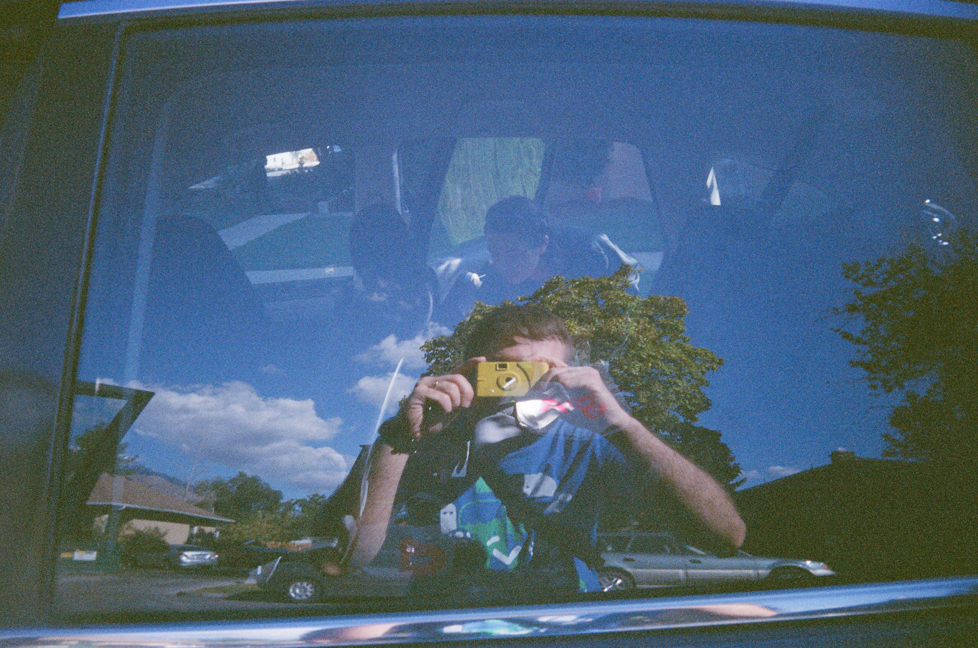
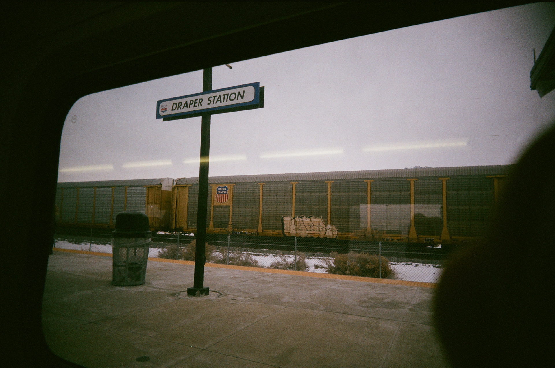
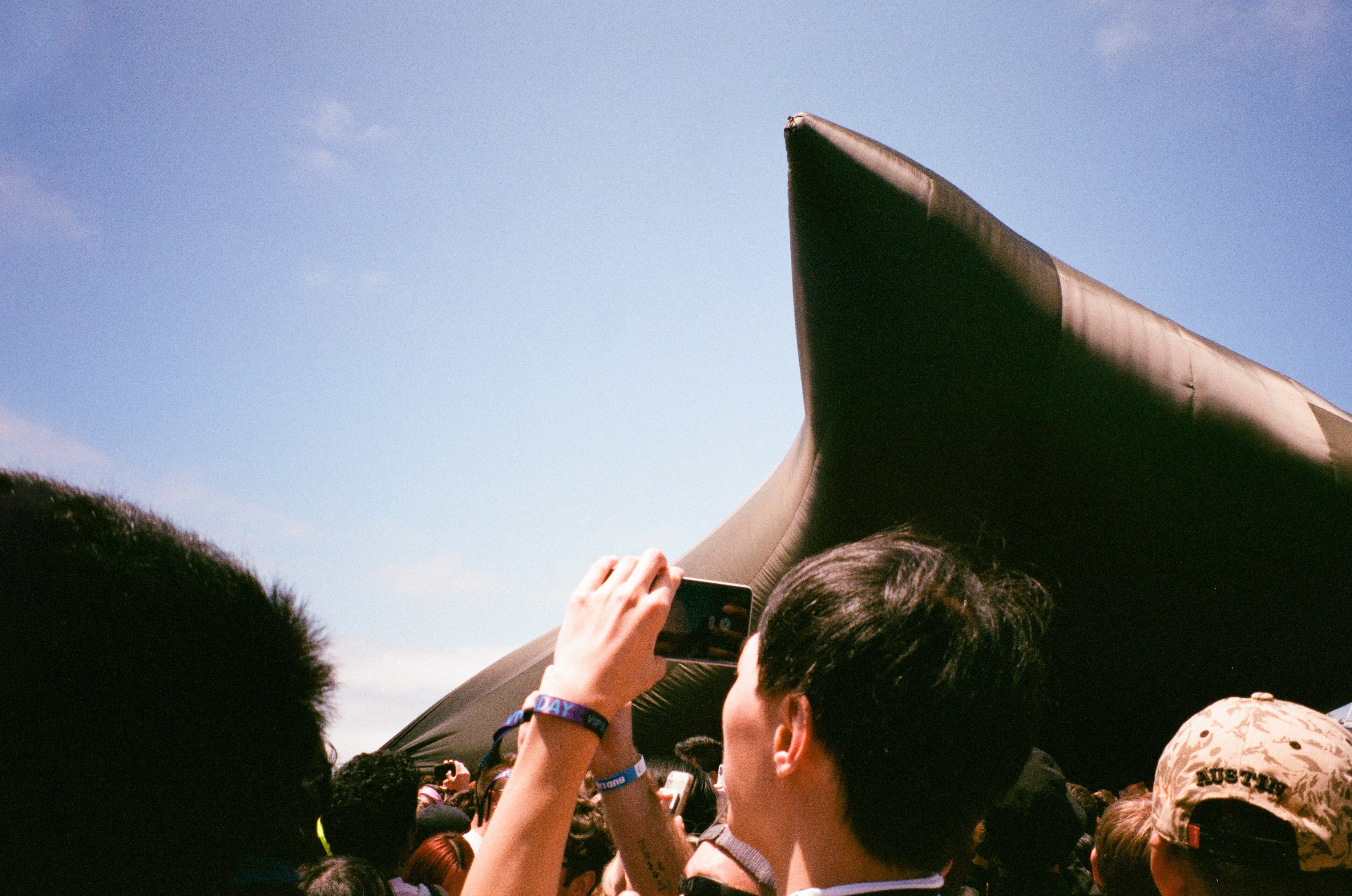
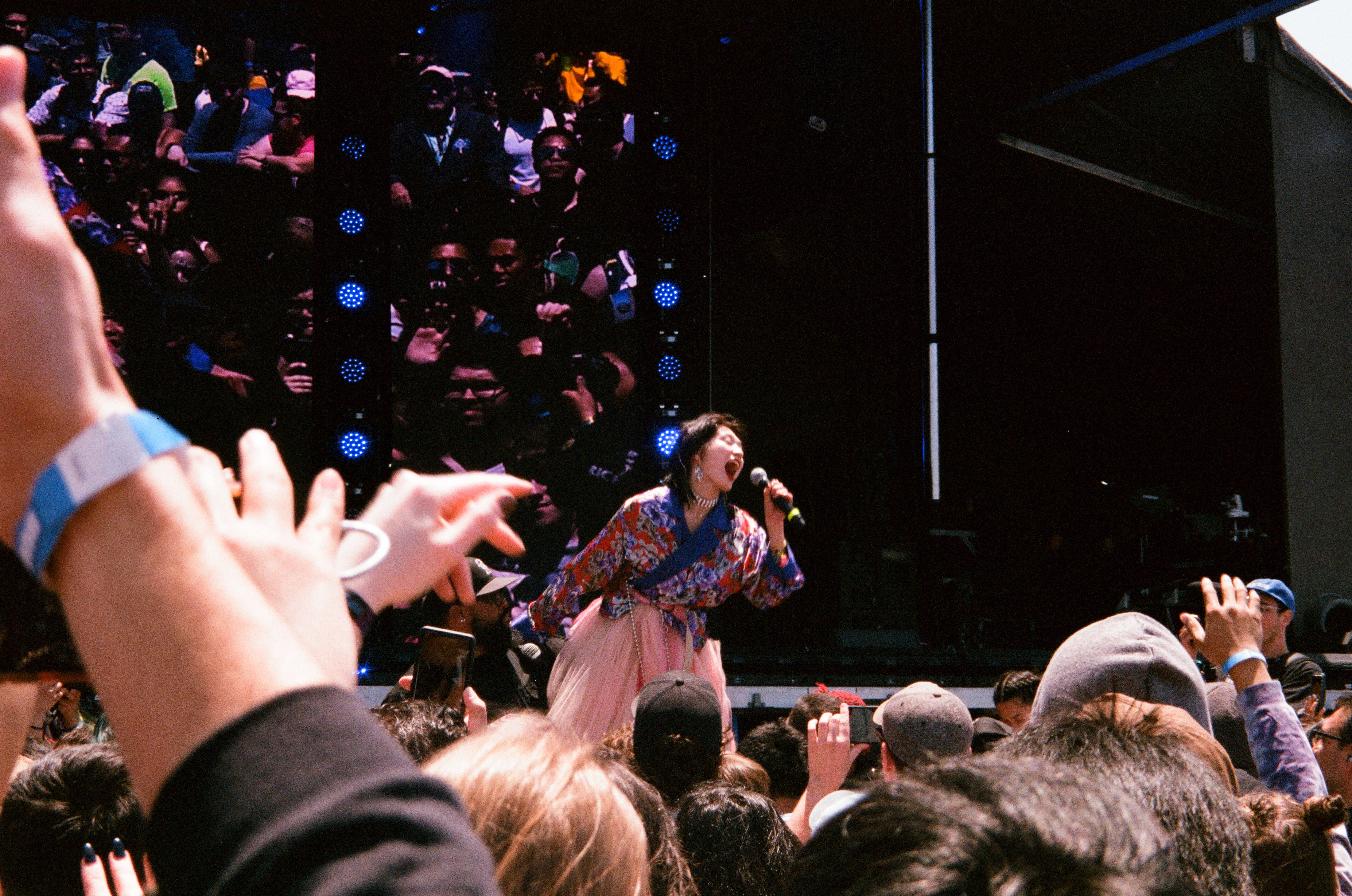
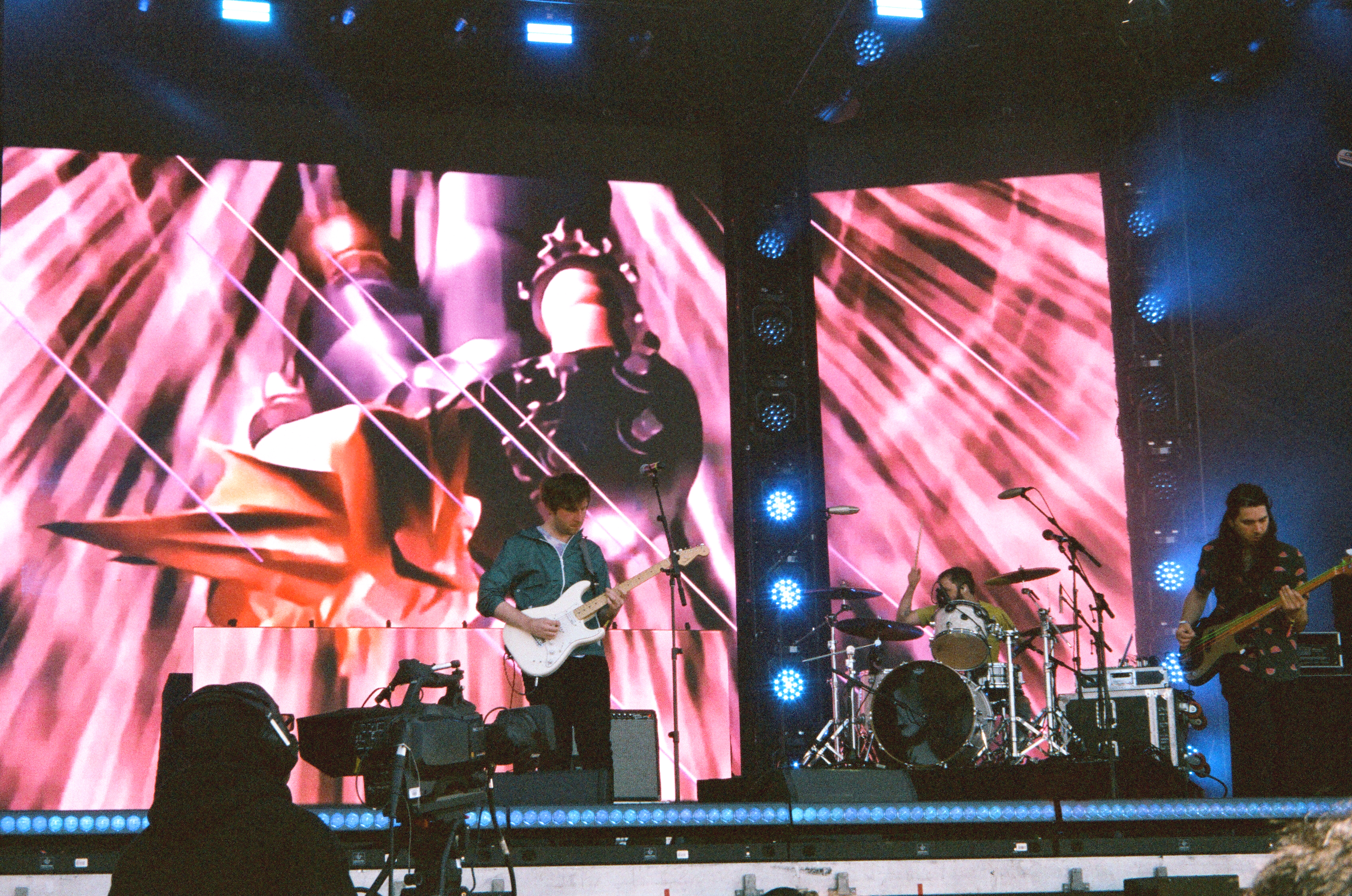
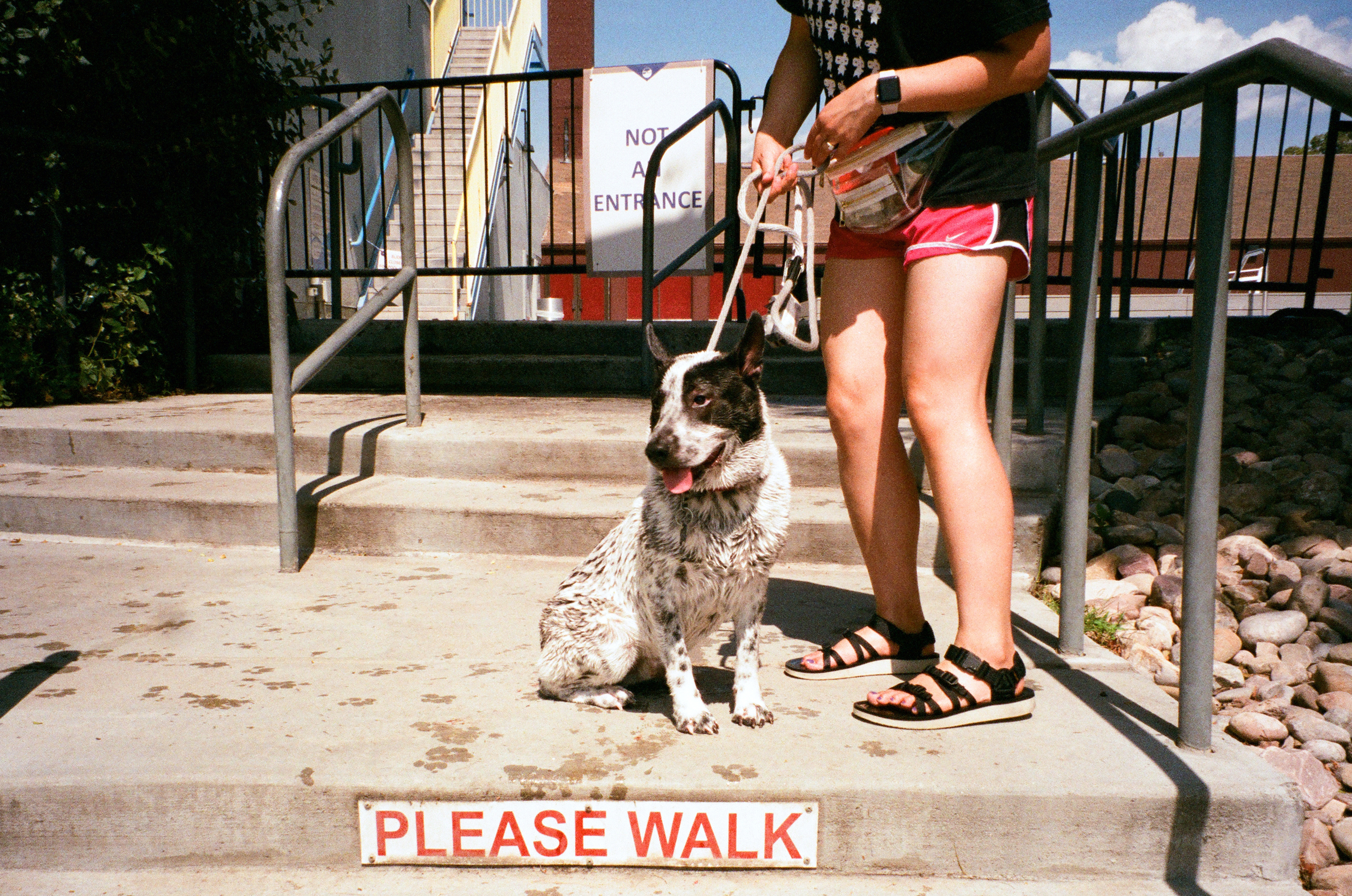
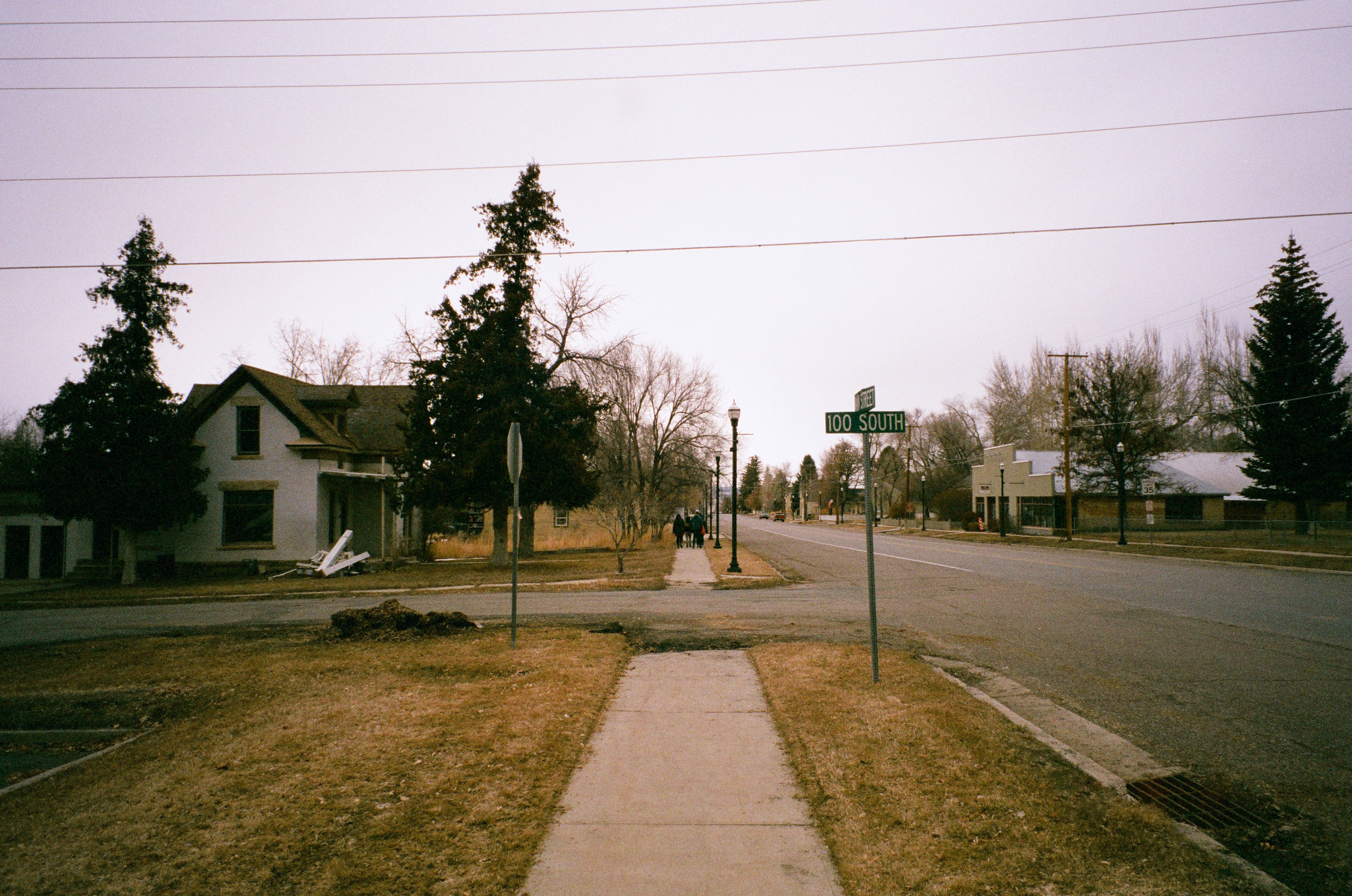
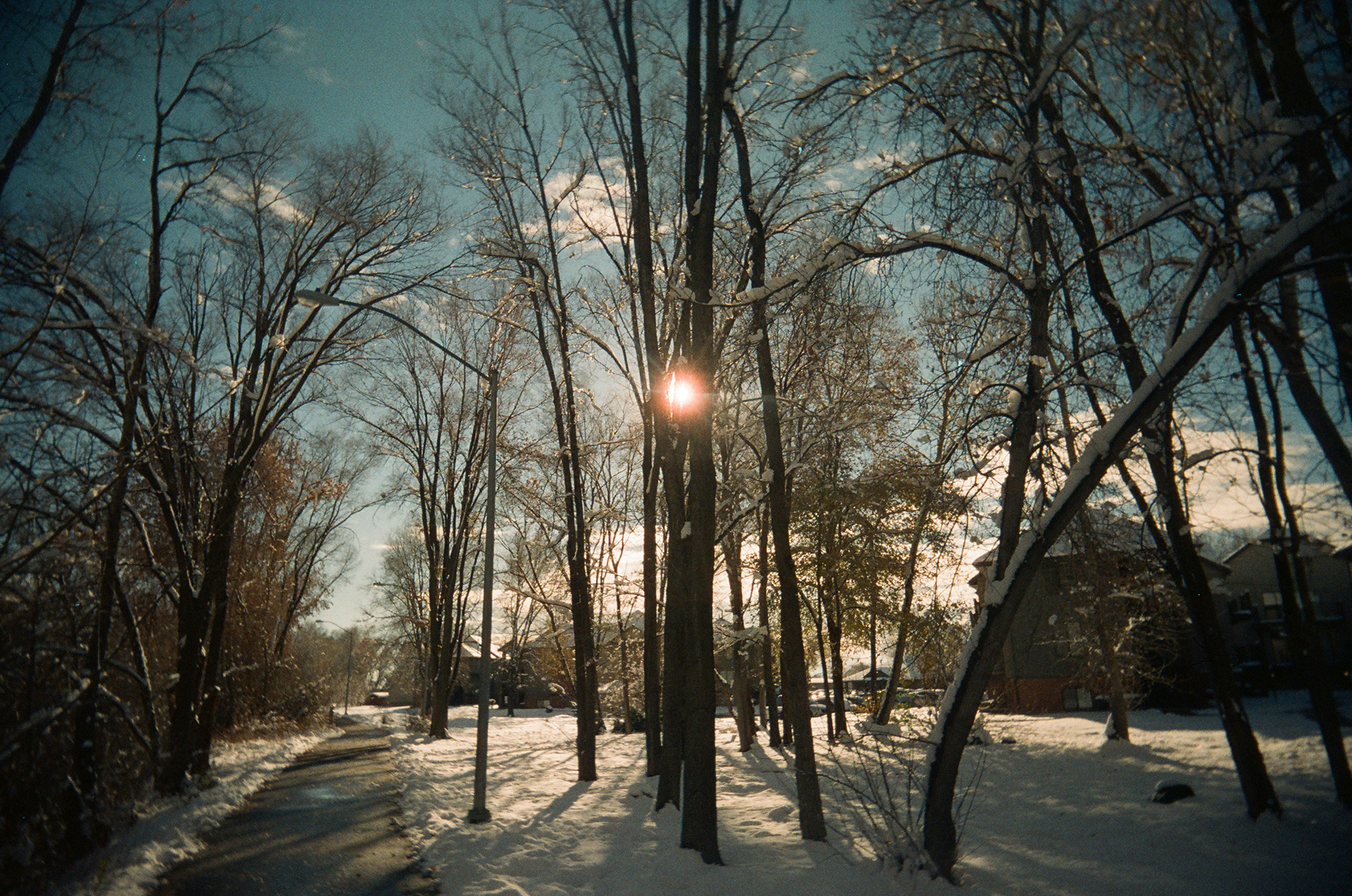
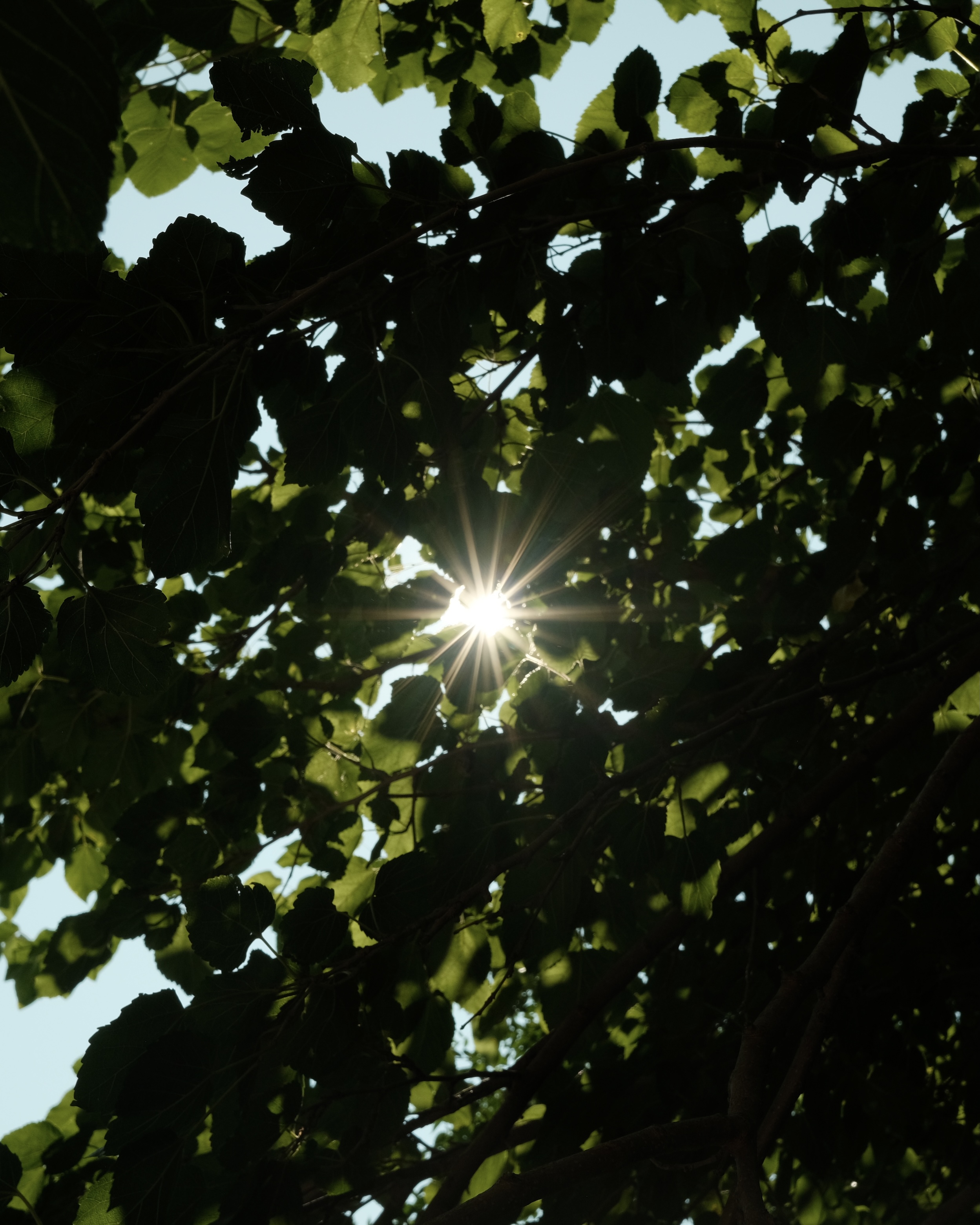
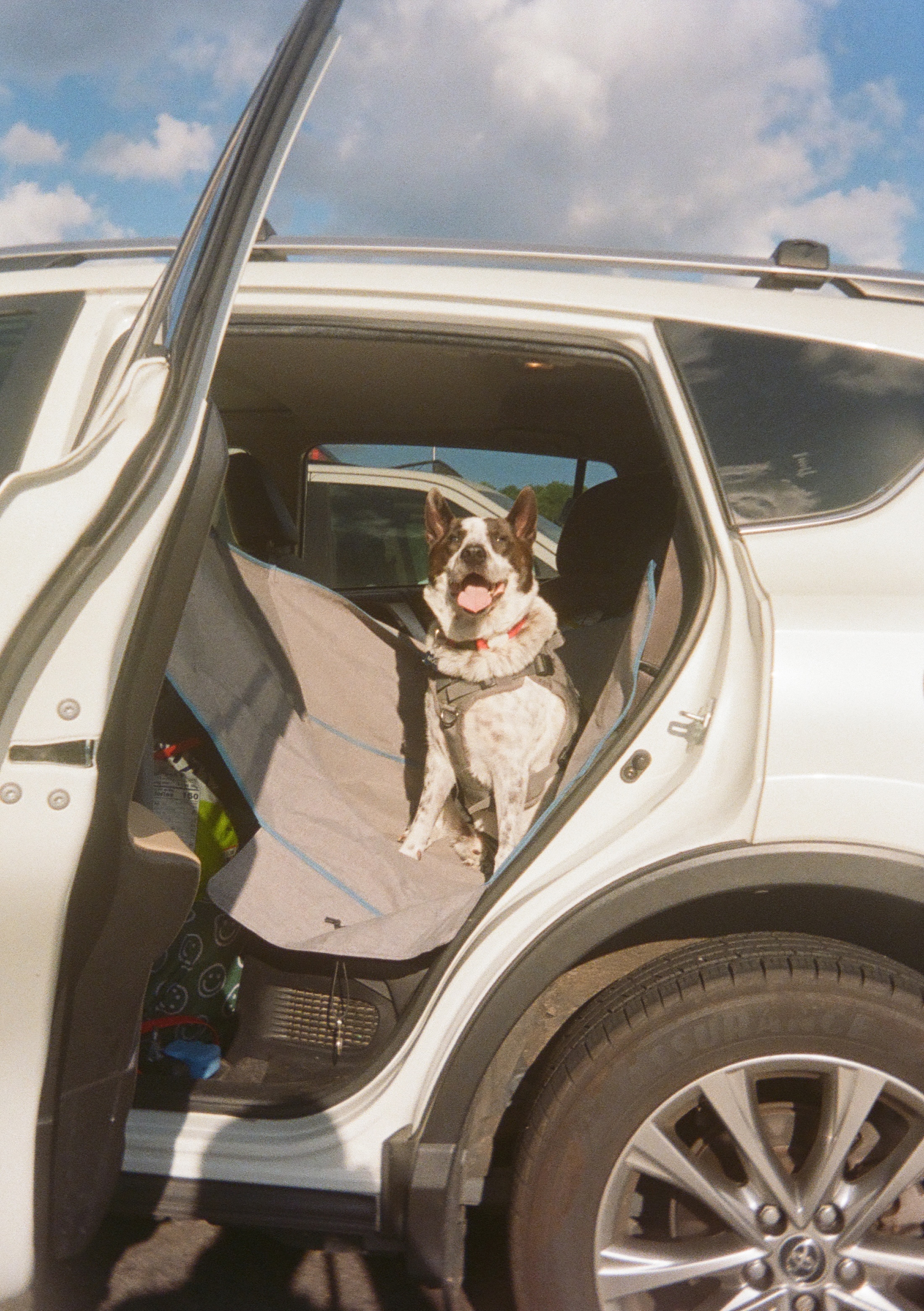
35mm Film Photography
Client: Self-initiated
2016 → Ongoing
Client: Self-initiated
2016 → Ongoing
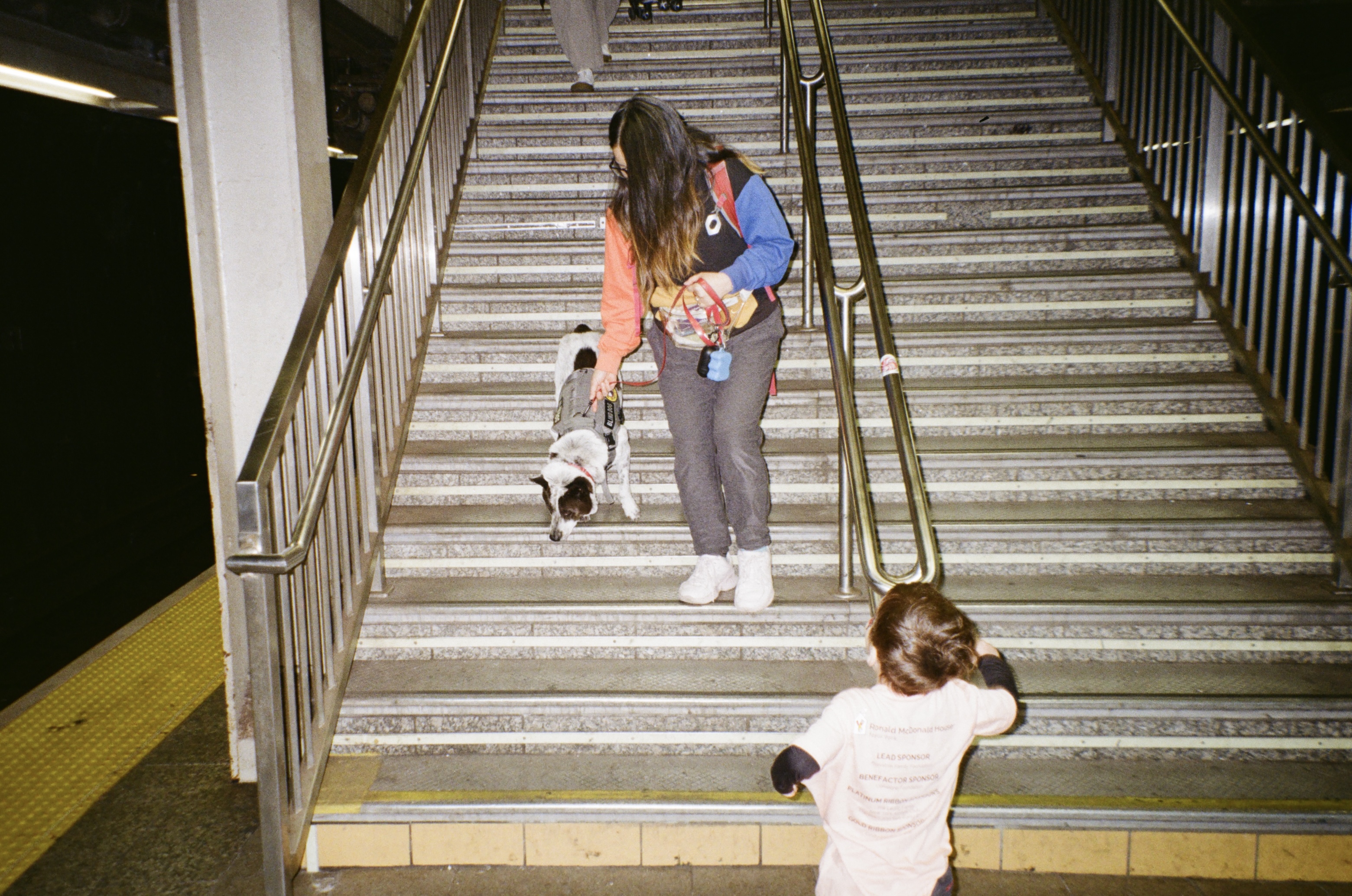
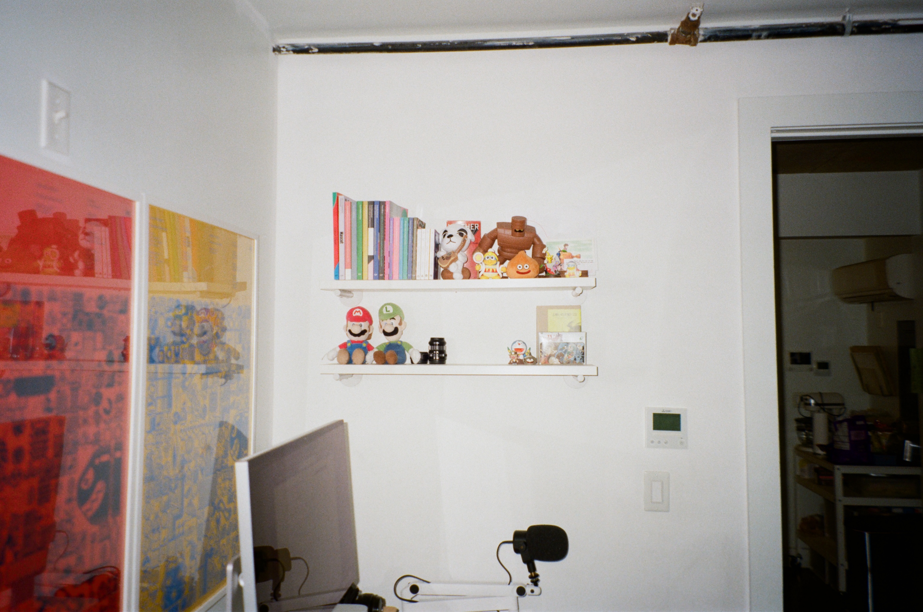
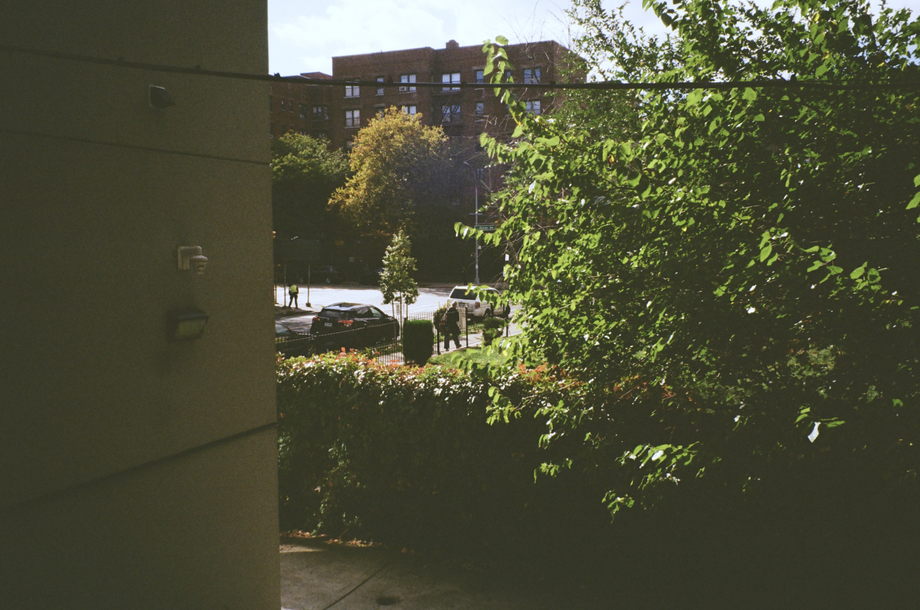
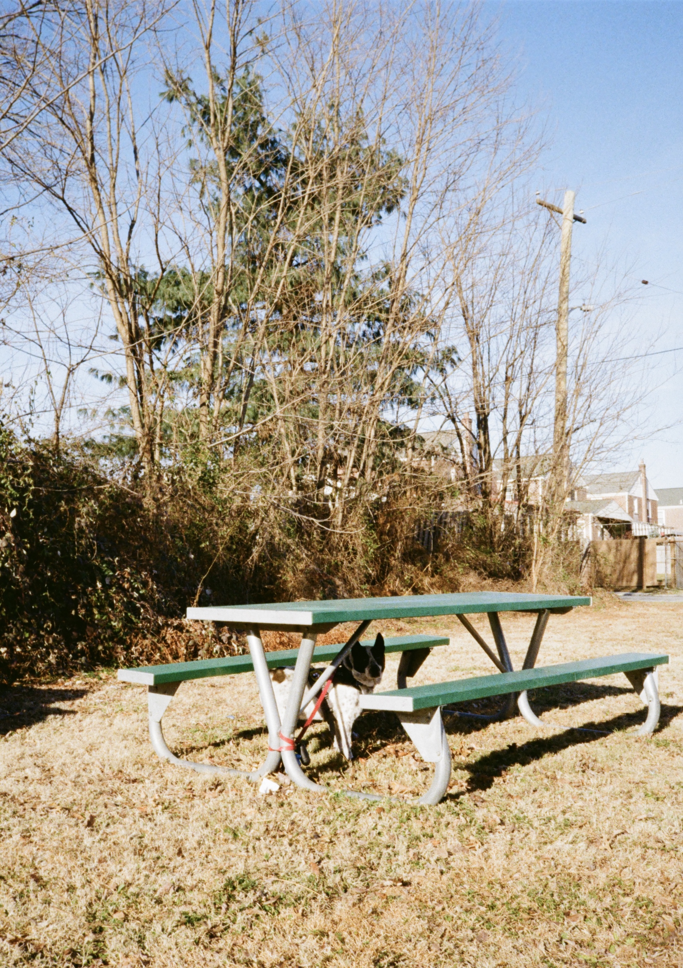
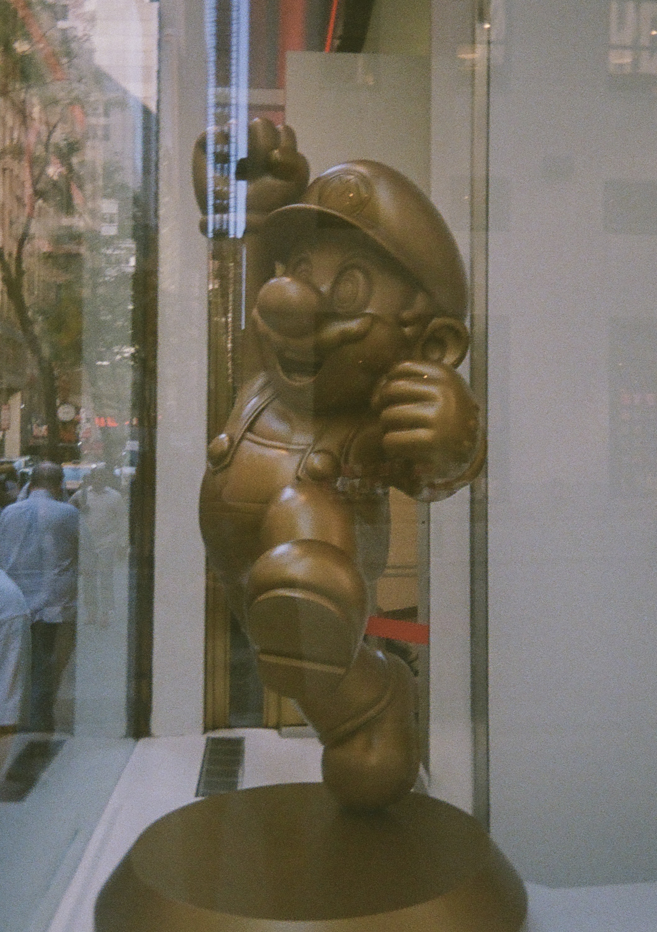
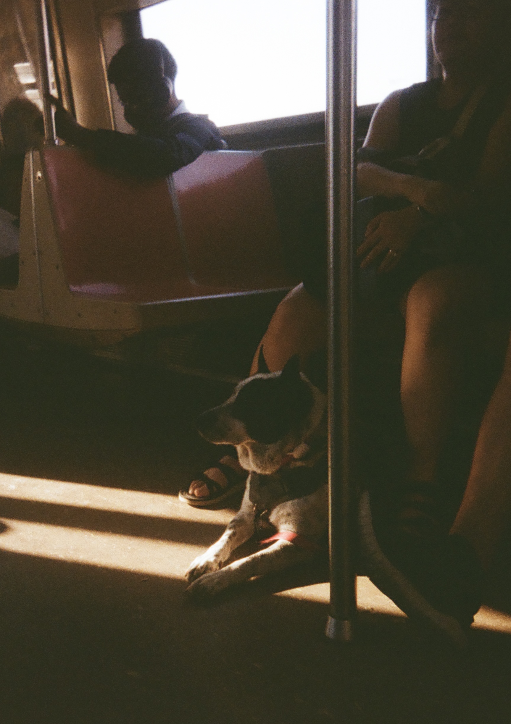
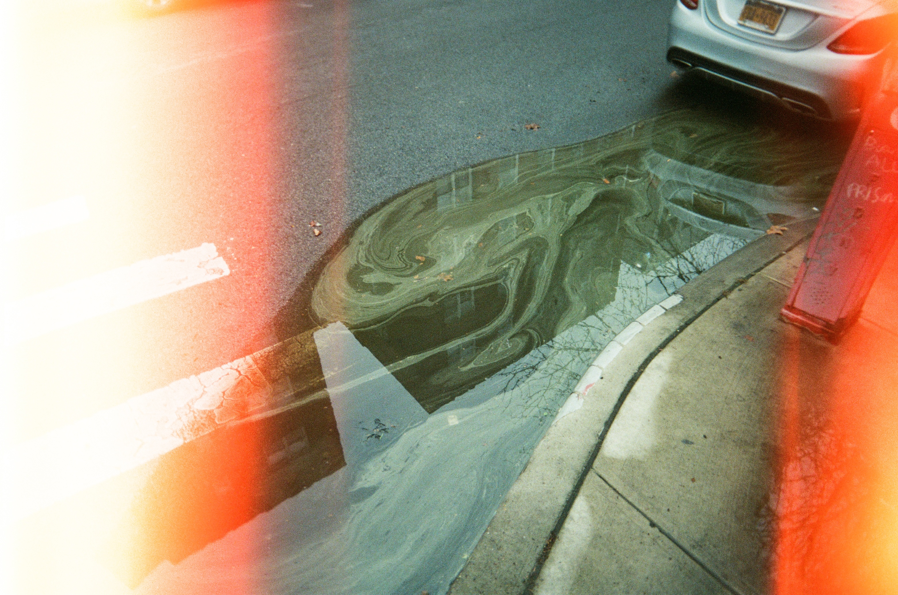
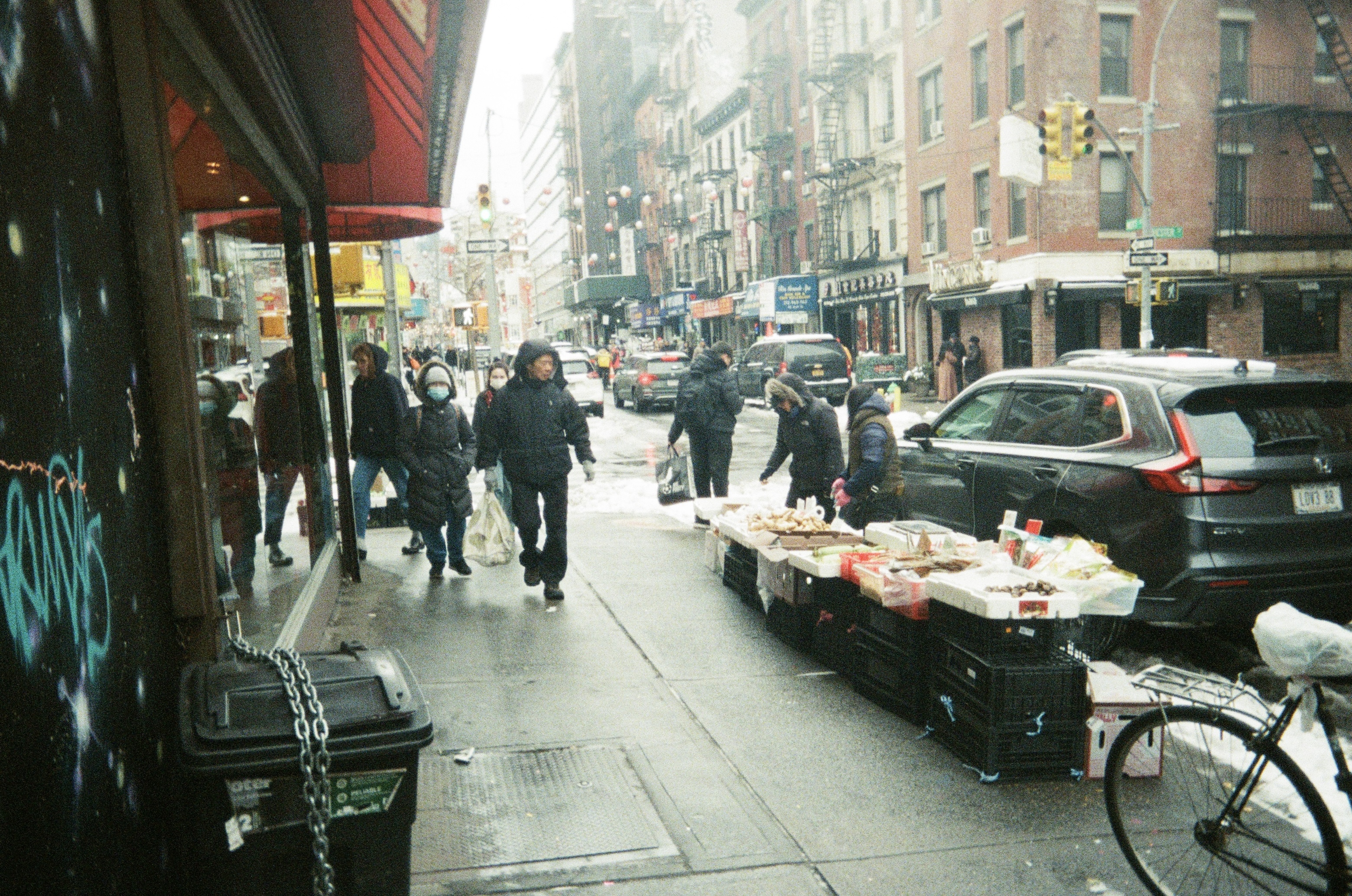
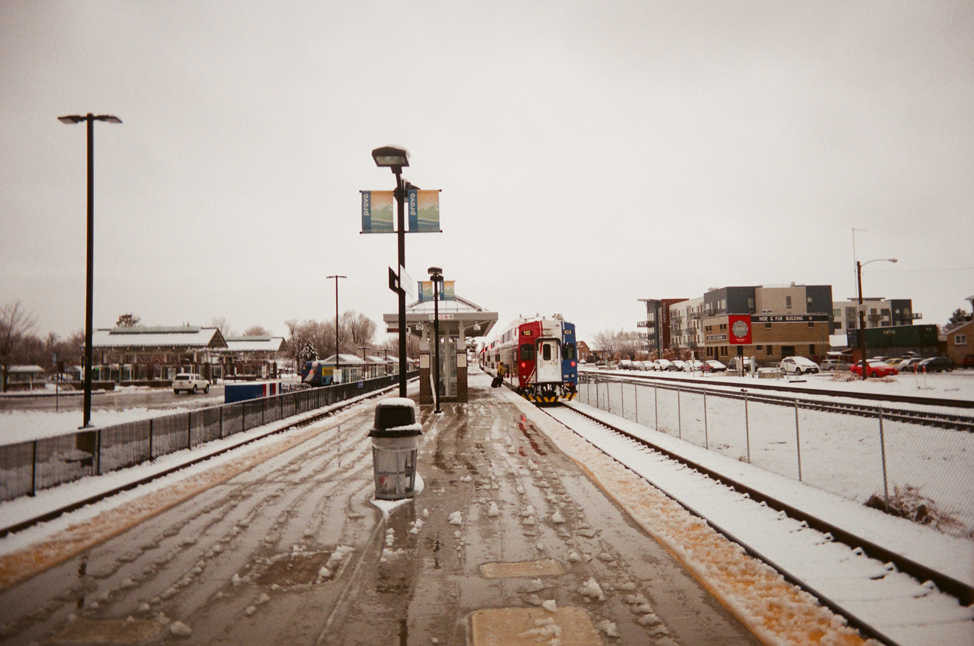
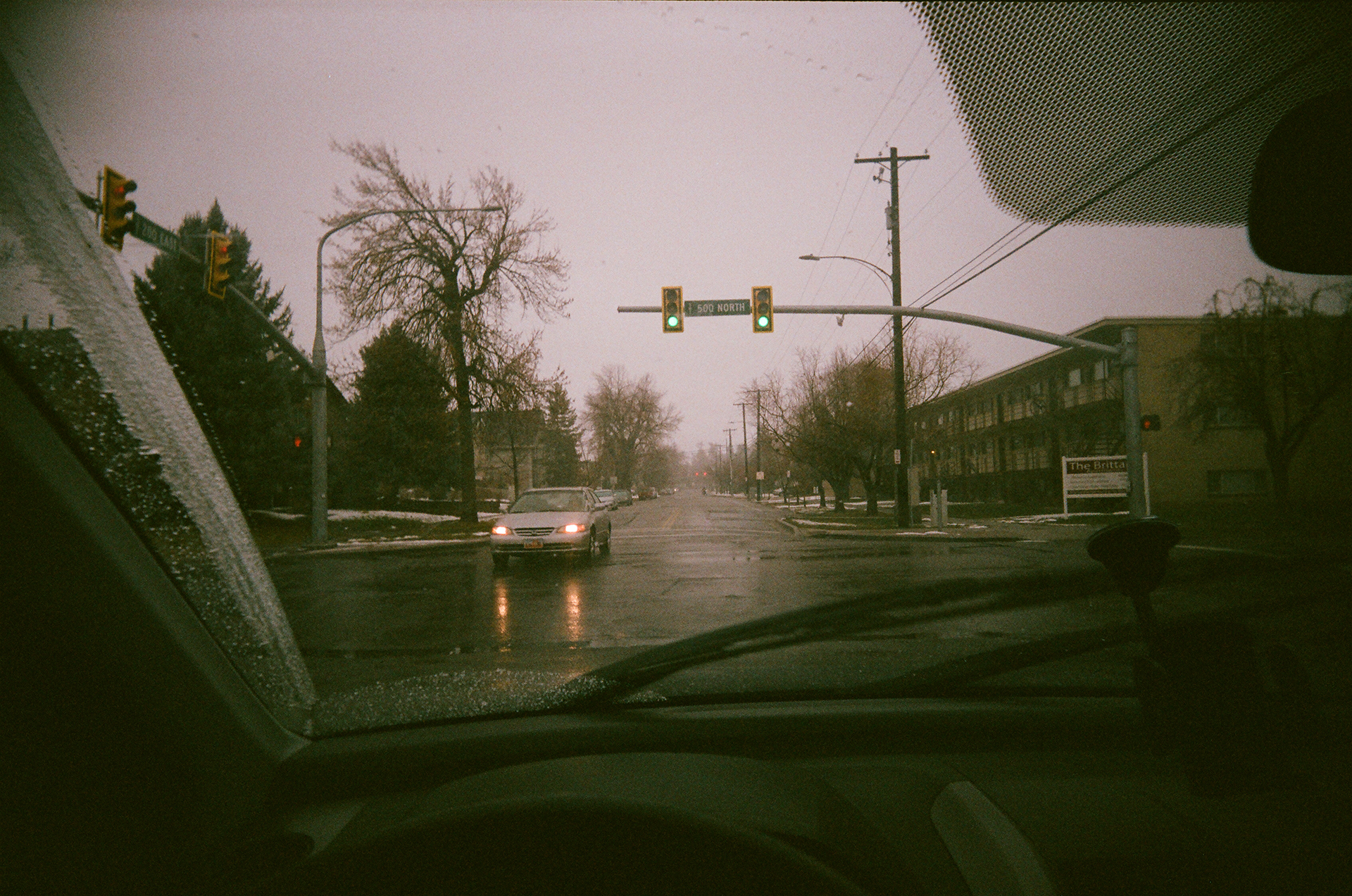
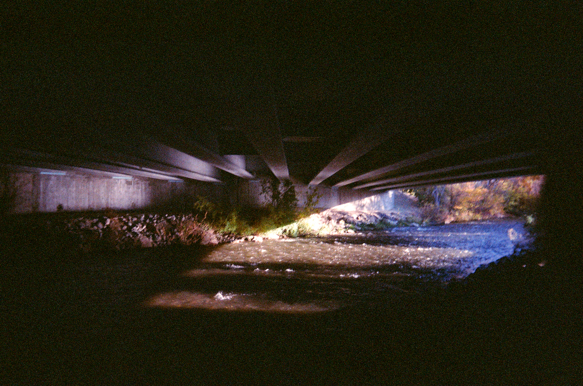
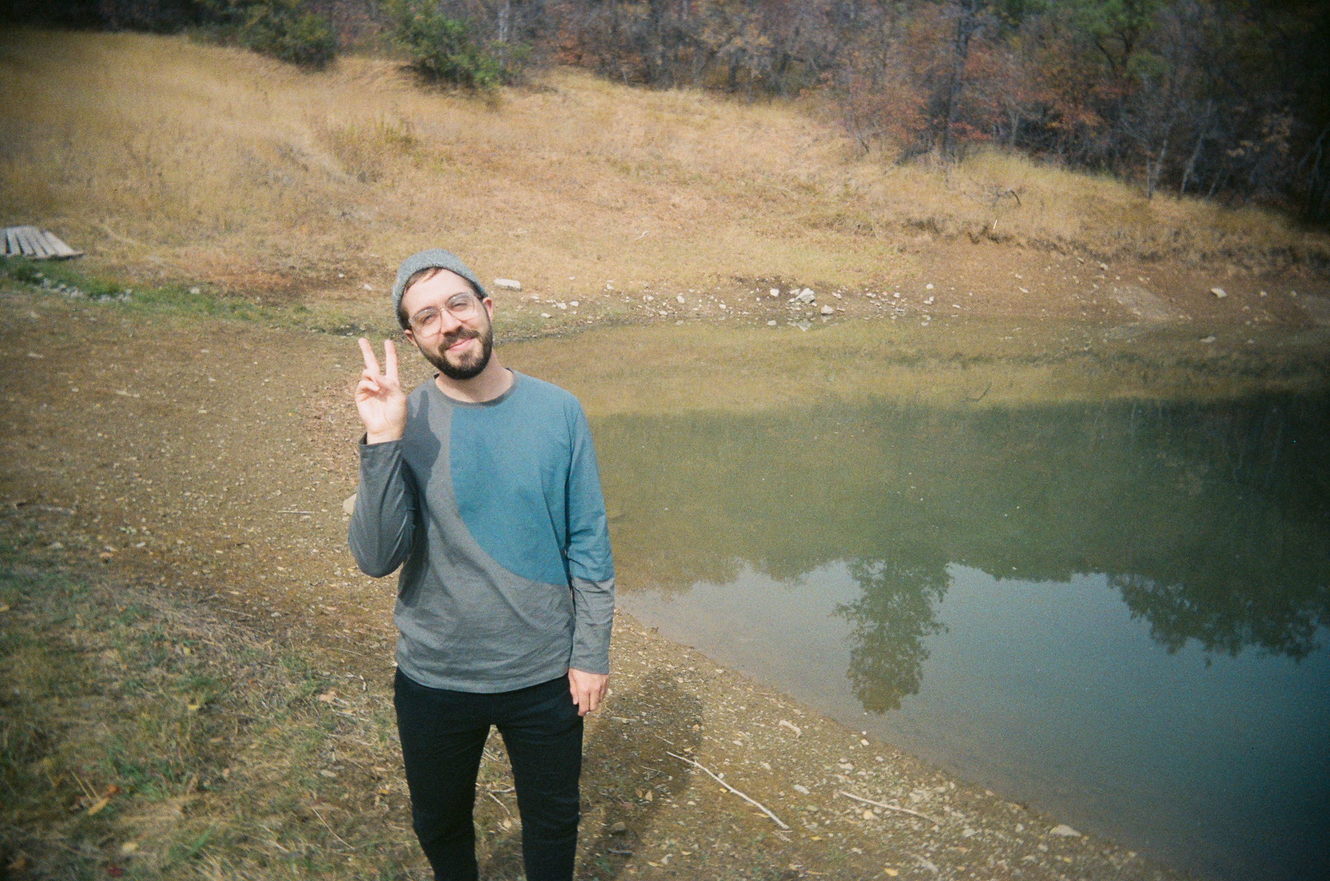
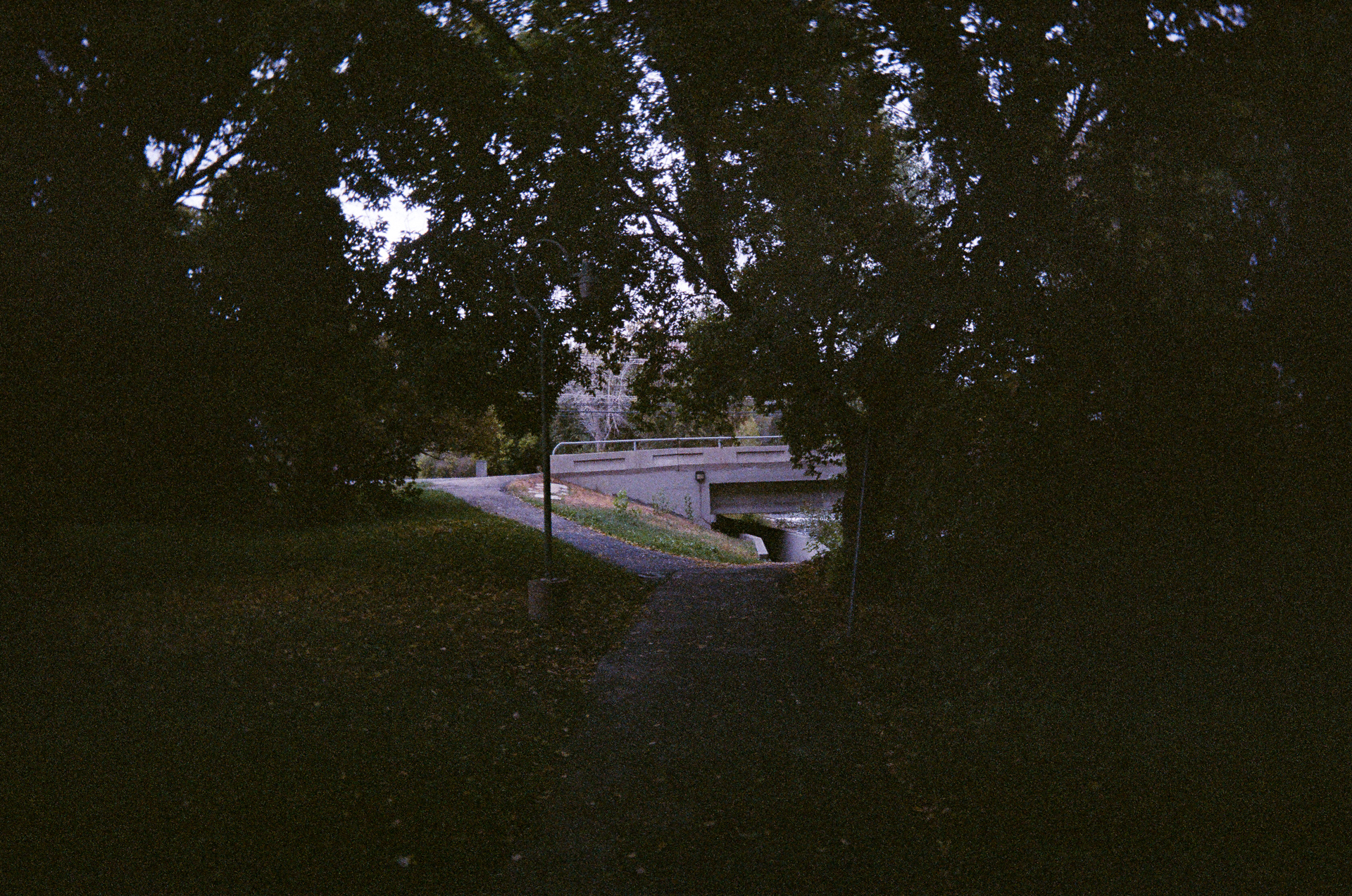
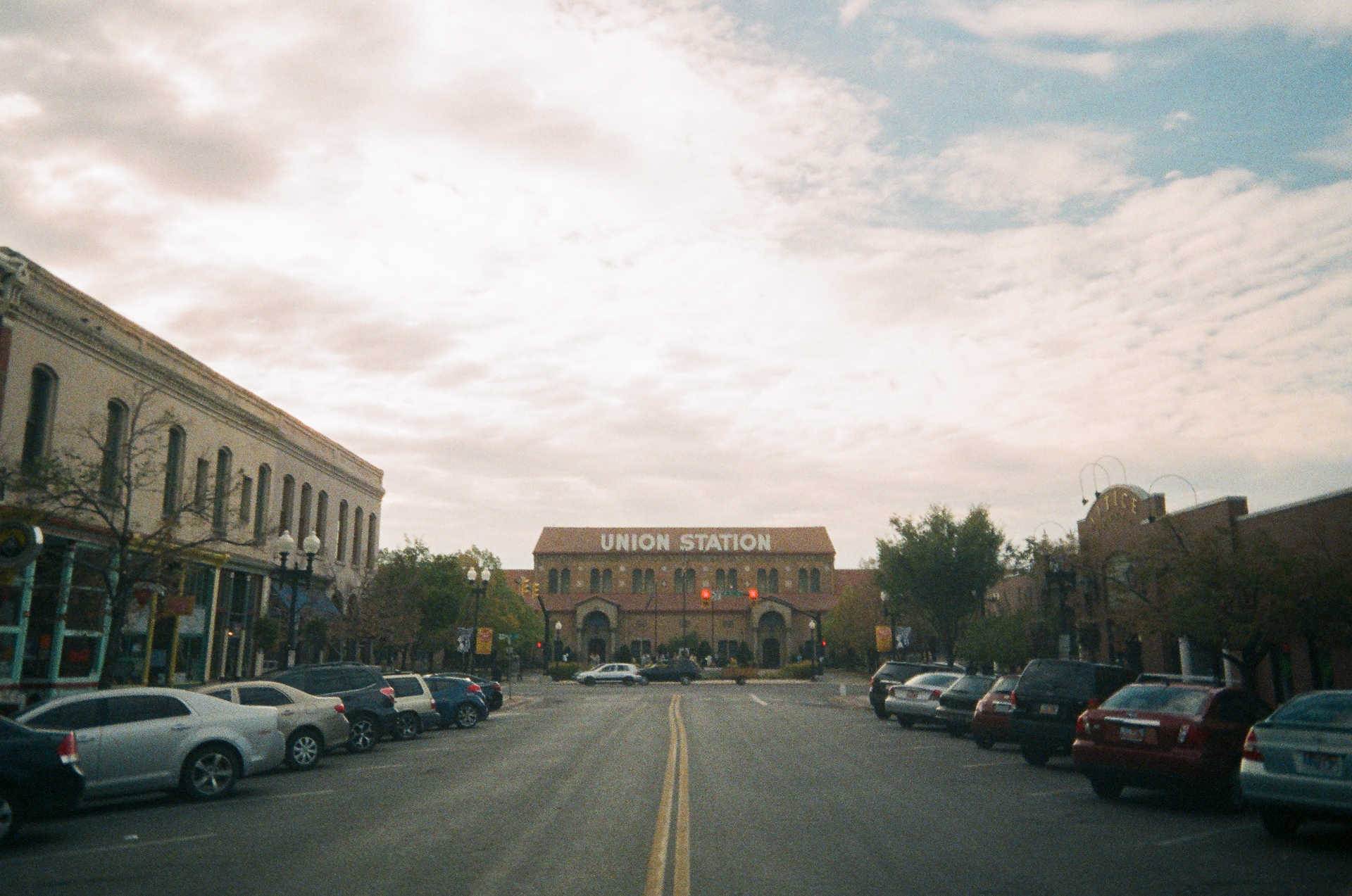
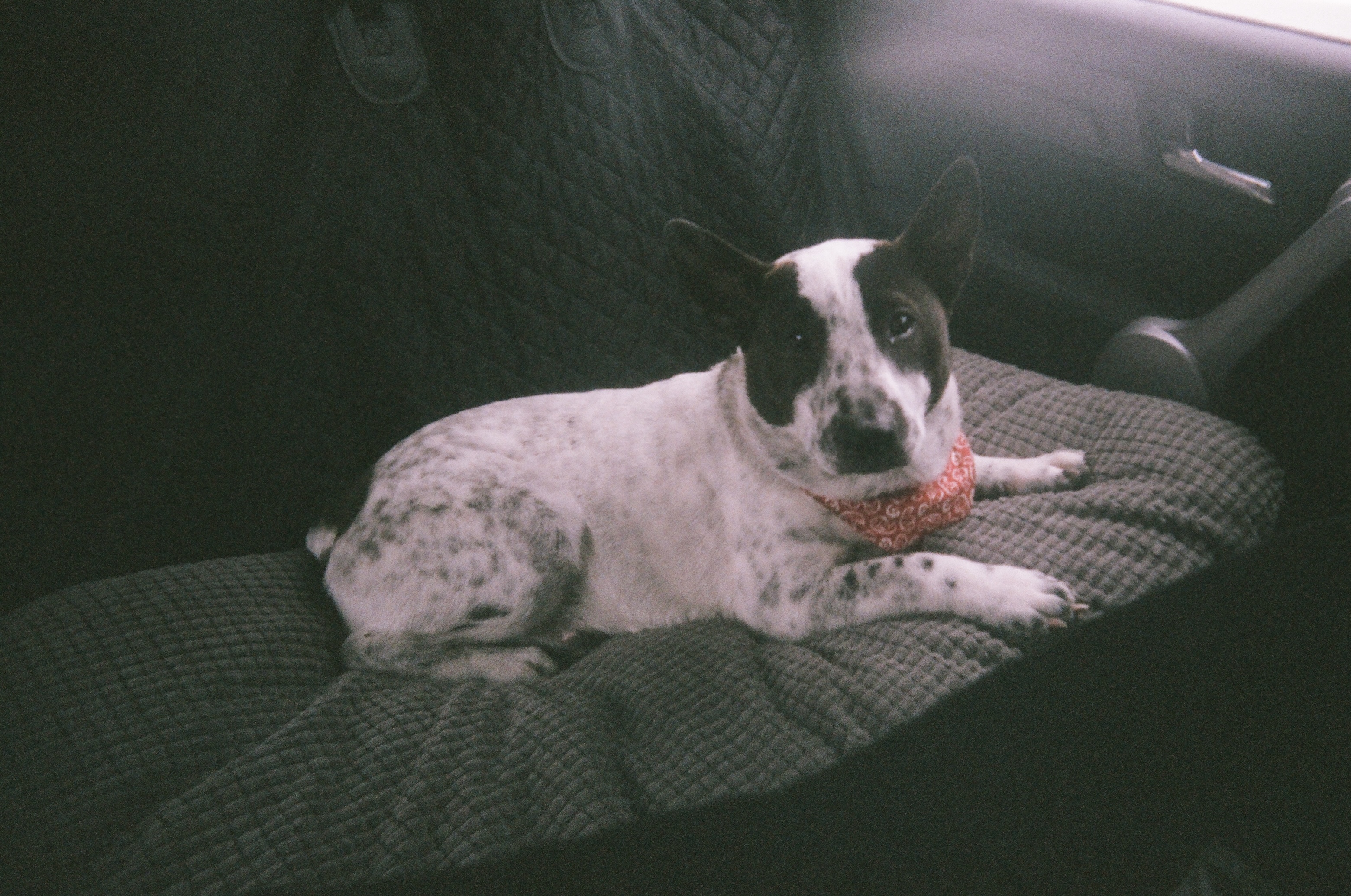
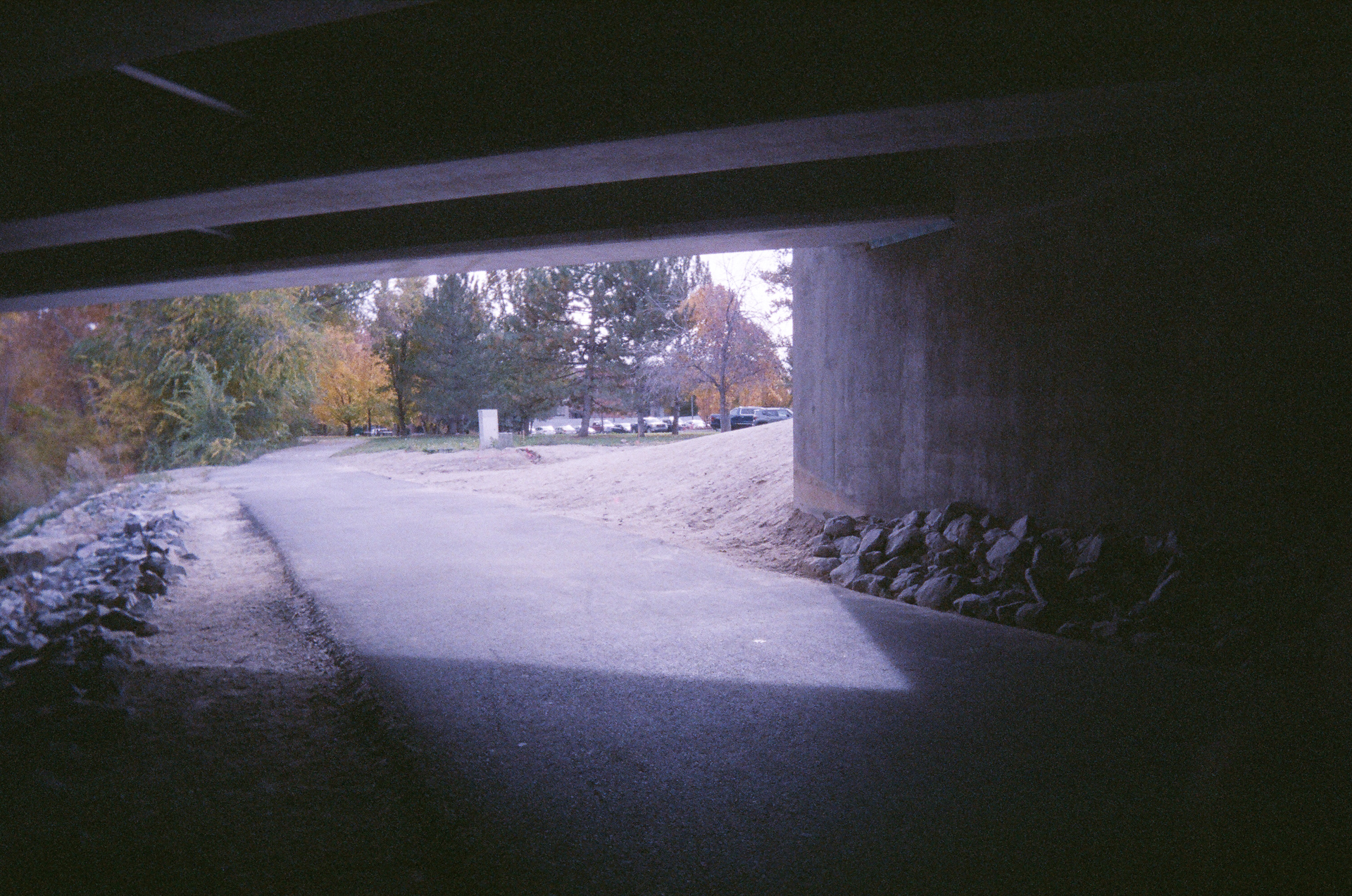
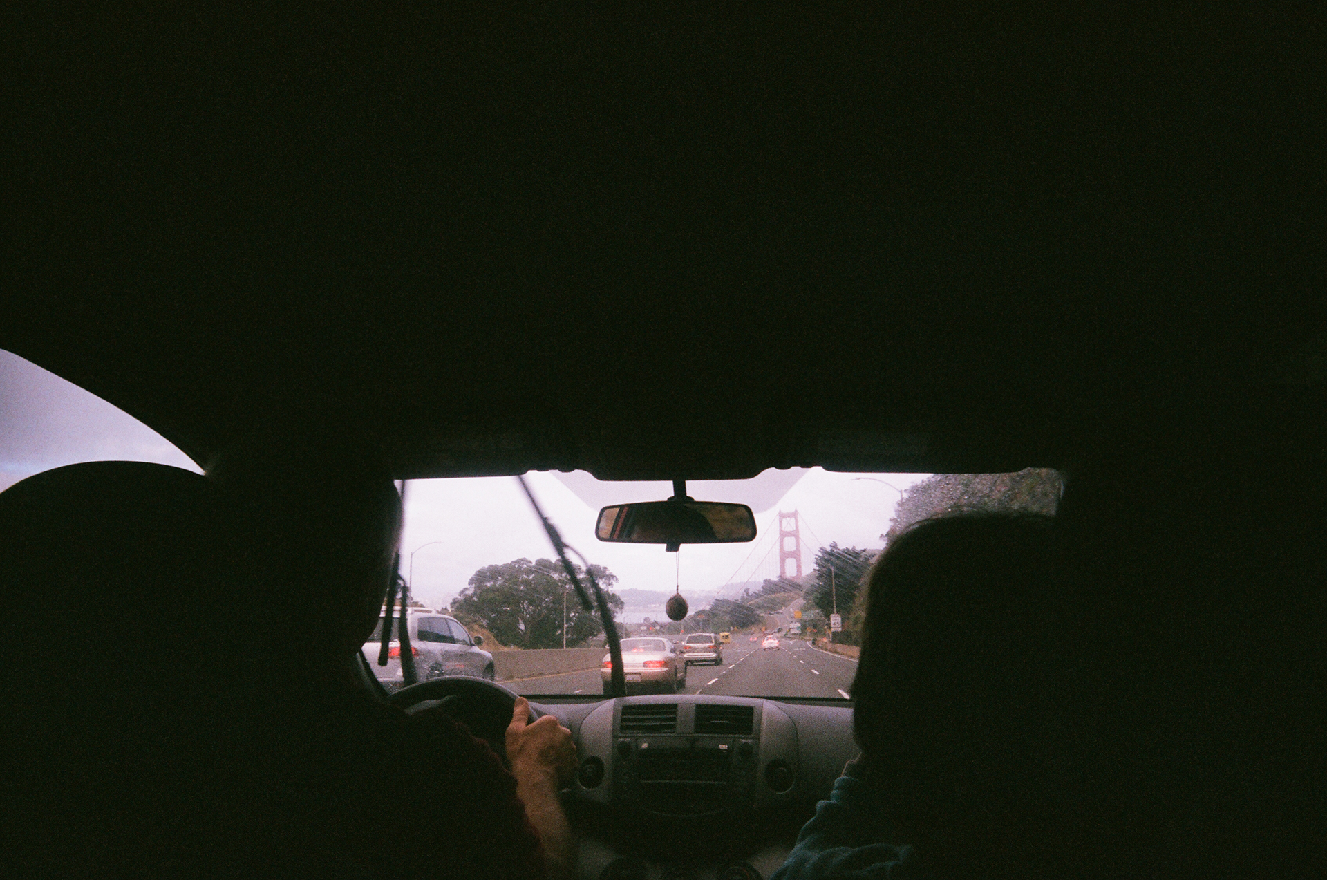
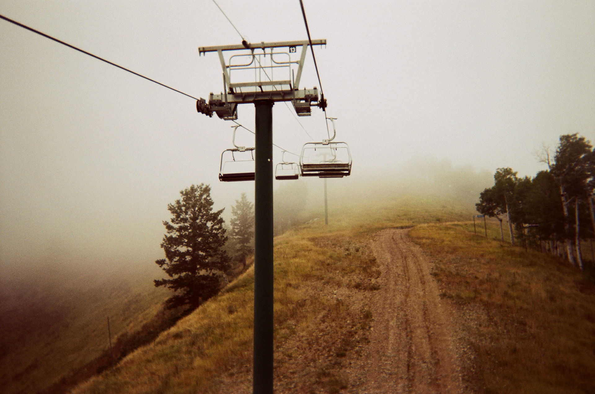
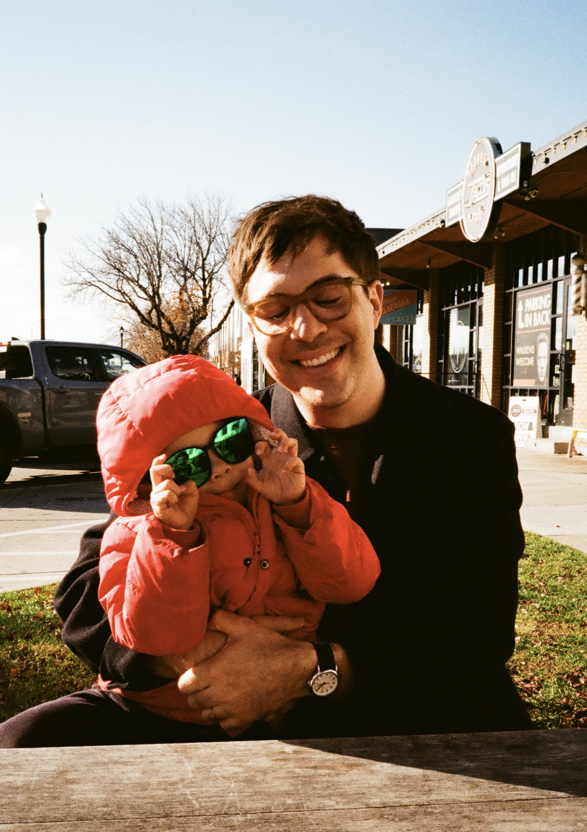
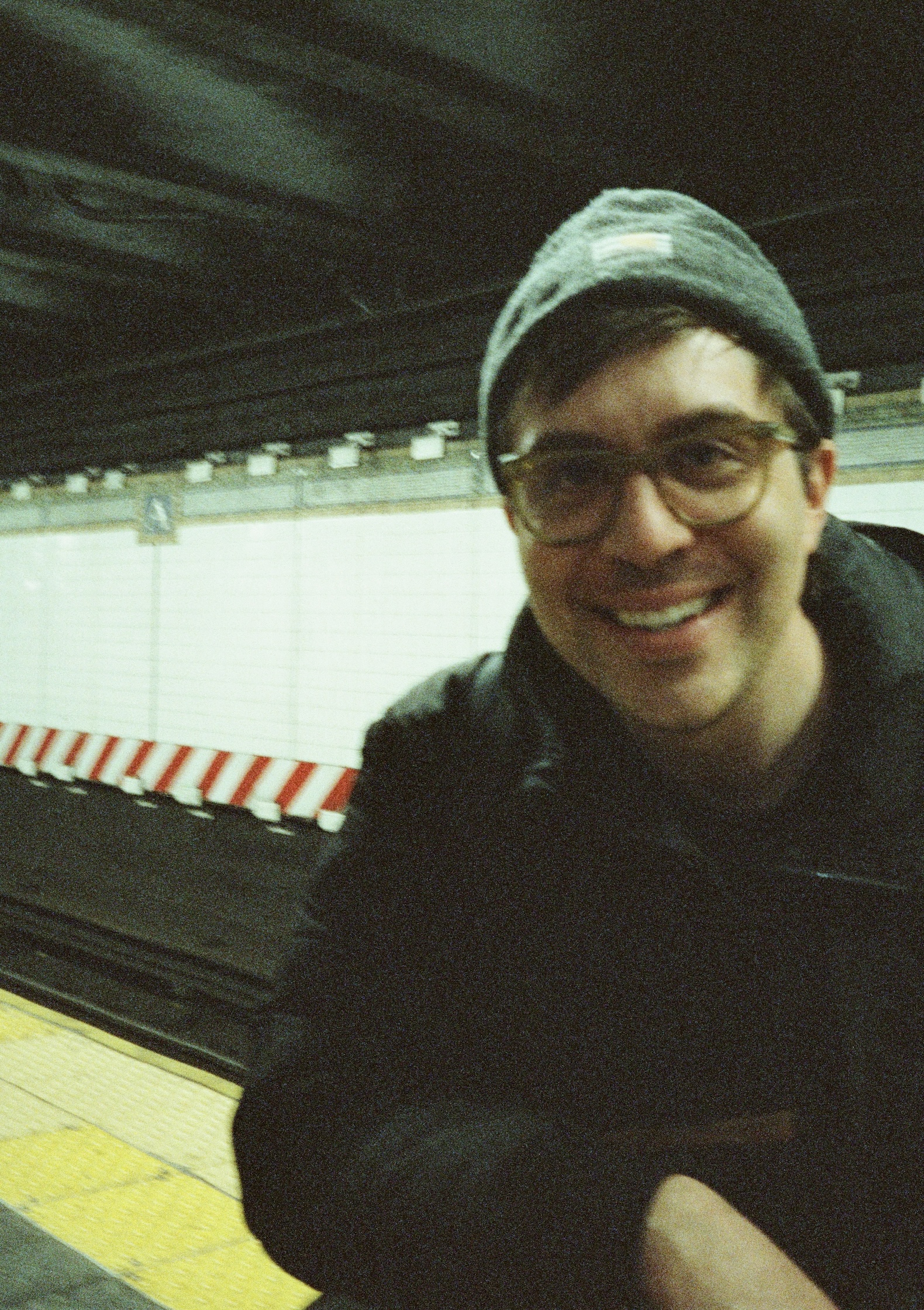
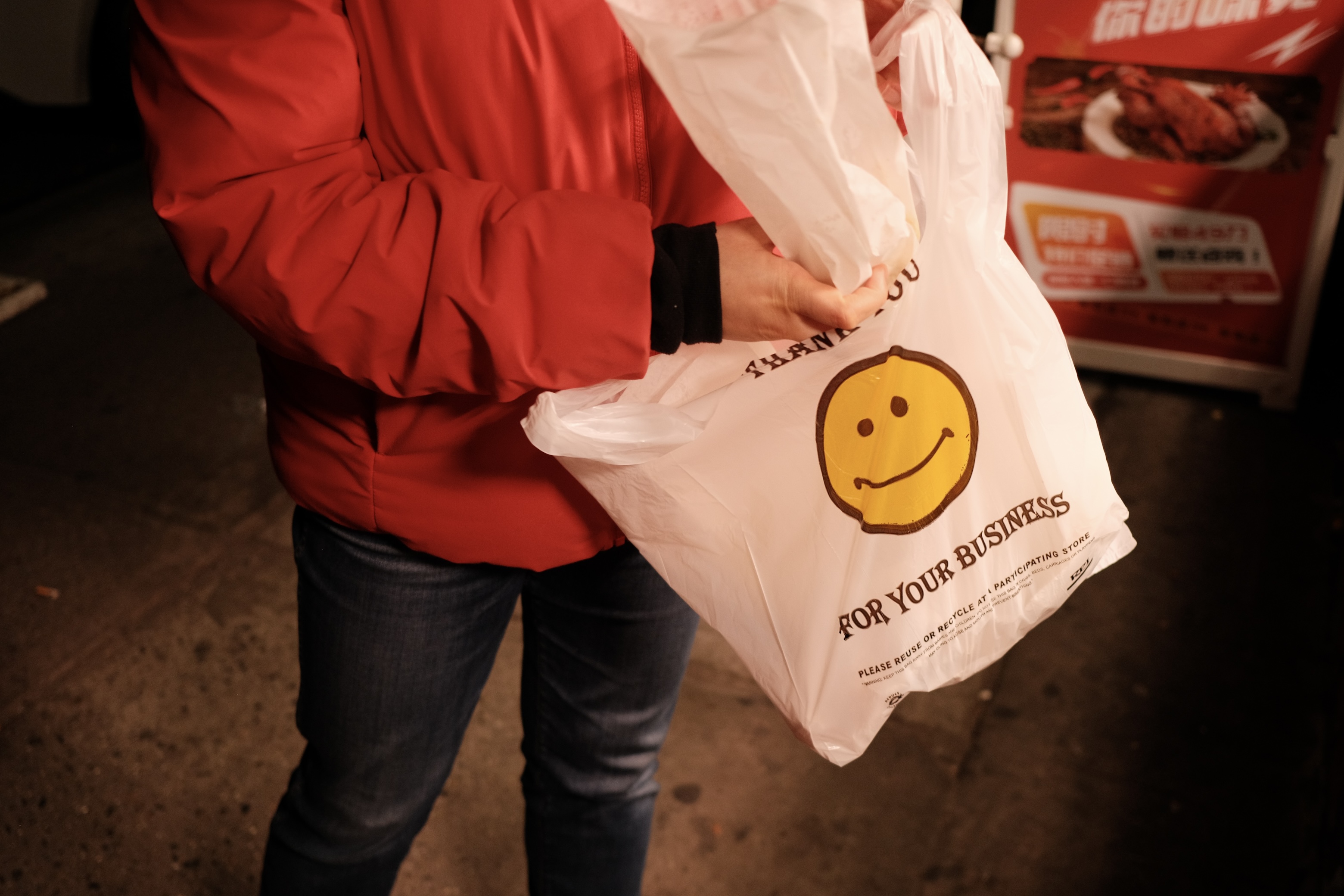
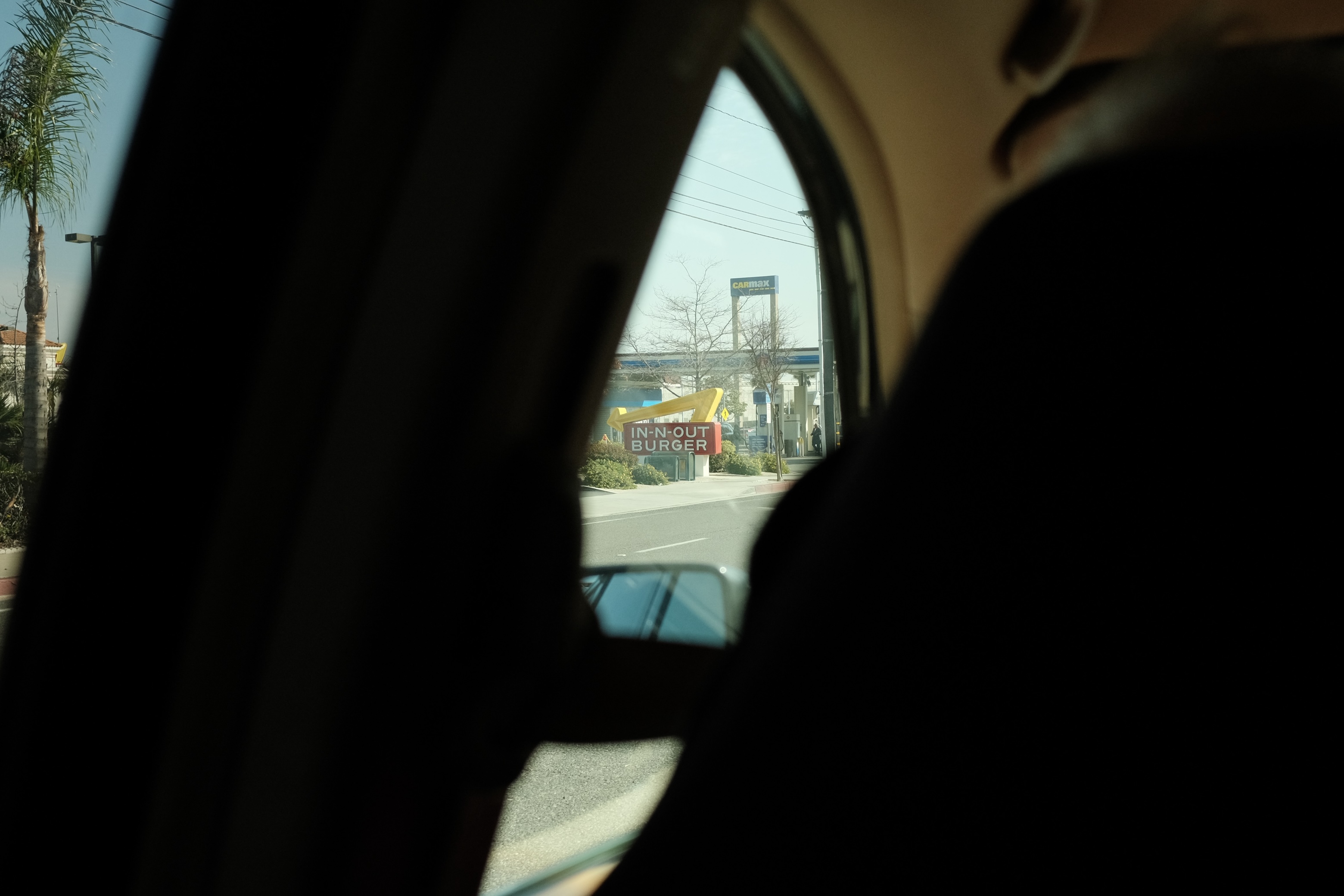
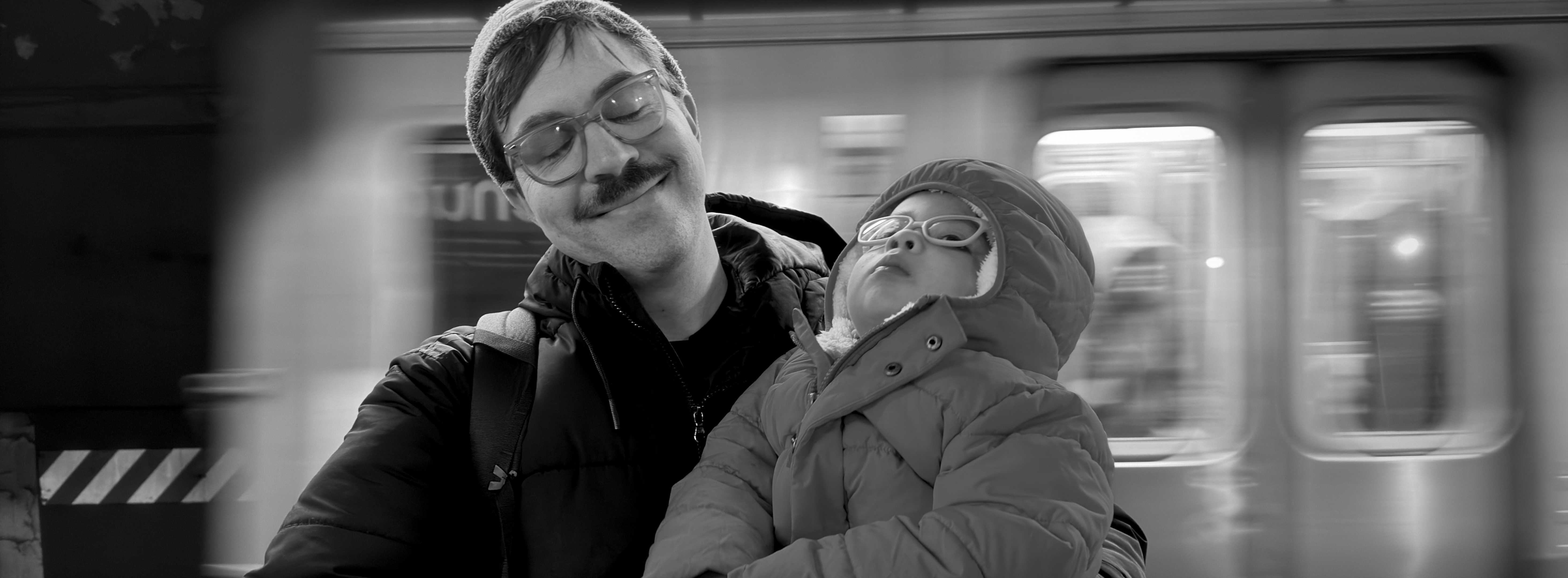
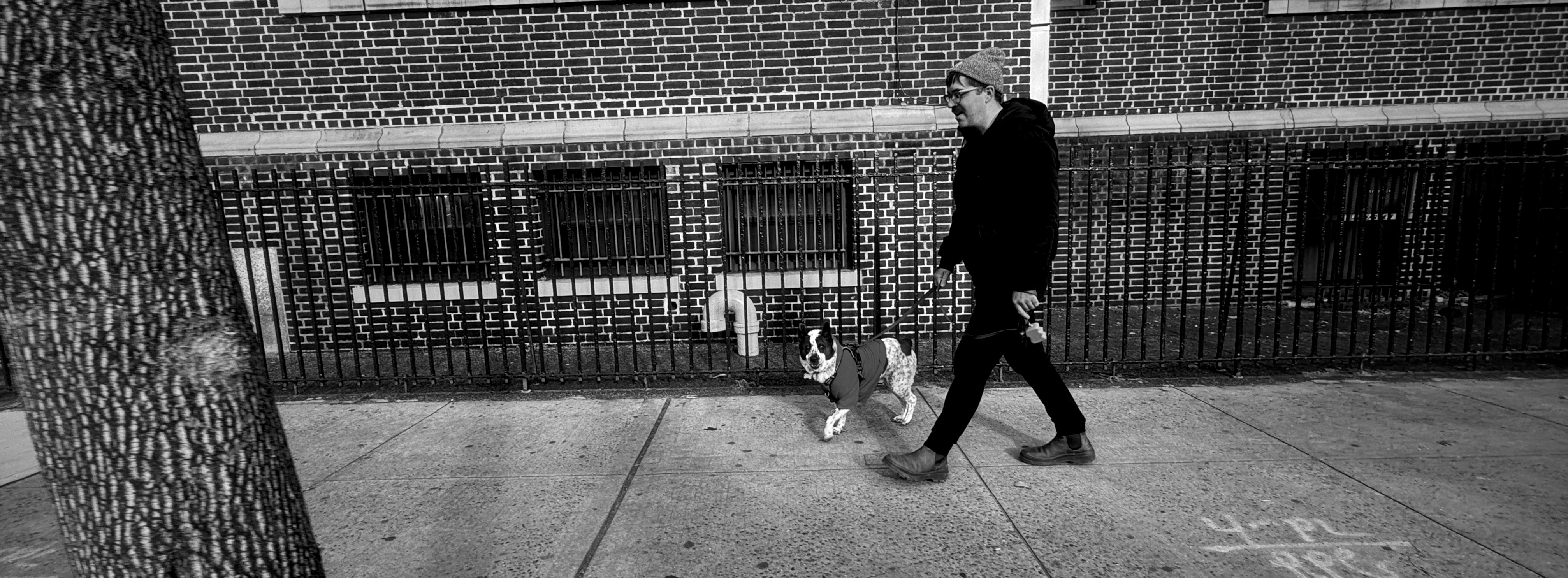
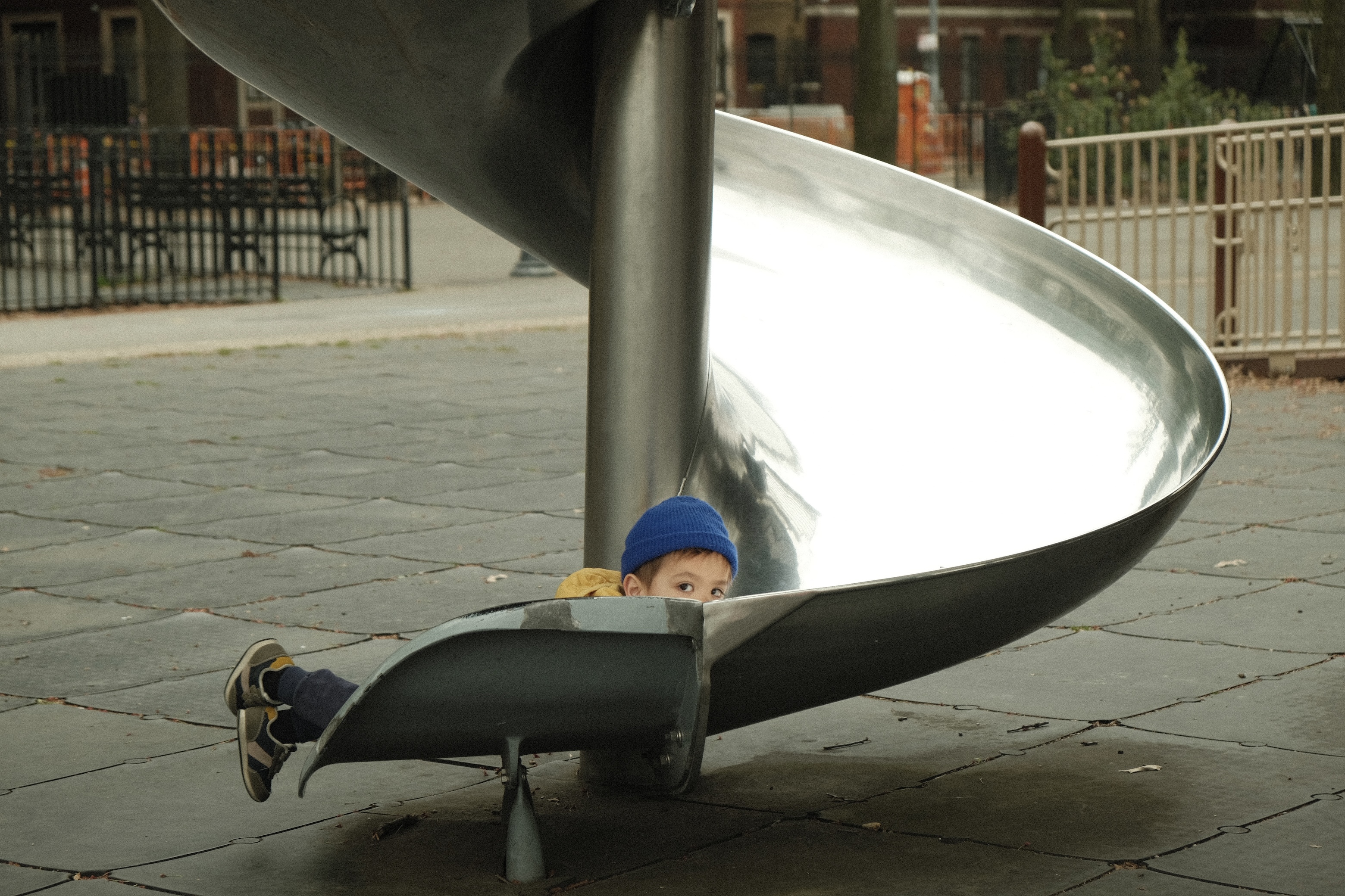
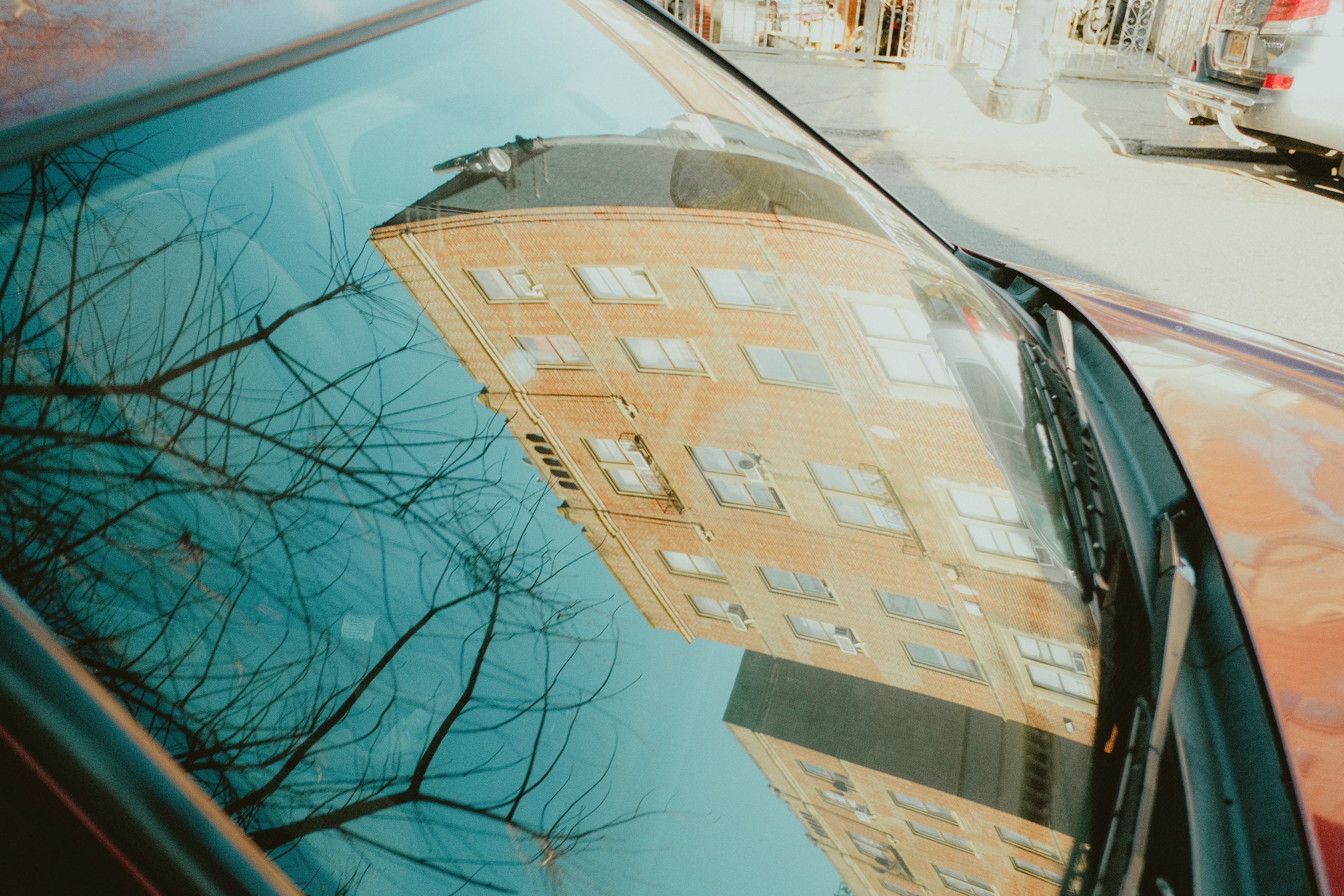
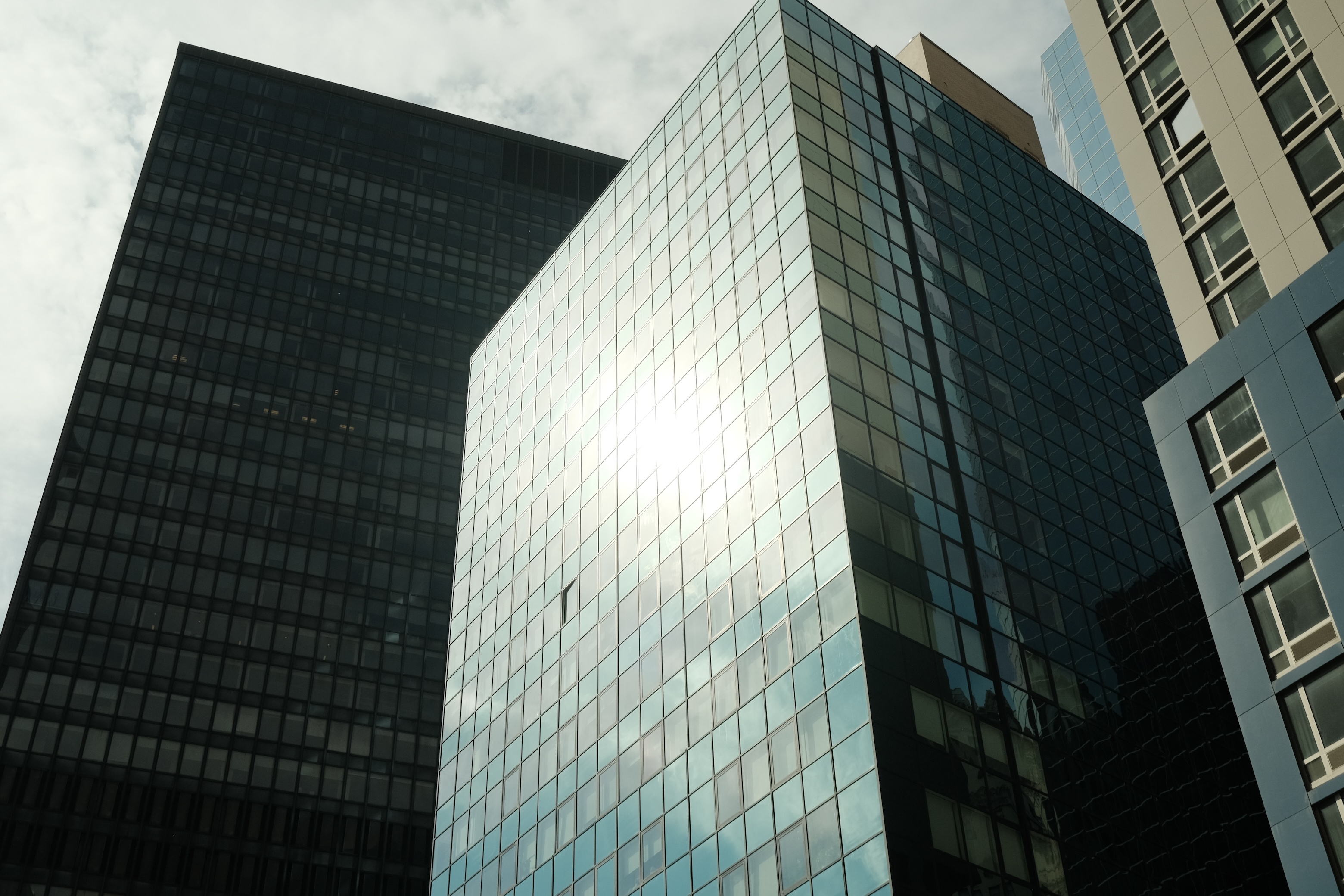
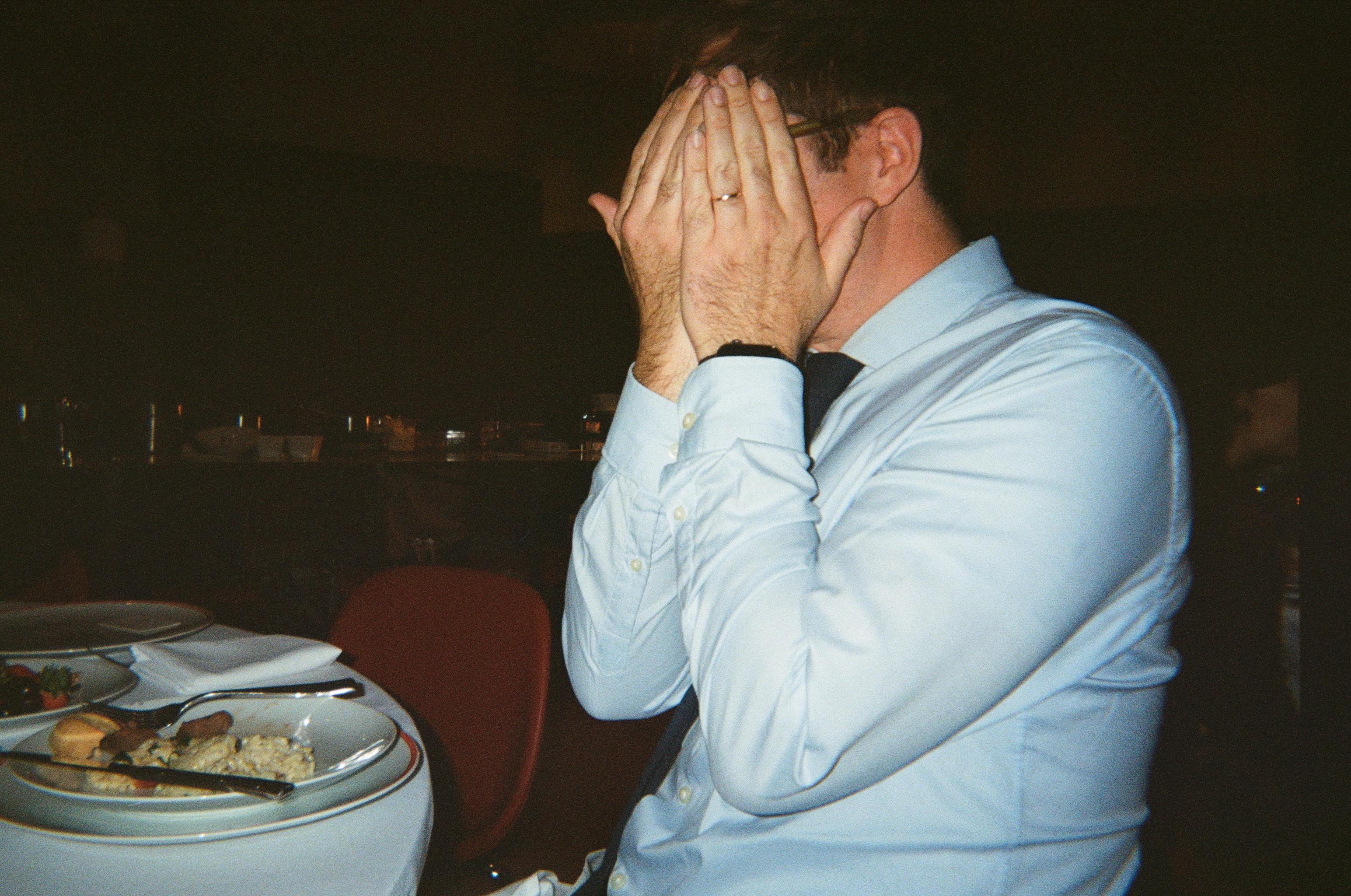
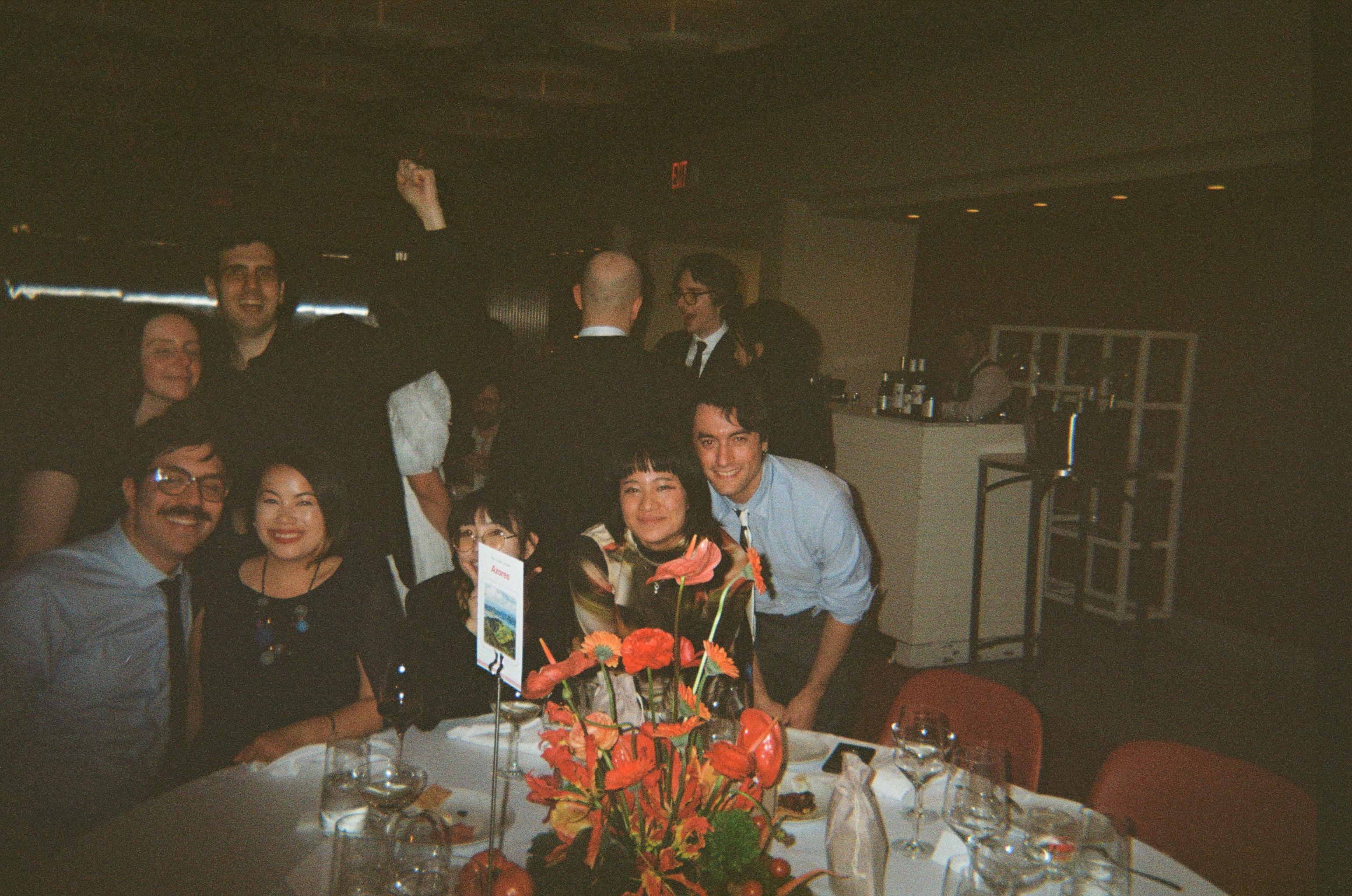
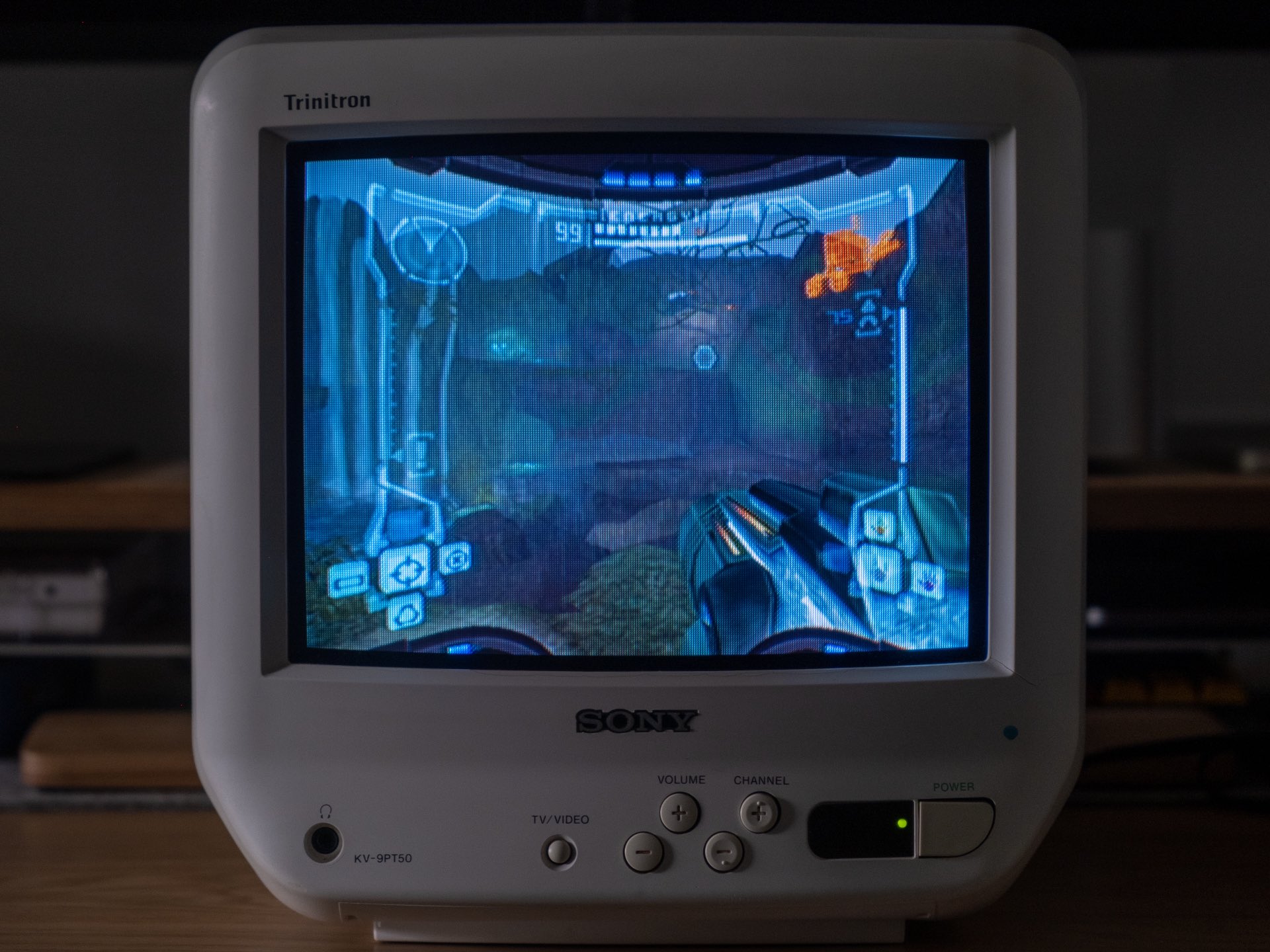
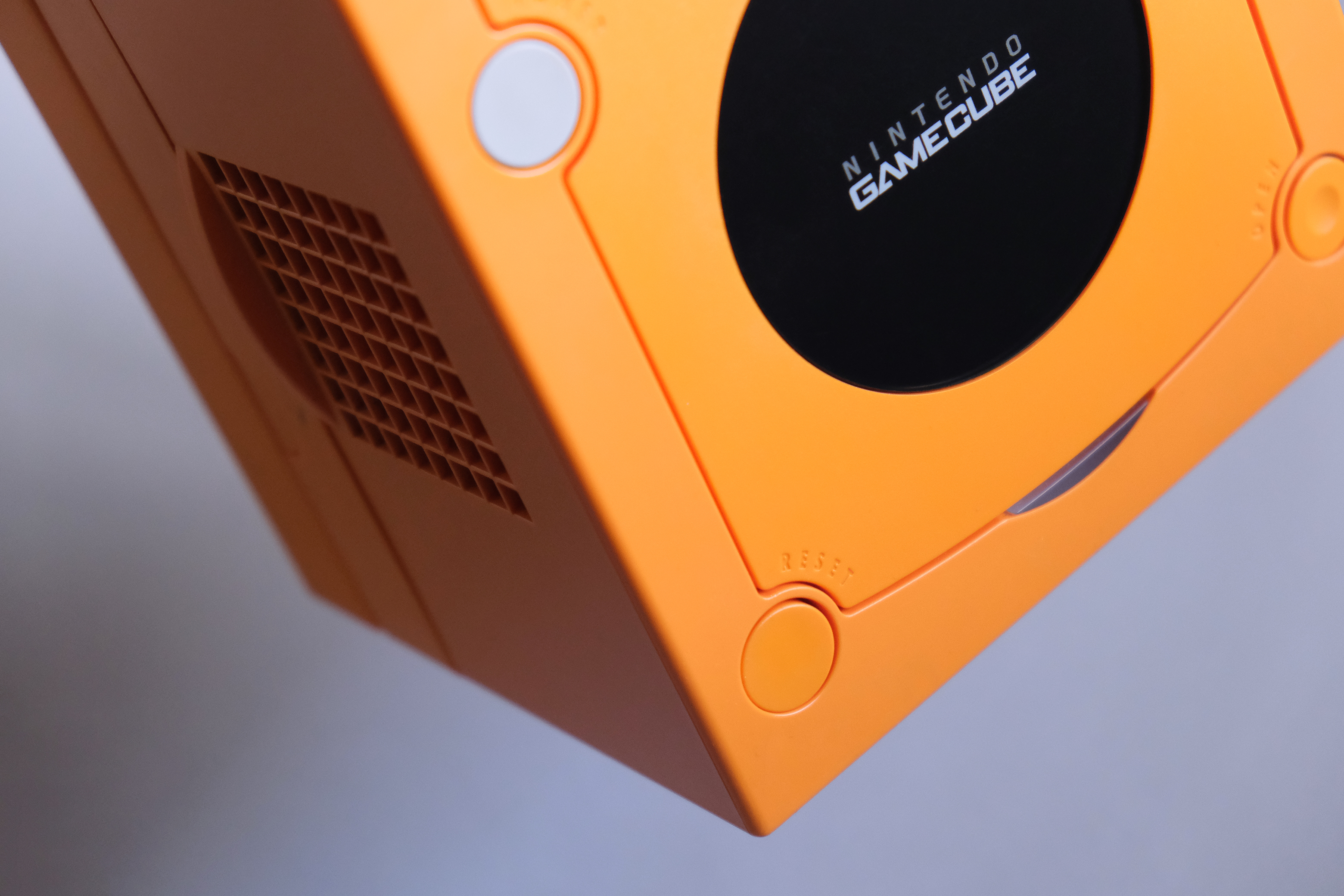
Selection of 35mm film photos, shot on little point and shoots I’ve collected over the last few years.
Most recently, I’ve been shooting with a Pentax 17 and a Konica Big Mini.
Updated periodically.
Updated periodically.


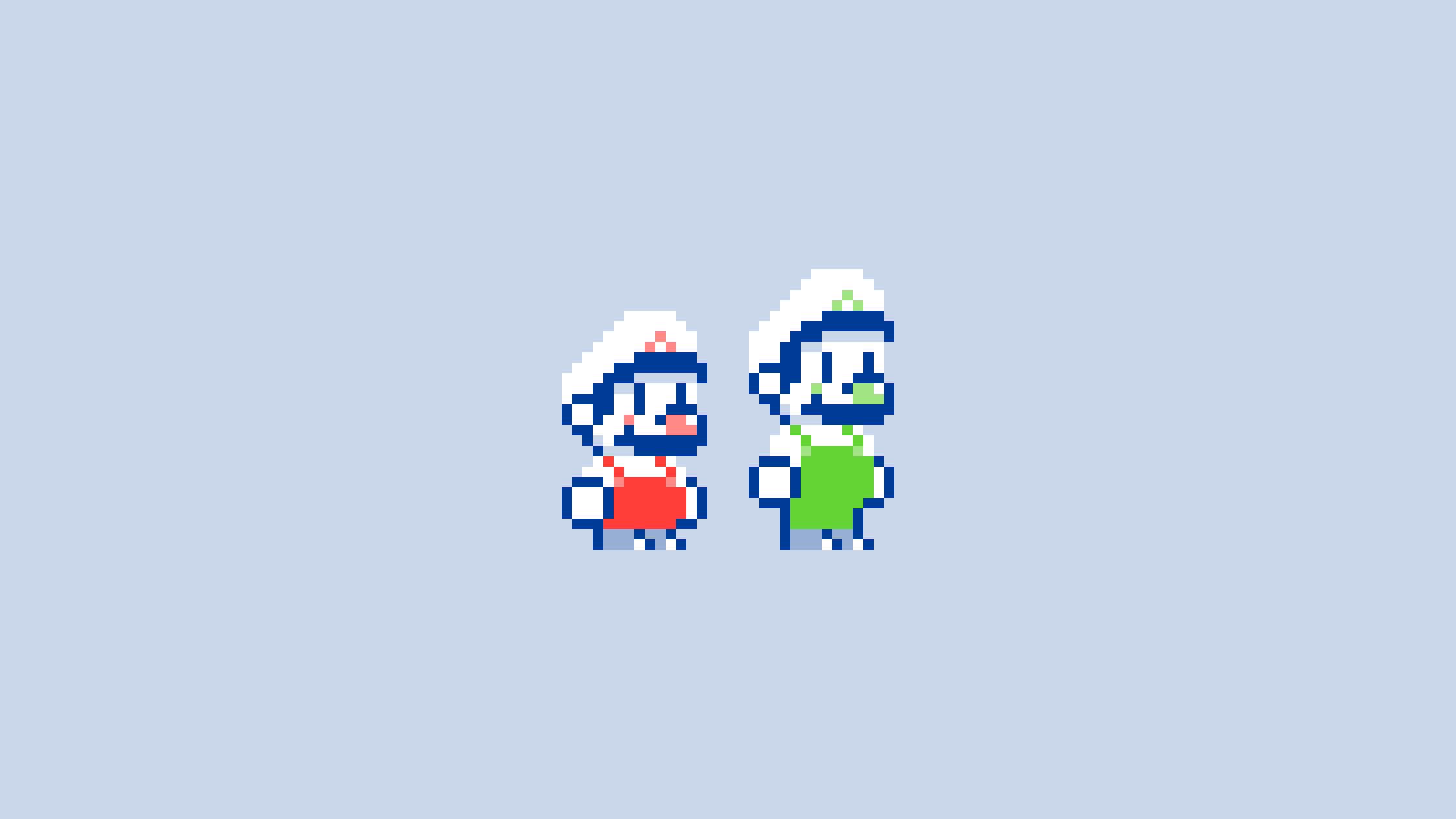
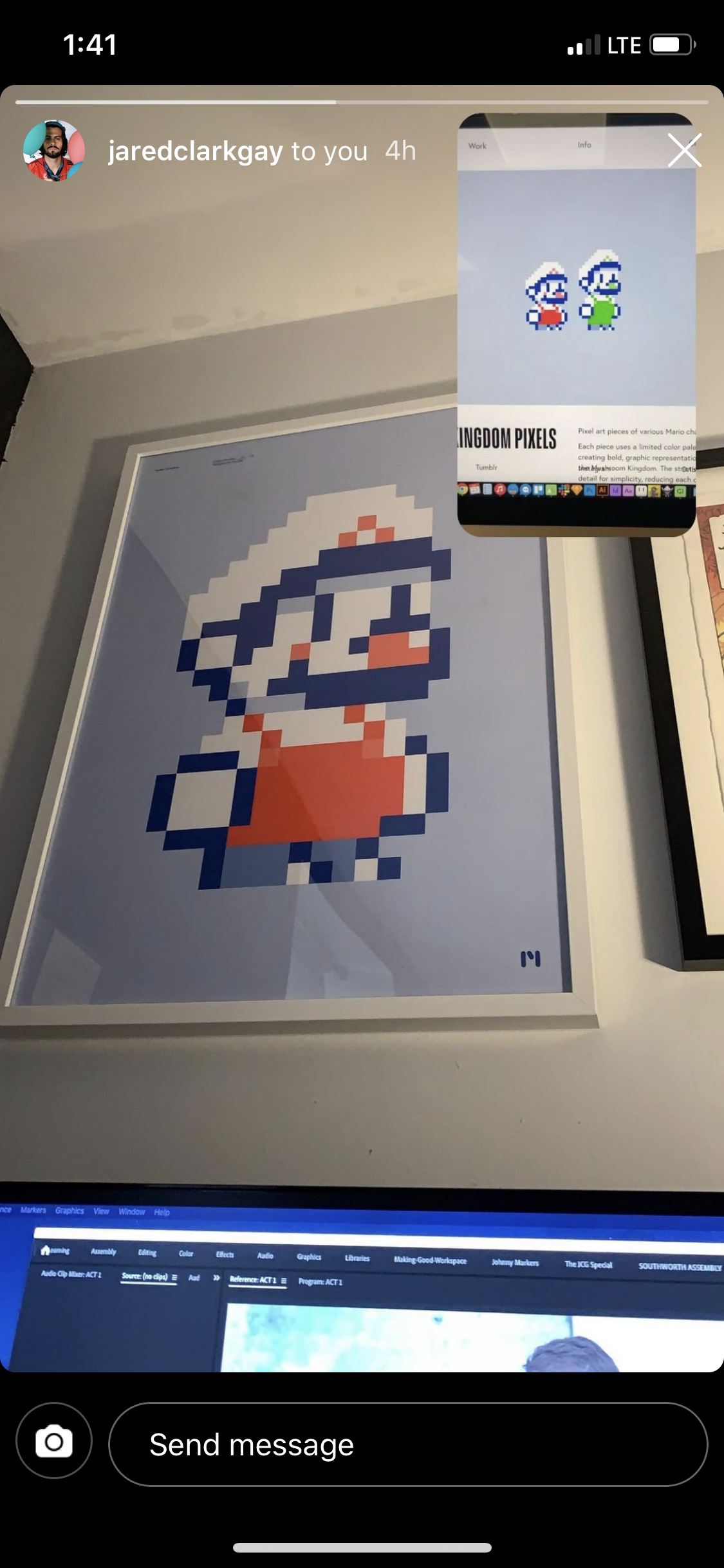
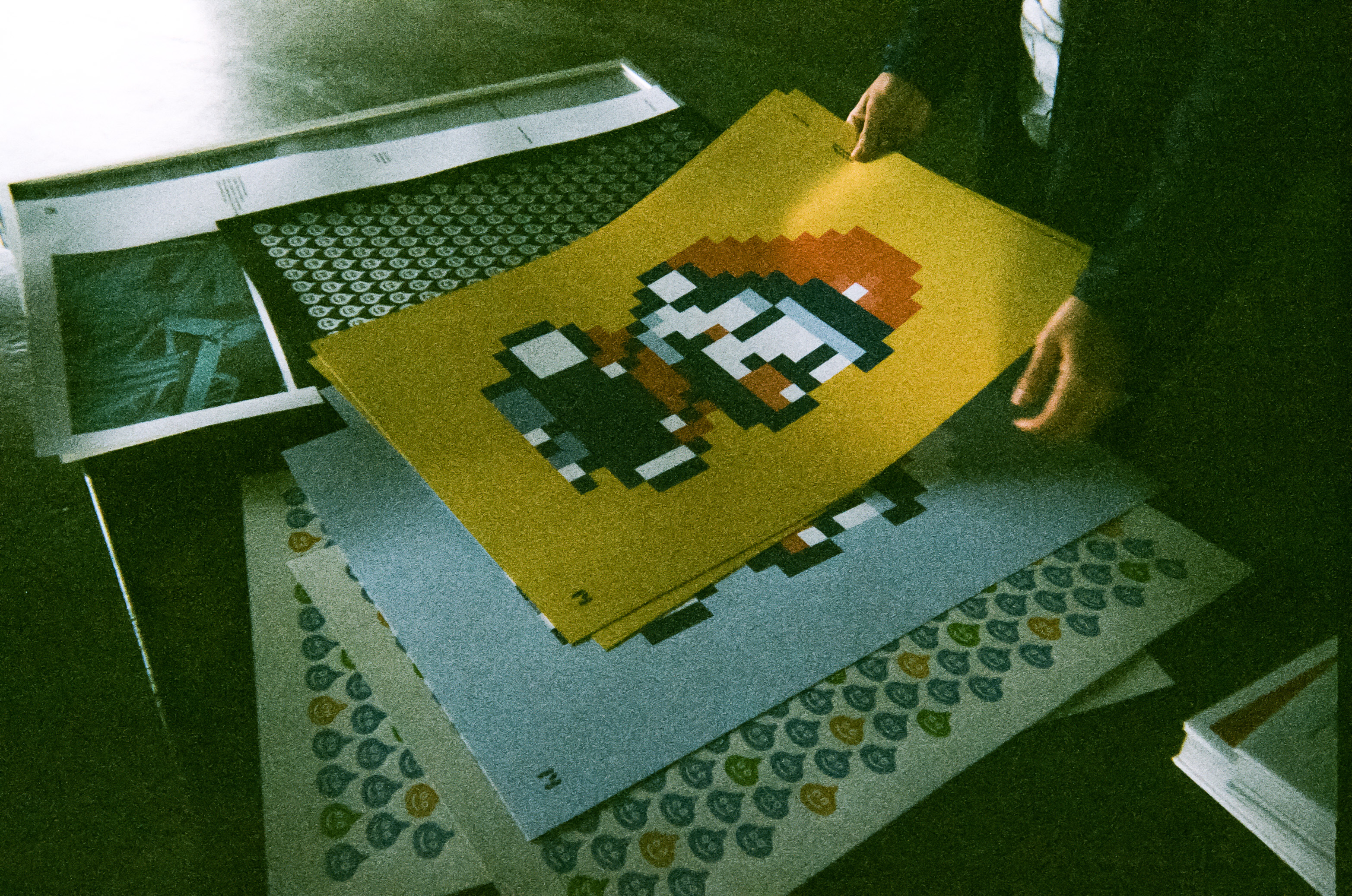
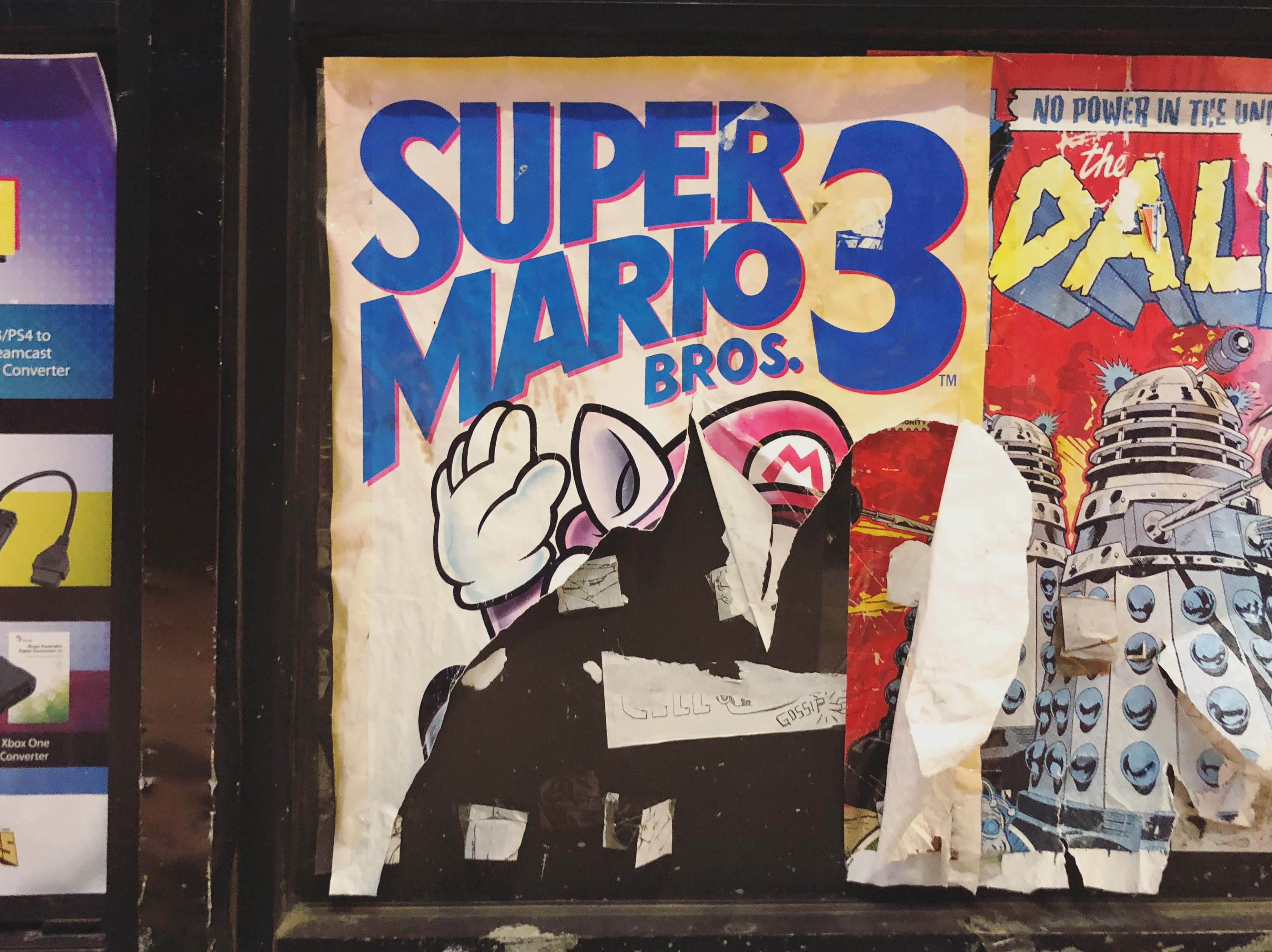
Mushroom Kingdom Pixels
Client: Self-initiated
2018, 2026
Client: Self-initiated
2018, 2026
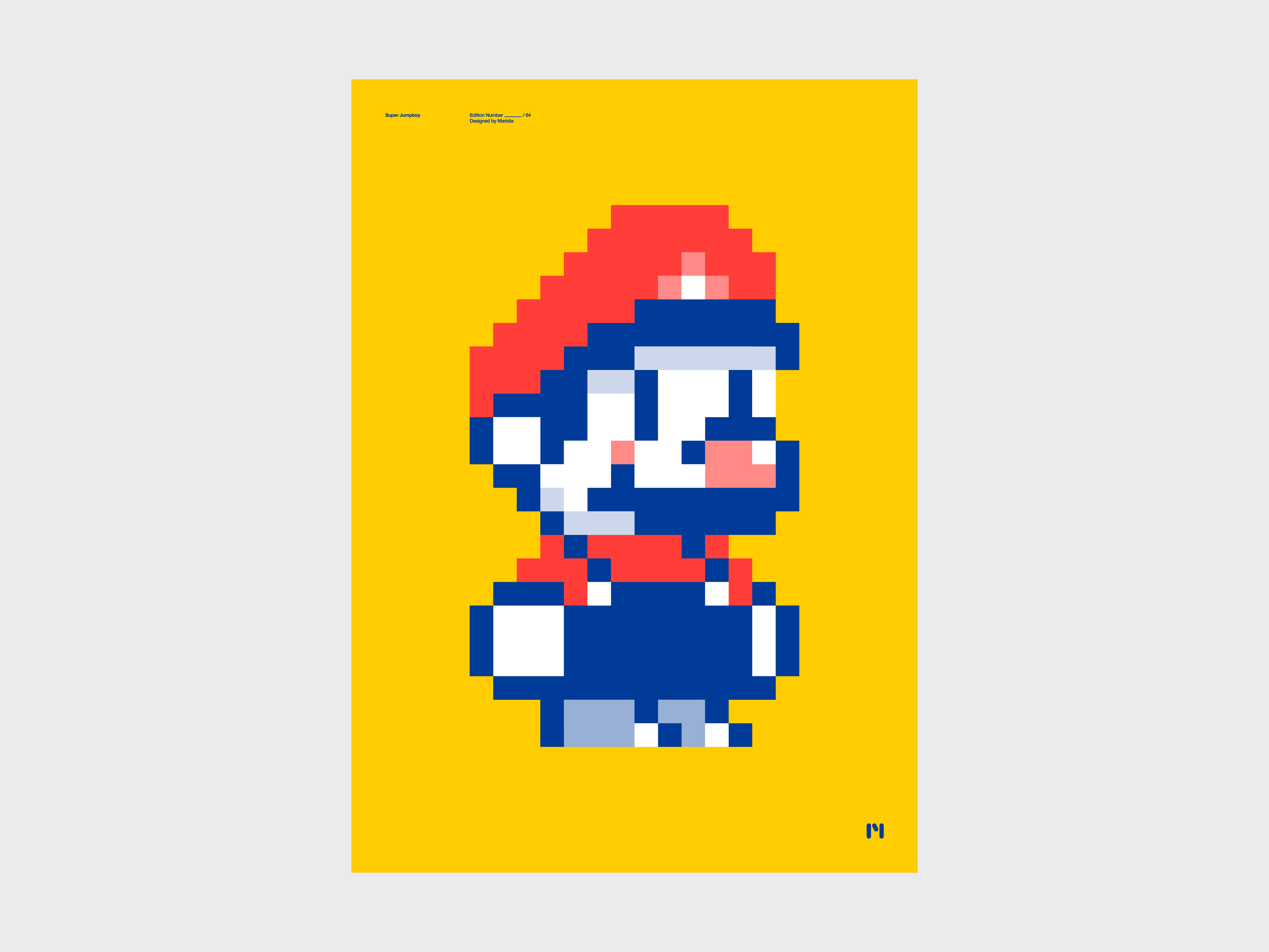
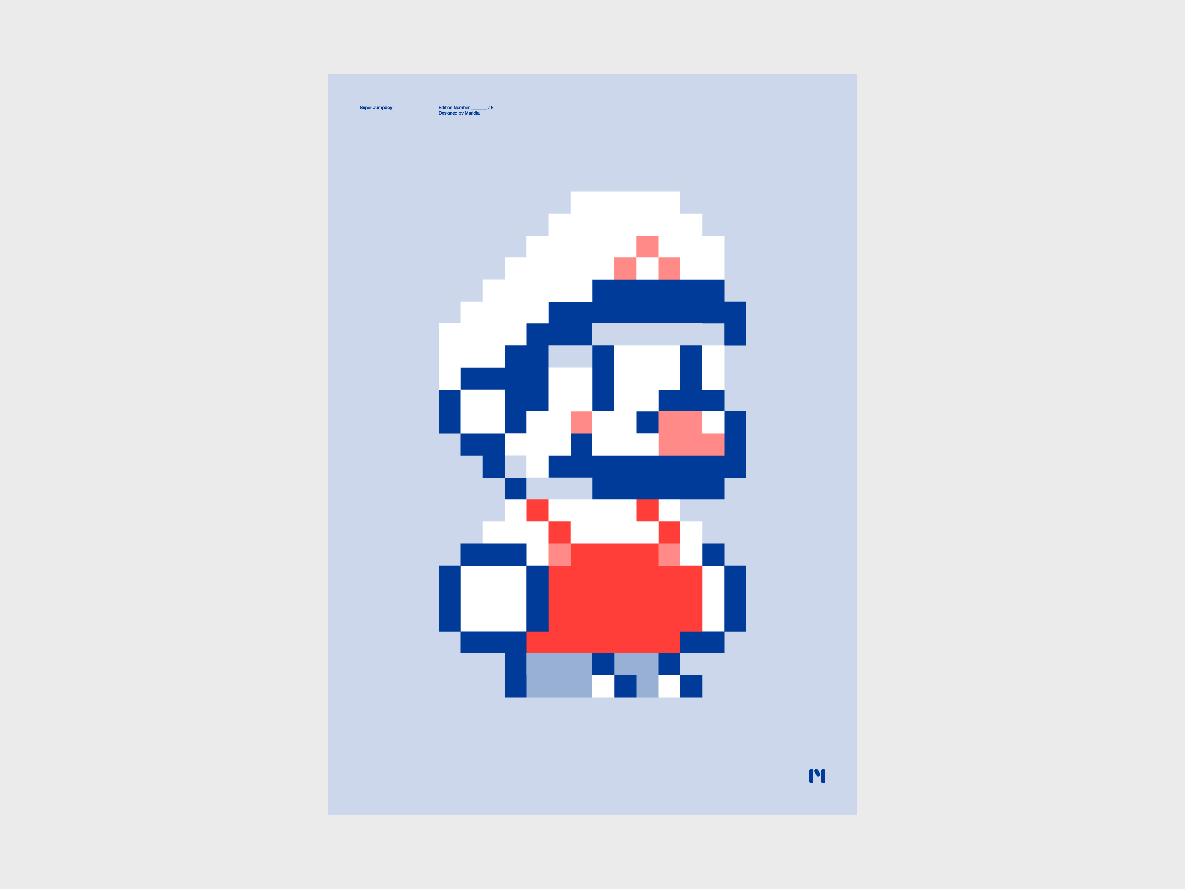
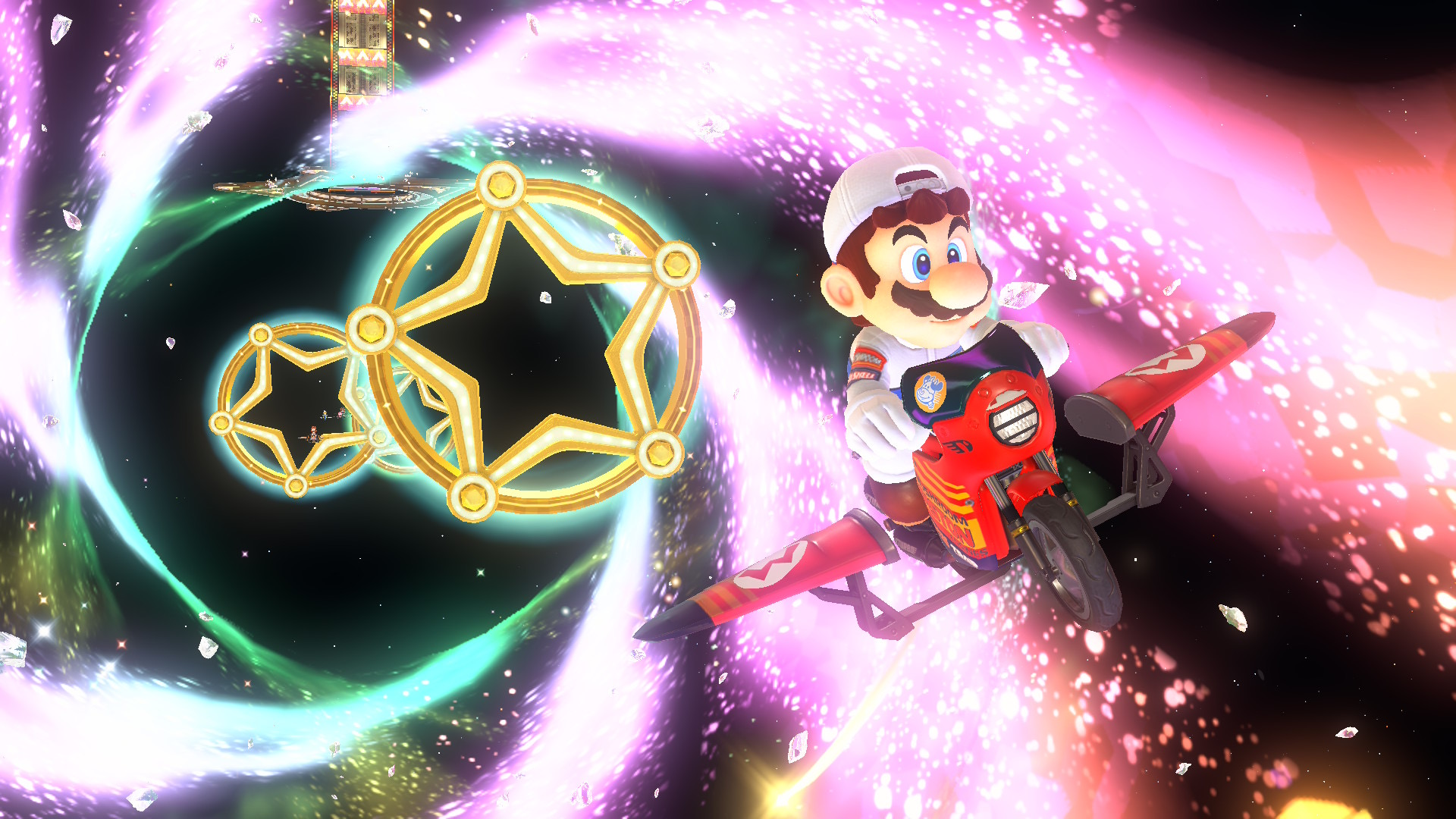
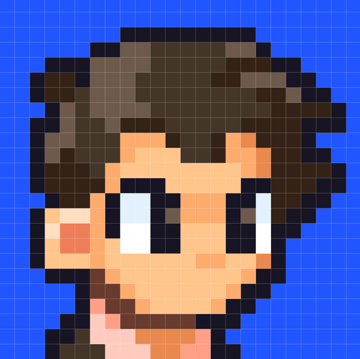
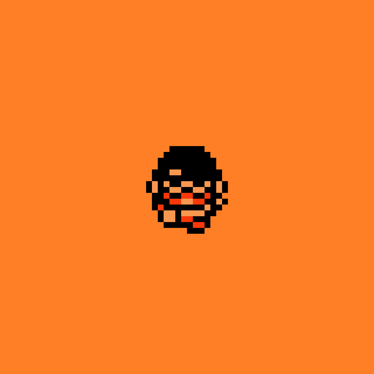
Pixel art pieces of various Mario characters, begun in 2018 and picked back up in 2026.
Each piece uses a limited color palette and canvas size, creating bold, graphic representations of characters from the Mushroom Kingdom. The strict constraints sacrifice detail for simplicity, reducing each character to their most basic identifiable forms.🍄 Work in progress. More images coming soon.
Similar Projects
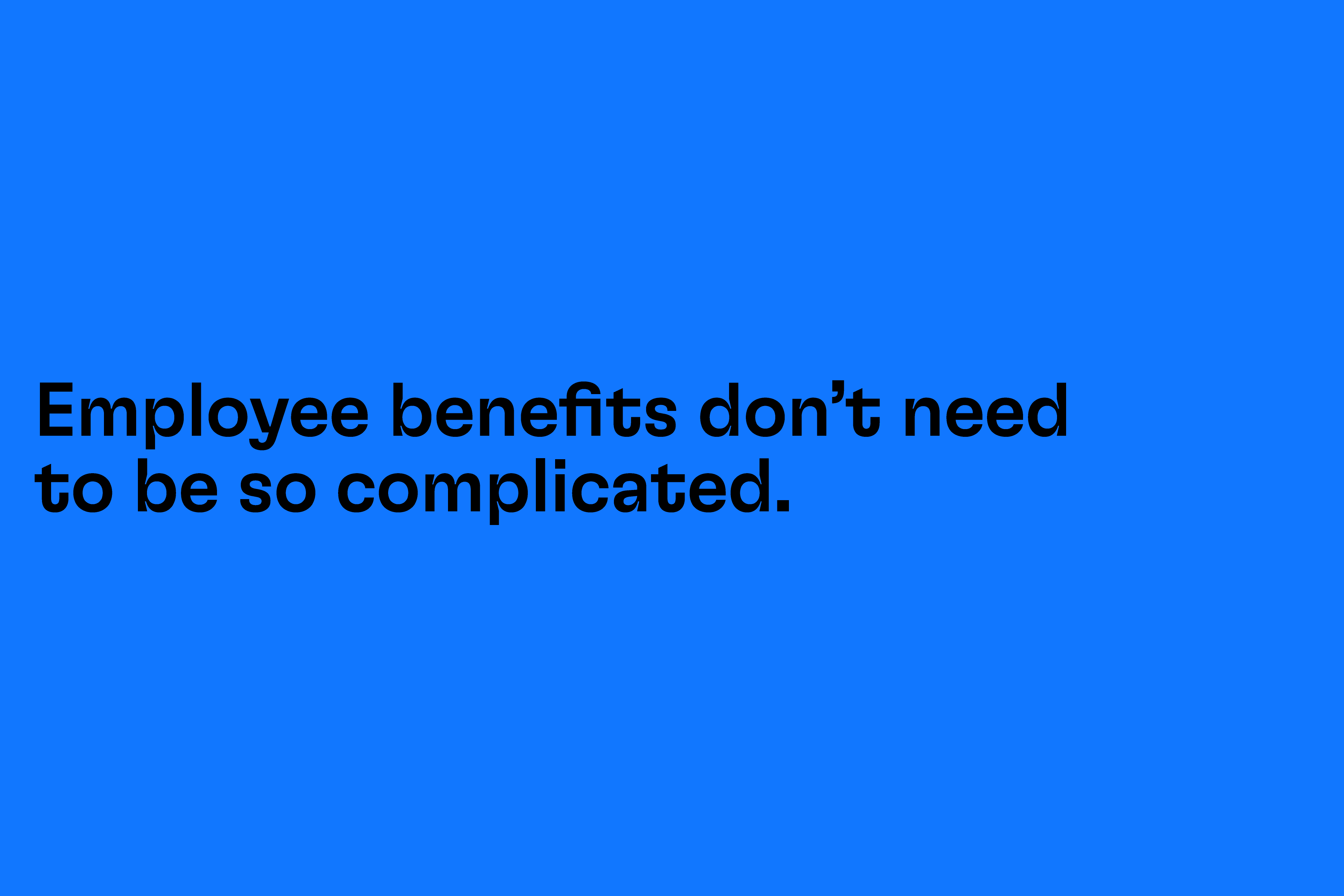
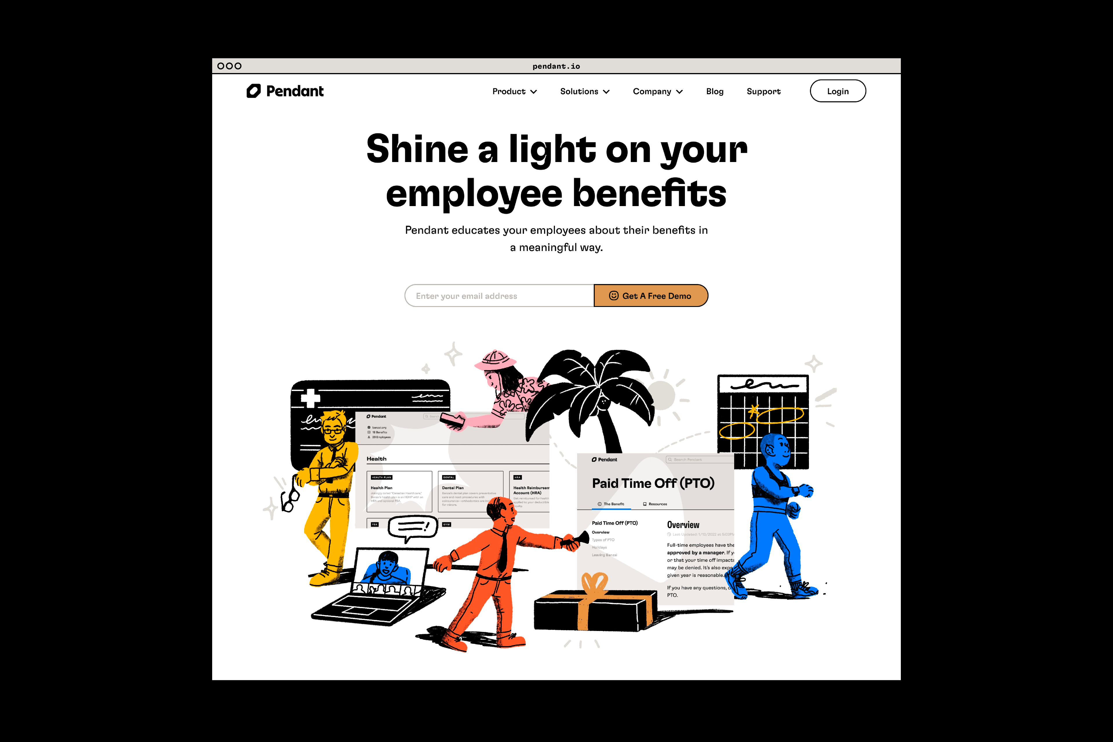
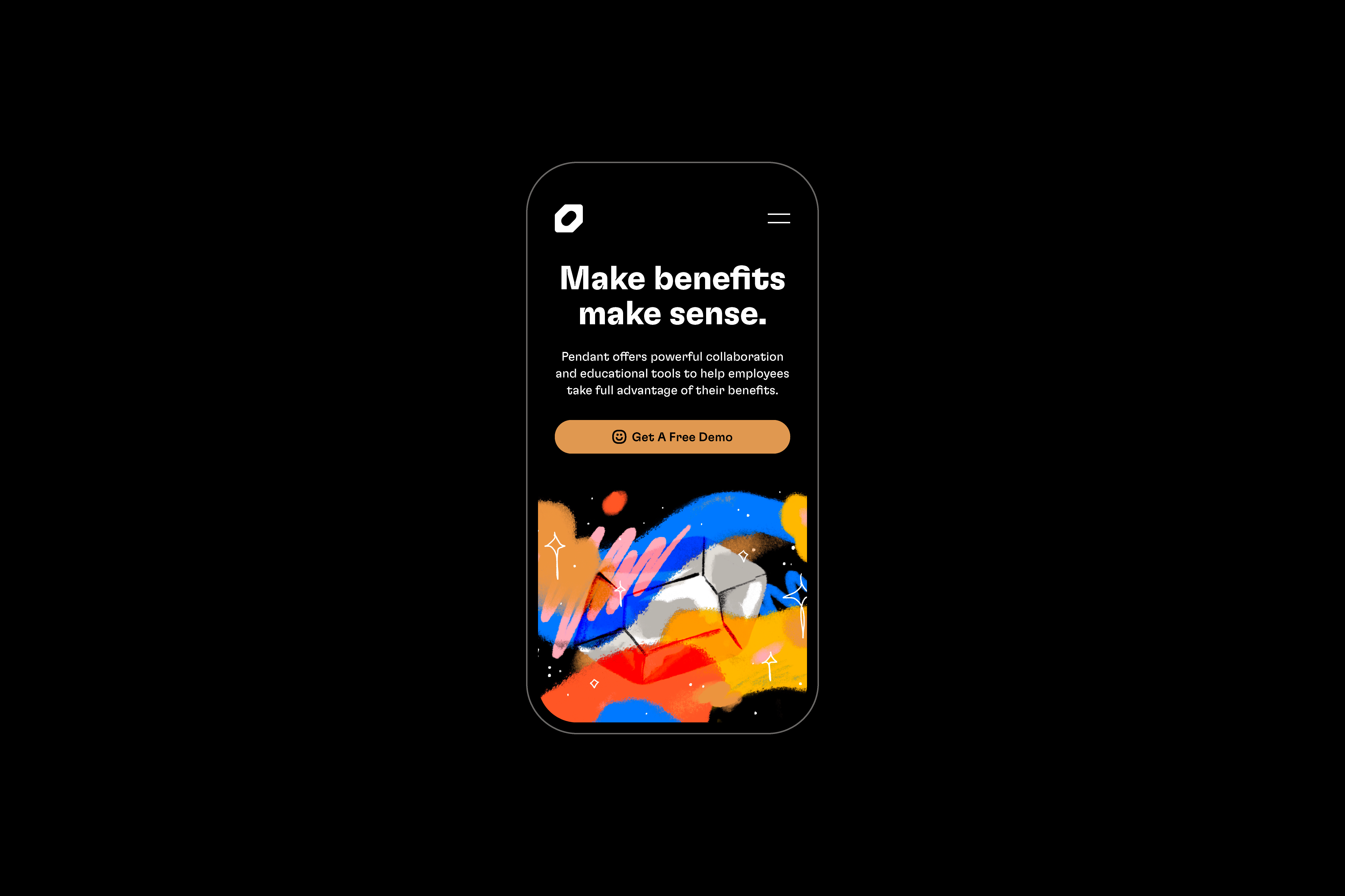
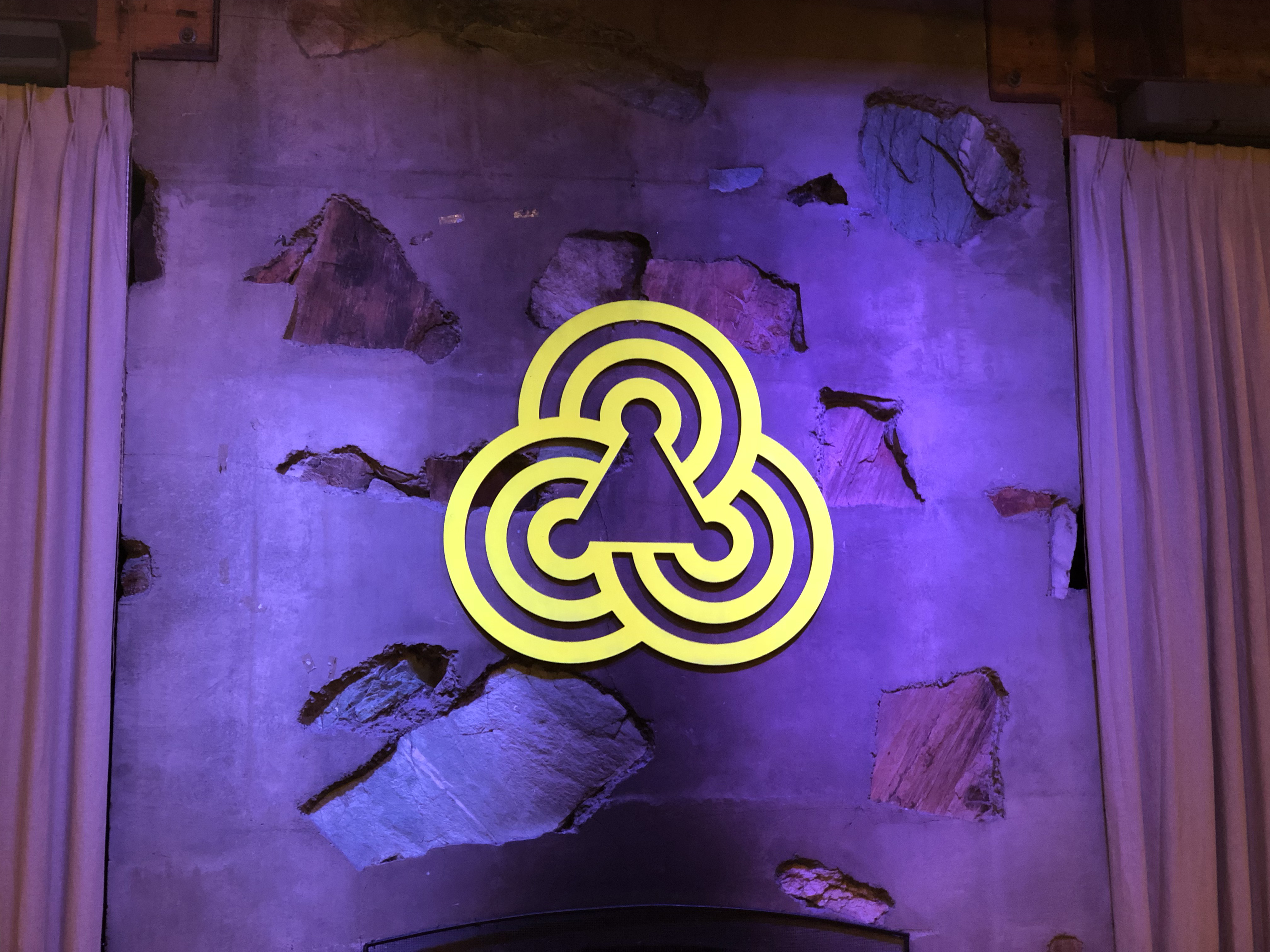
Name, logo, branding, strategy, art direction, and early brand management for Pendant, the HR-focused product from Banzai.
After freelancing full-time for two years, I returned to Banzai in 2021 to work on a new HR- and employee benefits-related product. It would have an entirely new name and brand, though I was told it should still feel like it came from the people who made Banzai. As product lead, I was responsible for leading branding and product design on what would become Pendant.
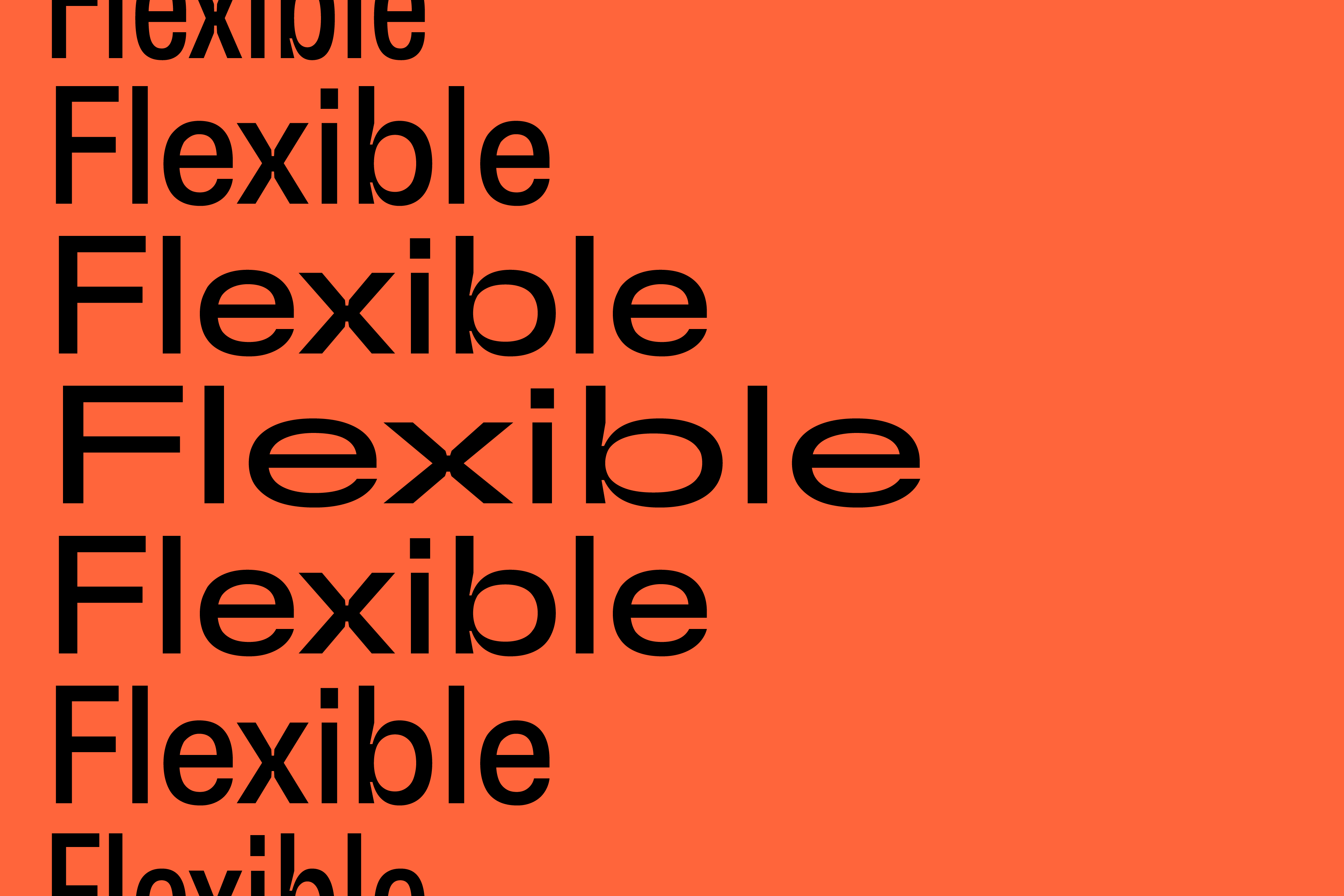
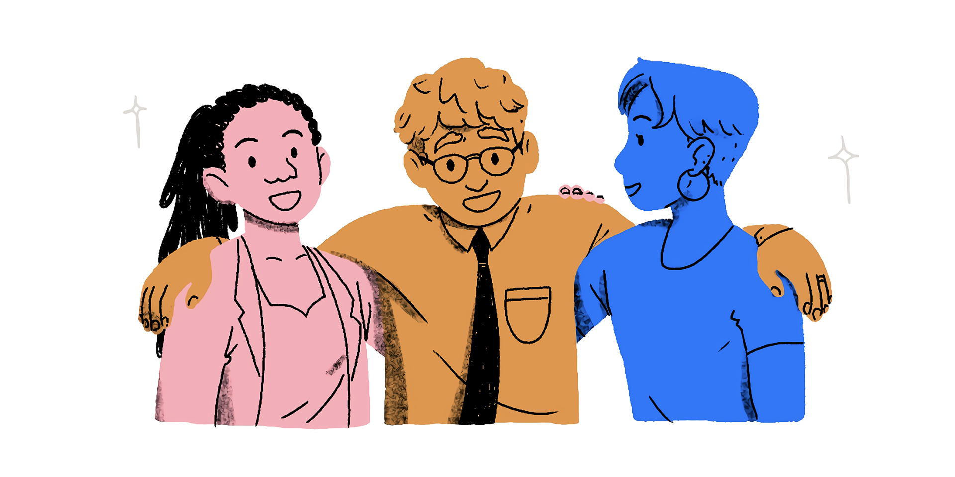
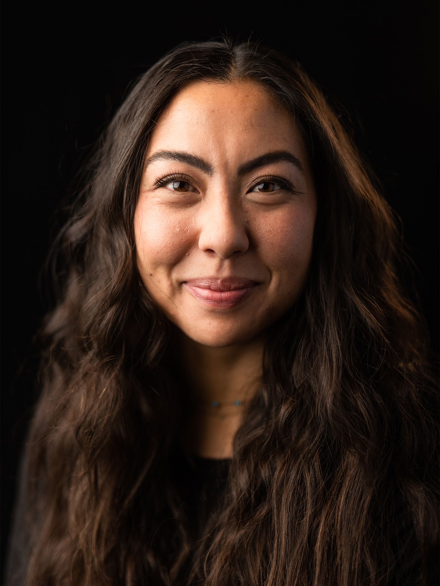
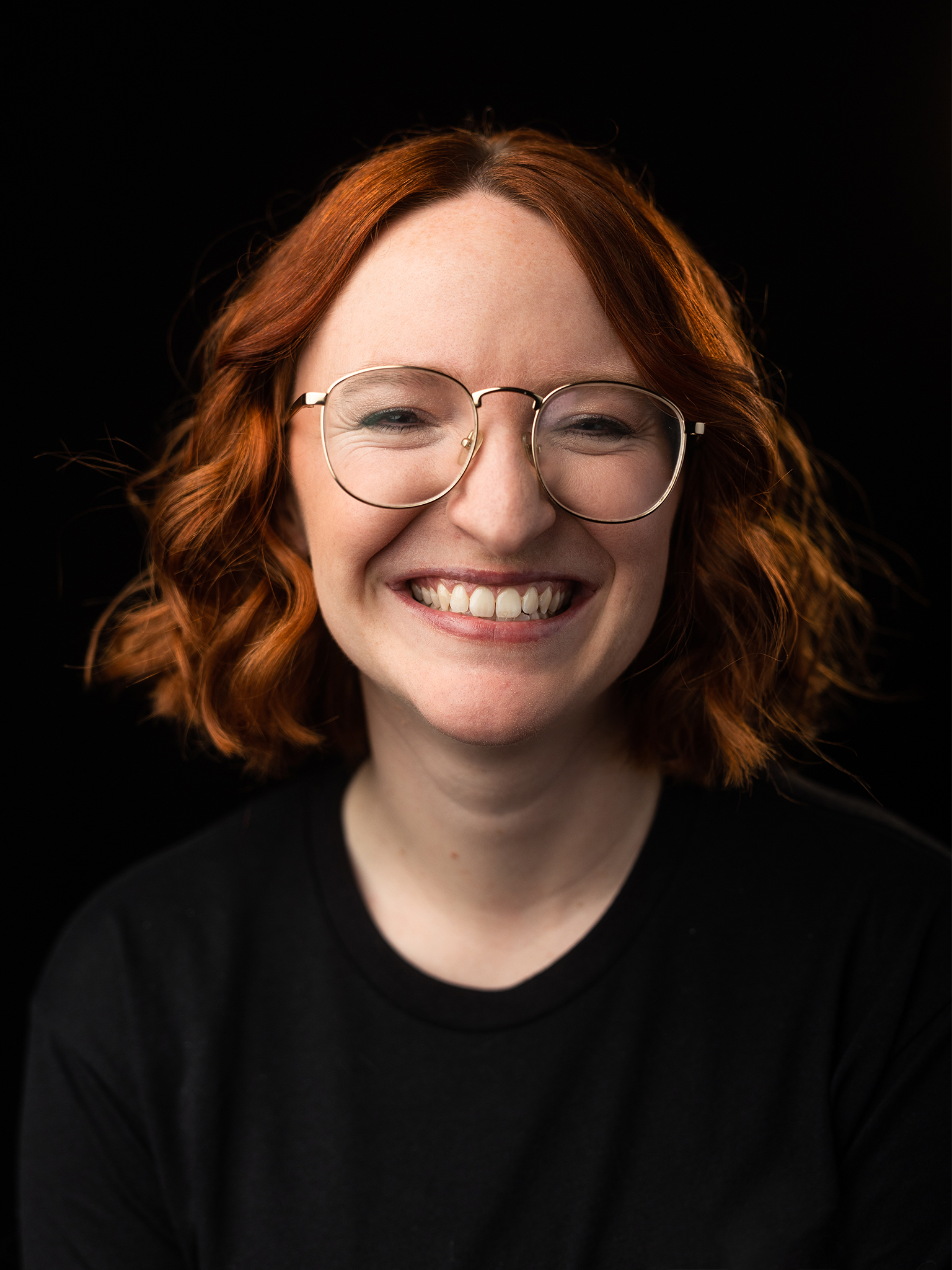
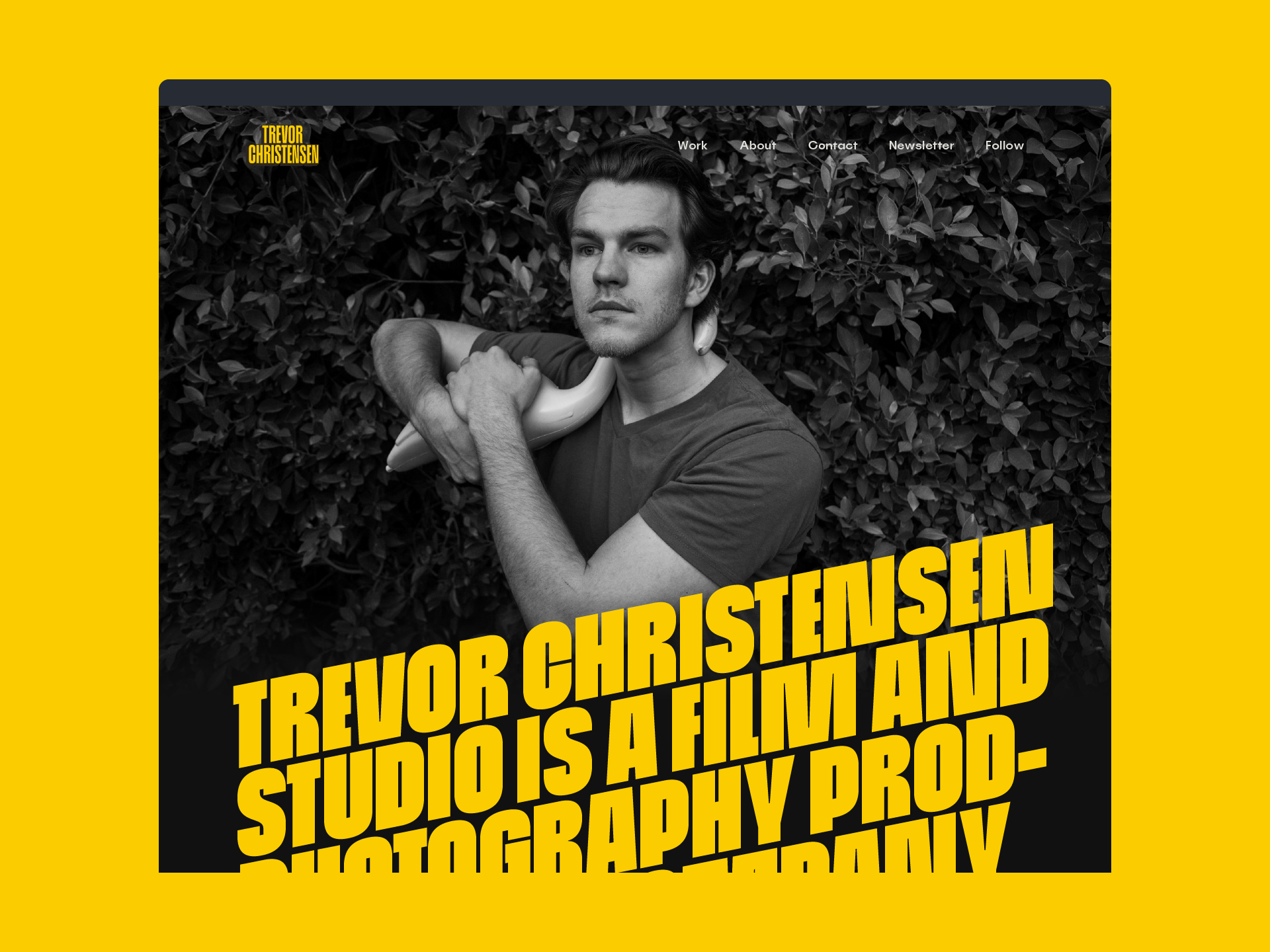
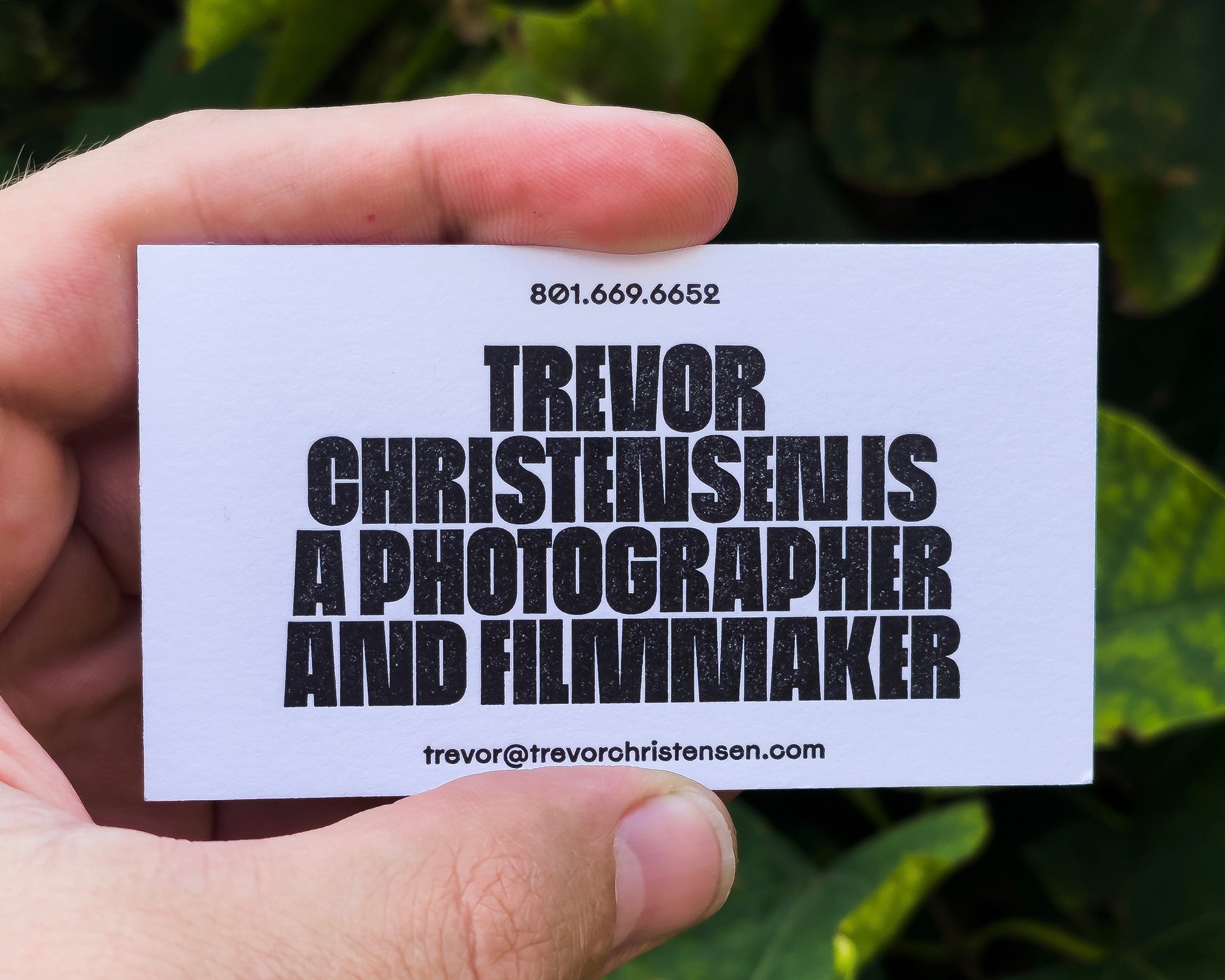
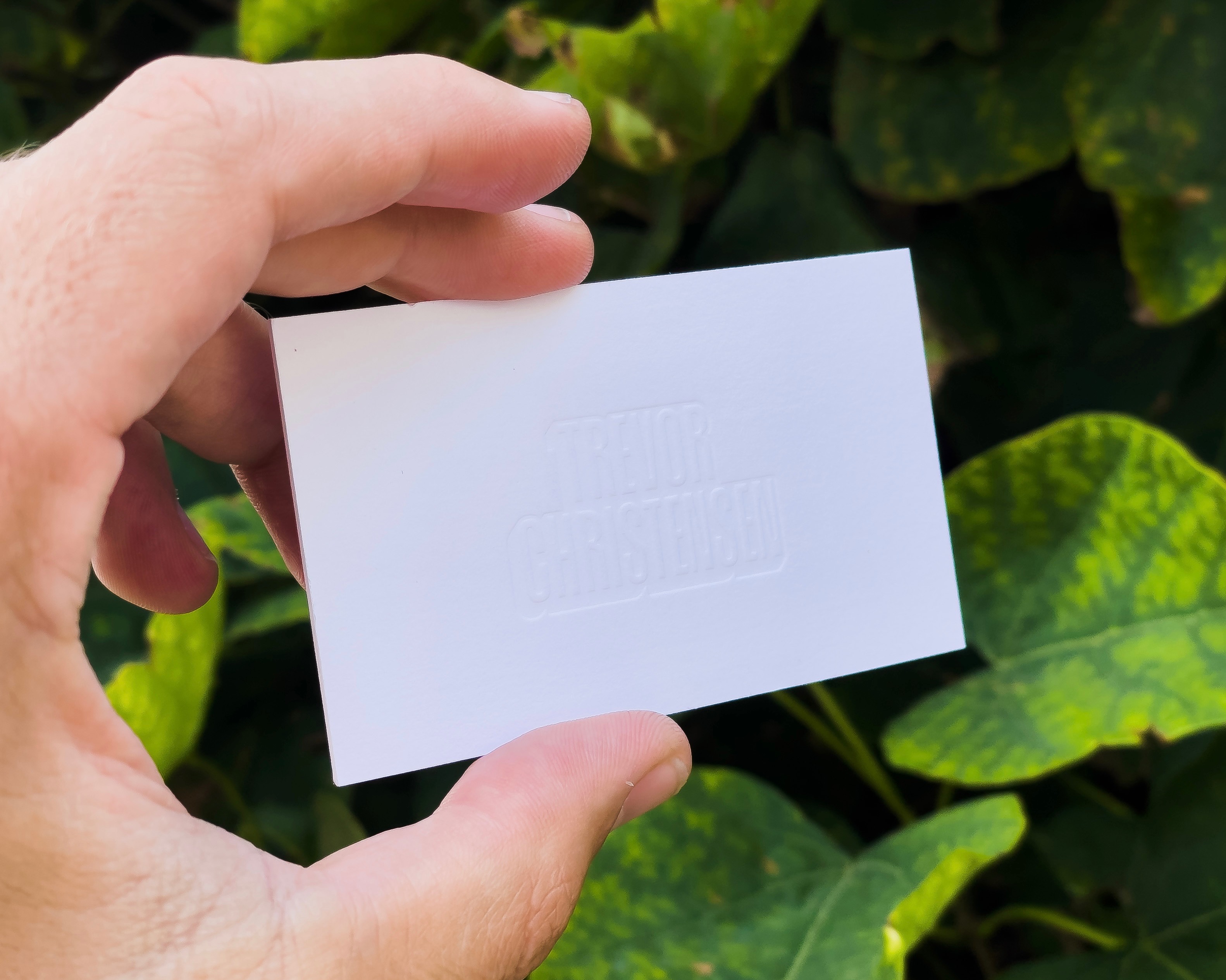
My process in the early days of working on Pendant was a holistic one, with the branding influencing the product design and vice versa. I chose GT Flexa as the brand type family for a few reasons: it’s beautifully drawn and tonally distinct, its endless flexibility would be suitable for the wide range of use cases we’d need it for, and its unique character lent the brand a friendly voice. Flexa is the backbone of the brand, giving Pendant a voice that is inviting but decisive. This is especially important because Pendant, being a product about employee benefits, would need to be a trustworthy resource during people’s difficult life changes, like having a baby or leaving a job. The color palette is bright and saturated, with colors reminiscent of light refracted through a prism. I worked with Pendant’s in-house illustrator Cristi Flores to nail down the illustration style. Cristi’s illustration work brings the brand to life with organic shapes and delicate application of Pendant’s color palette. I also worked with photographer Trevor Christensen on a set of employee portraits for Pendant. Their heavy use of black draws focus to the subjects’ faces and makes the photos harmonize with the rest of Pendant’s color palette.


Credits
Development
Kendall Buchanan
Zac Boswell
Mardo Del Cid
Austin Finlinson
Curtis Summers Project Management
Jeff Lord Copywriting
Nikole Rios Illustration
Cristi Flores Additional Design
Chelsea Miller
Greg Soper Photography
Trevor Christensen
Kendall Buchanan
Zac Boswell
Mardo Del Cid
Austin Finlinson
Curtis Summers Project Management
Jeff Lord Copywriting
Nikole Rios Illustration
Cristi Flores Additional Design
Chelsea Miller
Greg Soper Photography
Trevor Christensen
Related Projects
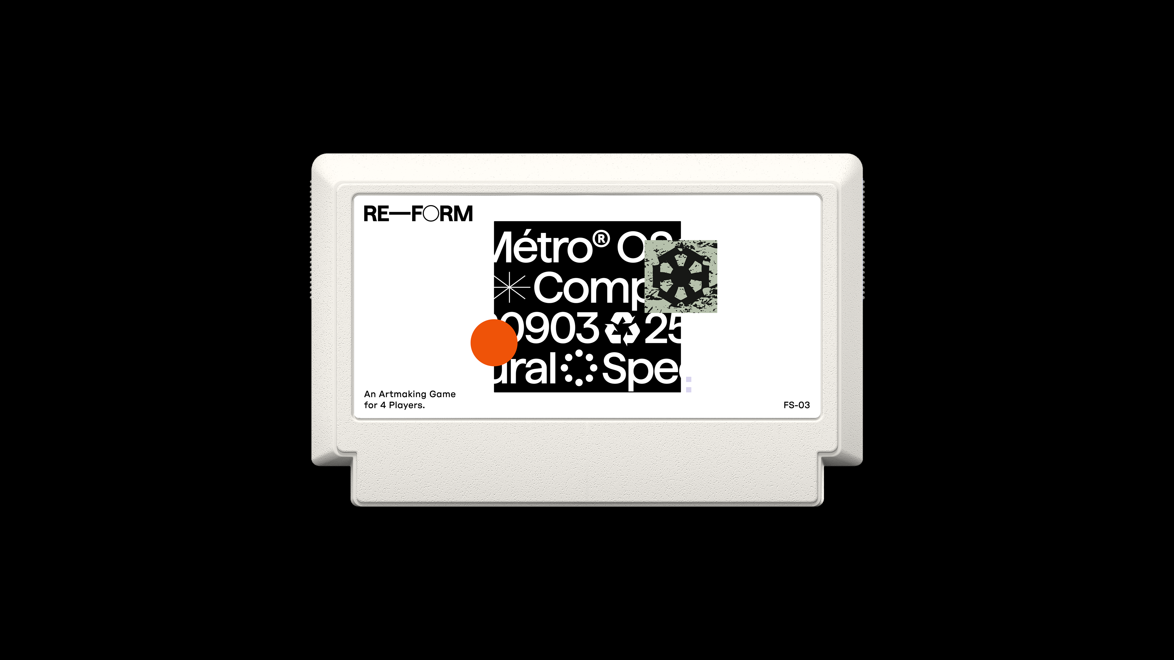
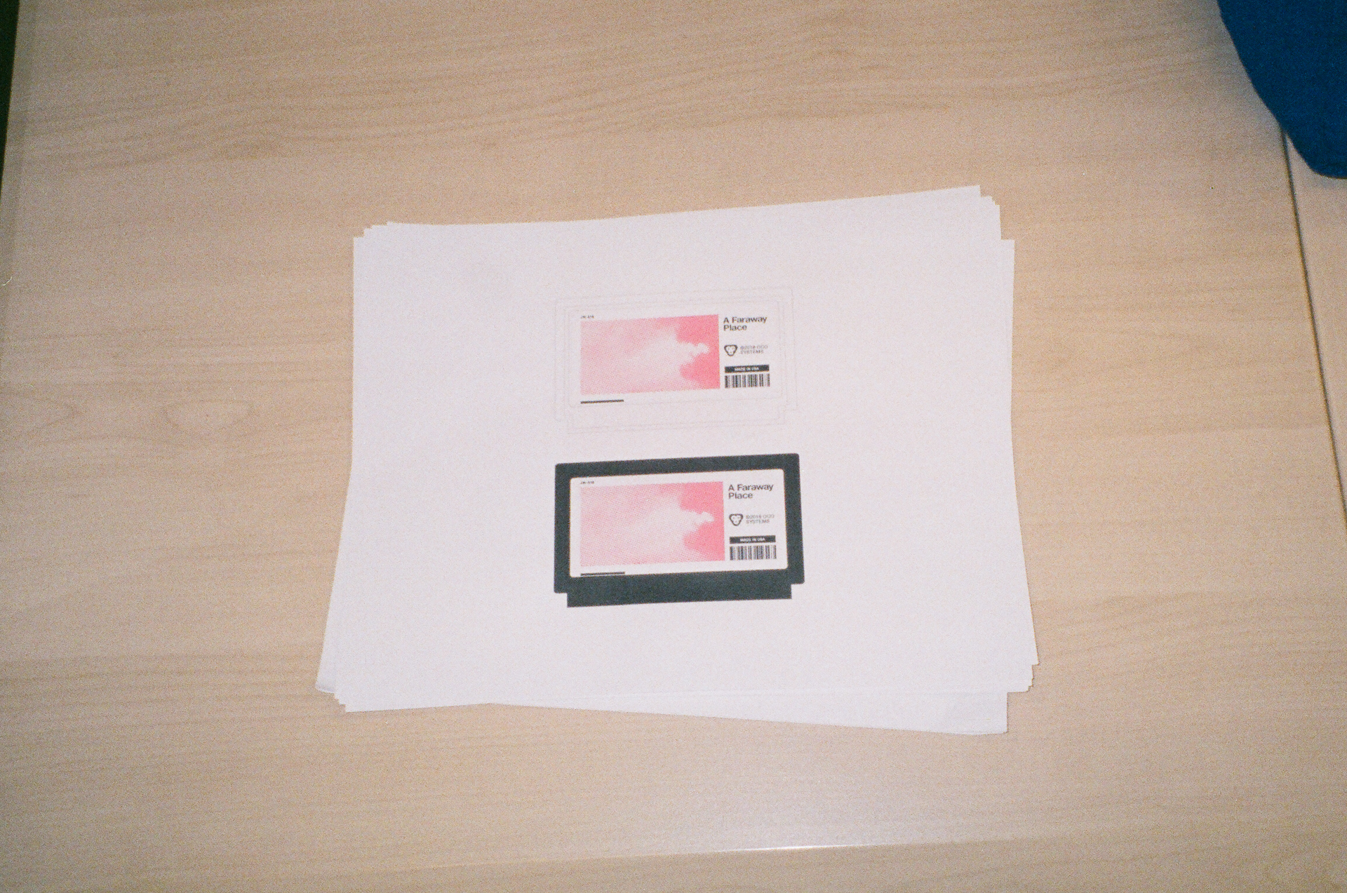
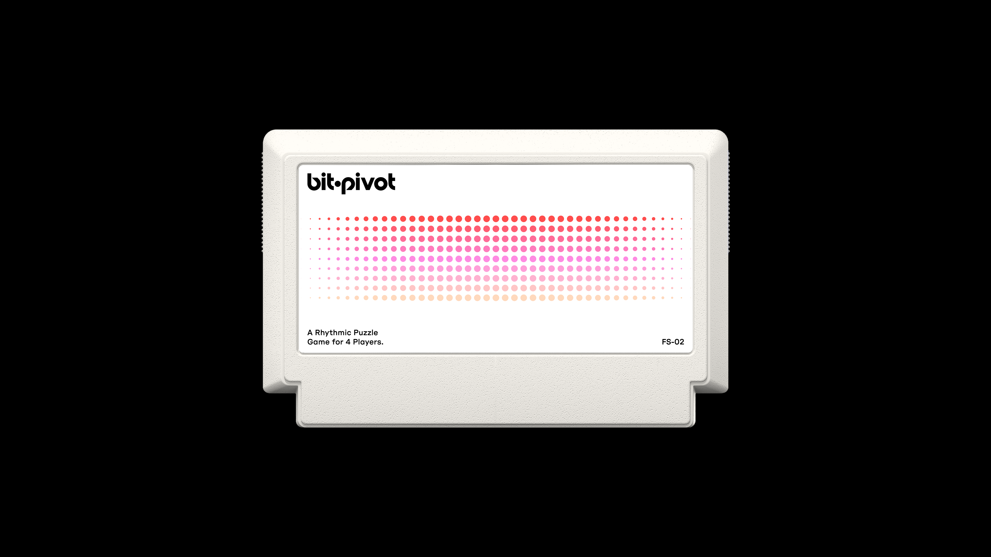
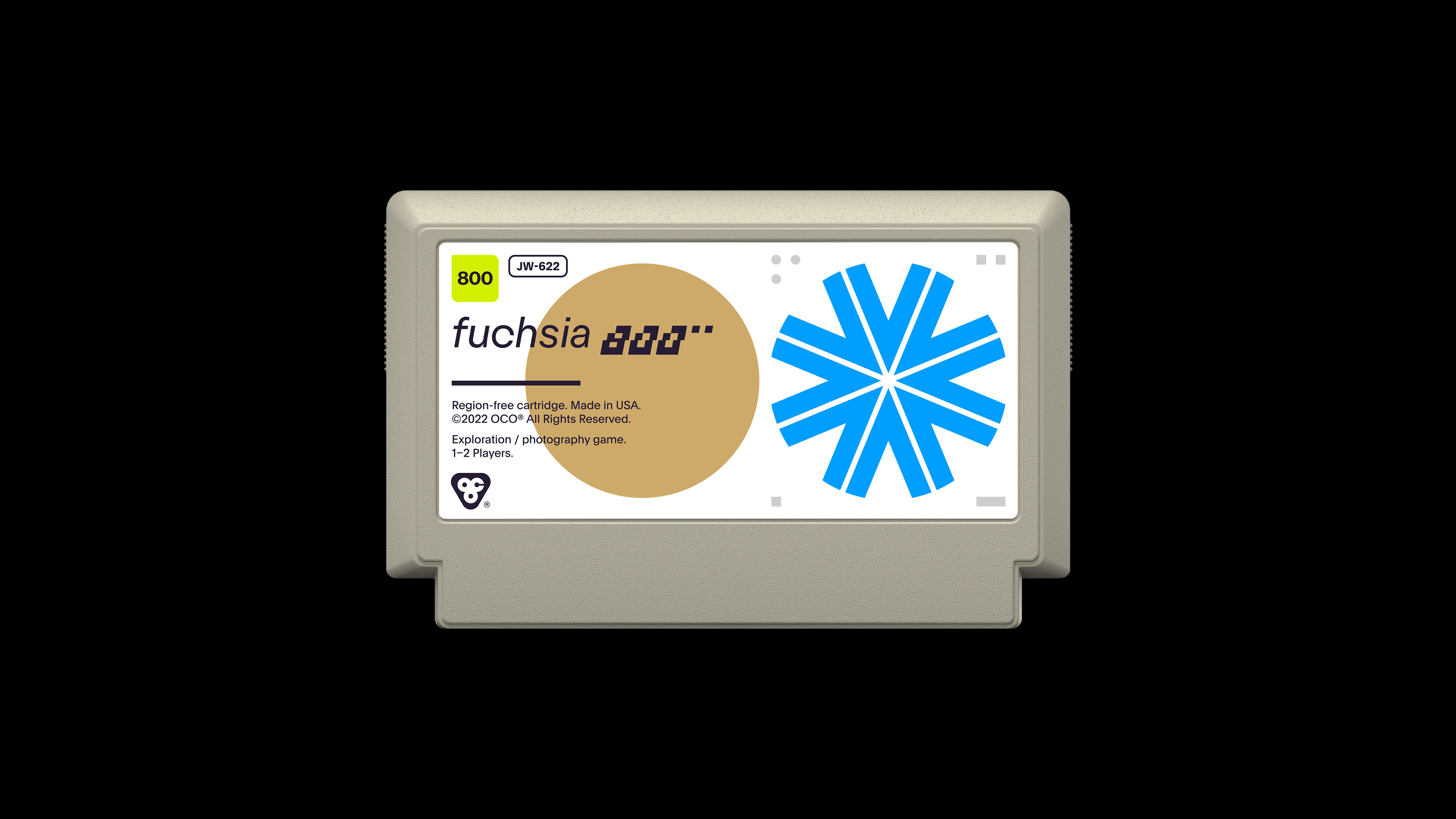
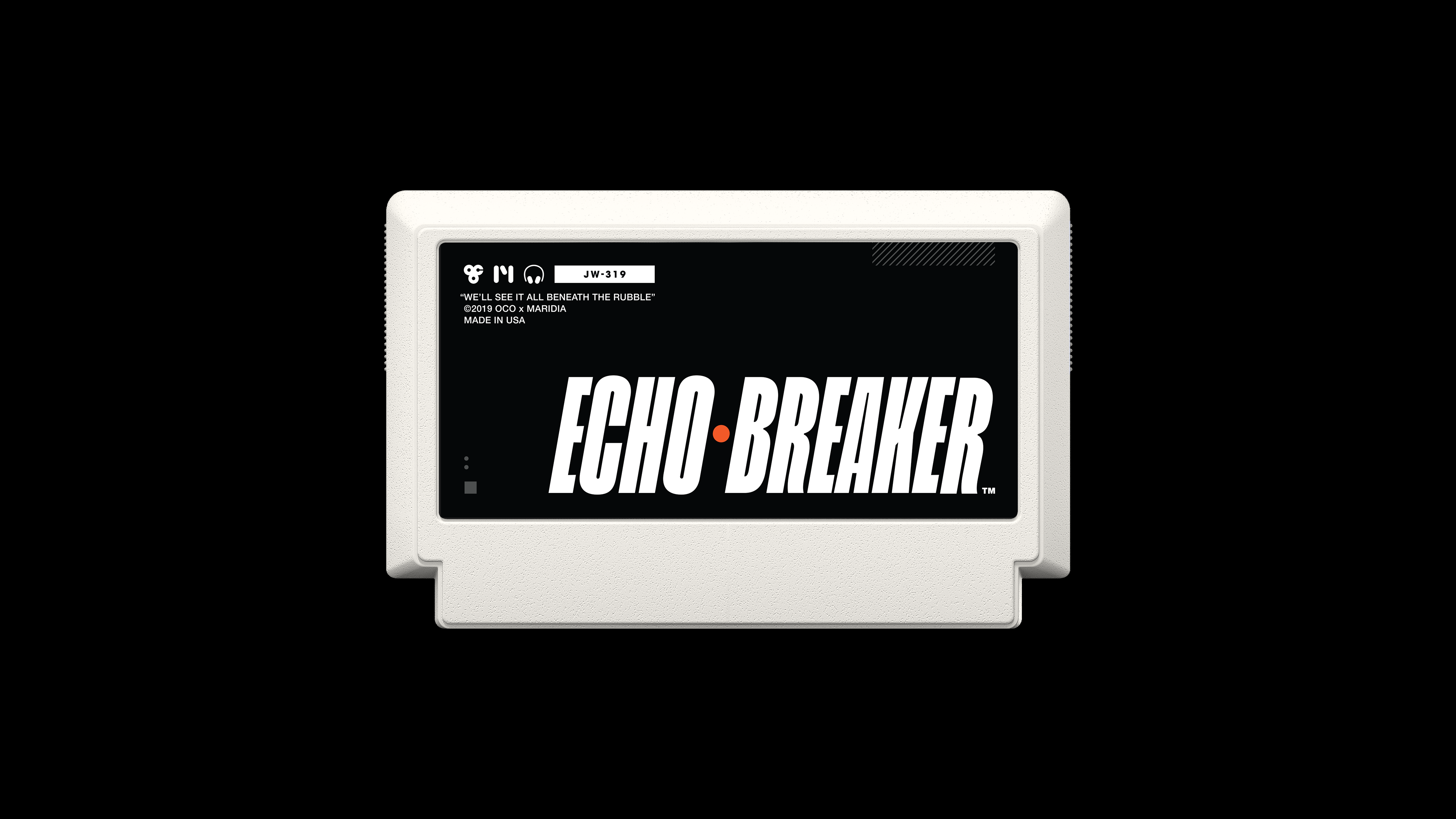
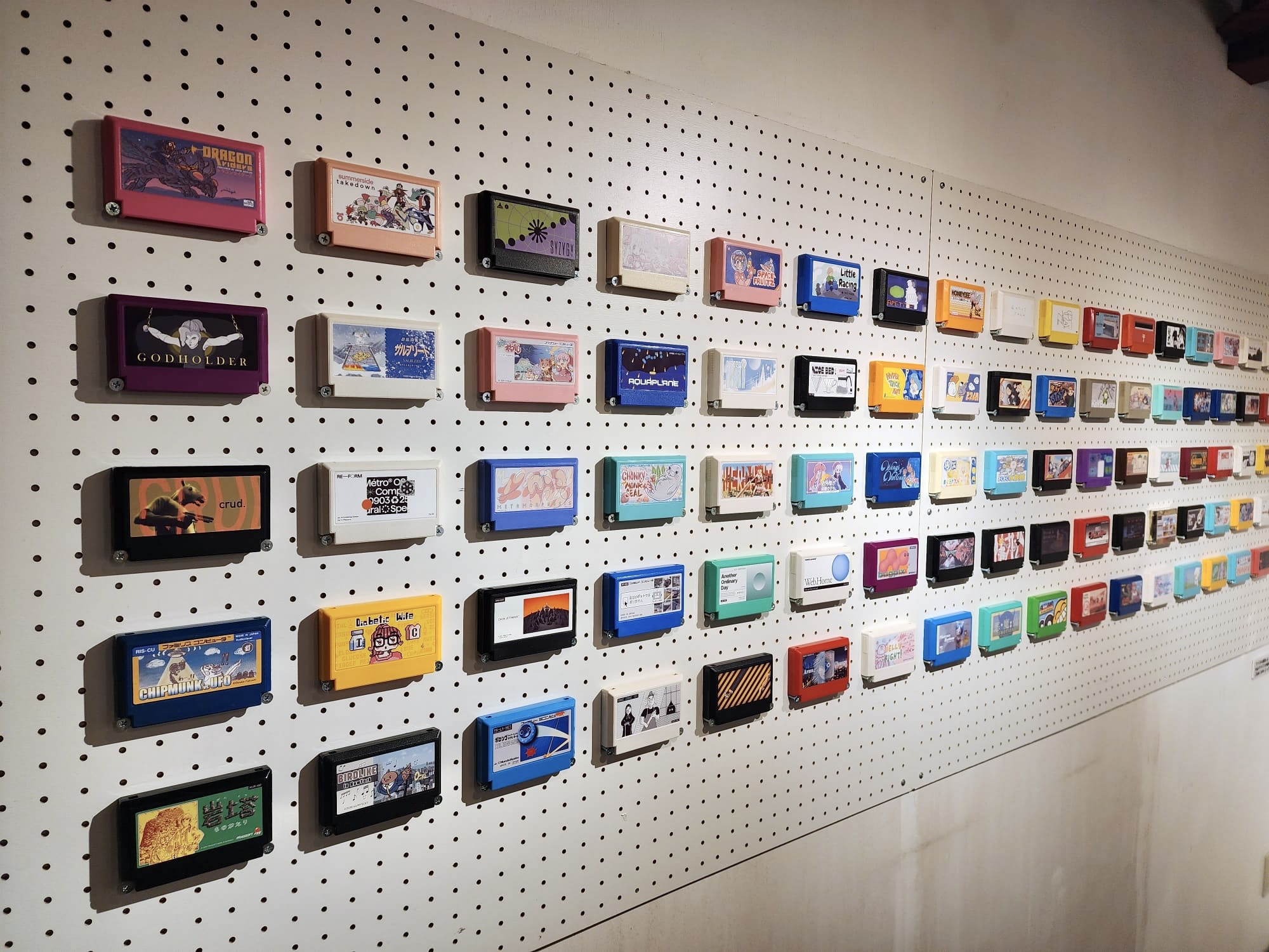
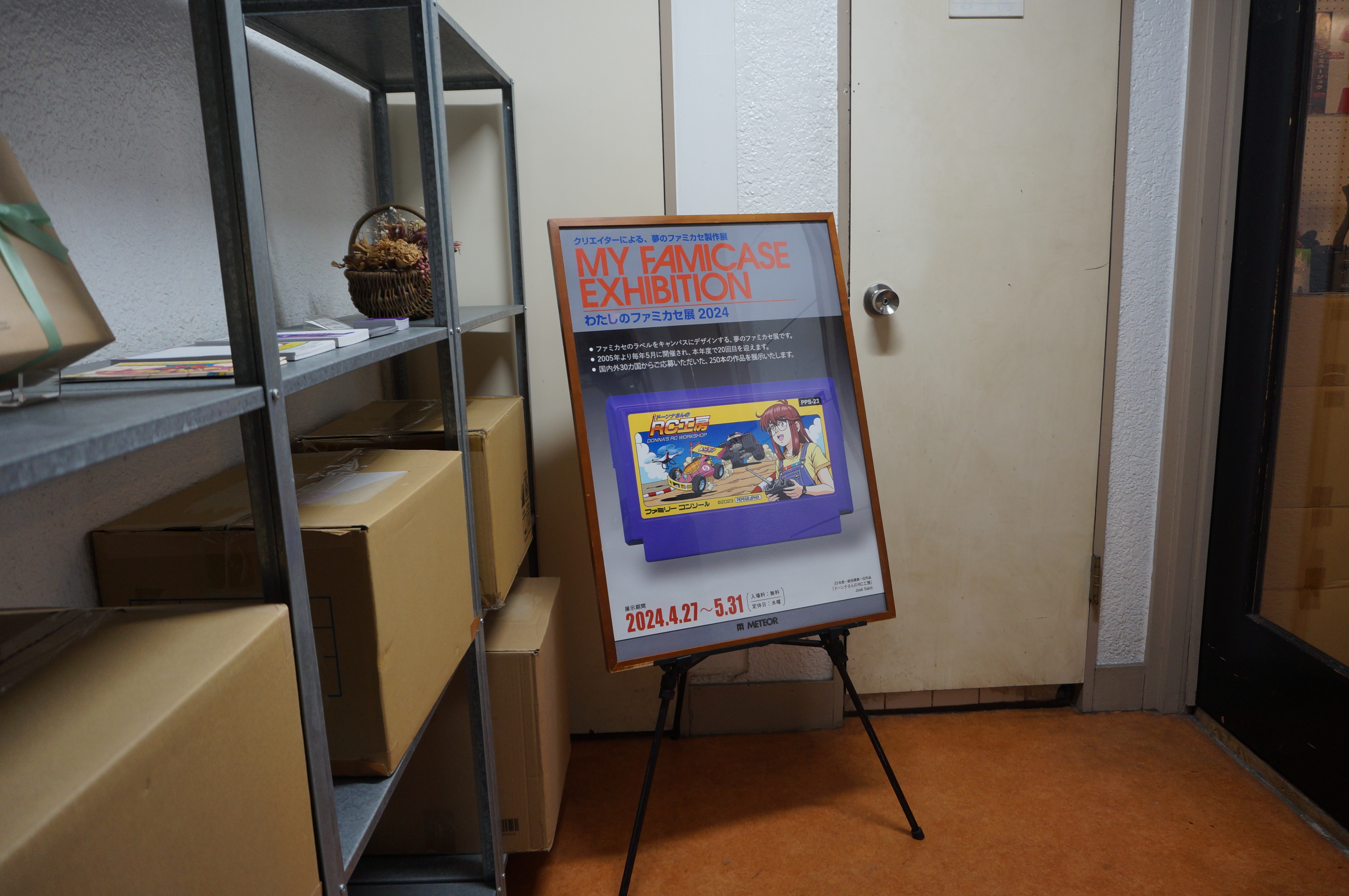
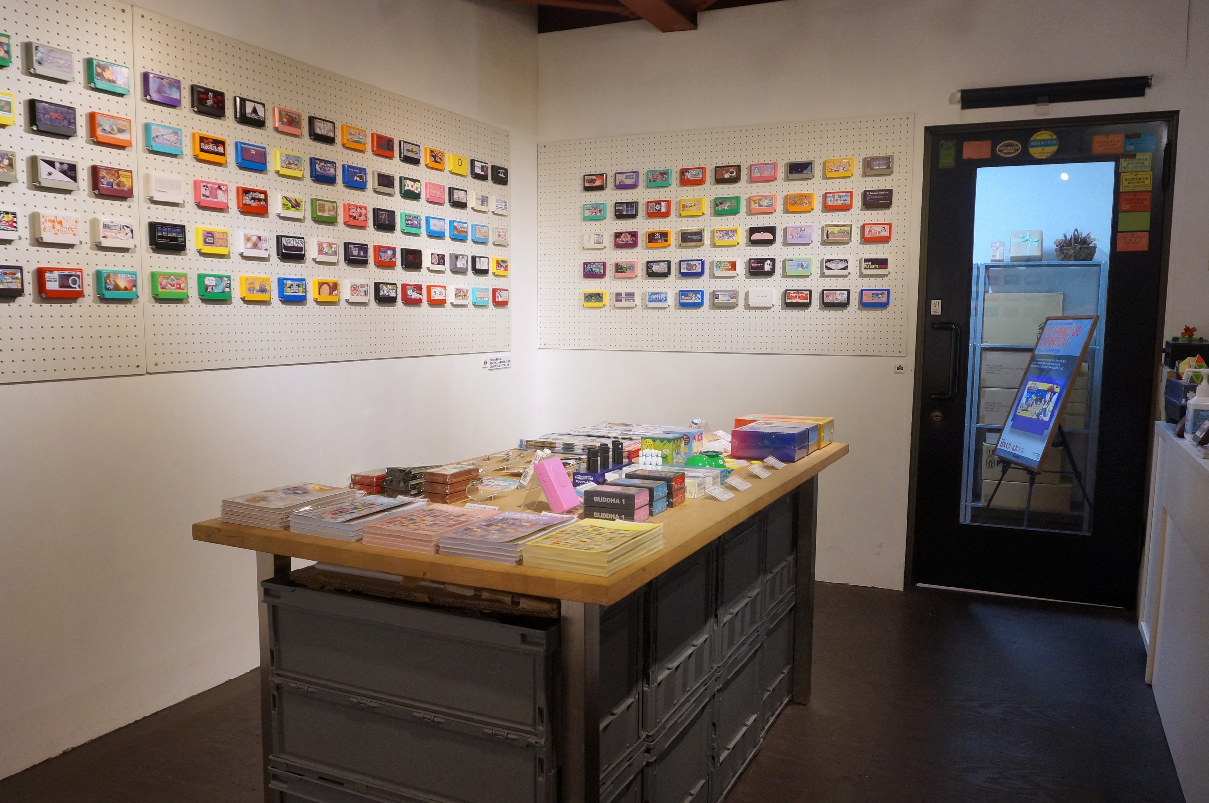
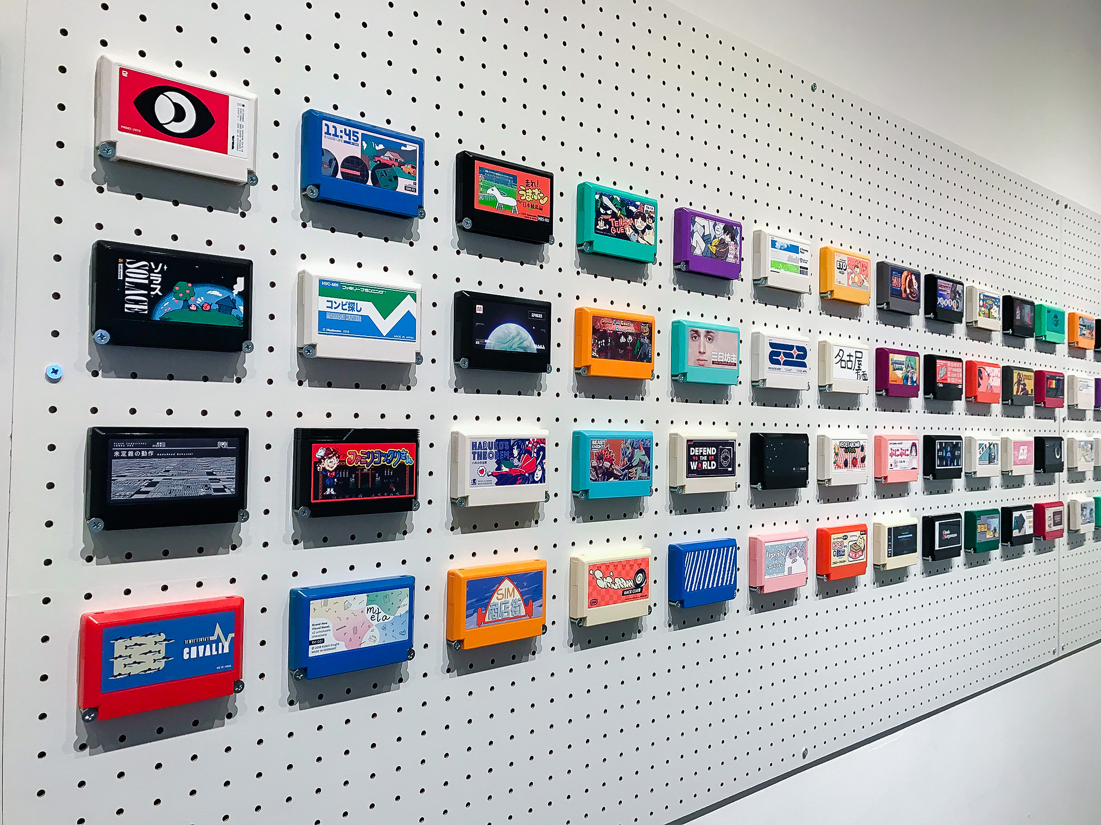
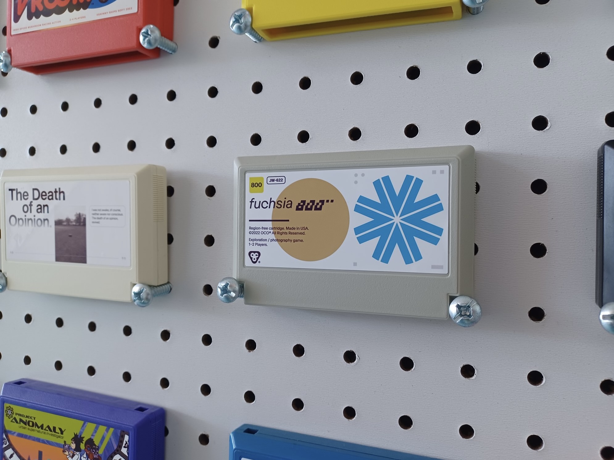
Cartridges for My Famicase Exhibition, an art exhibition in Tokyo where artists and designers create art for fictional Famicom (NES) games.
2025 → FS-03 — RE-FORM
2024 → FS-02 — bit•pivot
2023 → FS-01 — PLOOMISH™
2022 → fuchsia 800
2021 → fuchsia 400
2020 → Plastic Tactics®
2019 → Echo Breaker™
2018 → A Faraway Place
2017 → If Winter Ends
2024 → FS-02 — bit•pivot
2023 → FS-01 — PLOOMISH™
2022 → fuchsia 800
2021 → fuchsia 400
2020 → Plastic Tactics®
2019 → Echo Breaker™
2018 → A Faraway Place
2017 → If Winter Ends


Press
FS-03 — RE-FORM was featured on Aftermath in 2025.
FS-01 — PLOOMISH™ was featured on Kotaku in 2023.
If Winter Ends was featured on Kotaku in 2017.
Photos
Courtesy of METEOR ↗
2025 Photo by Crystal Ly
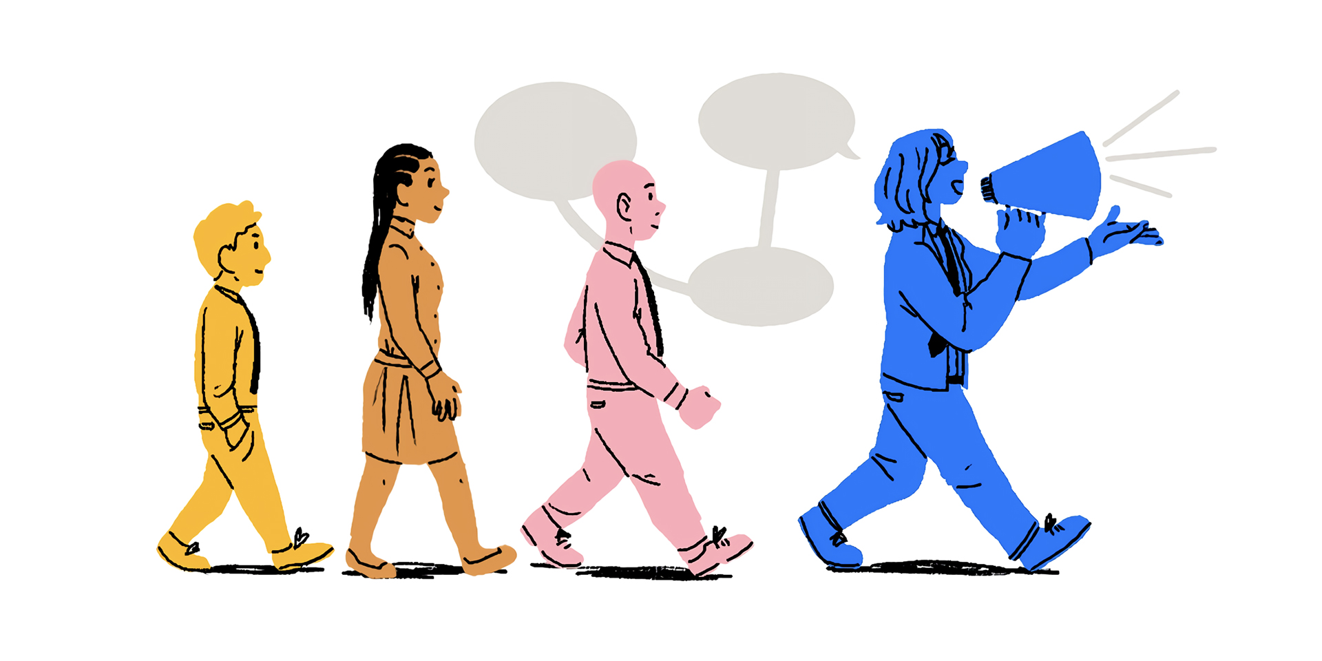
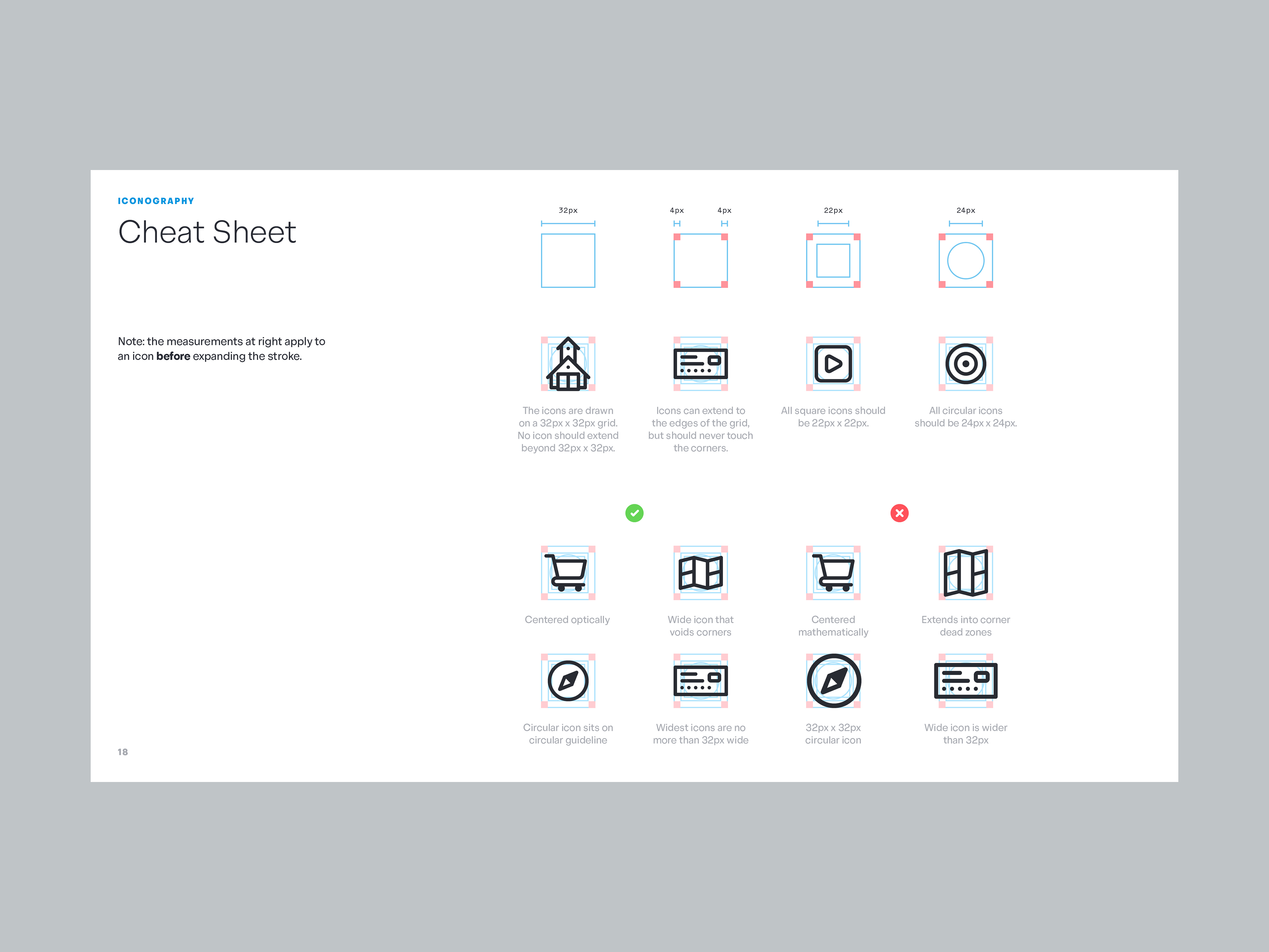
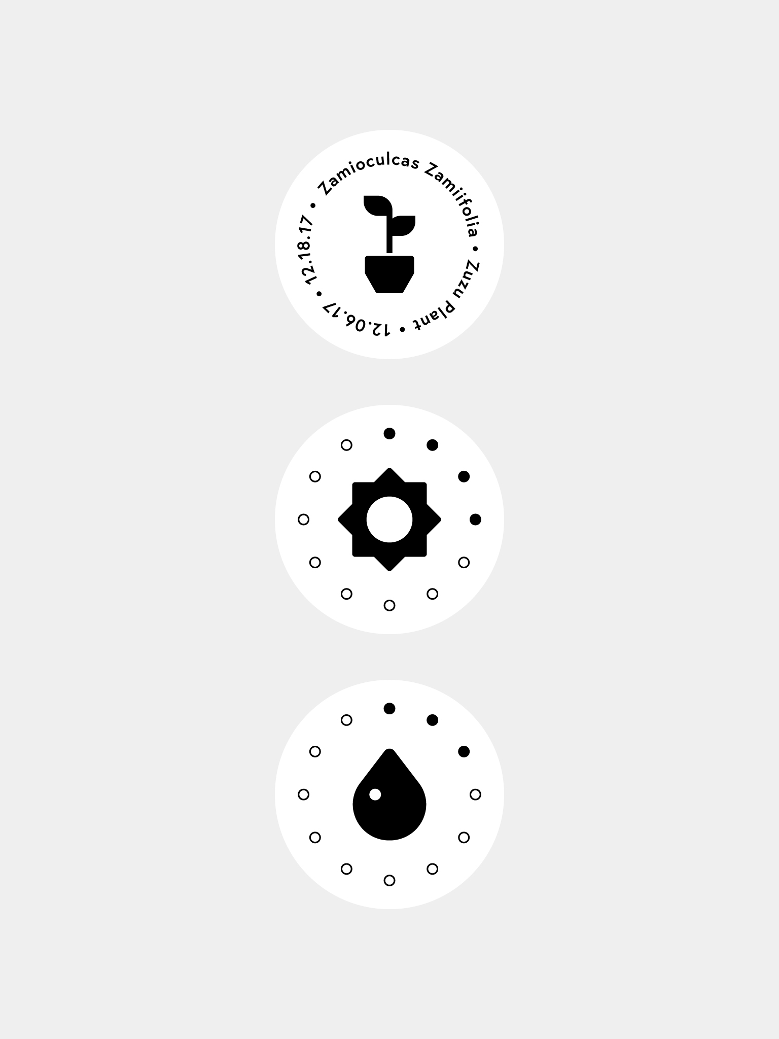
Set of 150+ icons for Pendant, the new HR product from Banzai. I drew the icons as part of Pendant’s larger brand package; although their primary purpose is to quickly communicate ideas in the product, I also wanted them to embody Pendant’s sense of playfulness and good humor.My other stylistic concern was that they harmonize with GT Flexa, Pendant’s brand type family: for that reason, the icons use a simple geometric base with little refinement. Square shapes maintain their sharp corners, and round shapes use an exaggerated ‘squircle’ form that mirrors Flexa’s circular glyphs.
As with all my icon projects, I’ve developed an underlying grid system and ruleset to maintain consistency across the whole icon set, regardless of who adds to it in the future.
Related Projects


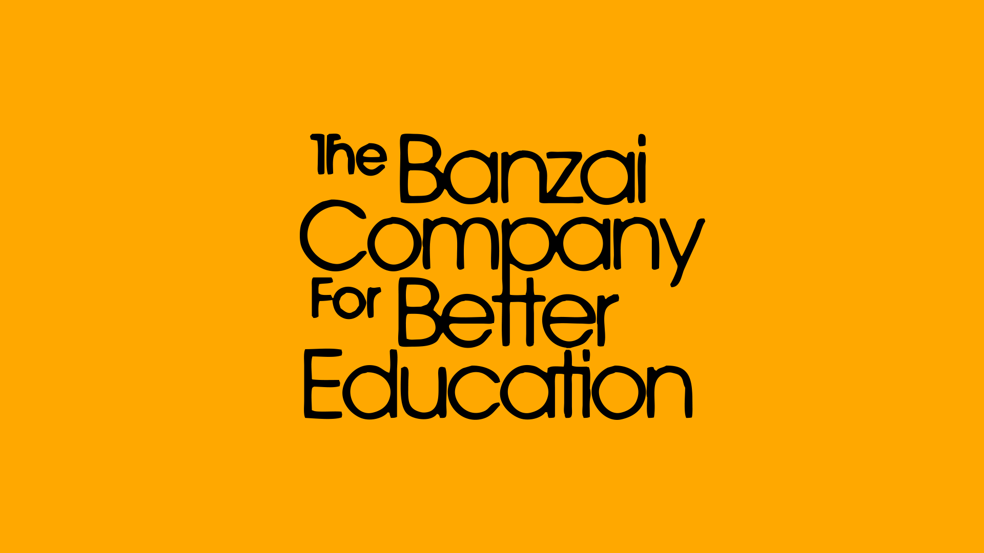
Logo, strategy, iconography, and art direction for Banzai’s brand refresh.After completing work on Pendant’s visual identity and foundational product design, I was tasked with refreshing Banzai’s visual identity.


Illustrations by Chepe Daniel ↯


Credits
Development
Kendall Buchanan
Zac Boswell
Mardo Del Cid
Jared Daines
Jeremy Sellars
Curtis SummersAdditional Design
Sarah Moffat
Greg Soper Product Design Management
Casey Jex Smith Copywriting
Nikole Rios
Kayla Czappa Illustration
Chepe Daniel Illustration Art Direction
Cristi Cash
Kendall Buchanan
Zac Boswell
Mardo Del Cid
Jared Daines
Jeremy Sellars
Curtis SummersAdditional Design
Sarah Moffat
Greg Soper Product Design Management
Casey Jex Smith Copywriting
Nikole Rios
Kayla Czappa Illustration
Chepe Daniel Illustration Art Direction
Cristi Cash
Similar Projects
Set of 400+ icons for Banzai, the life literacy company. This icon set is an update of previous work I had done for Banzai in 2019. For V3, drawn as part of a larger brand refresh, I wanted to create a set of icons that would last Banzai for years to come.
I wanted the new icons to (1) refine the icons I had already drawn for Banzai, (2) achieve parity with the Pendant Icons I drew for Banzai’s sister product, and (3) work in harmony with VC Cardinal, Banzai’s brand typeface.
In reality, Banzai Icons go far beyond what I did for Pendant, with more than twice as many icons in the set. Both icon sets are built upon the same grid system, though, so designers on either product can switch between them with ease.To capture Banzai’s friendly, enthusiastic voice, the icon set is built on a geometric base, with rounded corners and rounded stroke caps. The icons cover common UI- and product-related needs, as well as depicting objects from Banzai’s real-world life scenarios.
I also developed a set of guidelines for other designers to follow for adding new icons to the set.
Related Projects
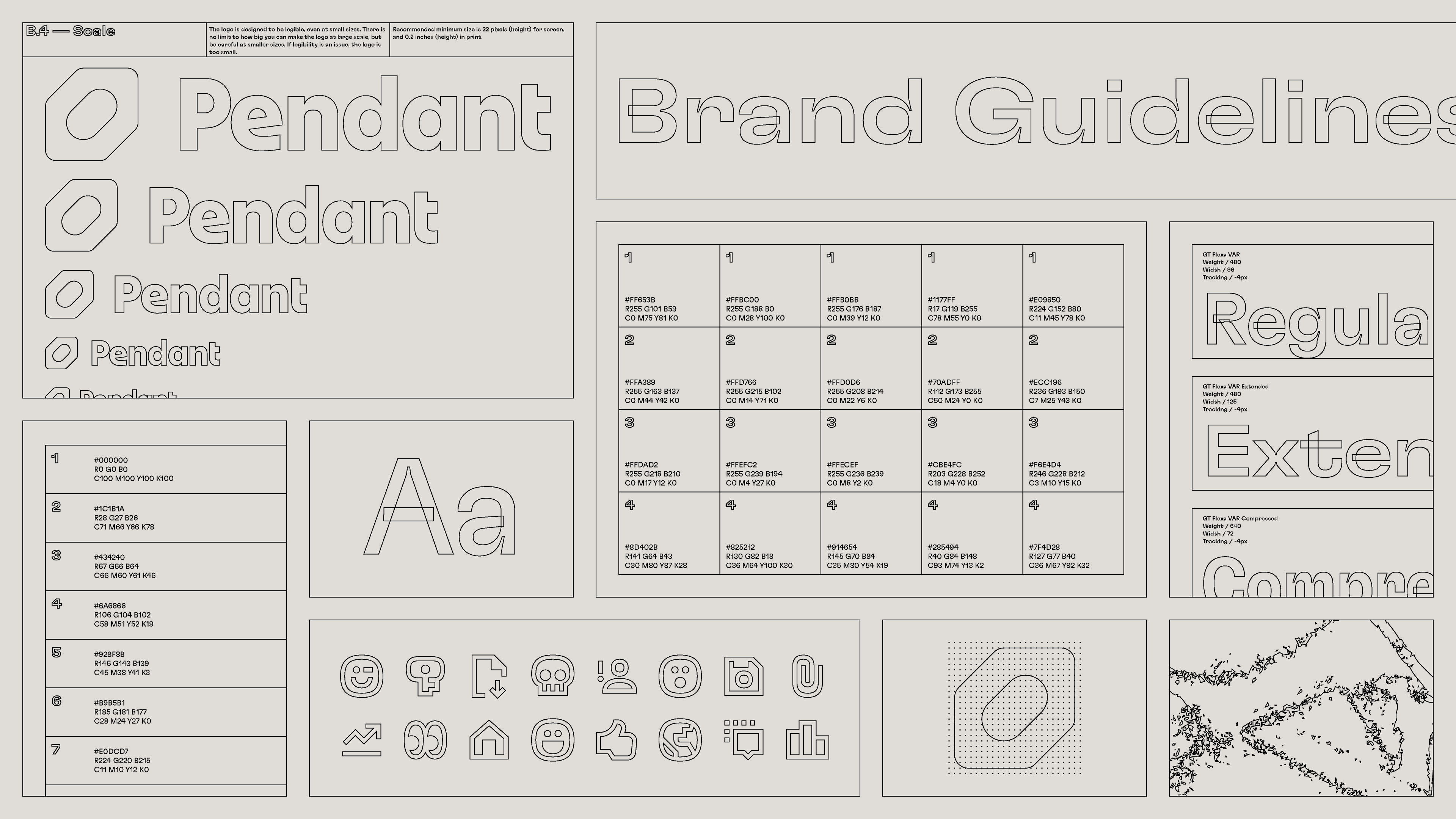

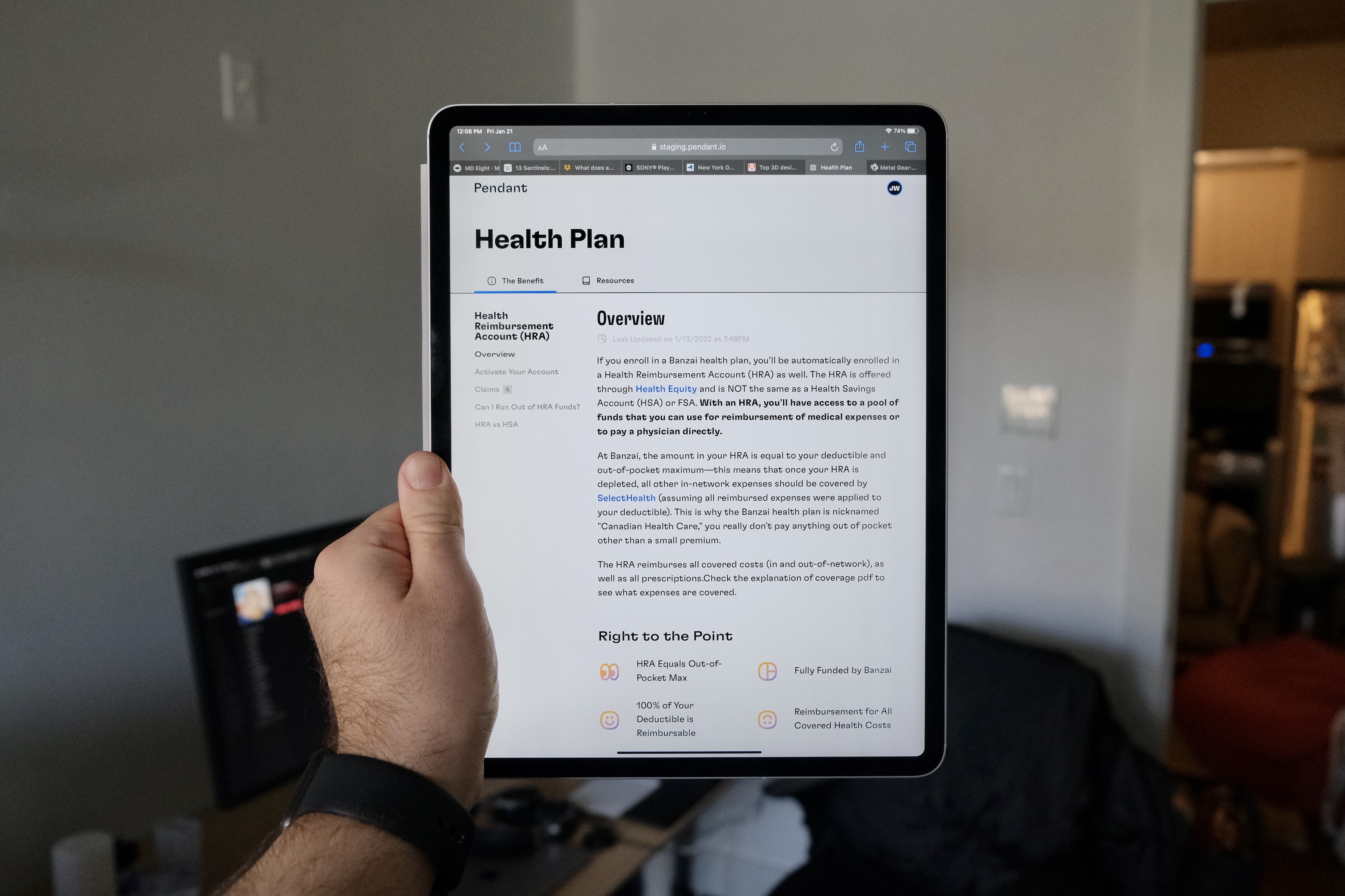
Brand guidelines for Pendant. The guidelines outline proper usage of Pendant’s brand assets, including logo, color, typography, and so on.
Unlike past style guide projects I’ve worked on—which were simple PDFs I wrote and laid out in InDesign—I built this document in Figma with the intention of publishing and sharing it online.
You can view some samples below, or view the guidelines in Figma.
Related Projects
Goofy Industries
Client: My Friends
2023
Client: My Friends
2023
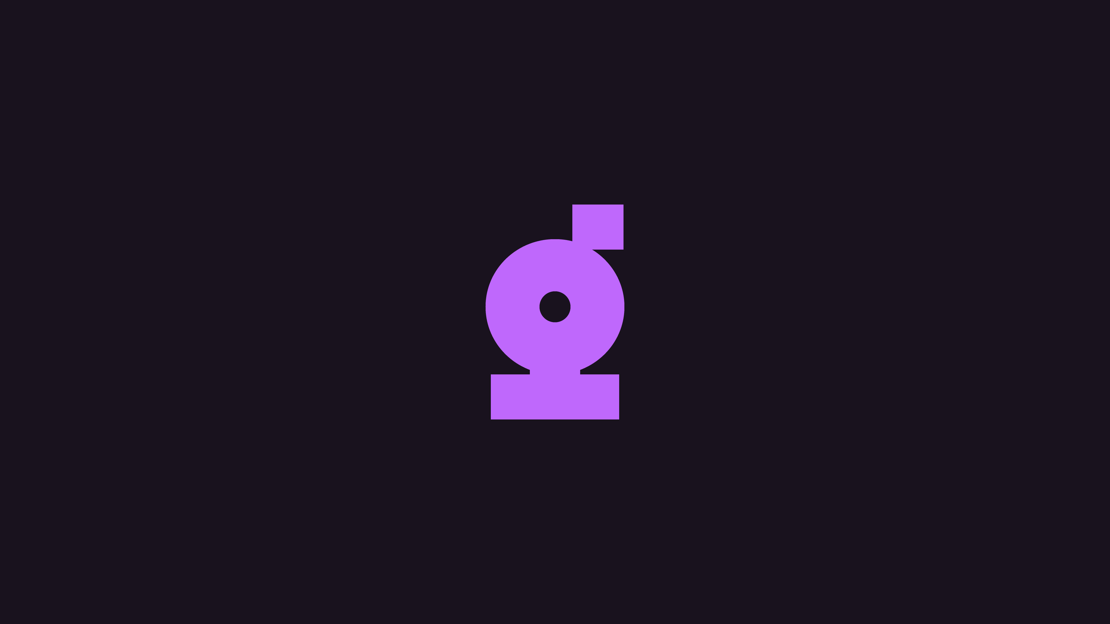
Name and logo for Goofy Industries, a fictional corporation that trades in post-dystopian human interactive experiences.
I drew this logo as part of a collaborative project with some friends of mine.
I drew this logo as part of a collaborative project with some friends of mine.

Related Project
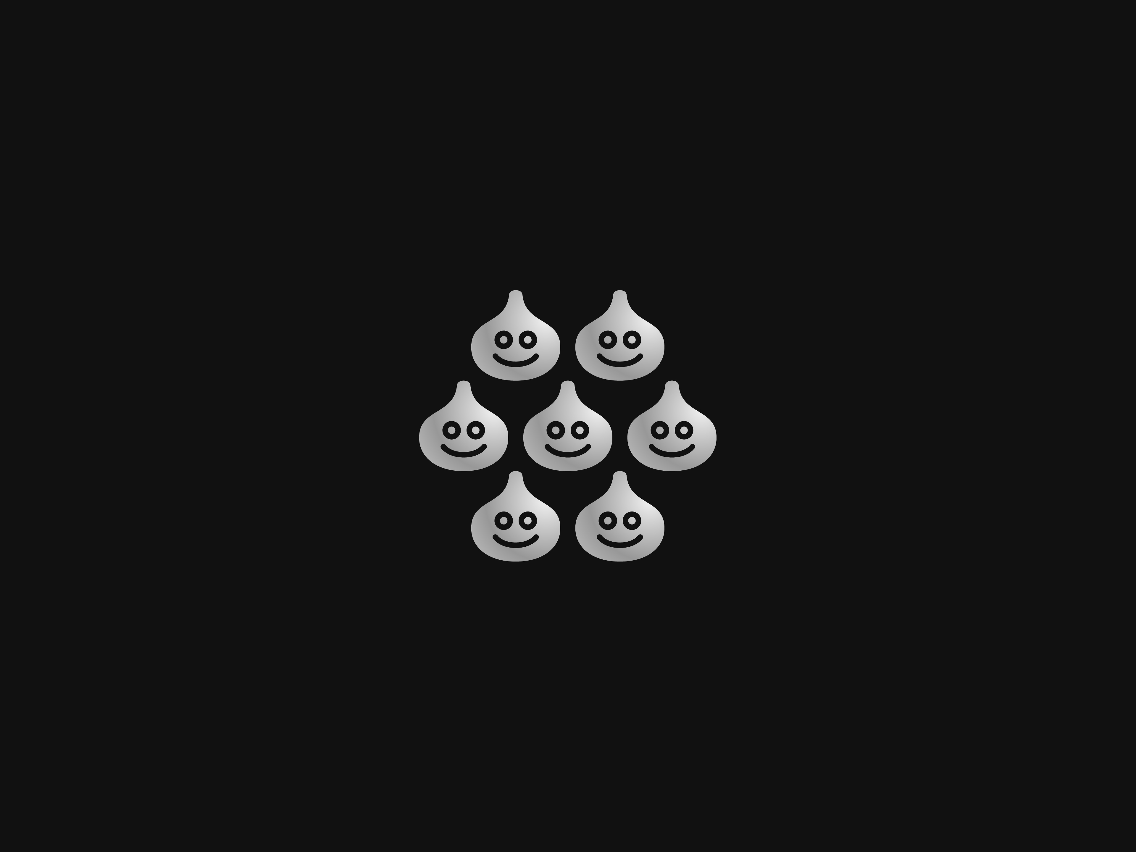
Dragon Quest Monsters
Client: Self-initiated
2021 → Ongoing
Client: Self-initiated
2021 → Ongoing
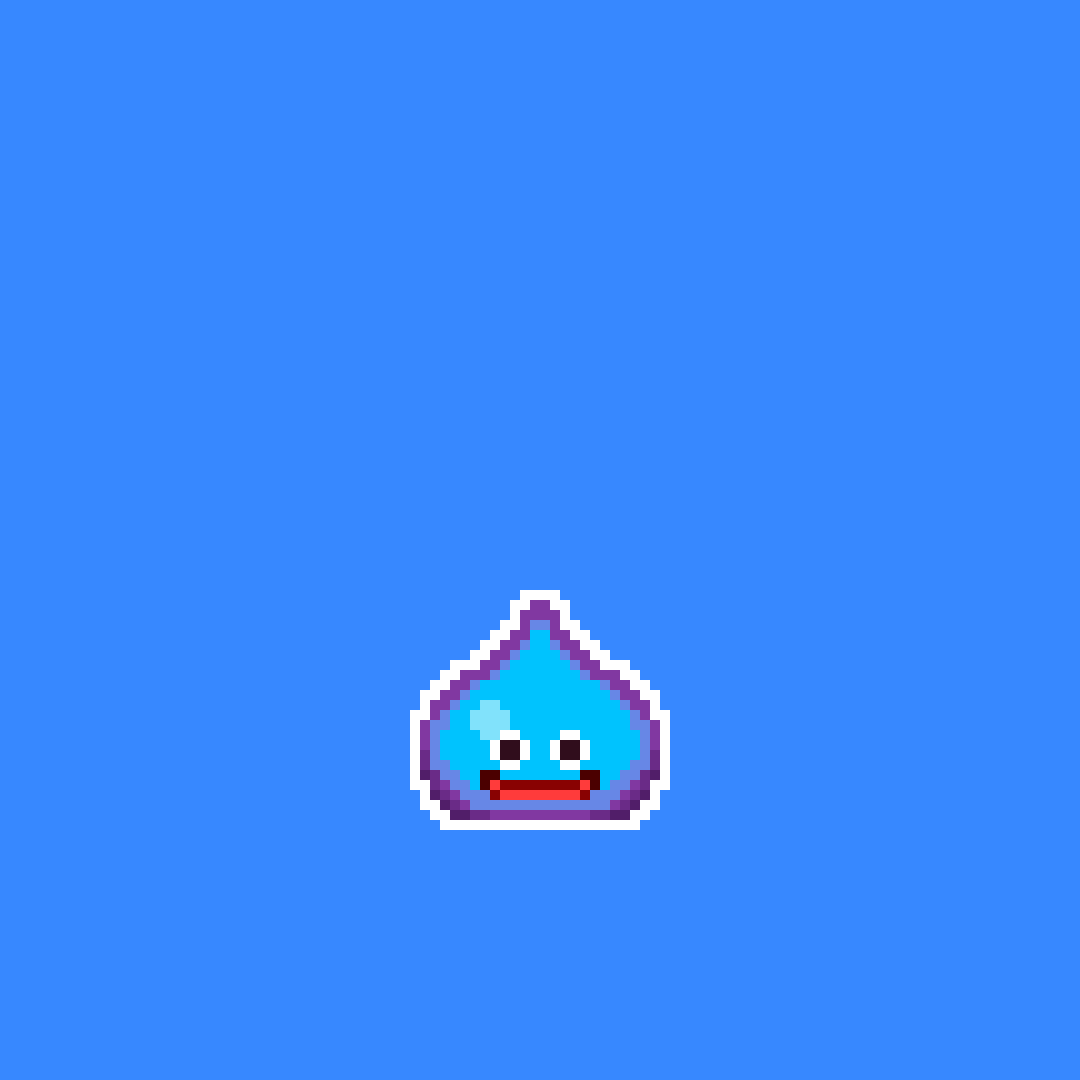
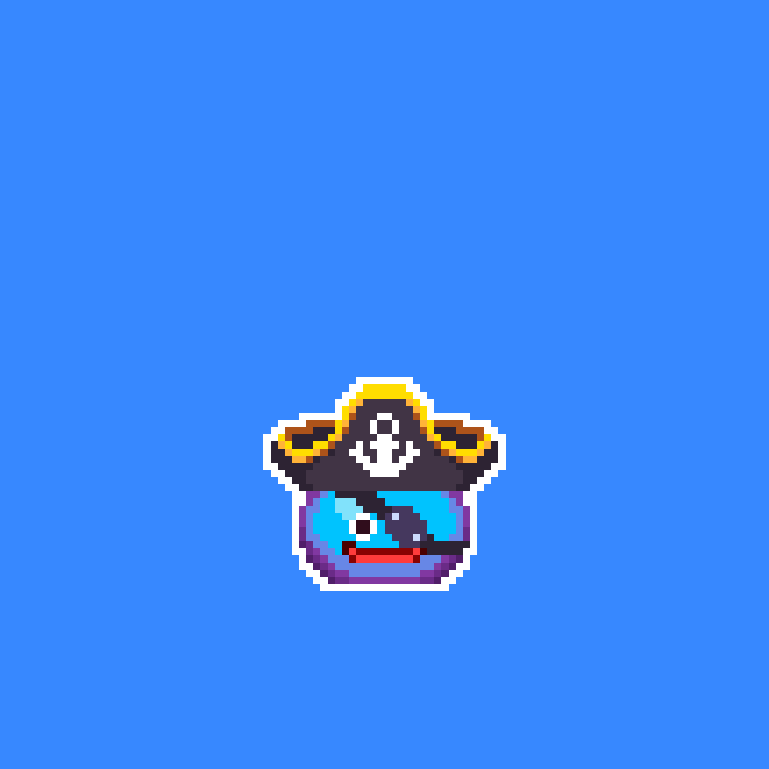
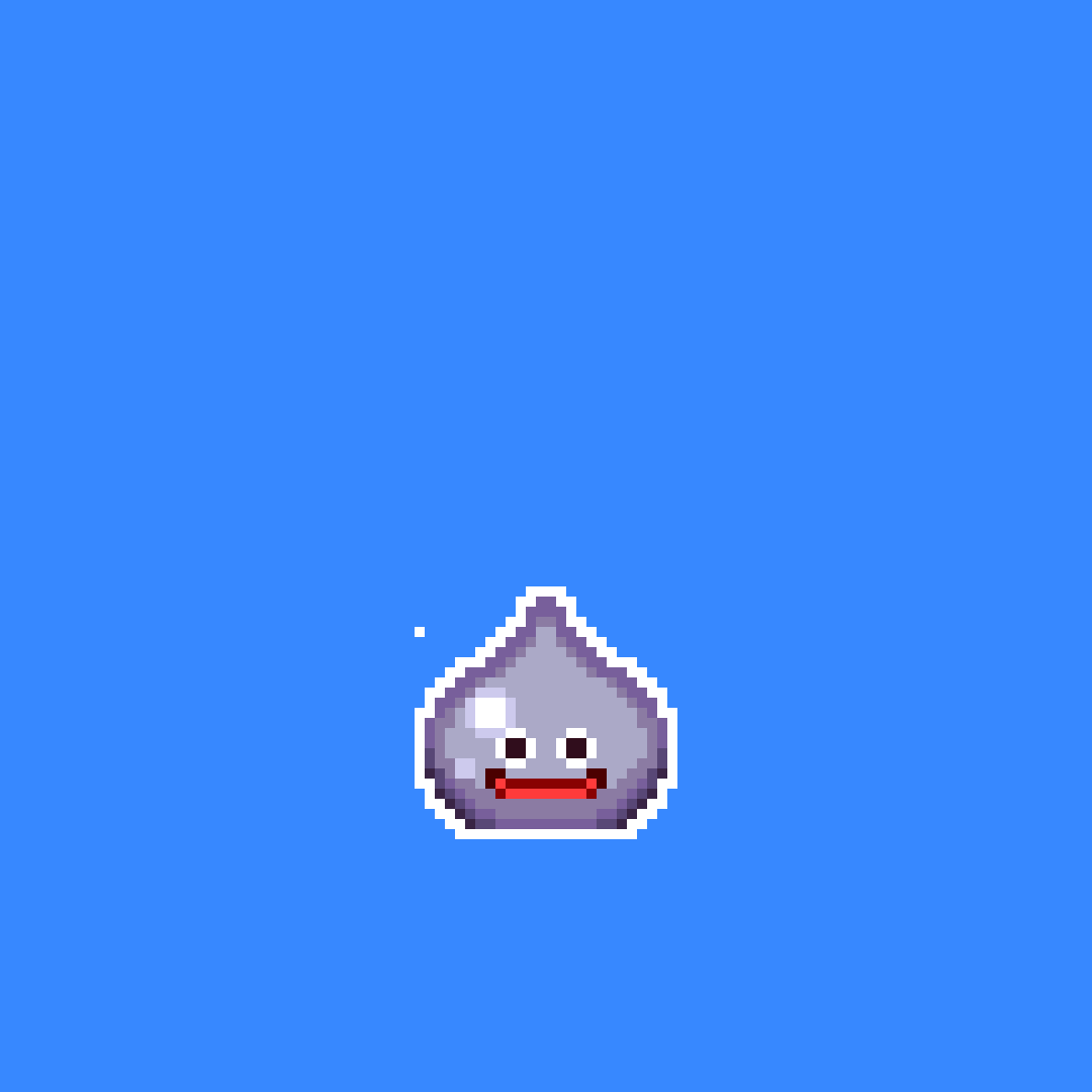
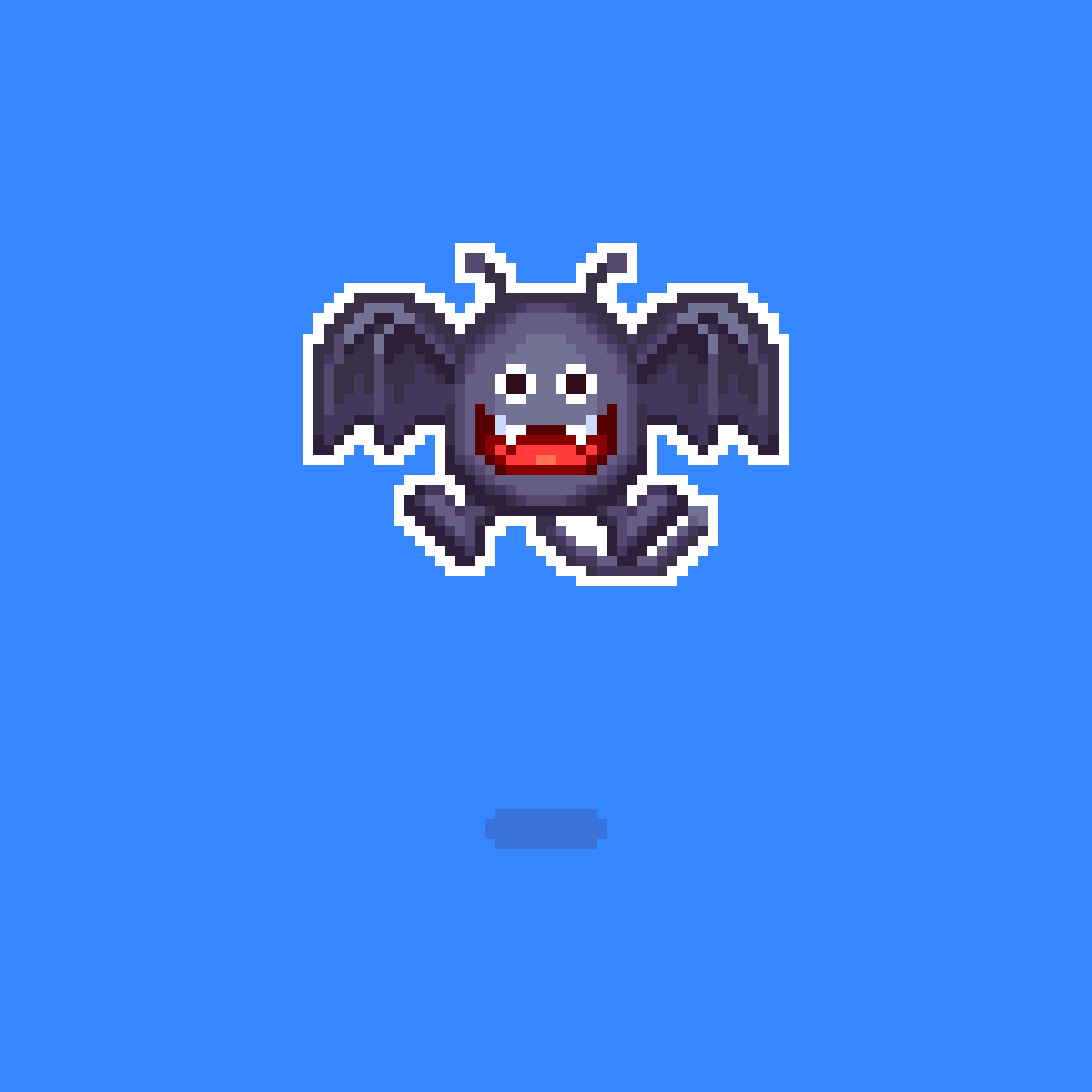
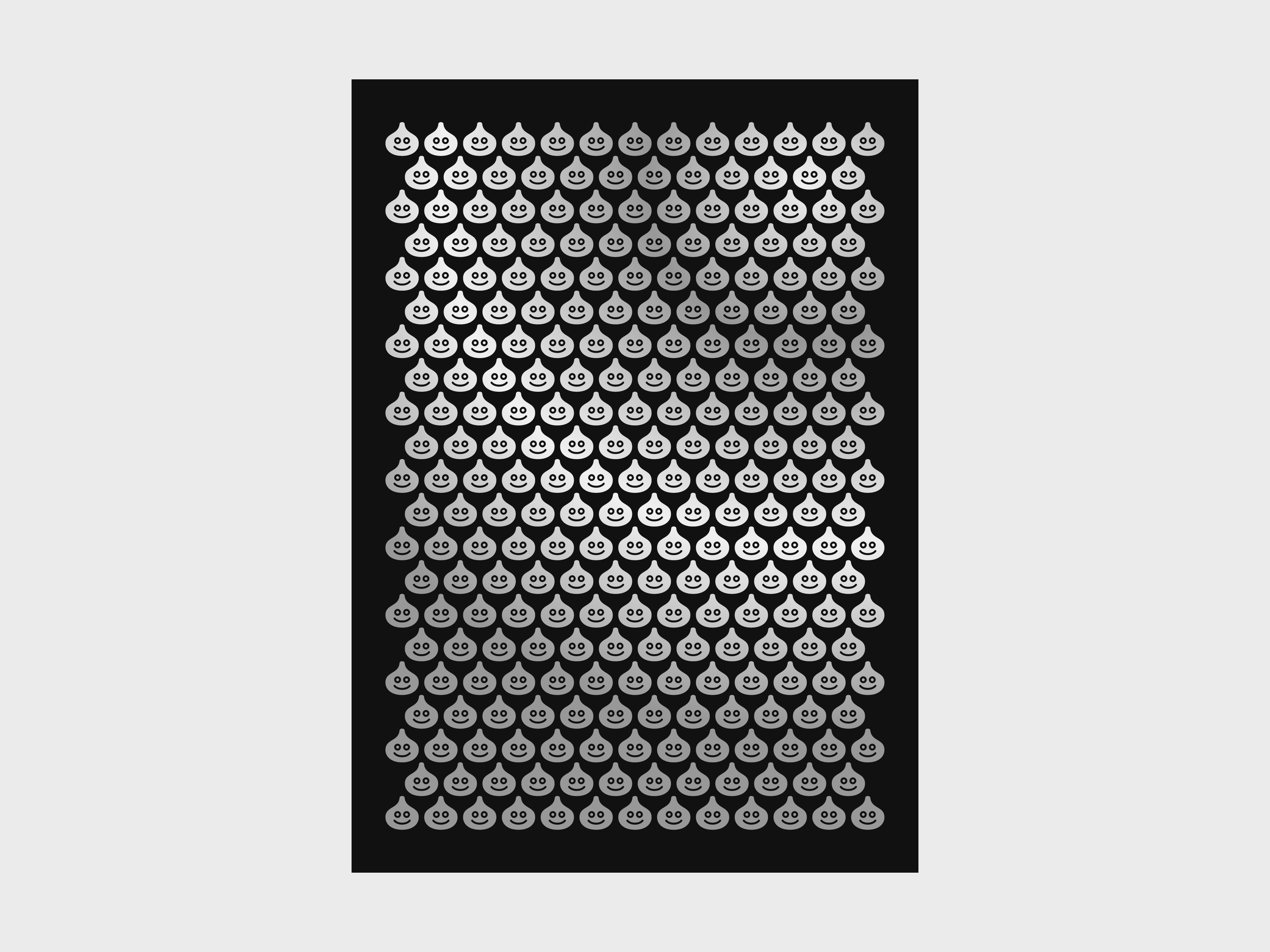
Animated pixel art loops of various monsters from the Dragon Quest series. Done for fun to celebrate my favorite game series’ 35th anniversary.
The perspective, animation, and styling are meant to mimic Dragon Quest’s battle scenes.
Illustrated and animated in Aseprite. Monsters originally designed by Akira Toriyama.💧 Work in progress. More images coming soon. 💧 Related projects → DQ-001, Mushroom Kingdom Pixels
Illustrated and animated in Aseprite. Monsters originally designed by Akira Toriyama.💧 Work in progress. More images coming soon. 💧 Related projects → DQ-001, Mushroom Kingdom Pixels
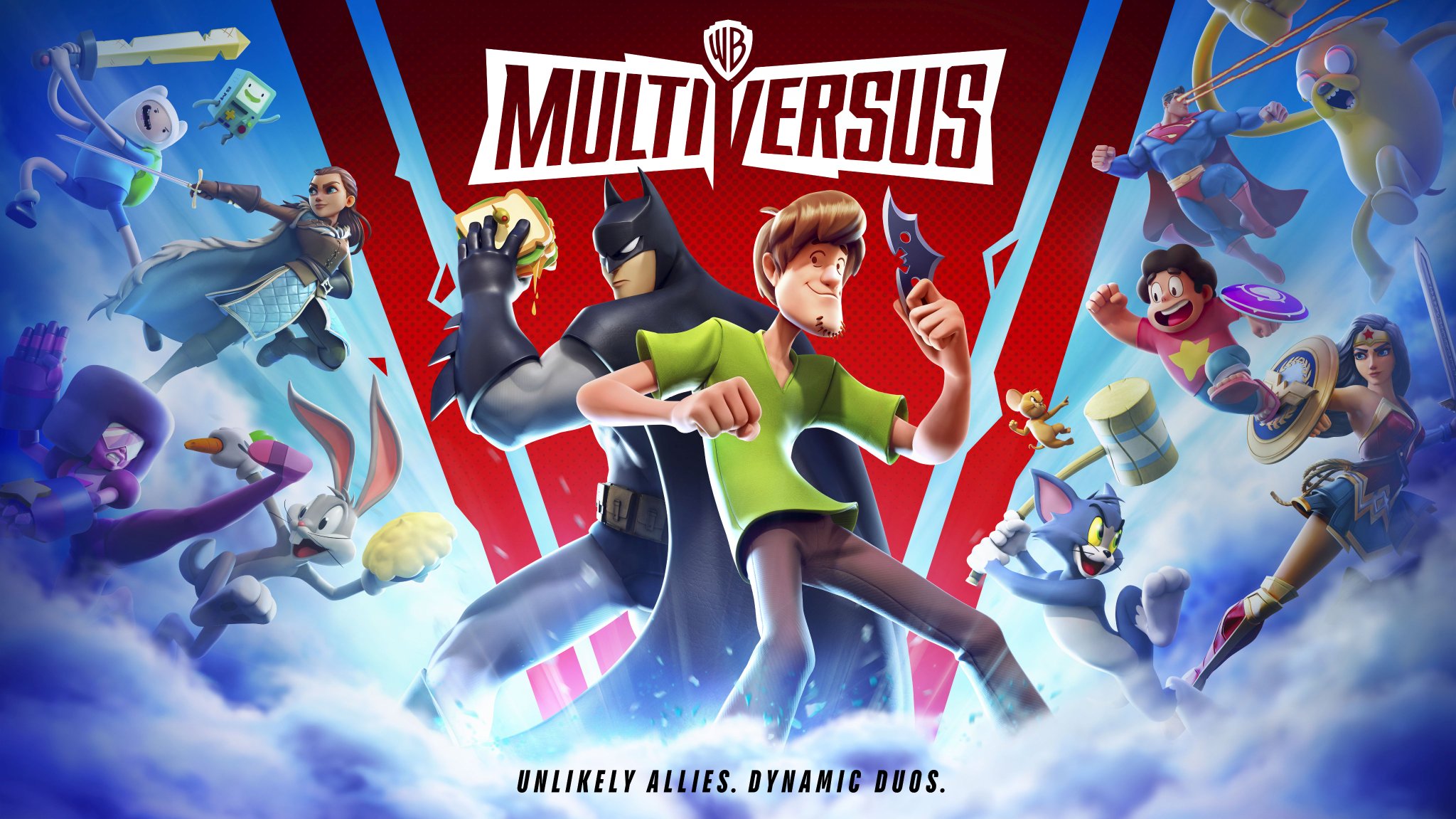
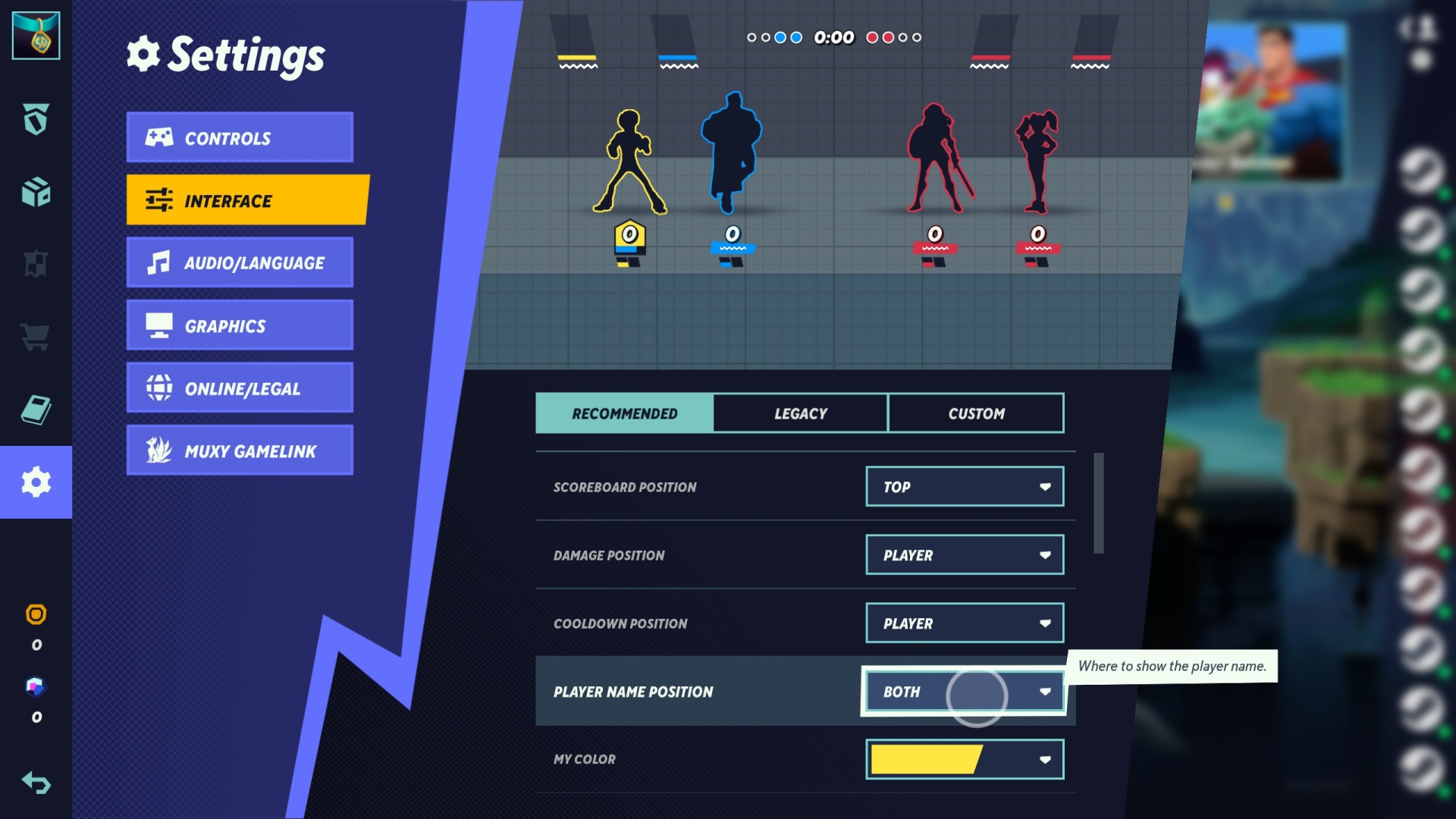
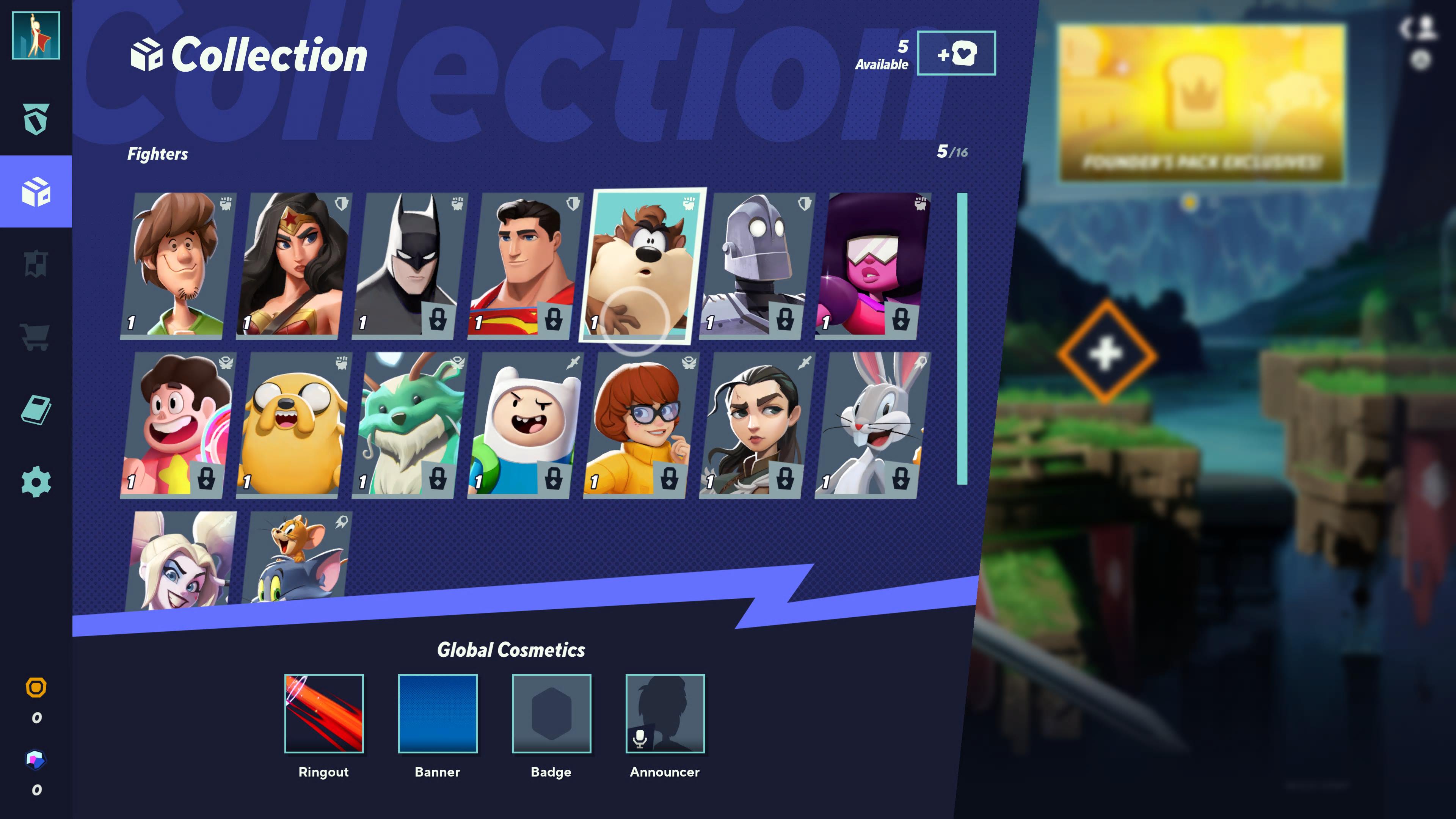
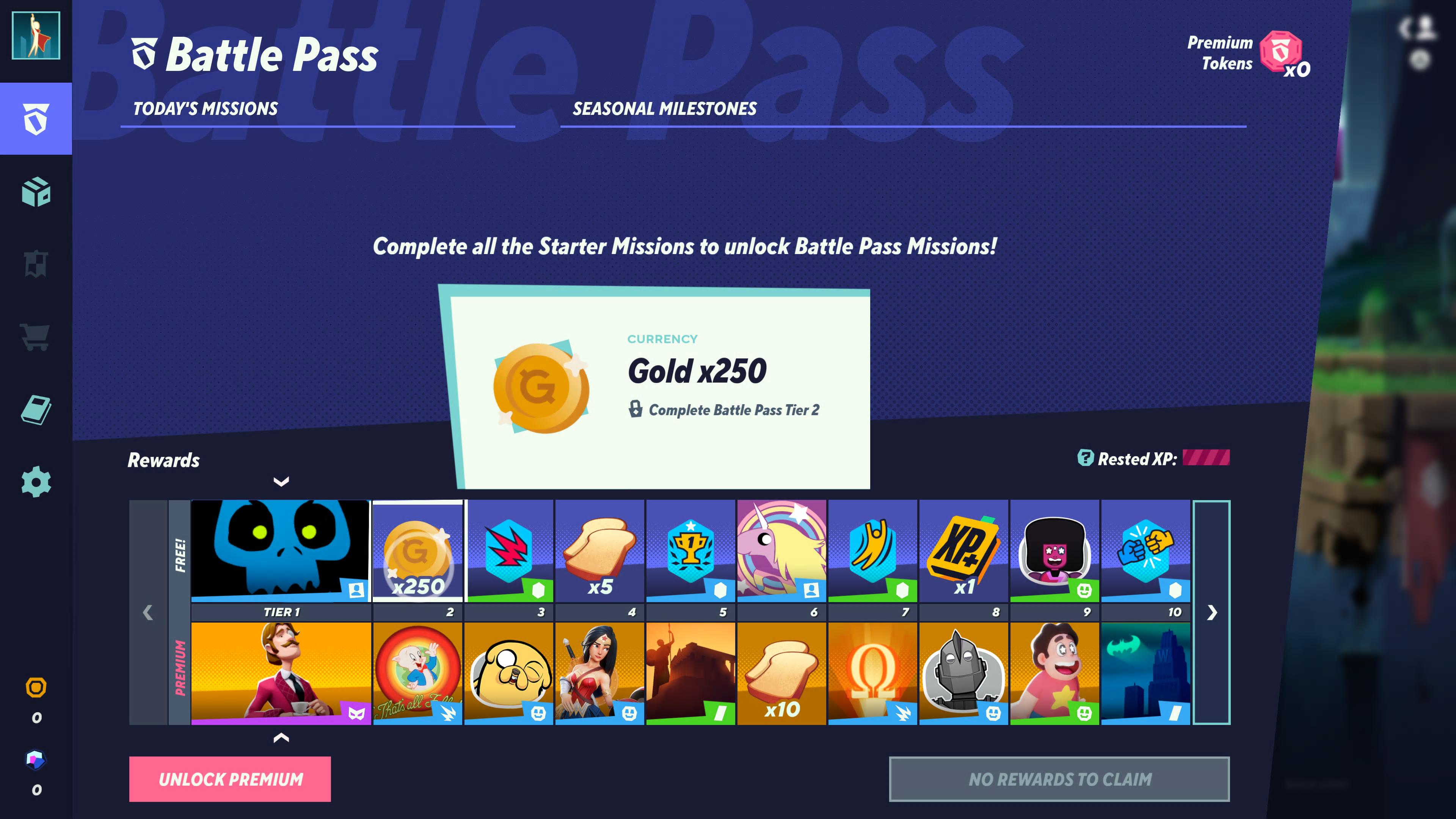
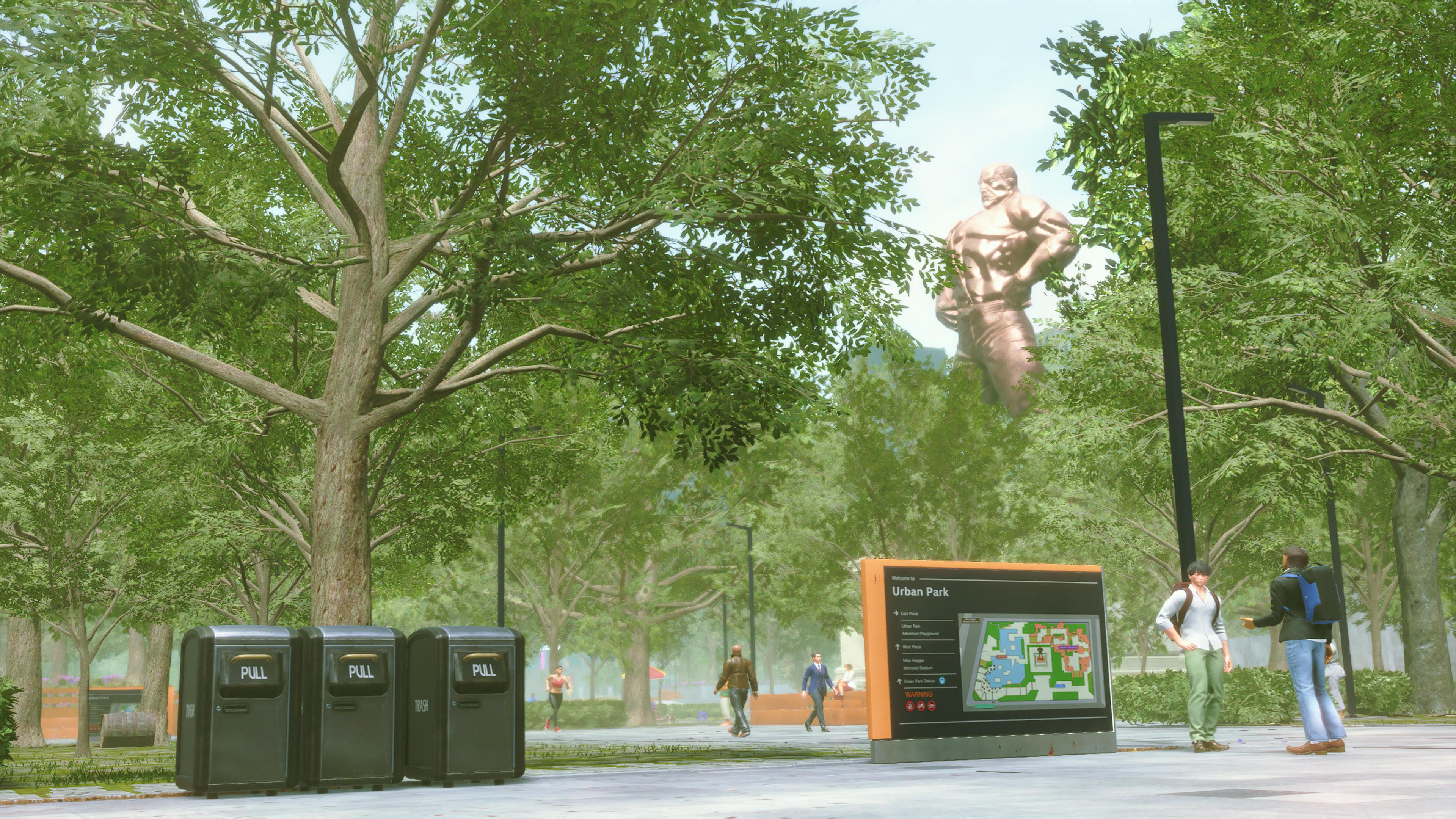
UI design work and iconography for Multiversus, the Warner Bros. platform fighter developed by Player First Games.I worked as a contract UI designer on Multiversus. I helped define the look and feel of the game’s interface, typography, and color palette. I also drew a set of icons which can be seen throughout Multiversus’ UI and marketing collateral.
Multiversus won Best Fighting Game at the 2022 Game Awards (and was nominated again for the same award in 2024).
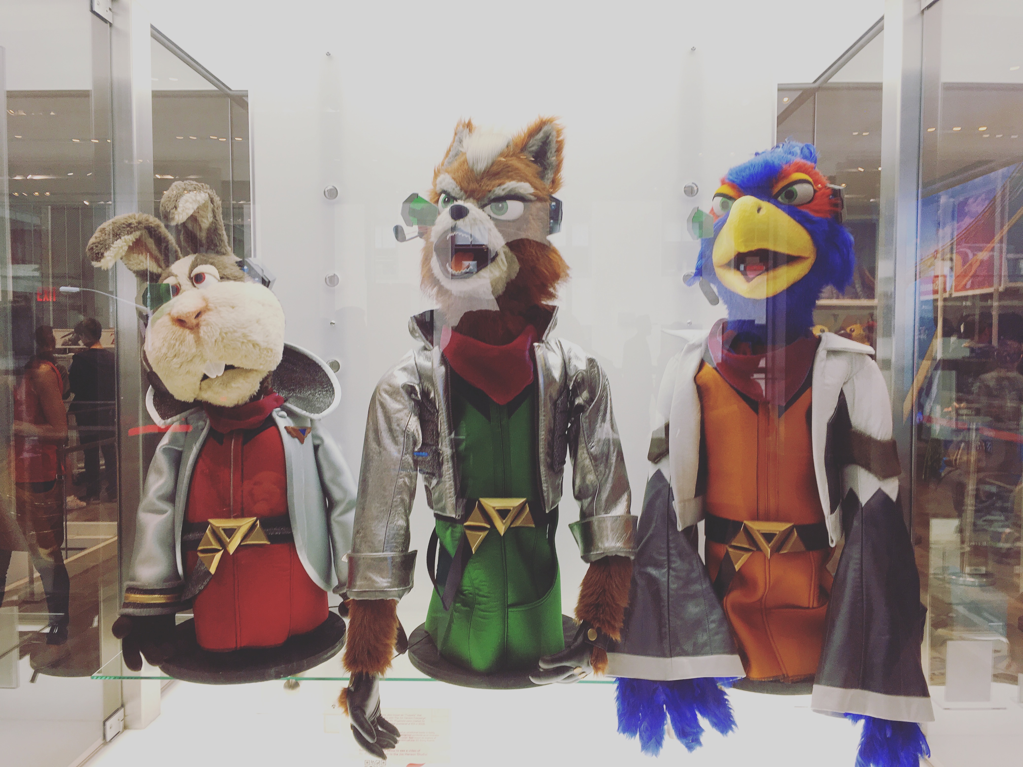
Game screens by WB Games / Player First Games ↯
Lead UX / UI Designer
Principal UI Artist
Similar Project
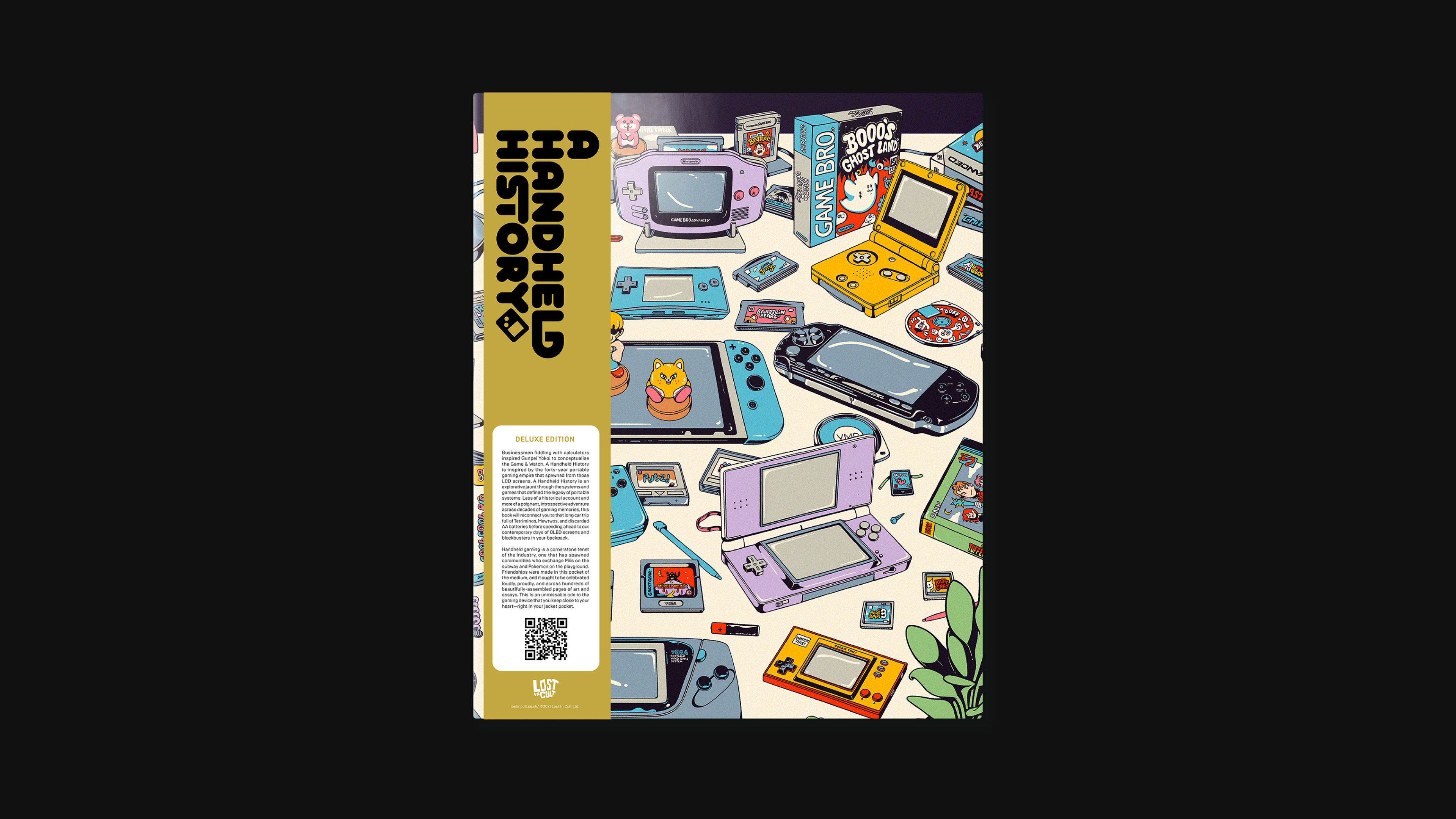
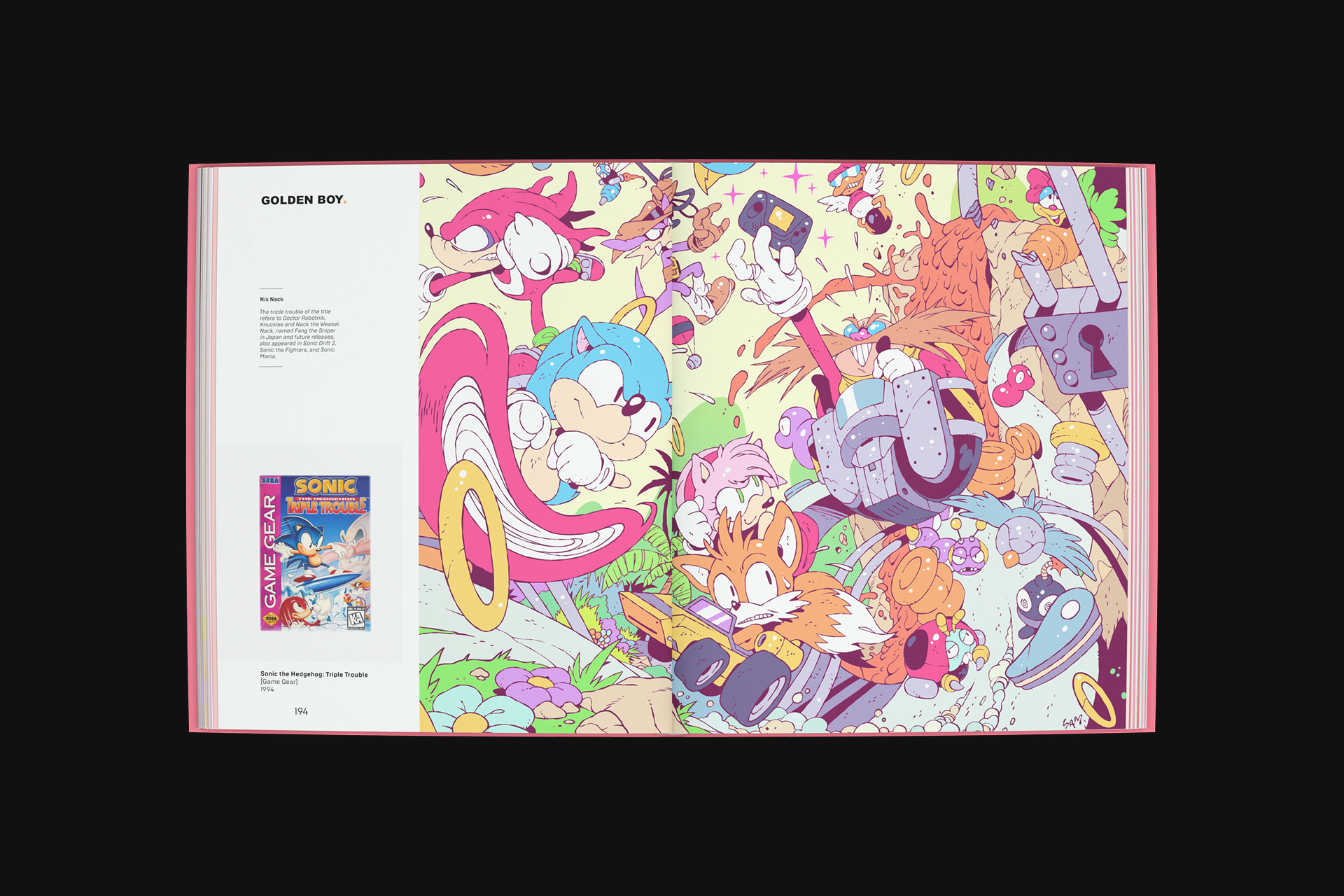
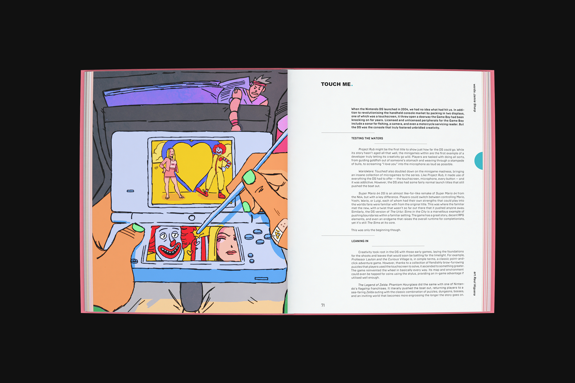
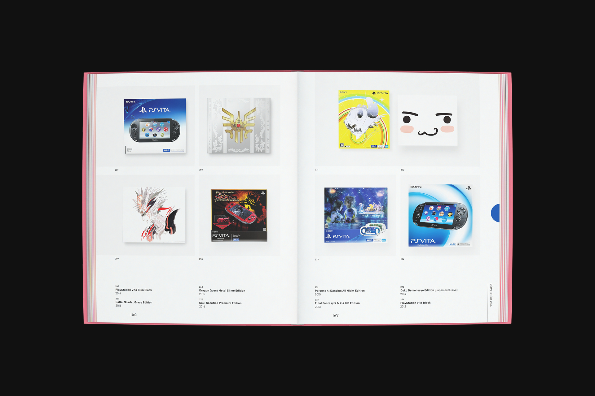
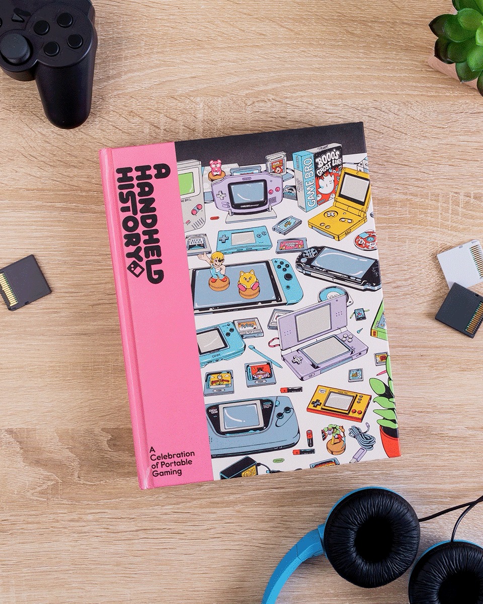
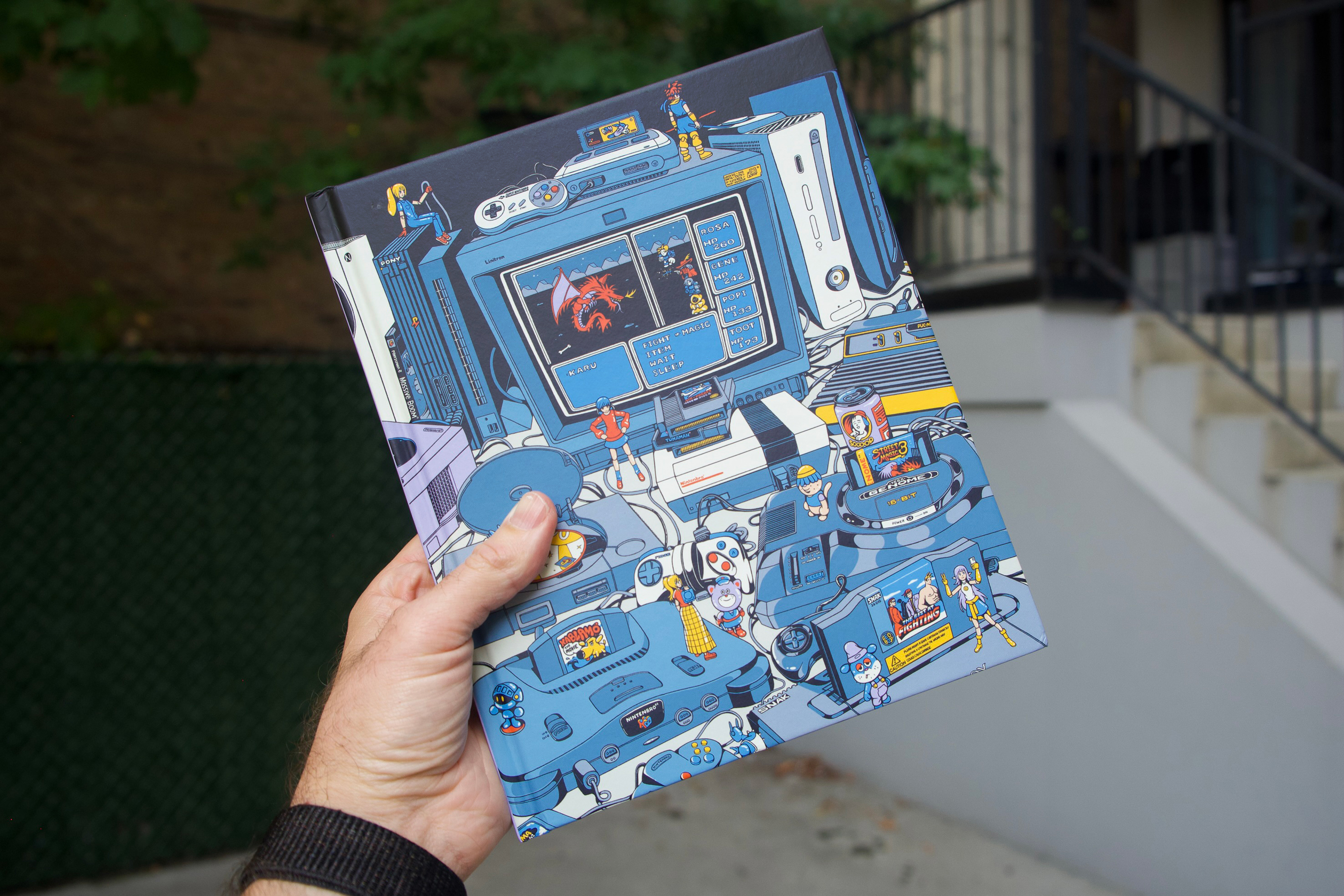
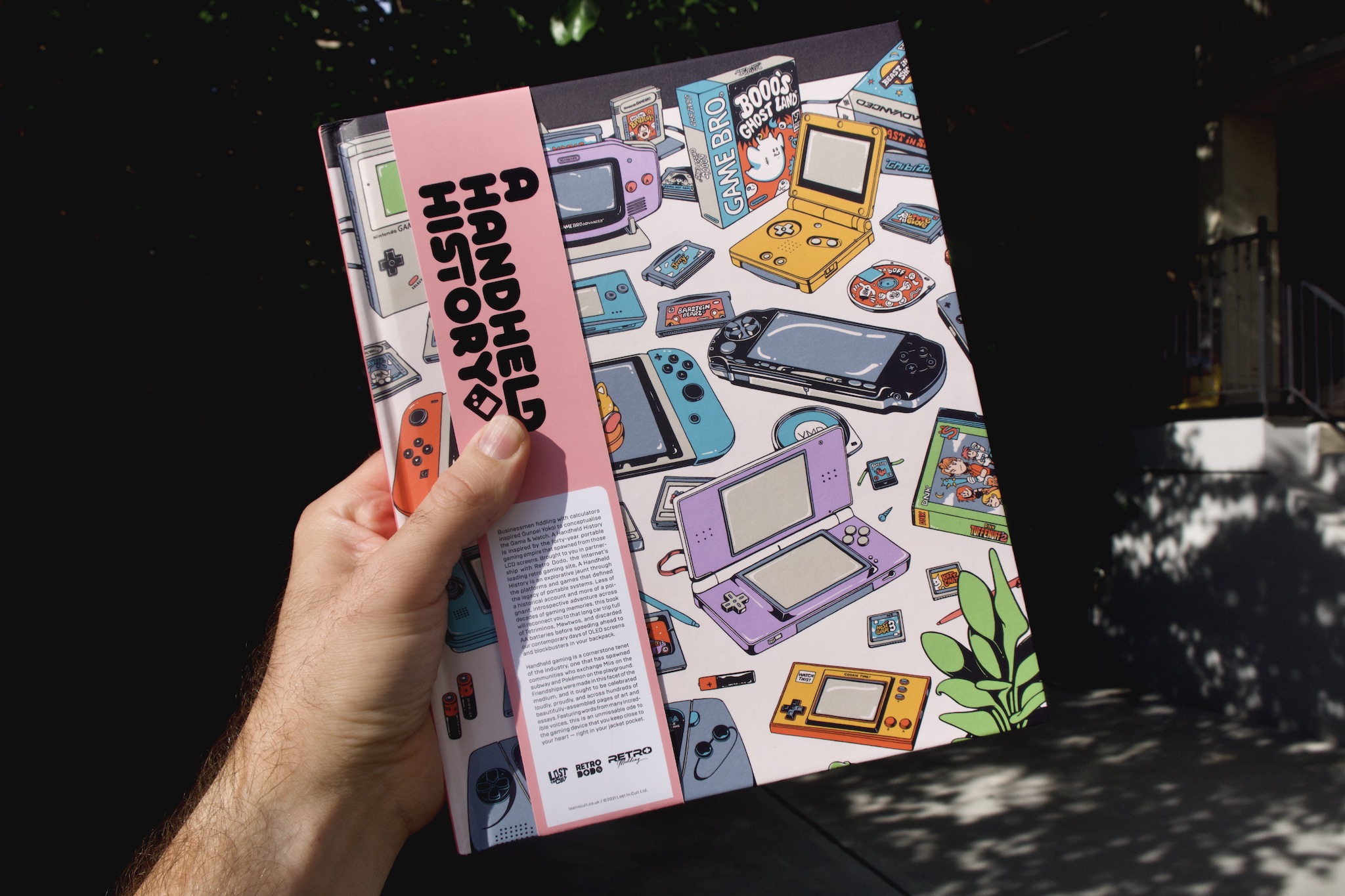
Design work for A Handheld History, a book chronicling the history of handheld videogame consoles.
I worked as part of the design team (alongside Nat King, Josh Lanphear, and Dan Clarke) on AHH to bring the book to life. I contributed imagery, layouts, and art direction.A Handheld History is available for purchase now → Lost in Cult shop ---- Editorial
Lost in Cult Cover Illustration
Stephen Maurice Graham Design Team
Nat King
Josh Lanphear
Dan Clarke


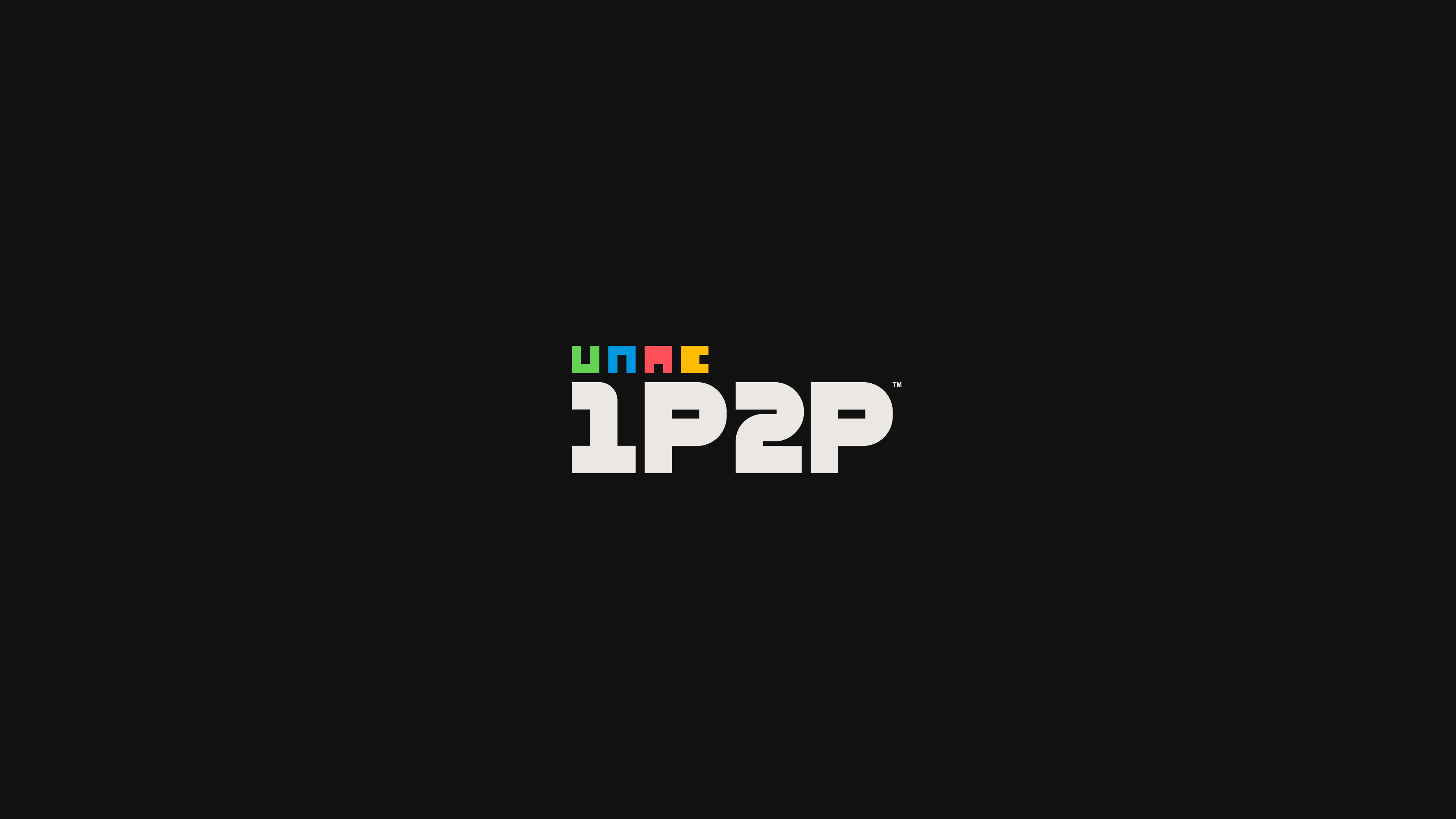
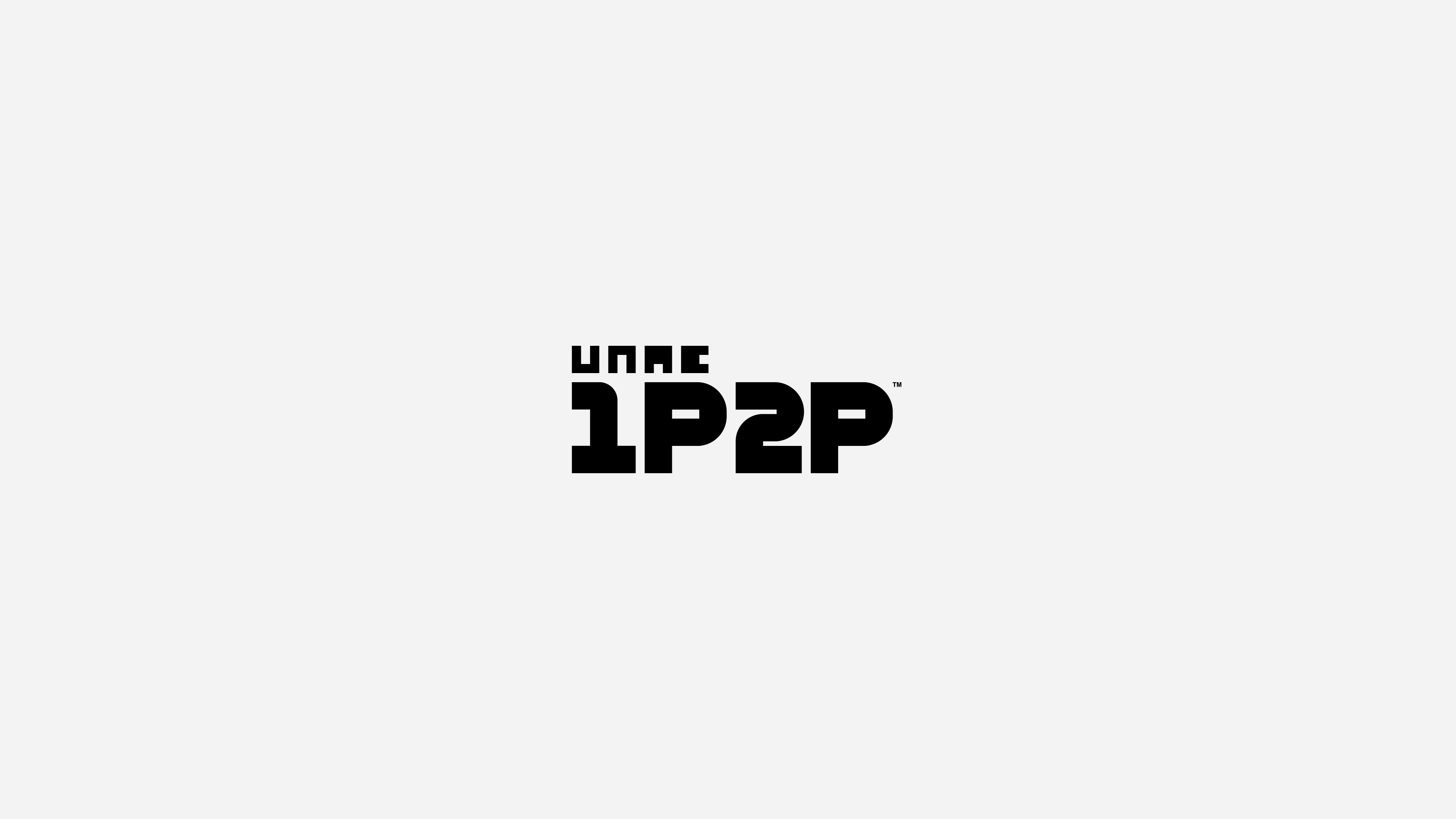
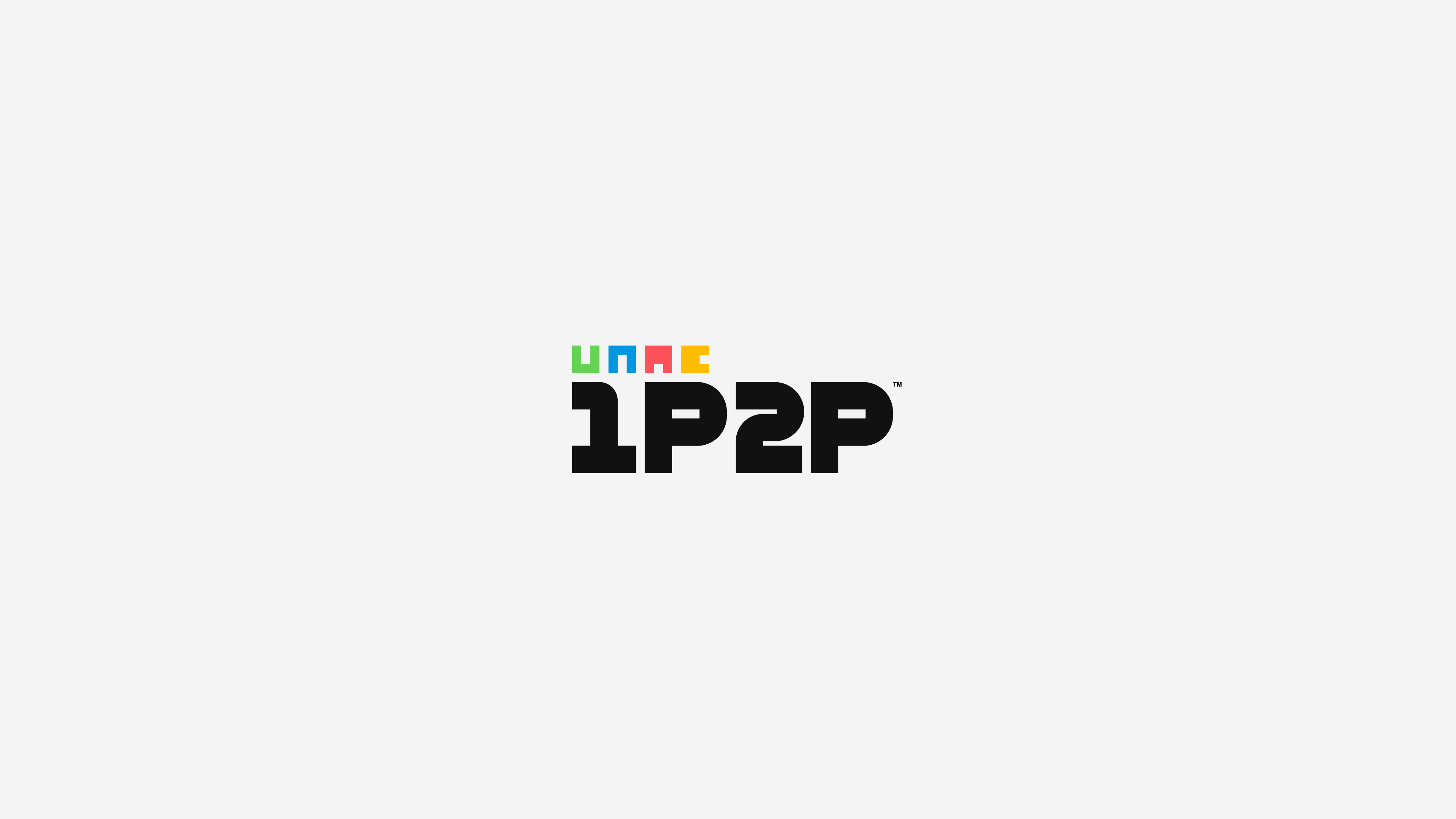
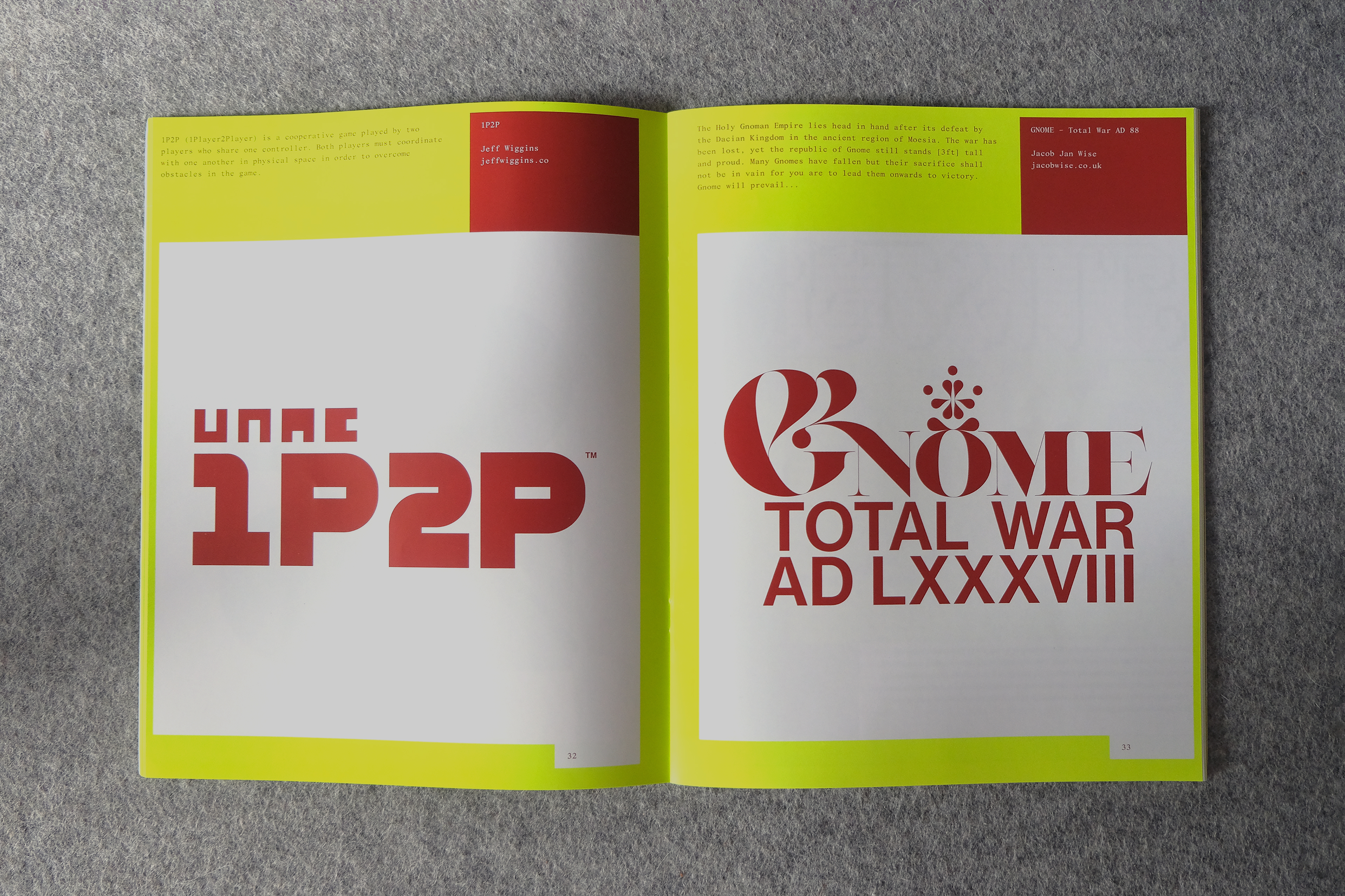
Logo for 1P2P™, my submission for RAID v2.
RAID is a zine produced by graphic designer and developer Simon Sweeney for which designers come up with an idea for a videogame and design its logo.My submission is 1P2P™ (1Player2Player), a cooperative game played by two players who share one controller. Both players must coordinate with one another in physical space in order to overcome obstacles in the game.
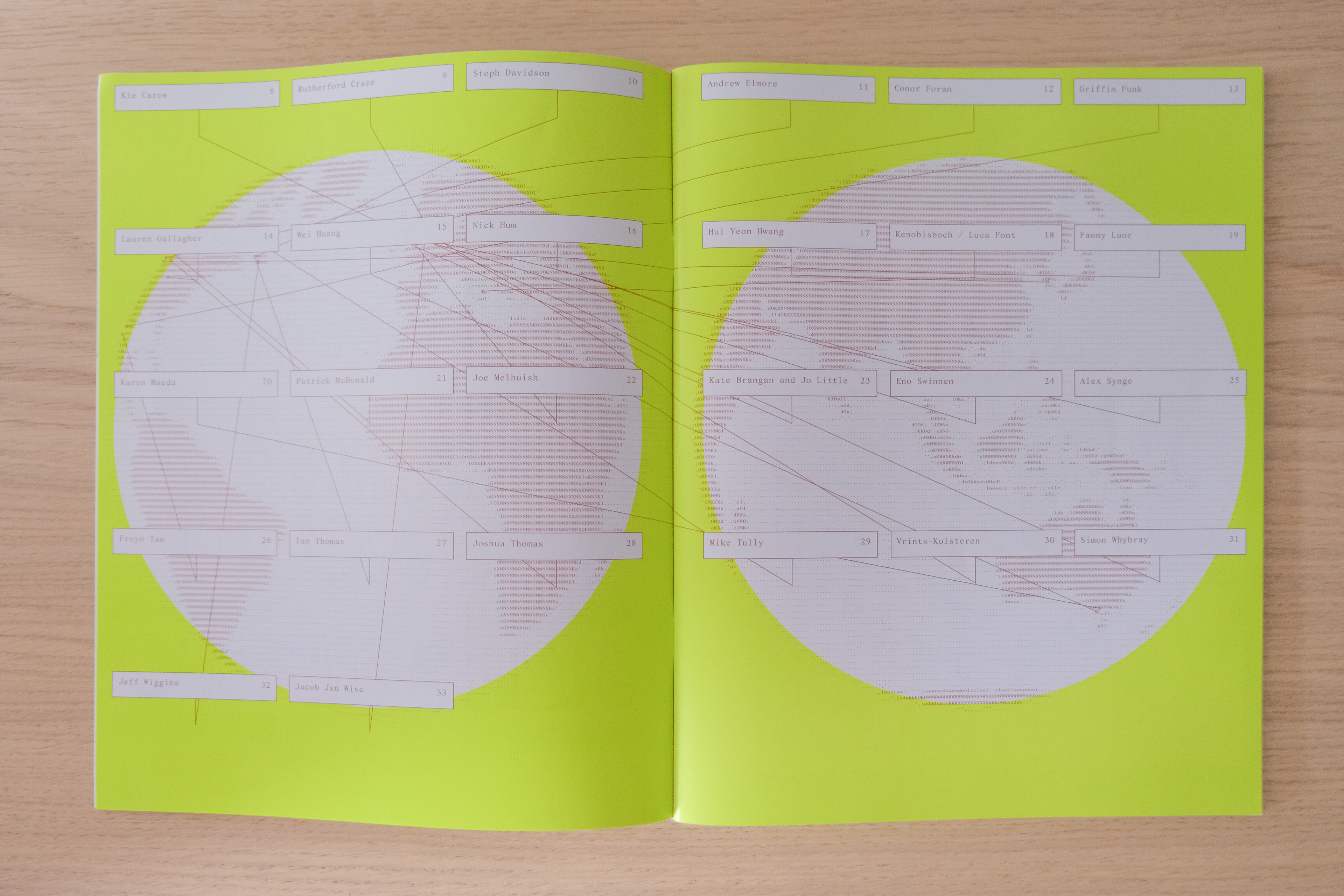
Other designers featured include Froyo Tam, Lauren Gallagher, Joshua Thomas, Rutherford Craze, Fanny Luor, Andrew Elmore, Simon Whybray, and more.RAID v2 is available for purchase now → RAID shop

Maridia
Client: Self-initiated
2018 → 2021
Client: Self-initiated
2018 → 2021
Founding, design, and ongoing brand management of Maridia, a design studio that aims to elevate videogames through graphic design.
I started Maridia for several reasons: to create a space for myself to work on game-related projects, to gain experience making and selling products, and eventually to attract design work for myself from game studios.
Maridia’s brand is purposely spare and straightforward so as not to distract from the various design projects it will be applied to. The typography, color palette, and quiet hints of playfulness reference the graphic design of 1980s videogames.


Related Projects
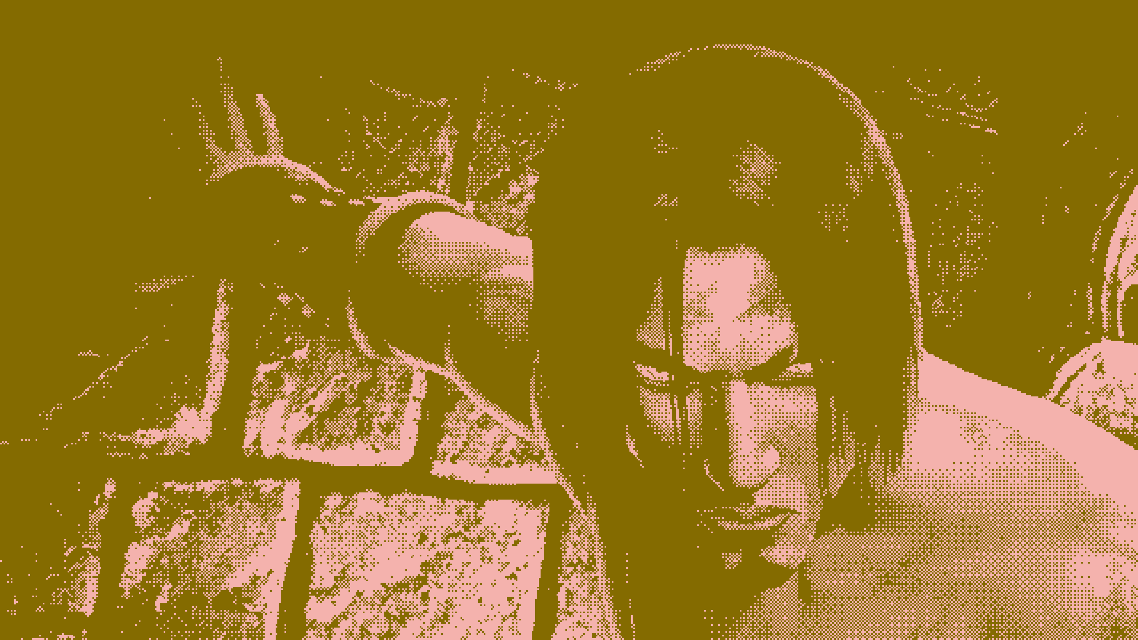
Series of collages for Ubisoft Stories, Ubisoft’s blog highlighting workers in game development.
Ubisoft contacted me to produce four collages: three for Ubisoft games I enjoyed and one for a game of my choice. I took inspiration from risograph printing, using limited color palettes and heavy use of dithering to achieve a unique visual effect. I also gave a brief interview about my work and what inspires me. Prince of Persia: The Sands of Time
Ubisoft contacted me to produce four collages: three for Ubisoft games I enjoyed and one for a game of my choice. I took inspiration from risograph printing, using limited color palettes and heavy use of dithering to achieve a unique visual effect. I also gave a brief interview about my work and what inspires me. Prince of Persia: The Sands of Time
- Pink (#F4B2AD) and Desert Gold (#816B00)
- Typeset in GT Ultra Fine by Grilli Type
- Hunter Green (#656C3A) and Magenta (#EF69F5)
- Typeset in Cardinal Wide by Very Cool Studio
- Aurora Green (#87E1D1) and Charcoal (#4E3844)
- Typeset in Editorial New and Mondwest by Pangram Pangram
- Fluro Orange (#FF5B01) and Purple (#221835)
- Typeset in Avantt by Displaay Type Foundry


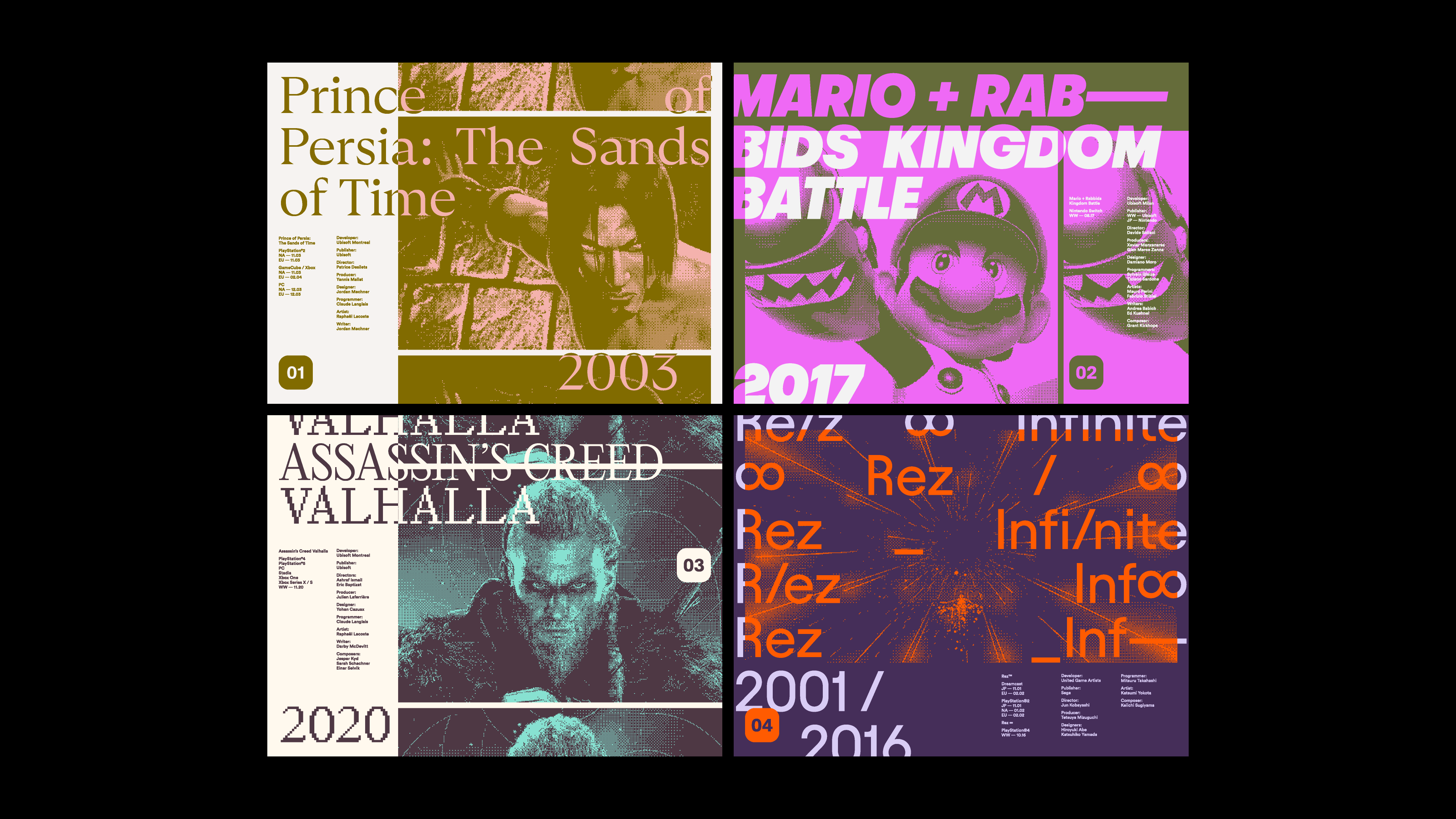
Art Direction
Elie Sitbon
Similar Project

Logo, style guide, and various brand assets for MinnMax, a Patreon dedicated to “games, friends, and getting better.”
Working with MinnMax founder Ben Hanson, I defined MinnMax’s visual identity. The goal was to create a brand that reflected MinnMax’s ethos of communal improvement and playfulness while maintaining a voice of integrity, confidence, and trustworthiness. By so doing, MinnMax is poised to grow into a thriving enthusiast press outlet.
I also developed brand guidelines to ensure that MinnMax’s brand voice retains its strength over time. MinnMax can be supported on Patreon.


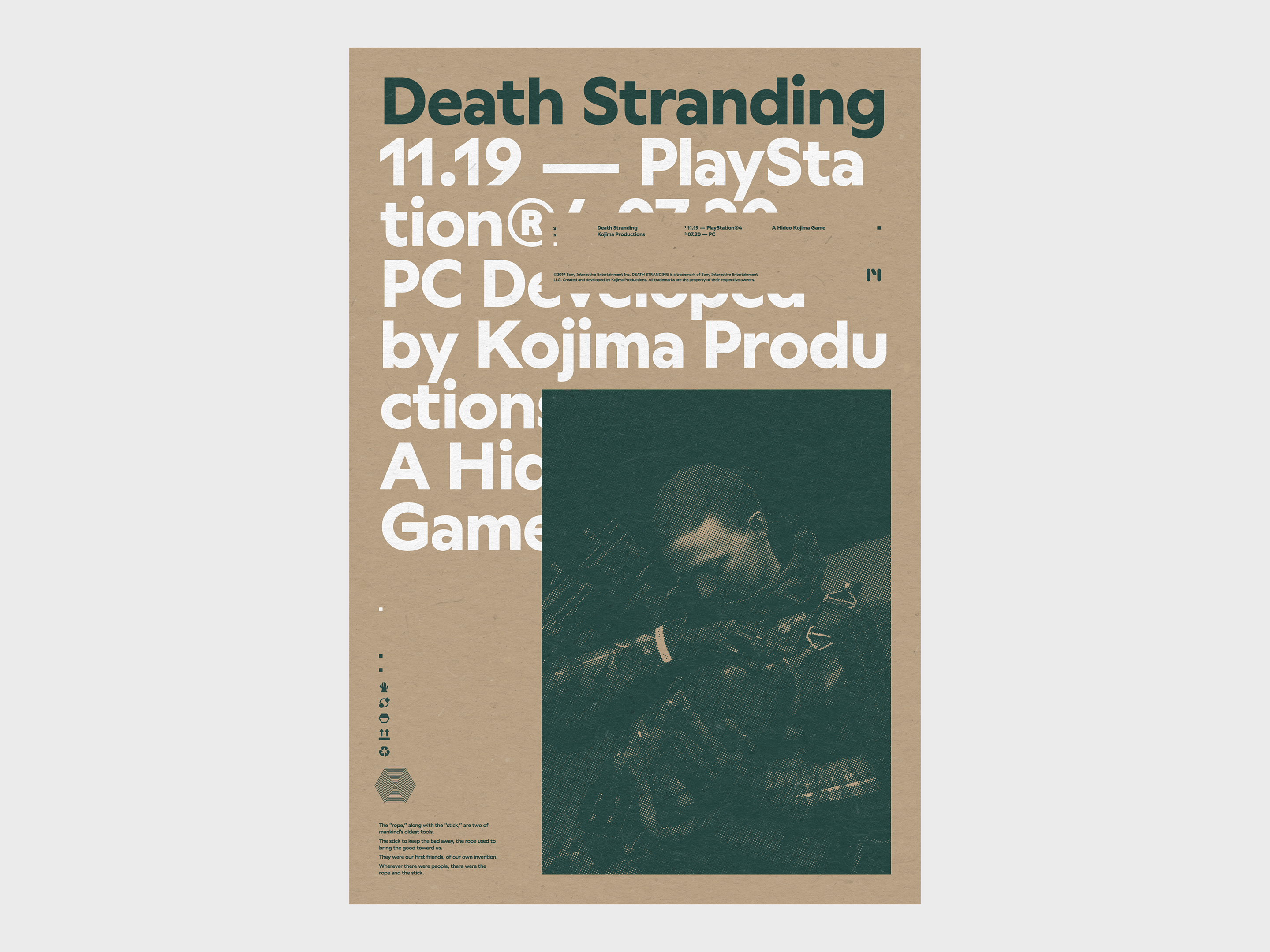
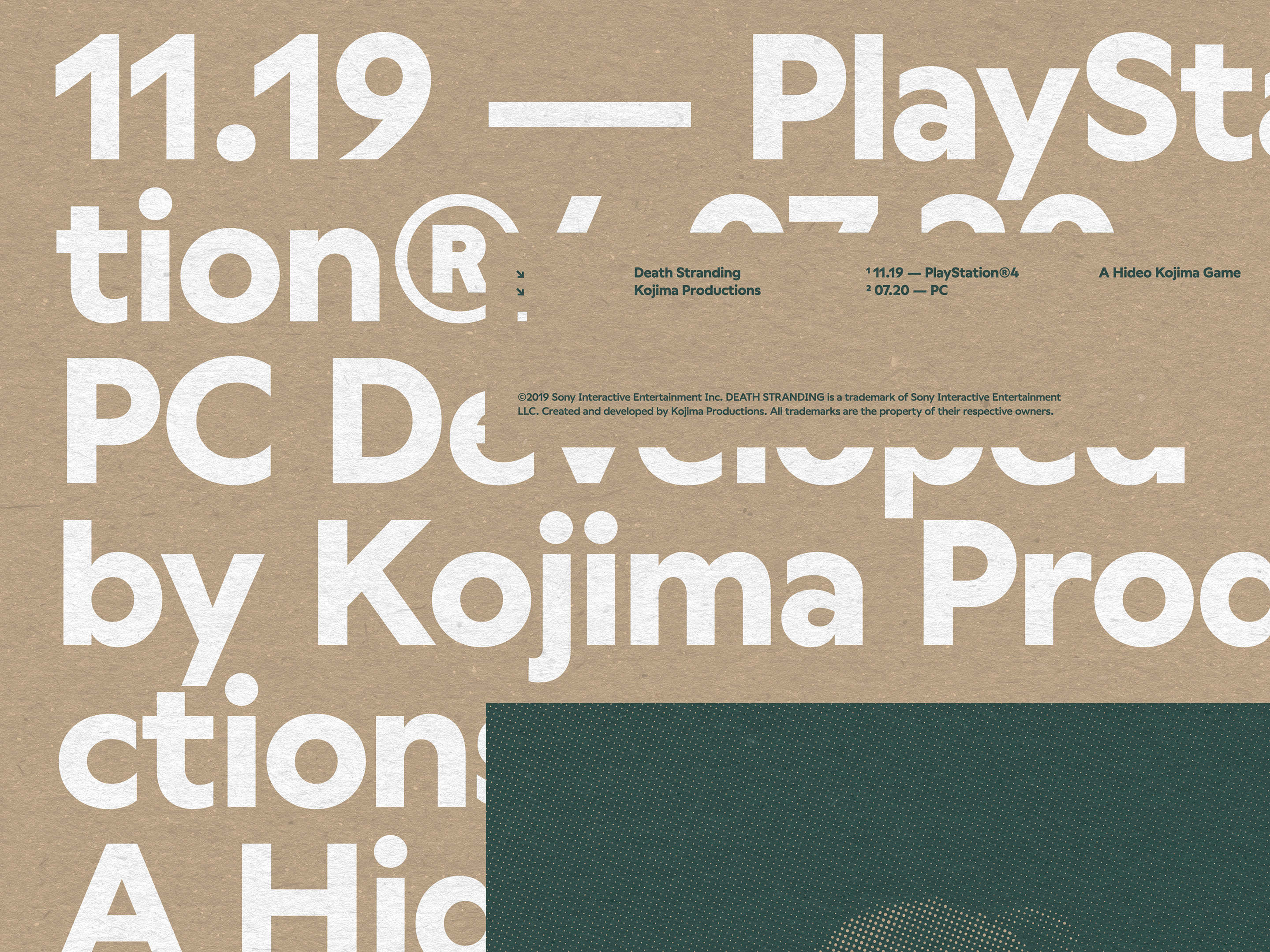
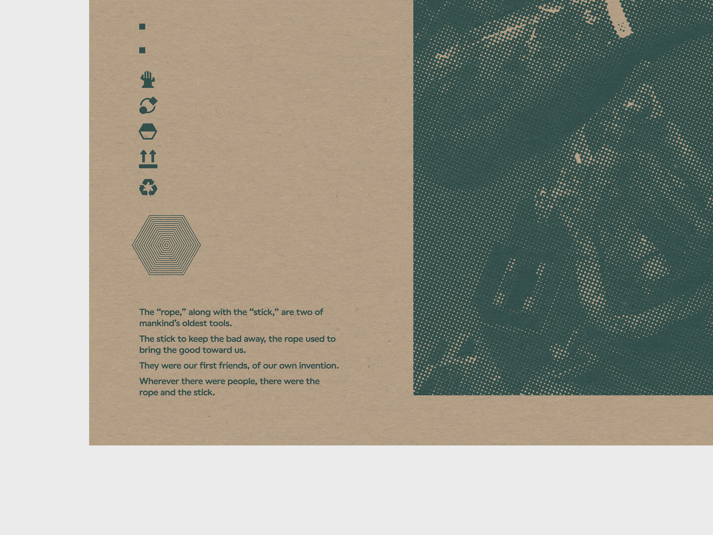
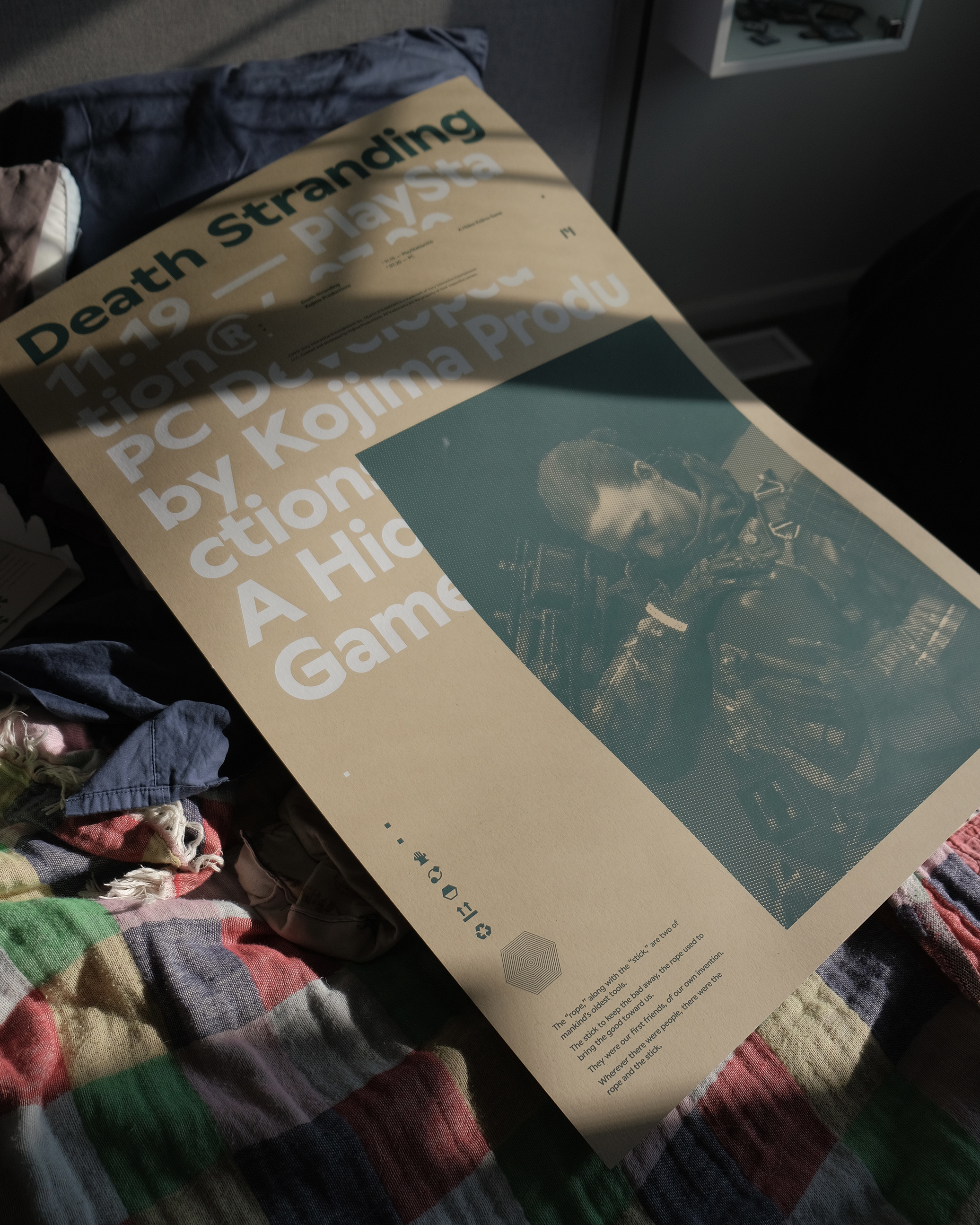
Death Stranding poster for Maridia. The poster combines imagery from Kojima’s landmark game with common US shipping iconography. The layered layout is reminiscent of packaging materials laid flat.
It also features a brief excerpt from Kobo Abe’s short story “Nawa,” which appears during the introduction of Death Stranding.
- 24in ✕ 36in
- Edition of 25
- 2 color (Pantone 7722U and white) screenprint by Vahalla Studios
- Printed on 100# French Muscletone Kraft paper
- Typeset in Wallop by Displaay Type Foundry
- Hand numbered
- Printed in USA
Animal Crossing Avatars
Client: Self-initiated
2020
Client: Self-initiated
2020
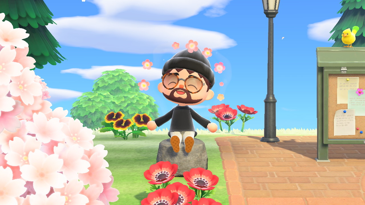
Social media avatars based on my Animal Crossing: New Horizons character (who is based on me).
My goal with this project was to recreate some of the character expressions found in Animal Crossing: New Horizons, using Illustrator’s gradient tools to replicate ACNH’s charming 3D artstyle. I also worked to refine my workflow between Illustrator and After Effects.
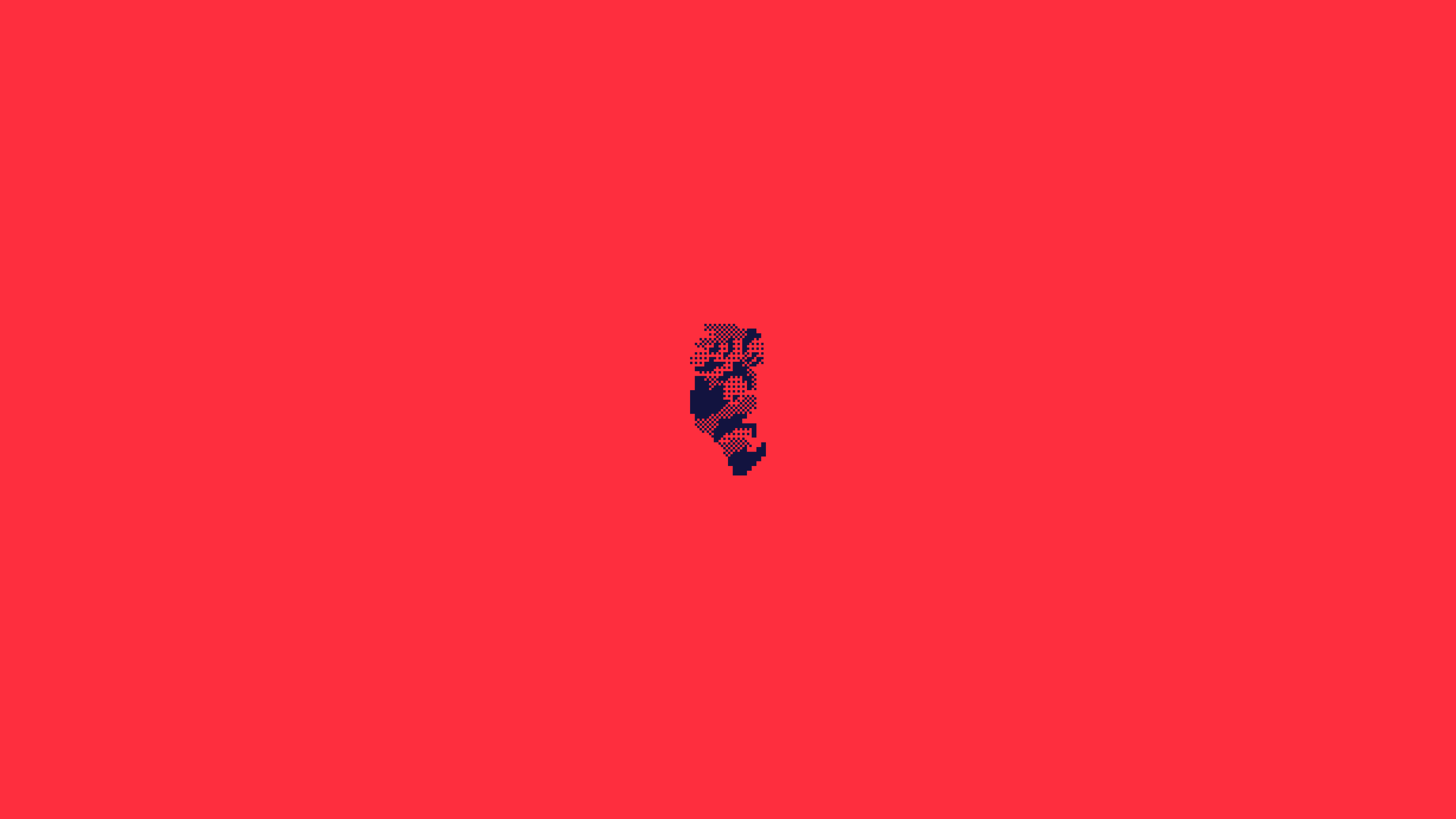

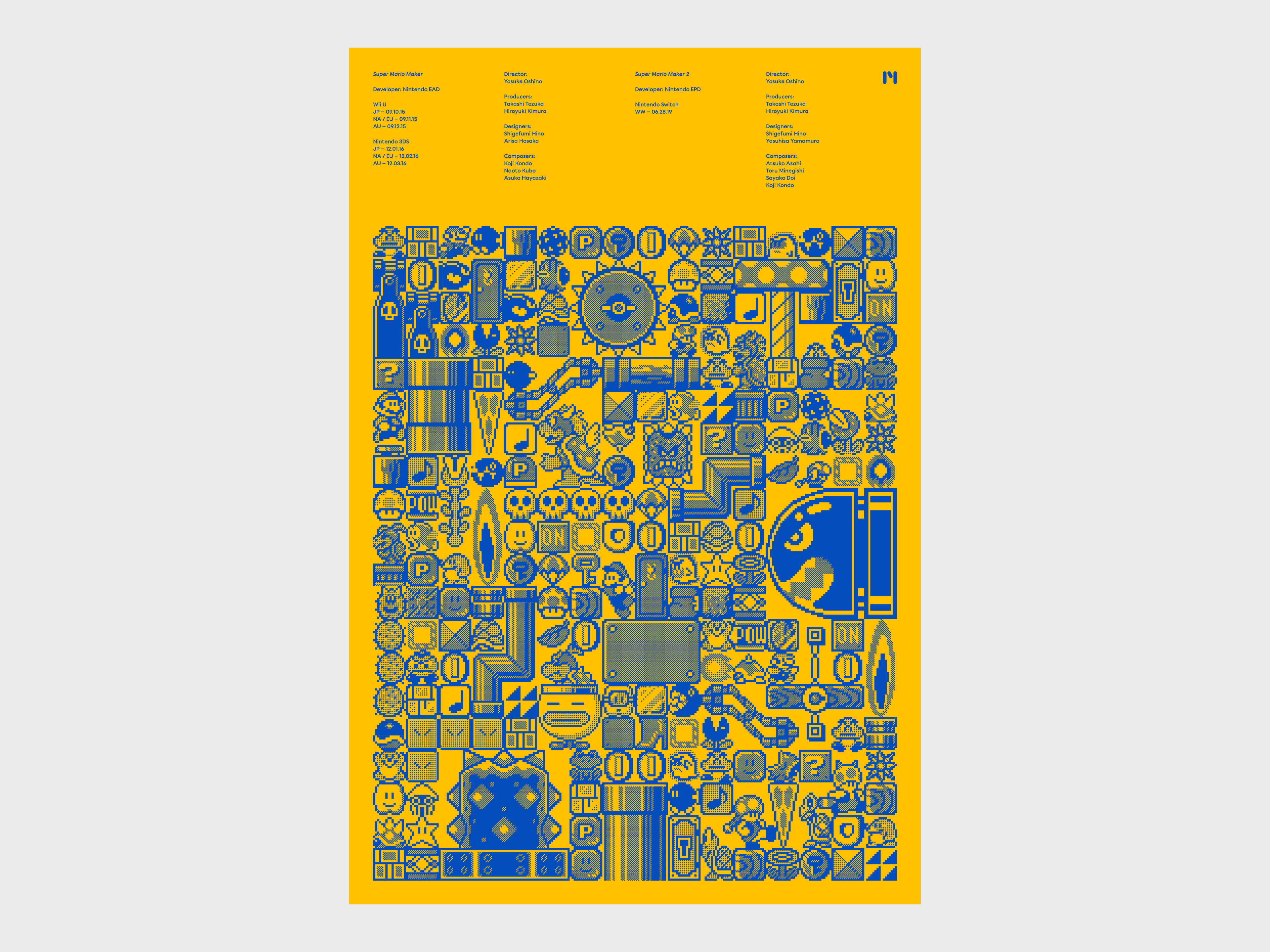
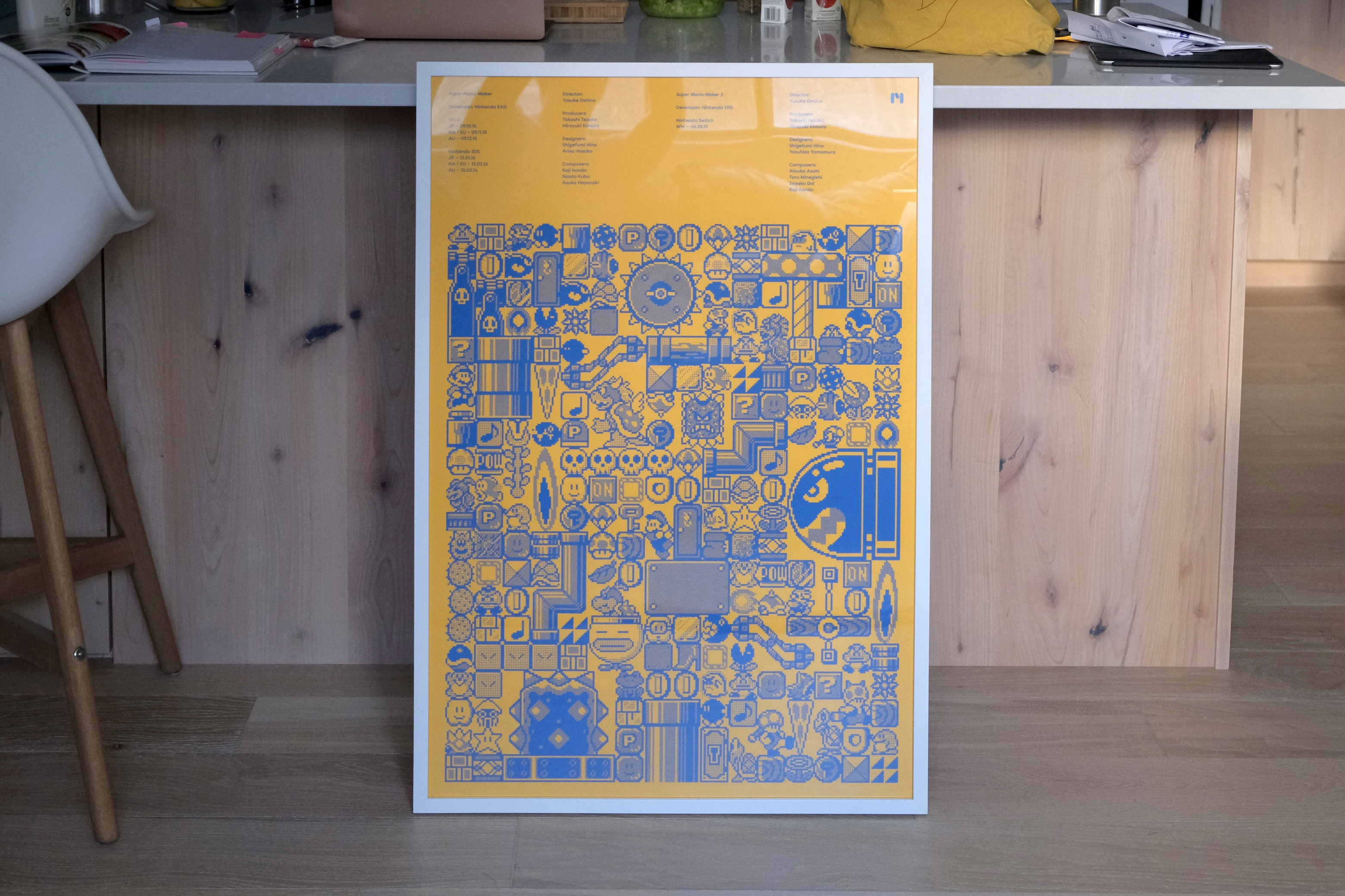
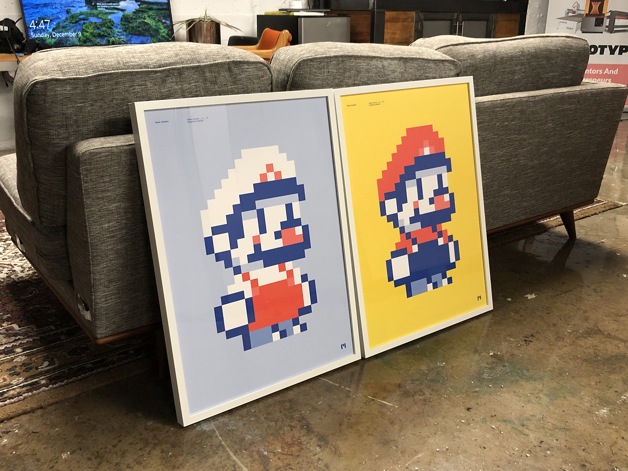
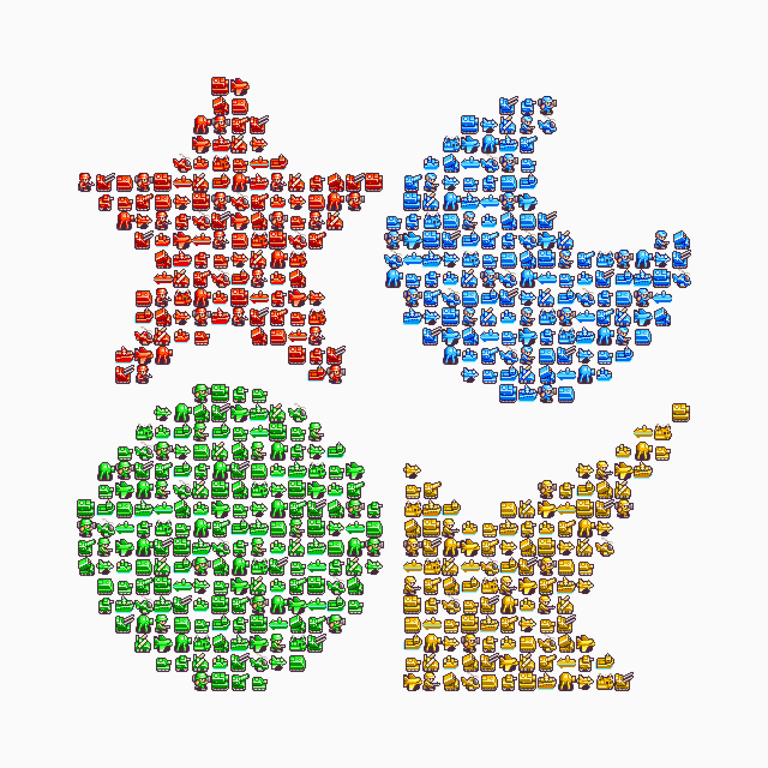
Set of Super Mario Maker posters for Maridia, released in commemoration of Super Mario Maker 2’s completion and Super Mario Bros.’ 35th anniversary.
The two posters deconstruct and rebuild a Mario Maker spritesheet of characters, enemies, and environmental elements.
The posters’ layout mimic Mario Maker’s creation tools: the objects are placed in the same locations on both posters, but the individual sprites change depending on the chosen ‘game style’ (Super Mario Bros. (MMK-SMB) or Super Mario Bros. 3 (MMK-SMB3)).
MMK-SMB Poster
- 24in ✕ 36in
- Limited edition of 32
- 1-color screenprint (Pantone 287U) by Vahalla Studios
- Printed on G.F Smith Colorplan Bright Red 270gsm paper
- Typeset in Chromatica Medium by Polytype
- Hand numbered
- Printed in USA
- 24in ✕ 36in
- Limited edition of 32
- 1-color screenprint (Pantone 2174U) by Vahalla Studios
- Printed on G.F Smith Colorplan Citrine 270gsm paper
- Typeset in Chromatica Medium by Polytype
- Hand numbered
- Printed in USA


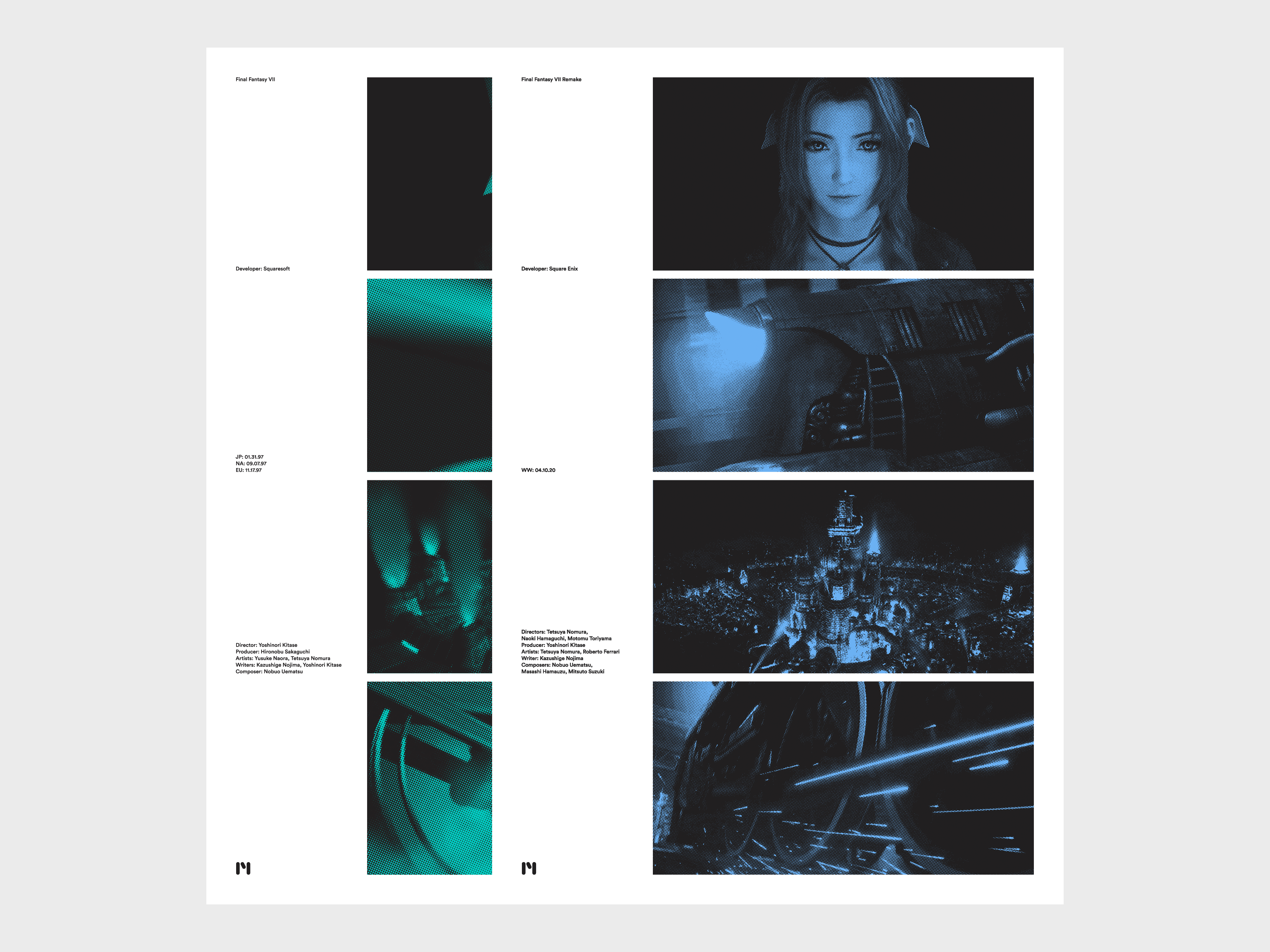
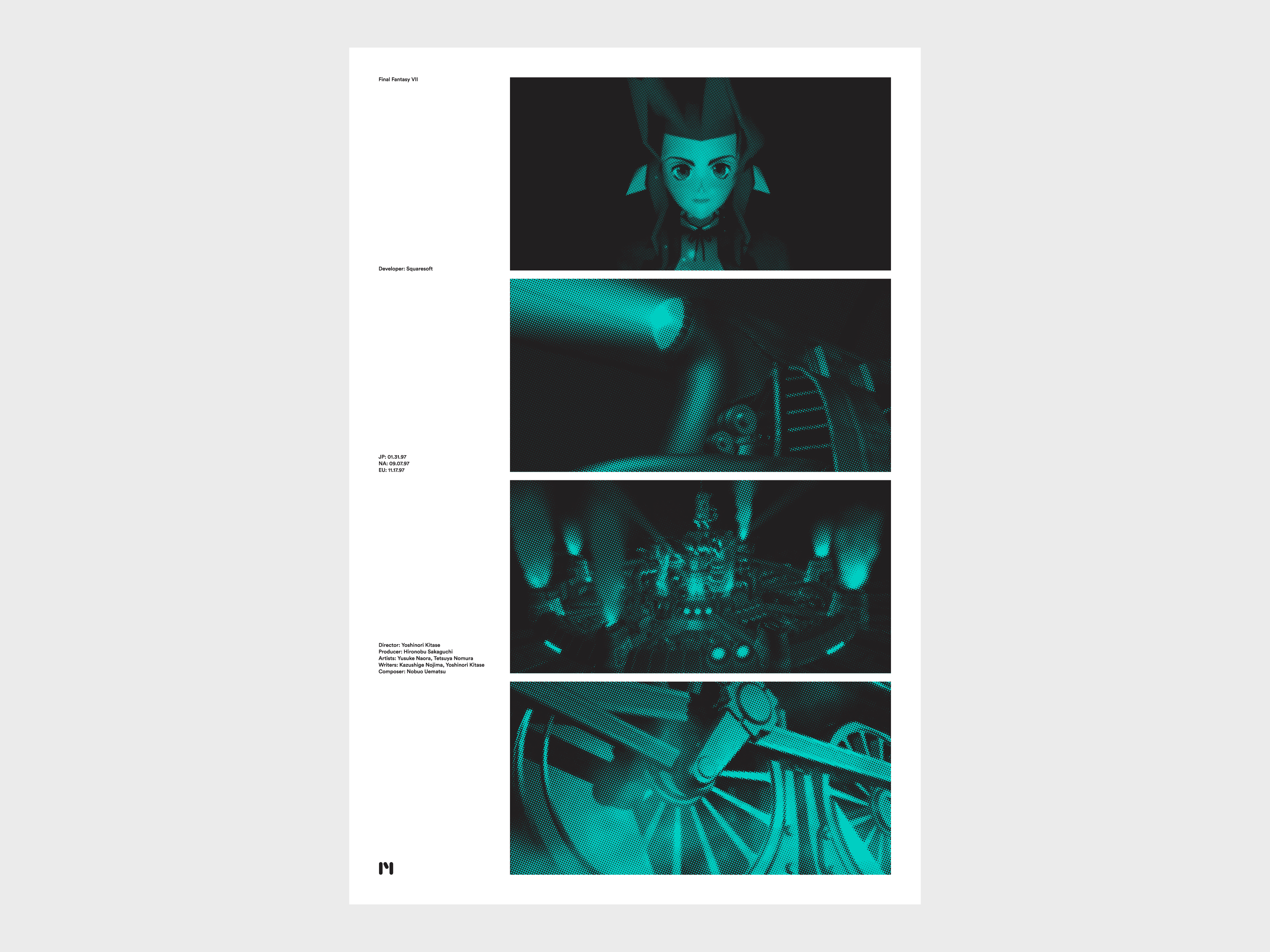
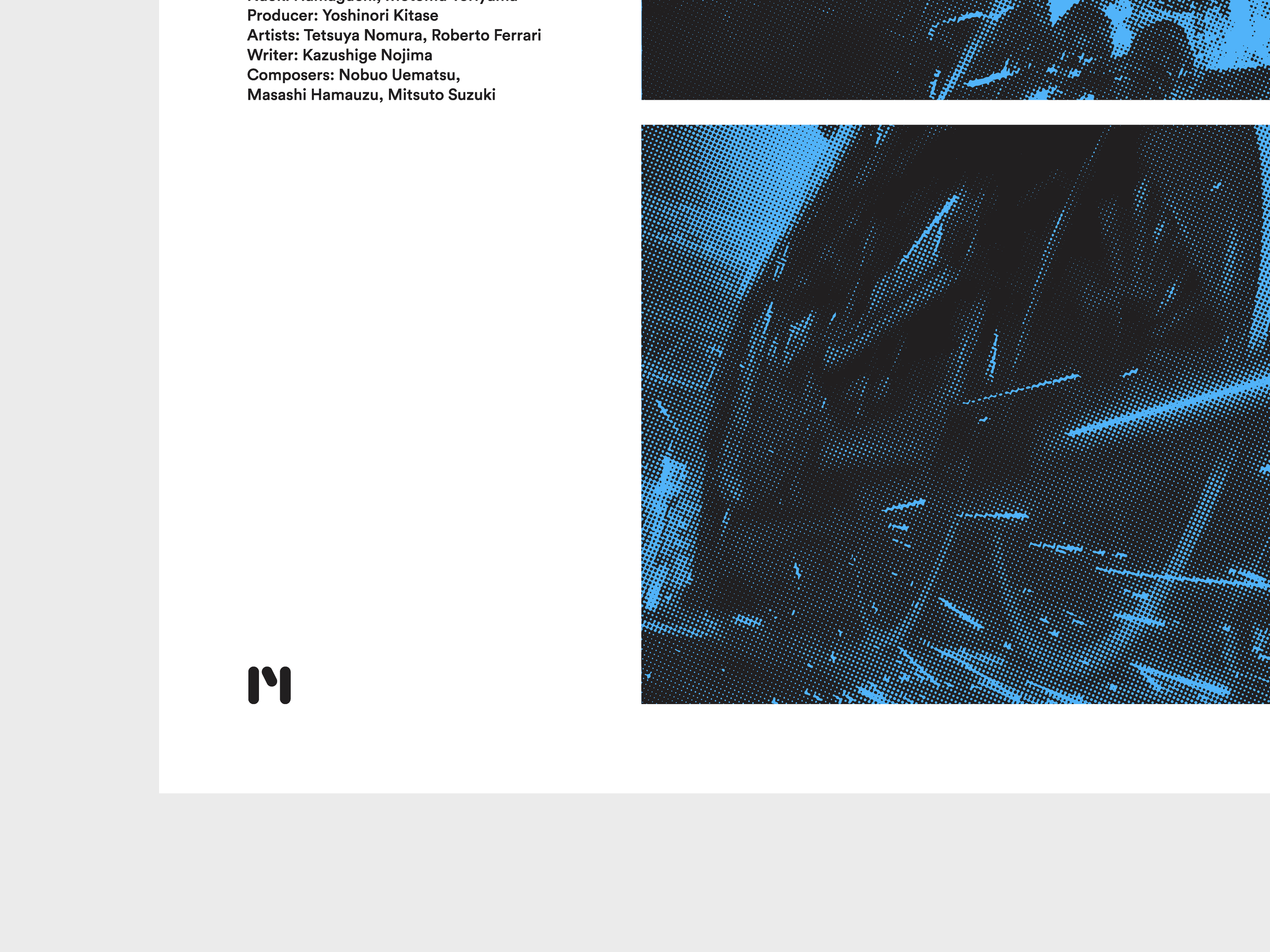
Set of Final Fantasy VII posters for Maridia.
The posters reference the opening cinematic of Final Fantasy VII (FF7-001) and Final Fantasy VII Remake (FF7-002), whose abrupt jump cuts set the tone for the futuristic adventures that follow.The posters also list the release dates and partial credits of each game’s respective PlayStation® and PlayStation®4 releases.
- Set of 2 posters
- 24in ✕ 36in
- Limited edition of 50 each
- 2 color screen prints by Vahalla Studios
- 100# uncoated poster stock
- Hand numbered
- Printed in USA


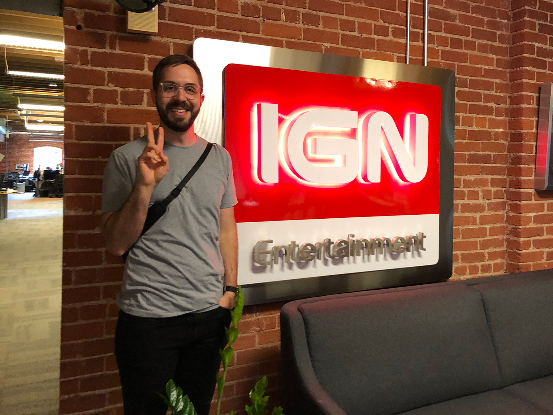
Selection of editorial thumbnails created for IGN.I worked with the Content Team at IGN to produce editorial visuals for use on IGN’s YouTube channel and across their website.


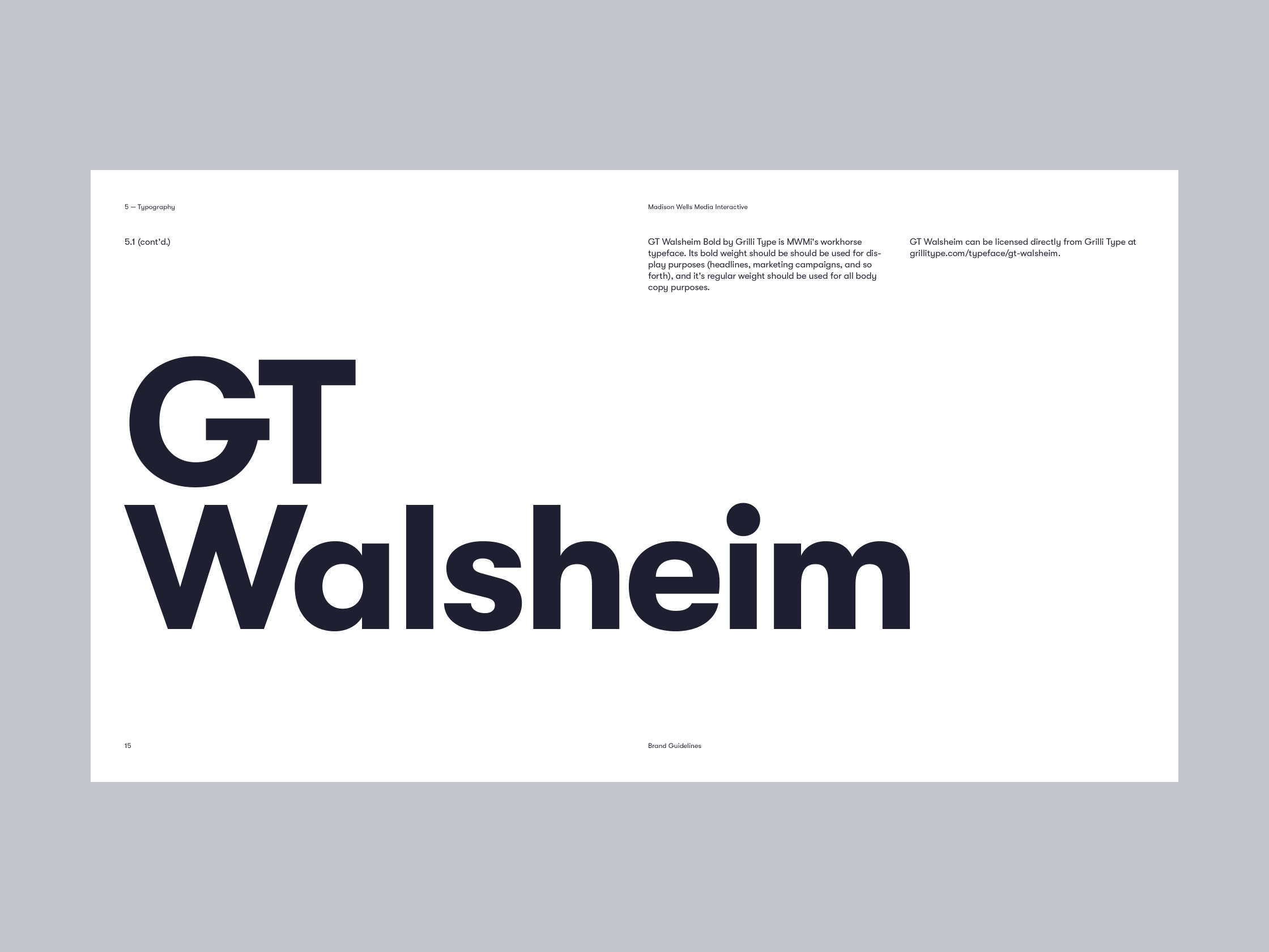
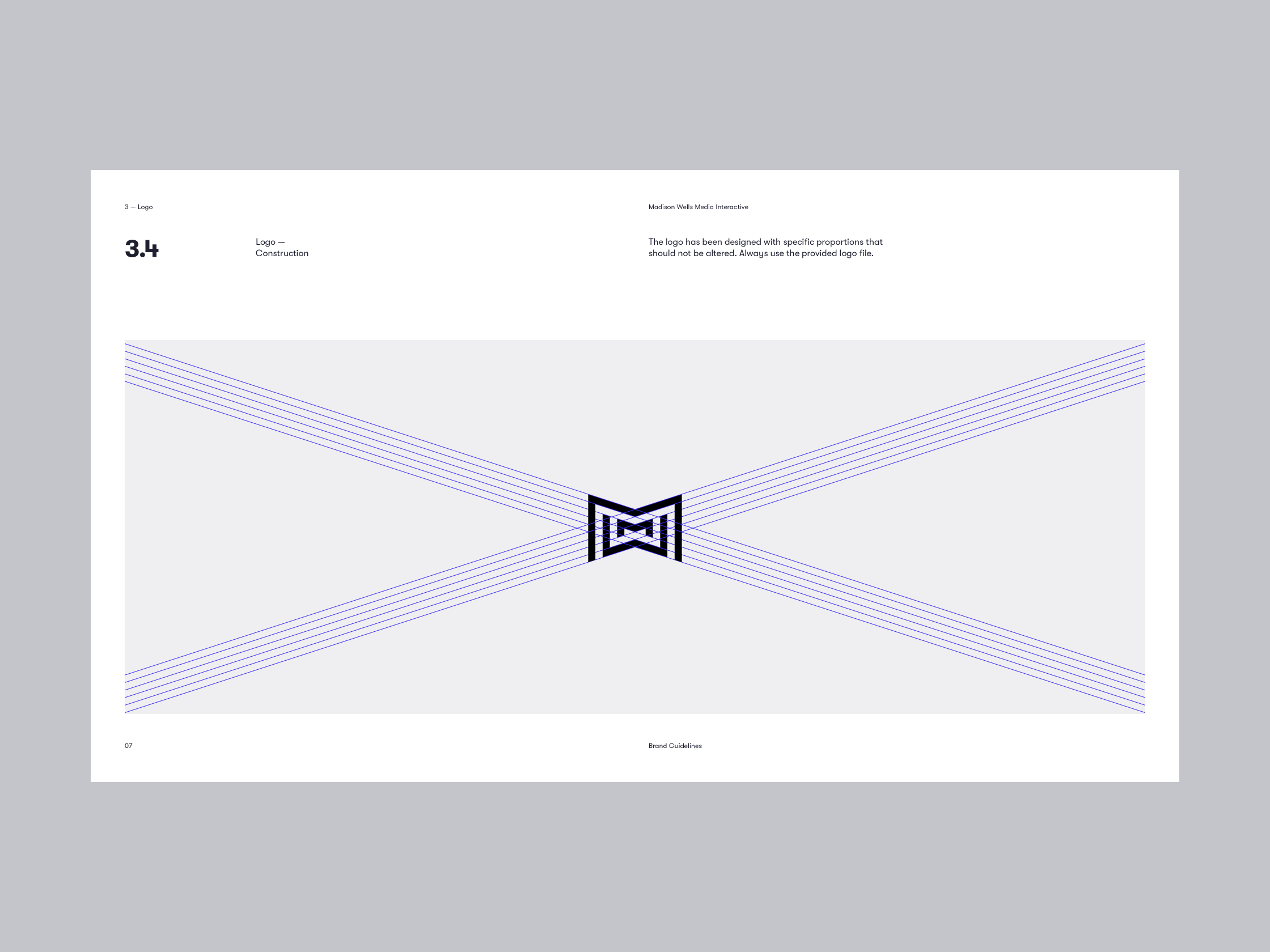
Brand strategy, design work, brand guidelines, and various assets for Madison Wells Media Interactive.
MWM’s four branches (Studios, Universe, Interactive, and Live) operate in various media. Unlike other branches of MWM, MWM Interactive markets and sells its products directly to consumers. The purpose of this project was to expand and refine MWMi’s brand to be more appealing to consumers.
I updated MWMi’s logotype and expanded its brand materials to better reflect its values and market position.
Note: MWM’s ‘bowtie’ logo mark drawn by Bruce Mau Design.
Note: MWM’s ‘bowtie’ logo mark drawn by Bruce Mau Design.


Brand guidelines sample ↯


Games published by MWM Interactive ↯


Limited edition t-shirt for Lindsay Ellis’s bestselling novel Axiom’s End. This shirt was given to a small number of people as a promotional item to commemorate the novel appearing on the New York Times bestseller list.
-
Oversized dye sublimation print + sleeve graphic
- Limited print run (✕30)
- Next Level Apparel 6200 silver poly/cotton crewneck shirt
- Printed in USA


Note: this icon set was updated in 2024 → Banzai Icons V3.
Set of 150+ icons for Banzai, drawn in 2017 and redone in 2019. The 2017 icon set expanded the surface area of Banzai’s branding, creating small opportunities to delight users in printed marketing materials, on the web, and in Banzai’s various apps. But the icons didn’t hold up at small sizes.To that end, I updated the icon set in 2019, using a smaller 32px ✕ 32px grid. I developed a standardized grid and guideline system to ensure that future designers would be able to easily draw new icons that feel harmonious with the rest of the icon set.
Images of the 2017 icon set can be viewed in my archive.
Related project → Banzai Icons V3, Banzai Brand Guidelines

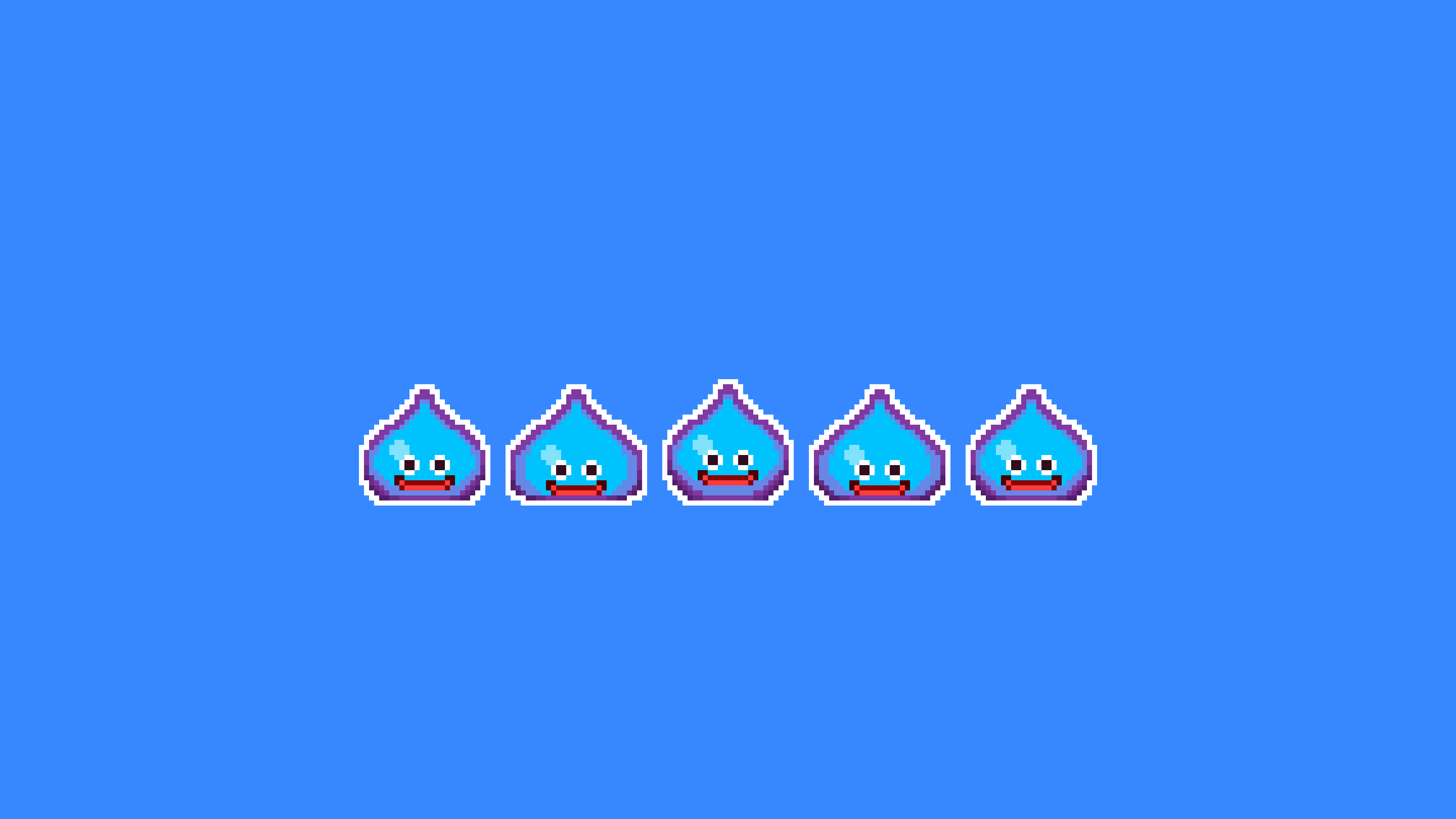
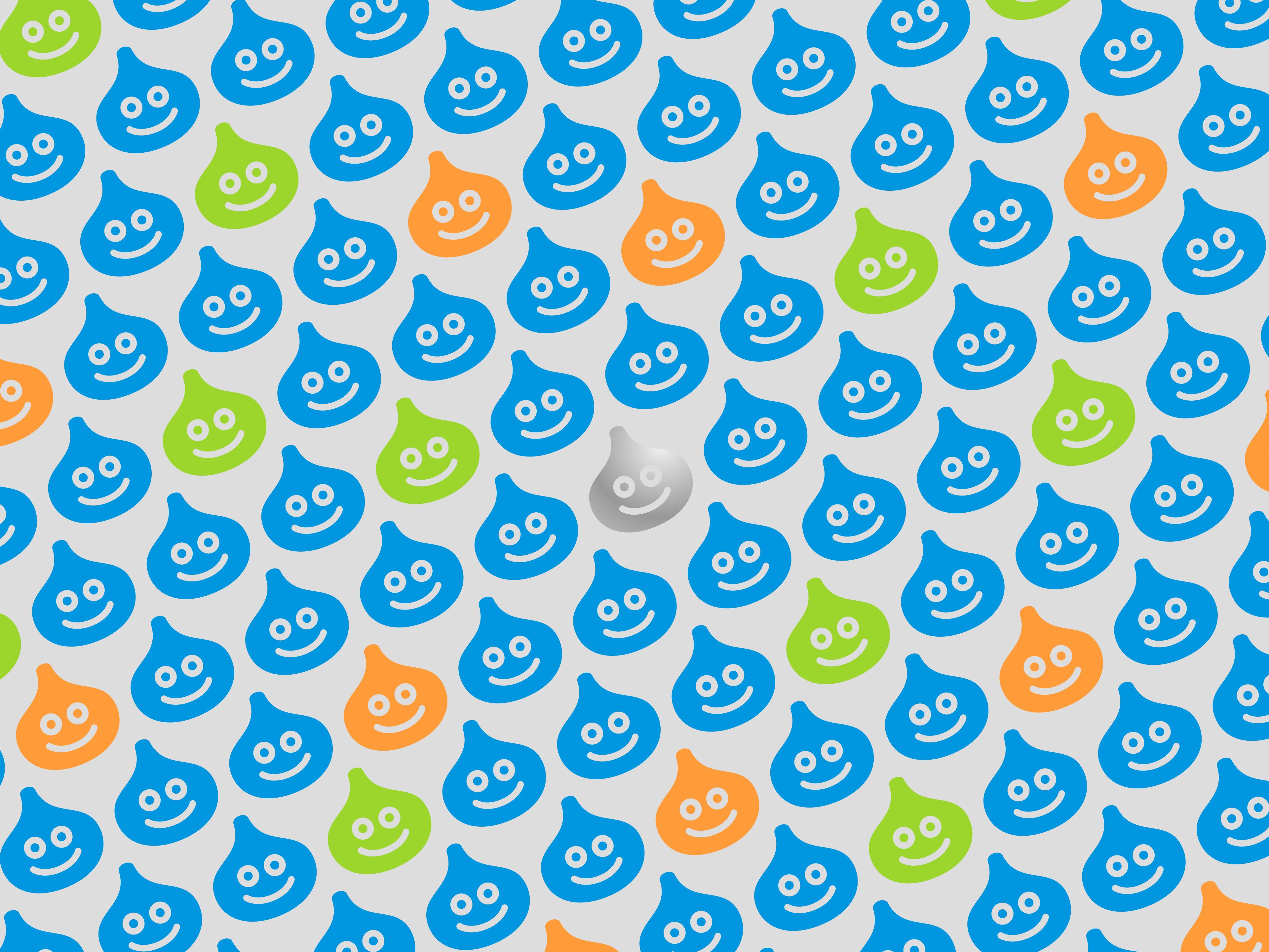
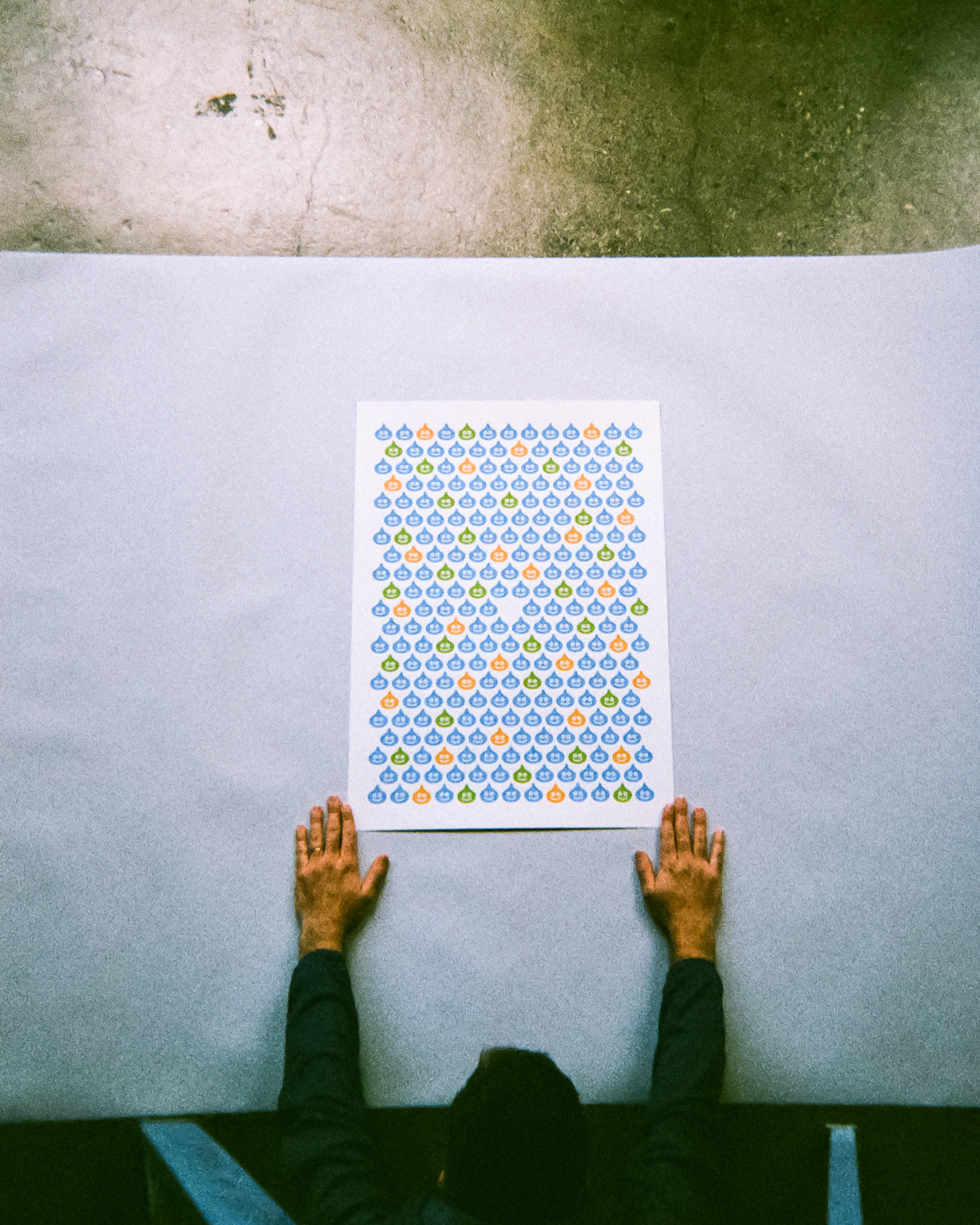
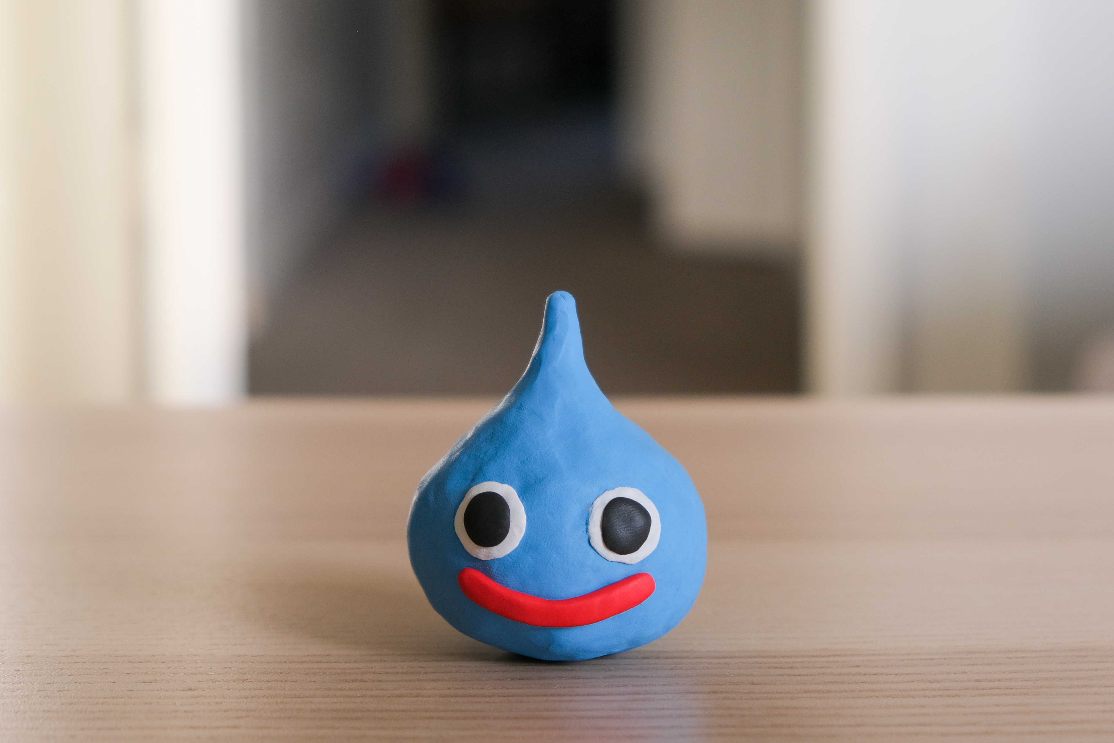
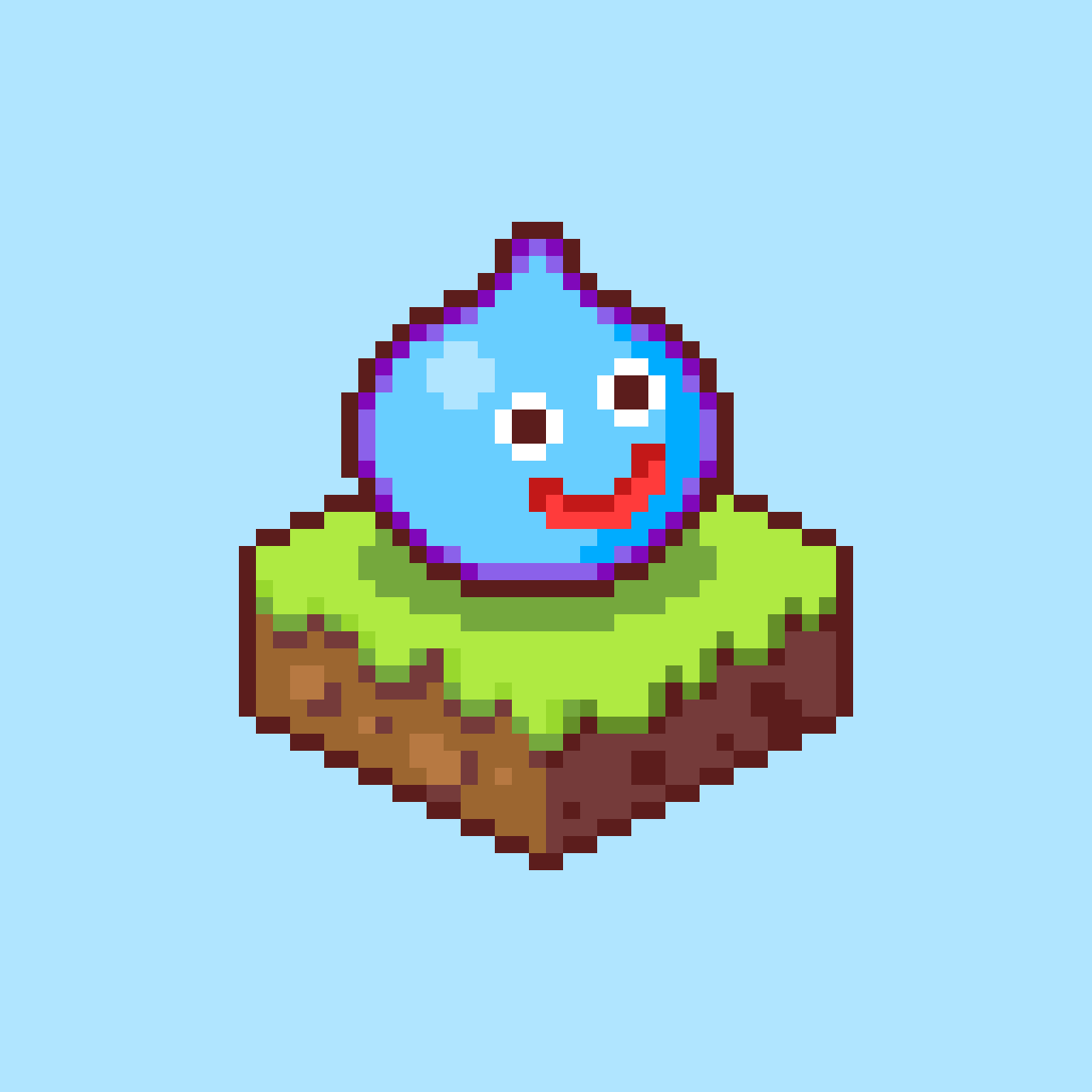
Dragon Quest poster for Maridia, released in commemoration of Dragon Quest XI coming to Nintendo Switch.
The poster references Akira Toriyama’s iconic slime monster design, deriving its color scheme from the three slimes that stack atop one another in various Dragon Quest games. The lone metal slime in the center of the poster alludes to that enemy’s rarity.
A very limited print run (✕15) of a special metallic silver ‘Metal Slime’ edition is also available.
- 500mm ✕ 700mm (19.75in ✕ 27.5in)
- Standard edition of 50, Special ‘Metal Slime’ edition of 15
- Screenprinting by Vahalla Studios
- 100# French Grout Gray / Blacktop papers
- Hand numbered
- Printed in USA


Tumbleseed Doodles
Client: Self-initiated
2019
Client: Self-initiated
2019
Self-initiated doodles of characters from Tumbleseed, the 2017 game by aeiowu.
Being a fan of Tumbleseed, I wanted to recreate the various seed powers from the game in a way that referenced Greg Wohlwend’s distinct illustration style without being too beholden to it.
To that end, the illustrations adhere to a strict grid, but I’ve applied a slight rotation and roughened effect to make each one feel unique and organic.


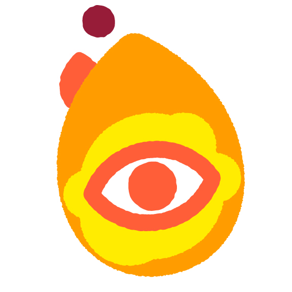

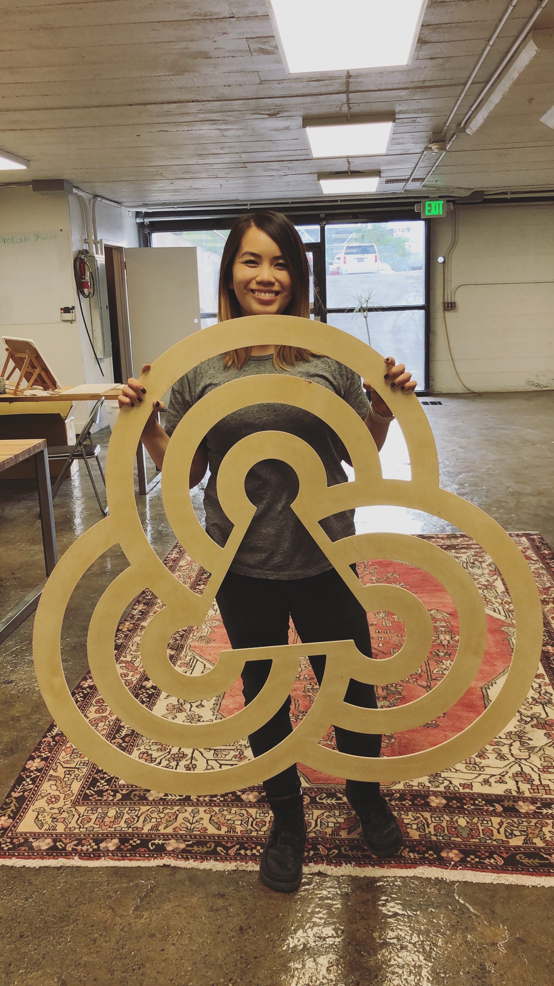
Logo mark for the Sego Awards, an initiative to increase the visibility of female founders and CEOs in Utah. The Sego Awards is a joint venture between Braid, Convoi, and Big Monocle.
The logo is an abstracted form of the sego lily, chosen for its ability to flourish in harsh conditions (as well as its designation as Utah’s state flower).

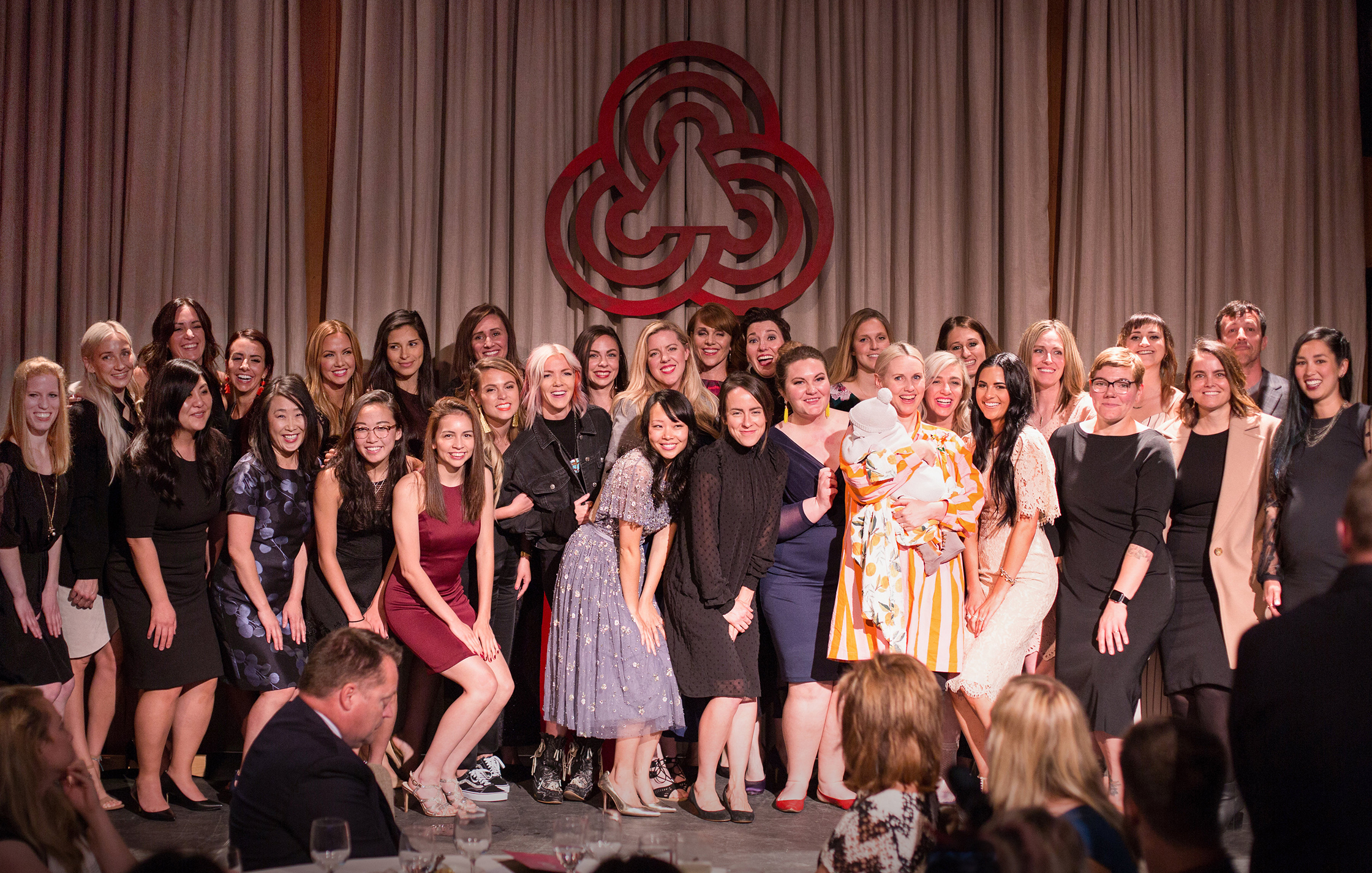
Sego Award Winners Photo
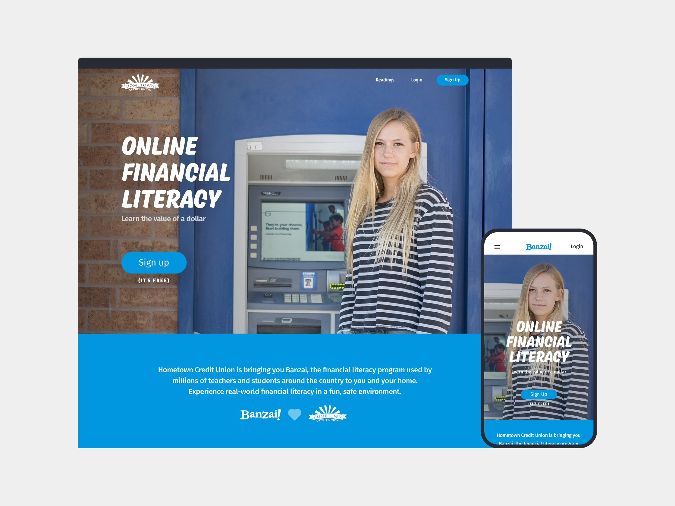
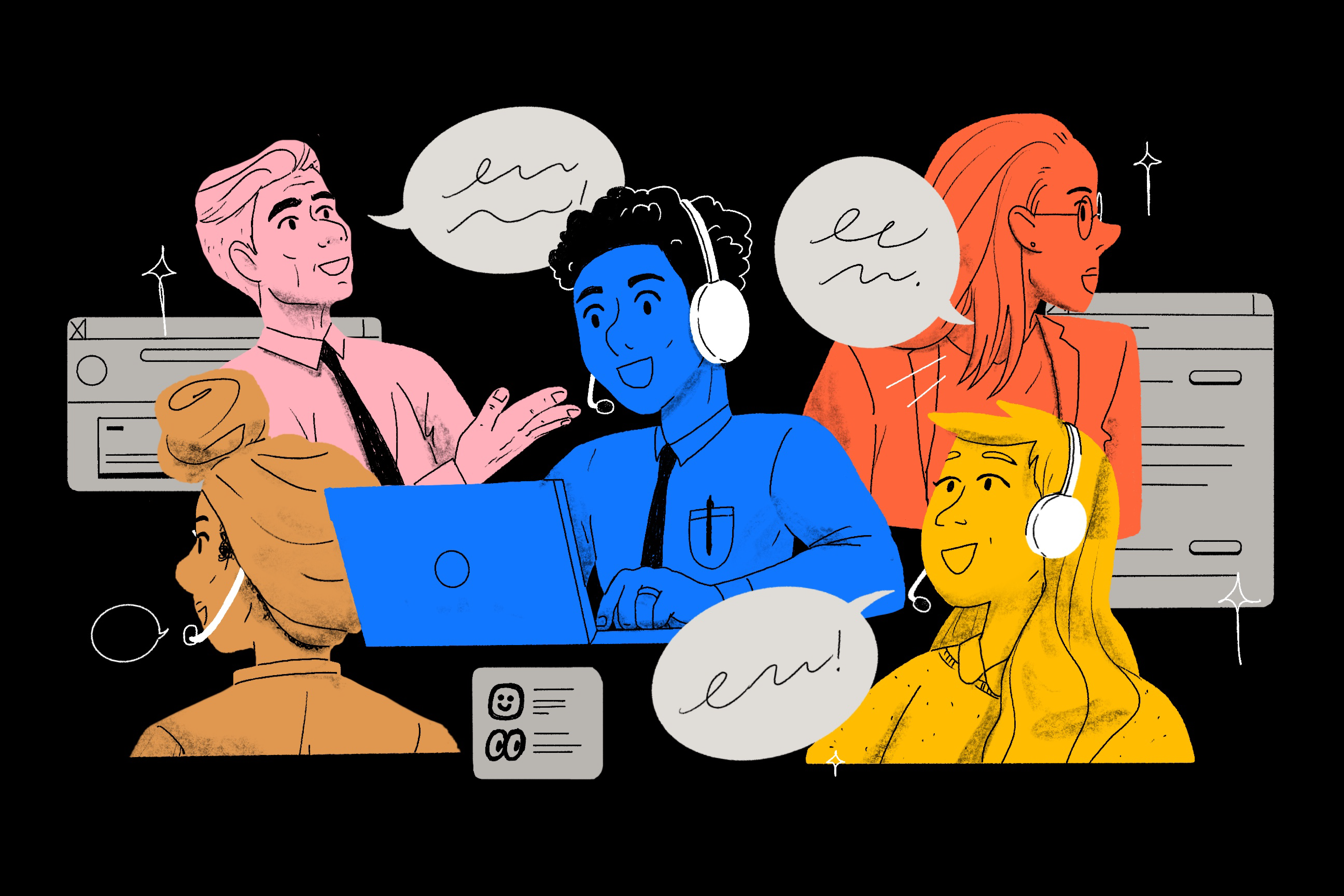
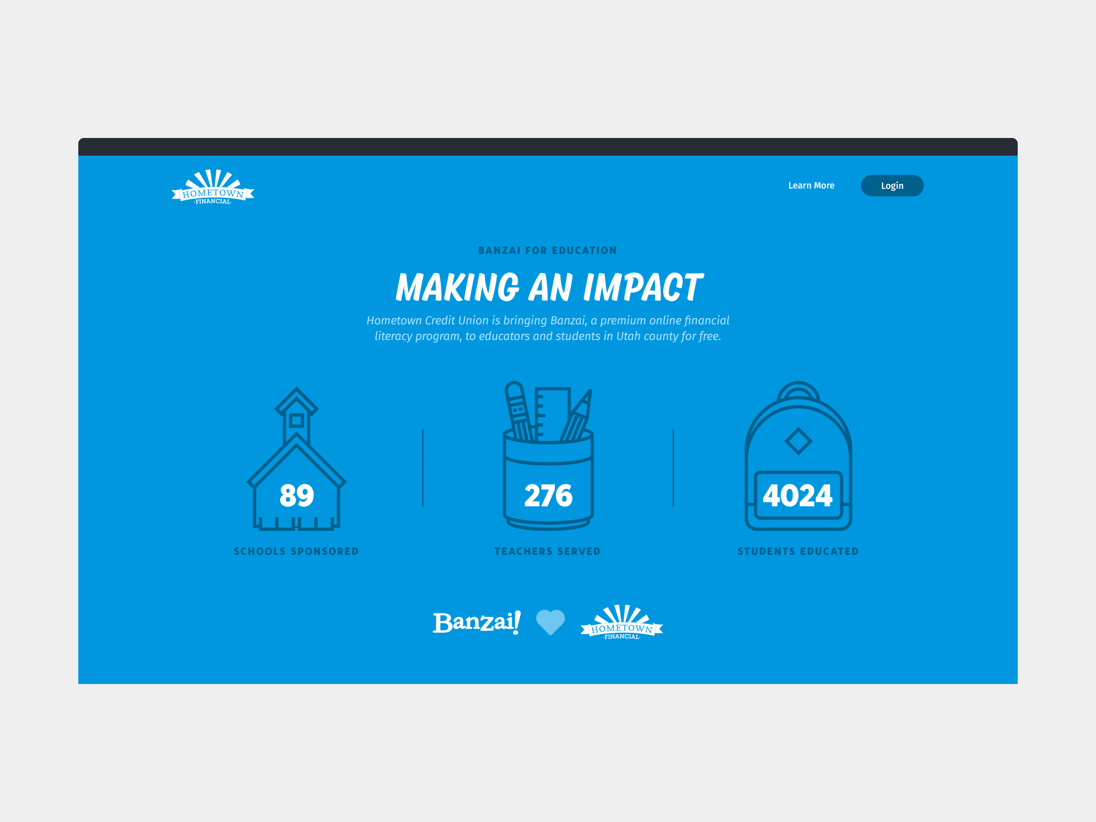
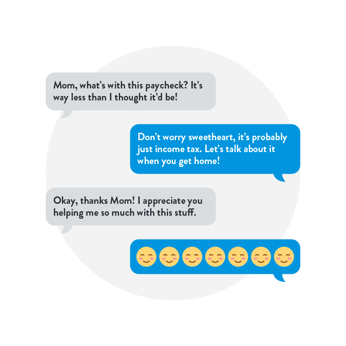
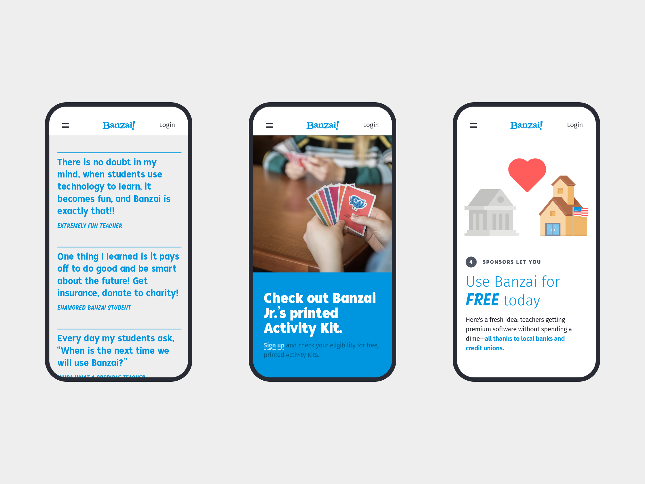
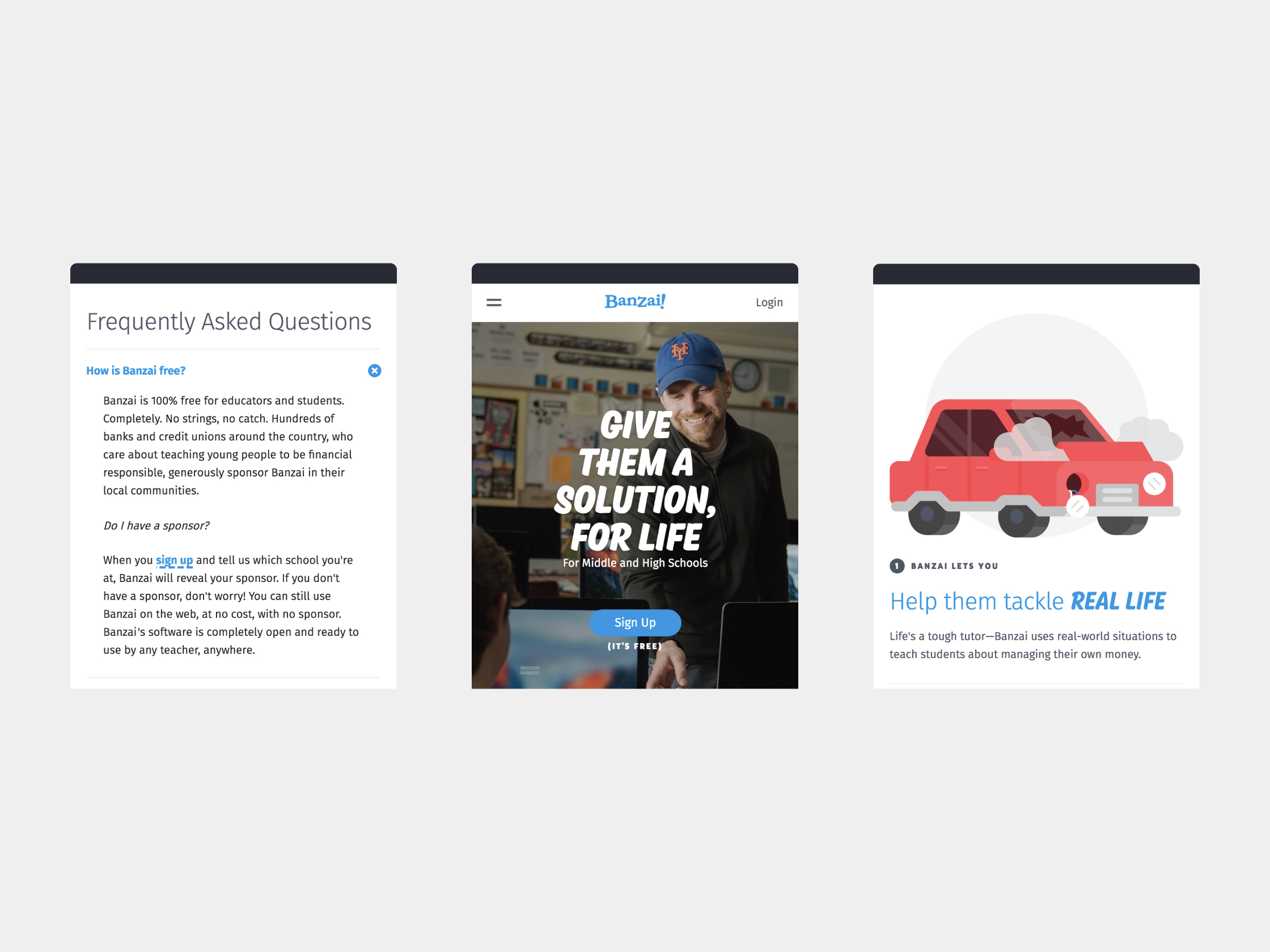
Design and illustration for various websites for Banzai.
Each site informed and expanded upon Banzai’s brand identity as a fun, effective teaching tool. I worked to represent Banzai effectively to its varied audiences: kids, teenagers, school teachers, parents, and sponsors.
I worked to emphasize Banzai’s unique position in the education tech market as a premium product that teachers can use for free in the classroom. On the other side, it was important to demonstrate Banzai’s value as a PR tool to potential sponsors.
It was equally important to show all audiences that Banzai is a tool that kids and teenagers will love to interact with.Development — Kendall Buchanan, Kenna Martin, Zac Boswell, Austin Hollenbaugh, Austin Finlinson
Related projects → Banzai Brand Guidelines, Banzai Home Page
Related projects → Banzai Brand Guidelines, Banzai Home Page


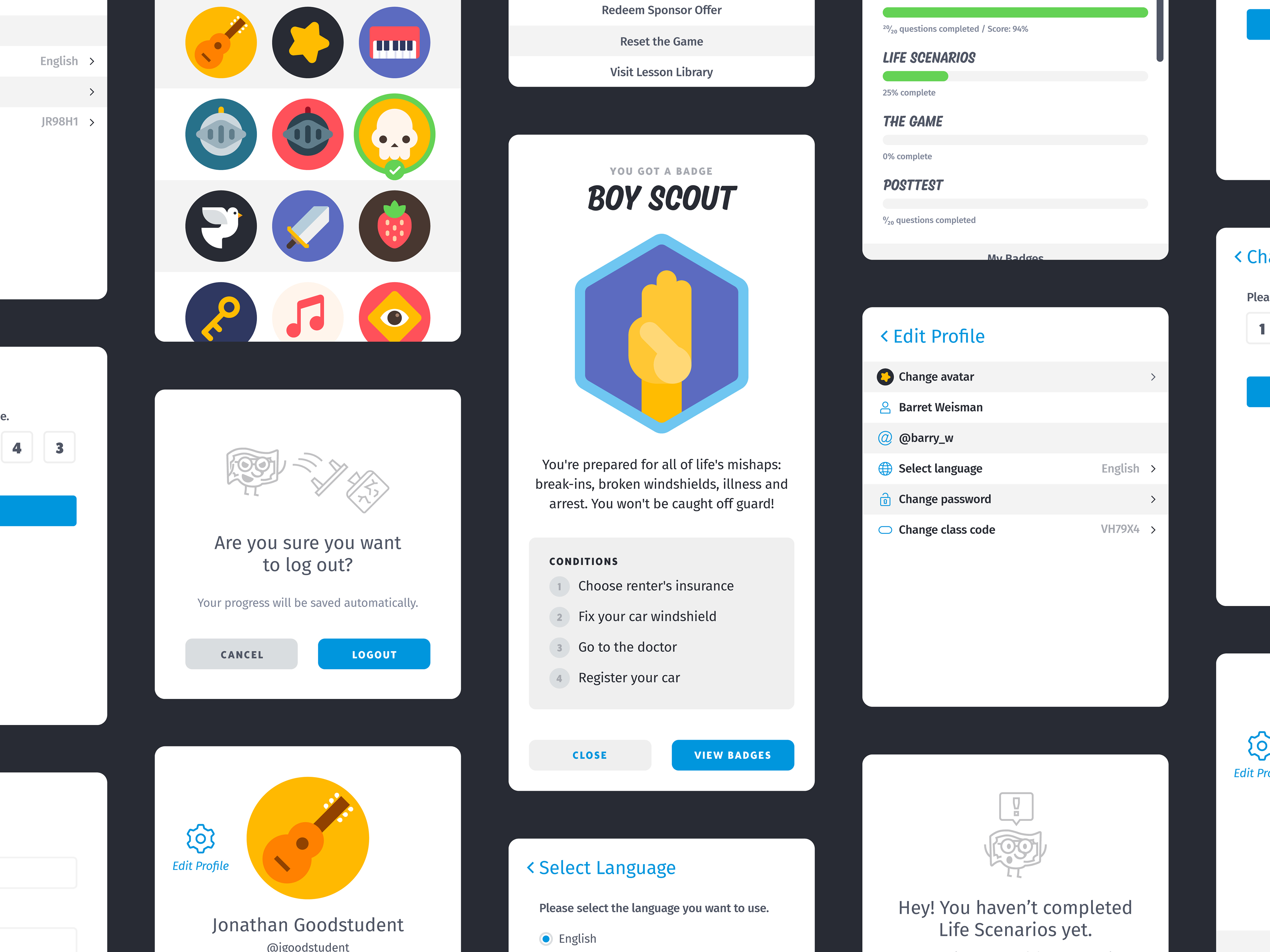
Set of user avatars for users of Banzai’s course app. In order to make Banzai’s courses more useful to students, I introduced a profile system that tracks a student’s progress in each of Banzai’s courses. As part of this update, we allowed students to select an avatar to represent them in the app.
The main goal was to cover a lot of ground with the icons; I wanted them to appeal to Banzai’s diverse audience.
Because they appear in various sizes within the app, the user icons are drawn on a grid, with large geometric shapes that remain readable at small sizes.
Related projects → Banzai Course App

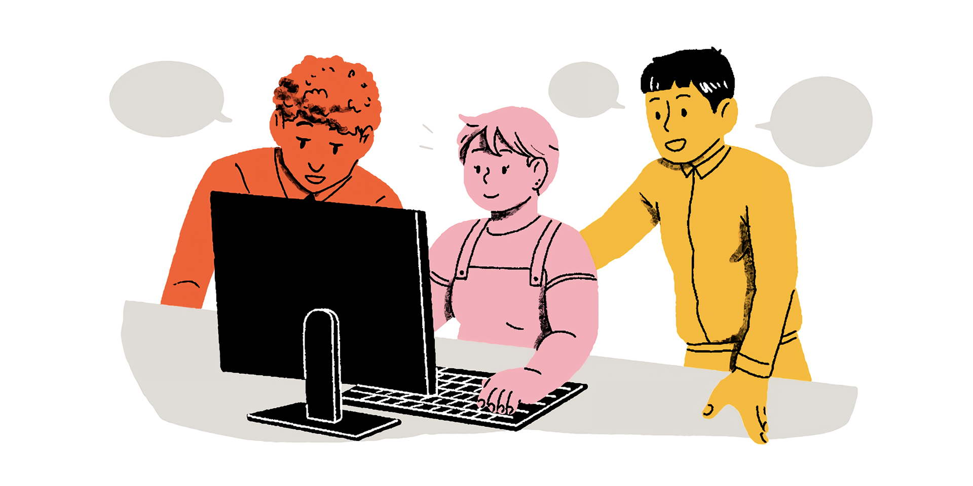
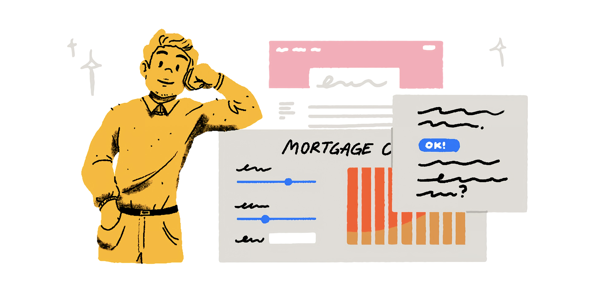
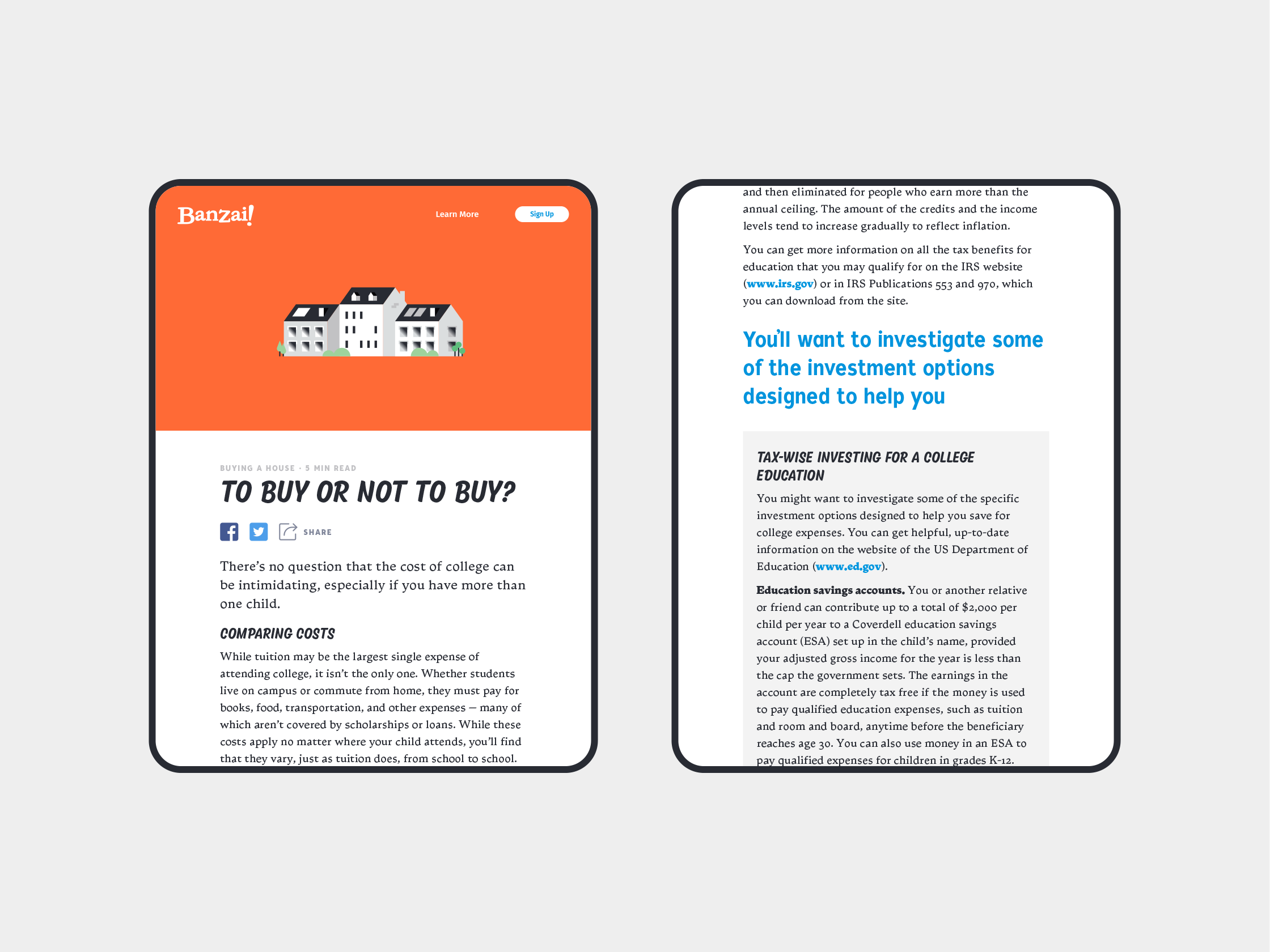
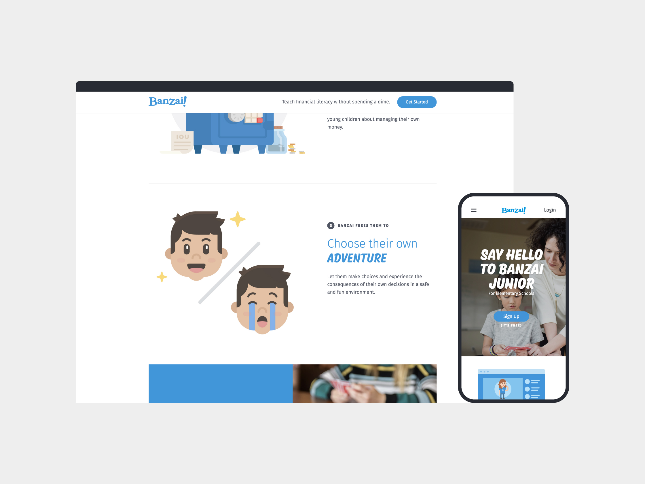
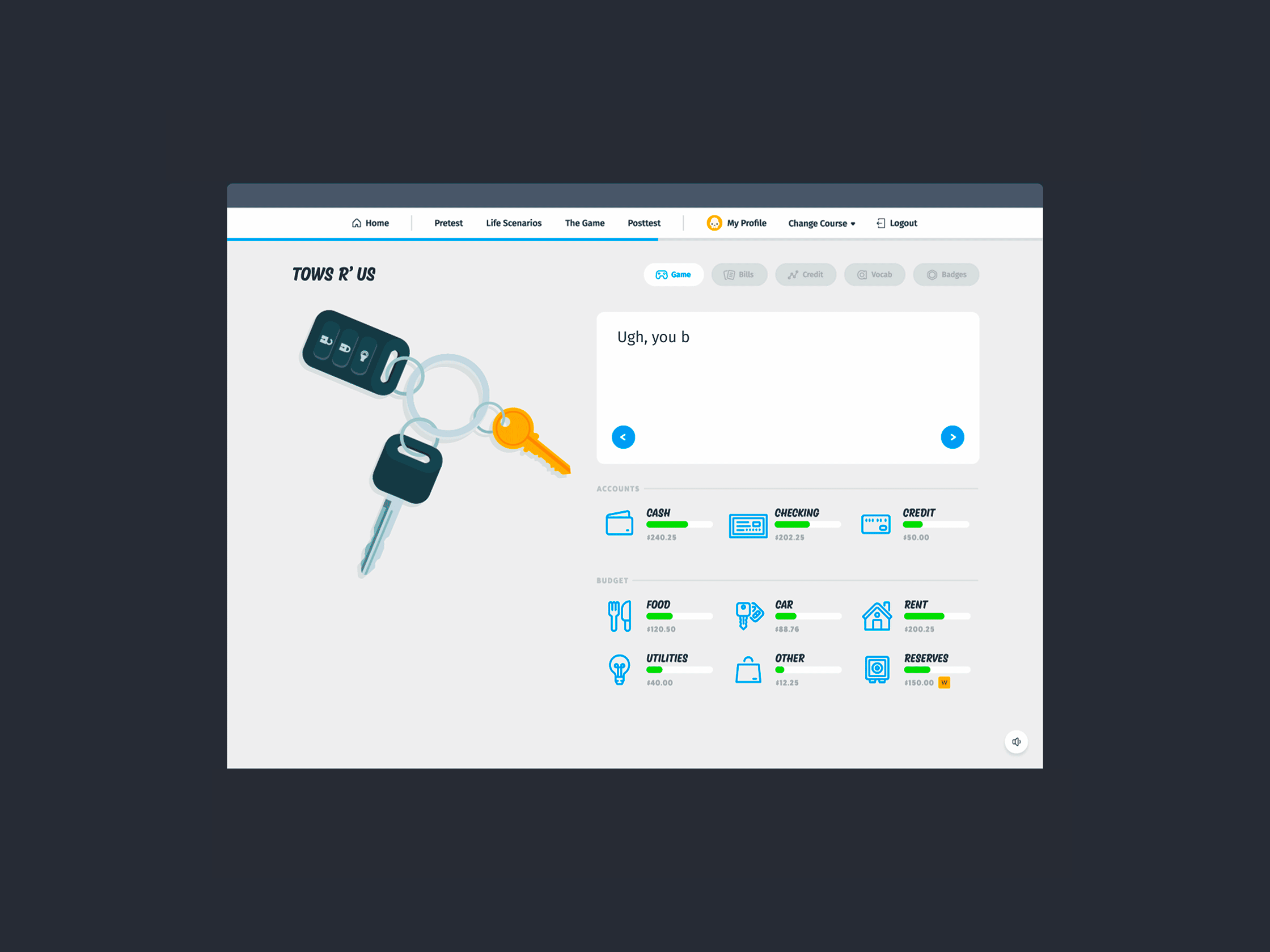
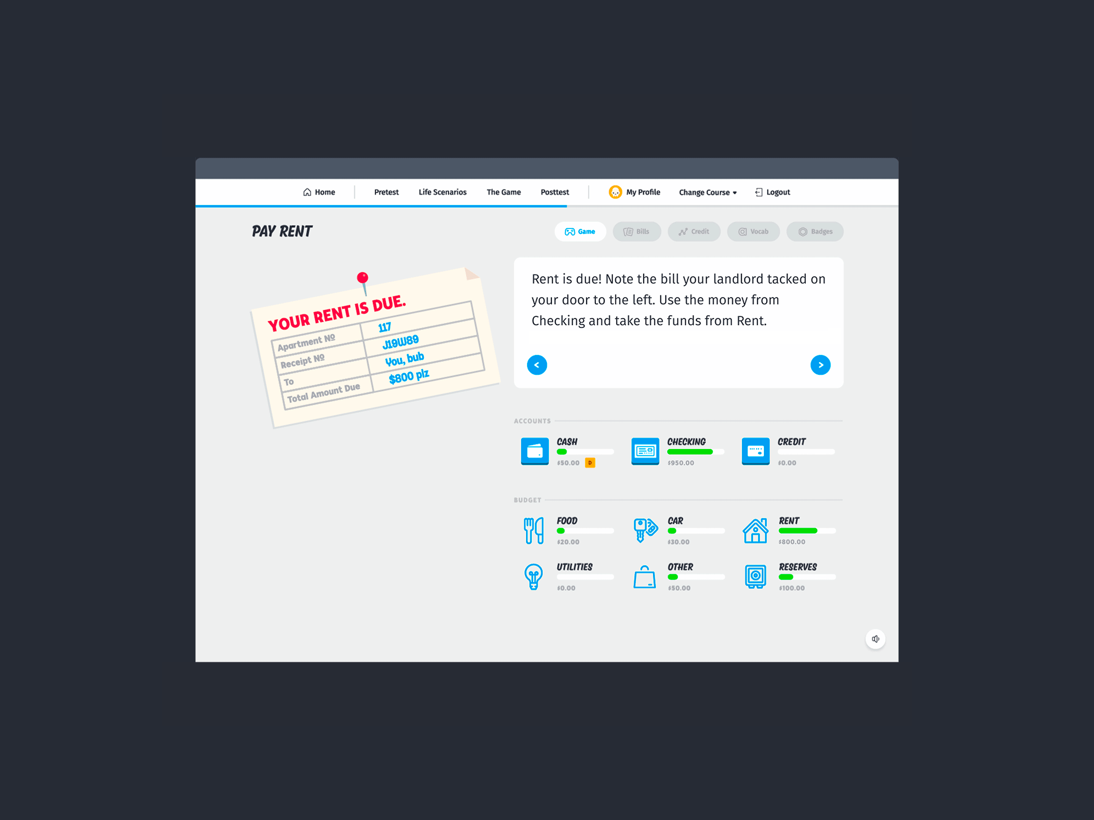
Product design for Banzai’s course app. The course app is Banzai’s flagship product; users move their way through a series of lifelike financial dilemmas, learning how to budget their money and prepare for emergencies.
When I was hired at Banzai, my first project was to take the lead on completely rethinking Banzai’s course app, which at the time relied on a combination of a web app and printed booklets for users to complete. In close partnership with developer Kendall Buchanan and illustrator Cristi Cash, I worked through the strategy, user experience, and user interface of the course app.
The release of the first version of the course app coincided with the release of Banzai Junior, Banzai’s first course for elementary school students. Since then, I’ve worked with a growing product team to make numerous iterations and additions to the course app. I led UI design at every stage of the process until I left Banzai in 2019.
Development — Kendall Buchanan, Kenna Martin, Zac Boswell, Austin Hollenbaugh, Austin Finlinson
Illustration — Cristi Cash, Chelsea Miller
Related projects → Banzai Brand Guidelines, Banzai Web Design

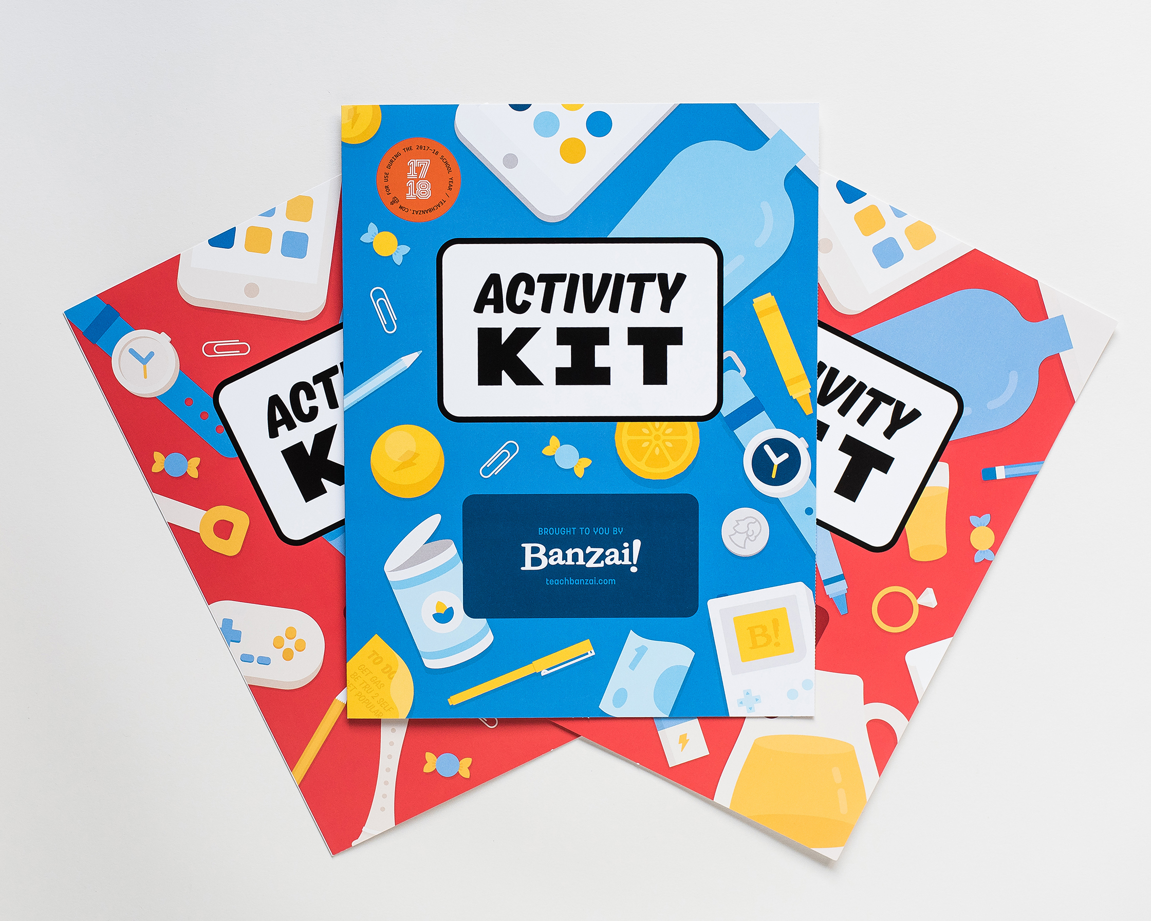
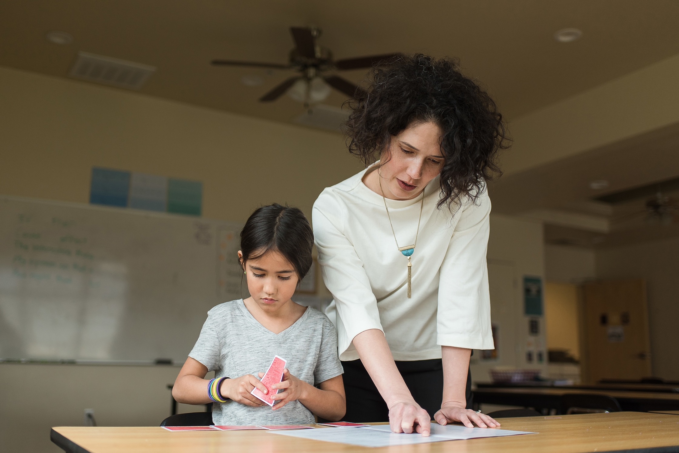
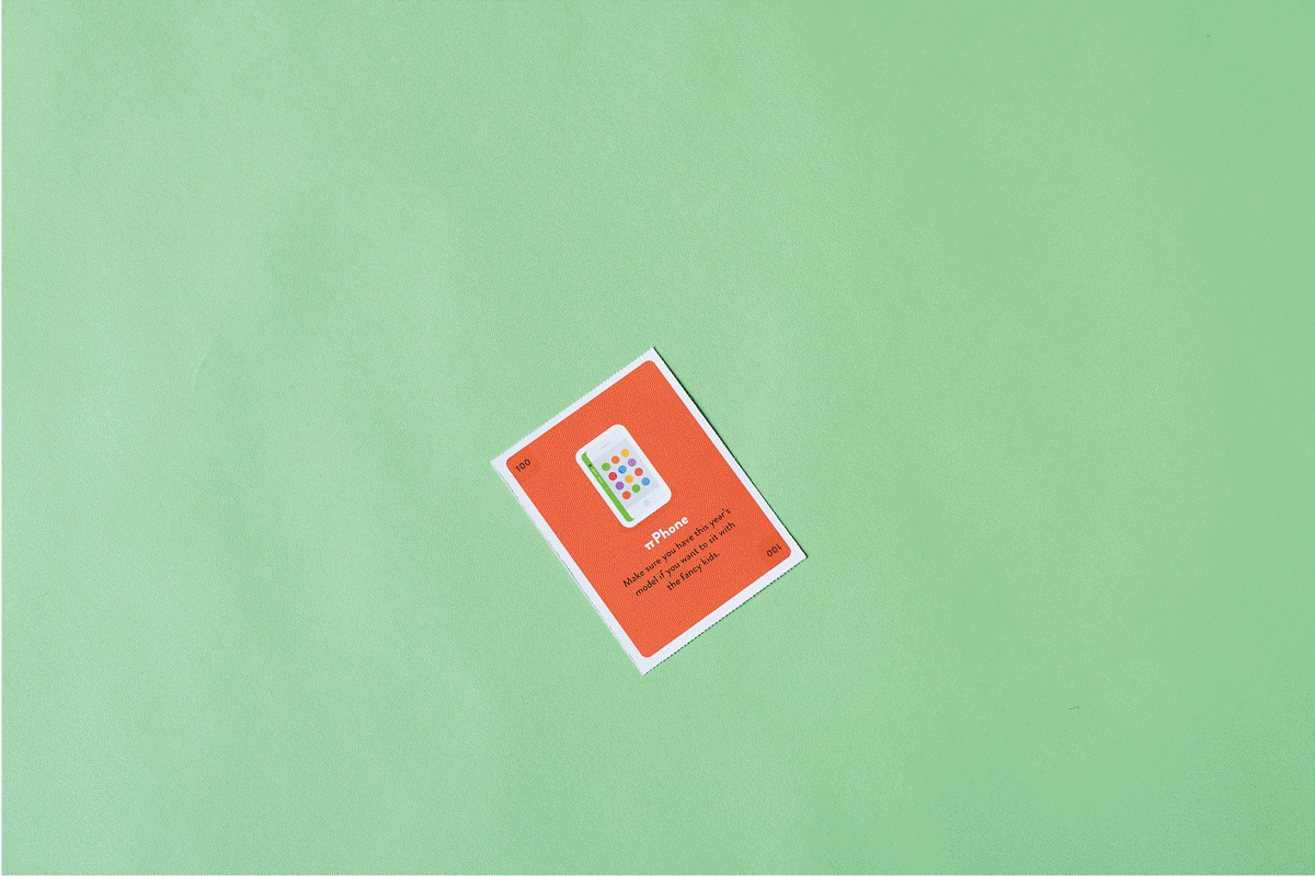
Design, name, writing, and illustration for the Banzai Activity Kits, two sets of financial literacy activities for young students. The Activity Kits supplement Banzai’s online courses with hands-on exercises for use in and out of the classroom.
The red Activity Kit is designed for elementary school students, the blue one for middle and high schoolers. Both offer activities catered toward their specific audiences, including a perforated page of playing cards for an in-class trading game. Photos — Trevor Christensen


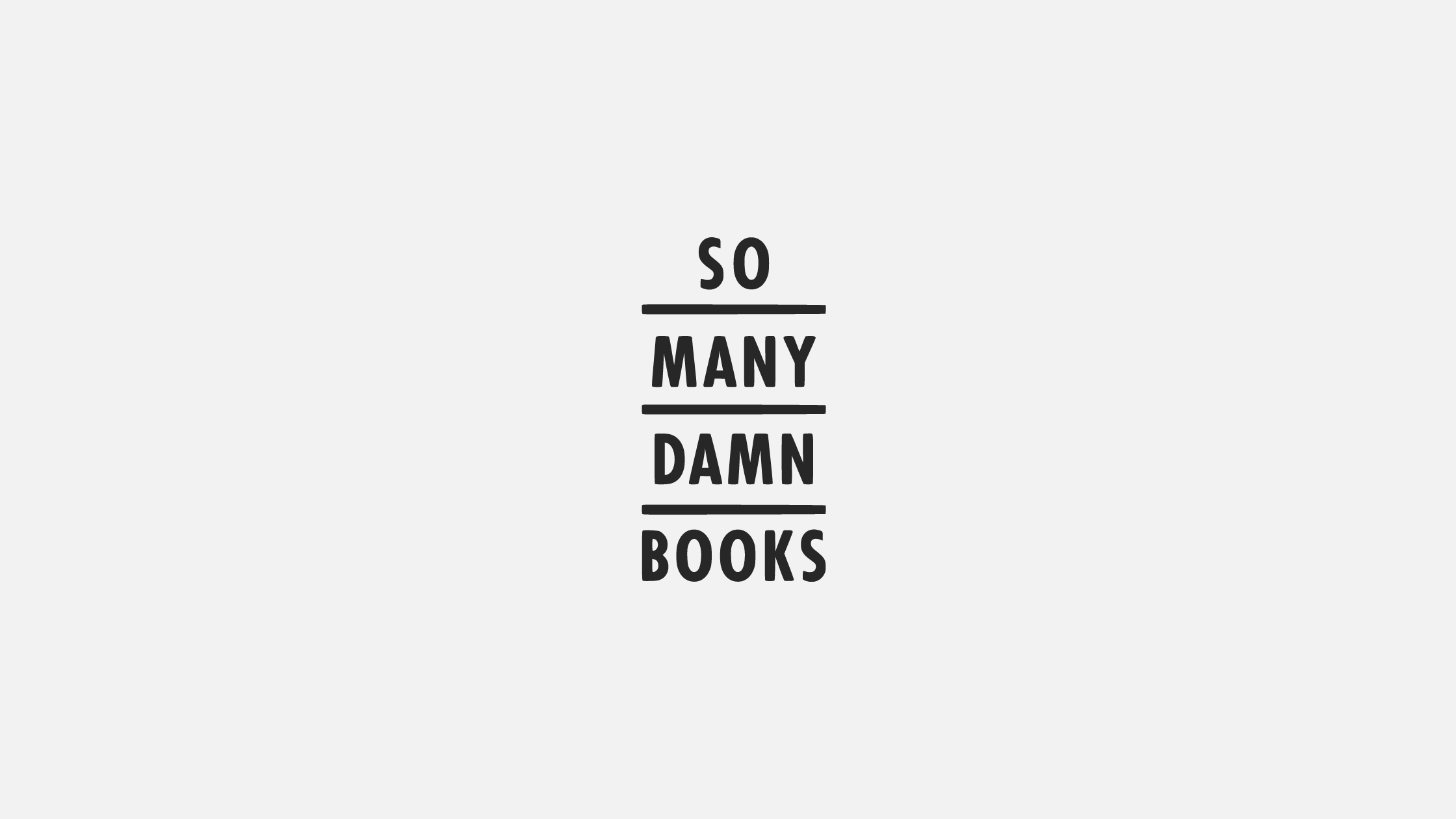
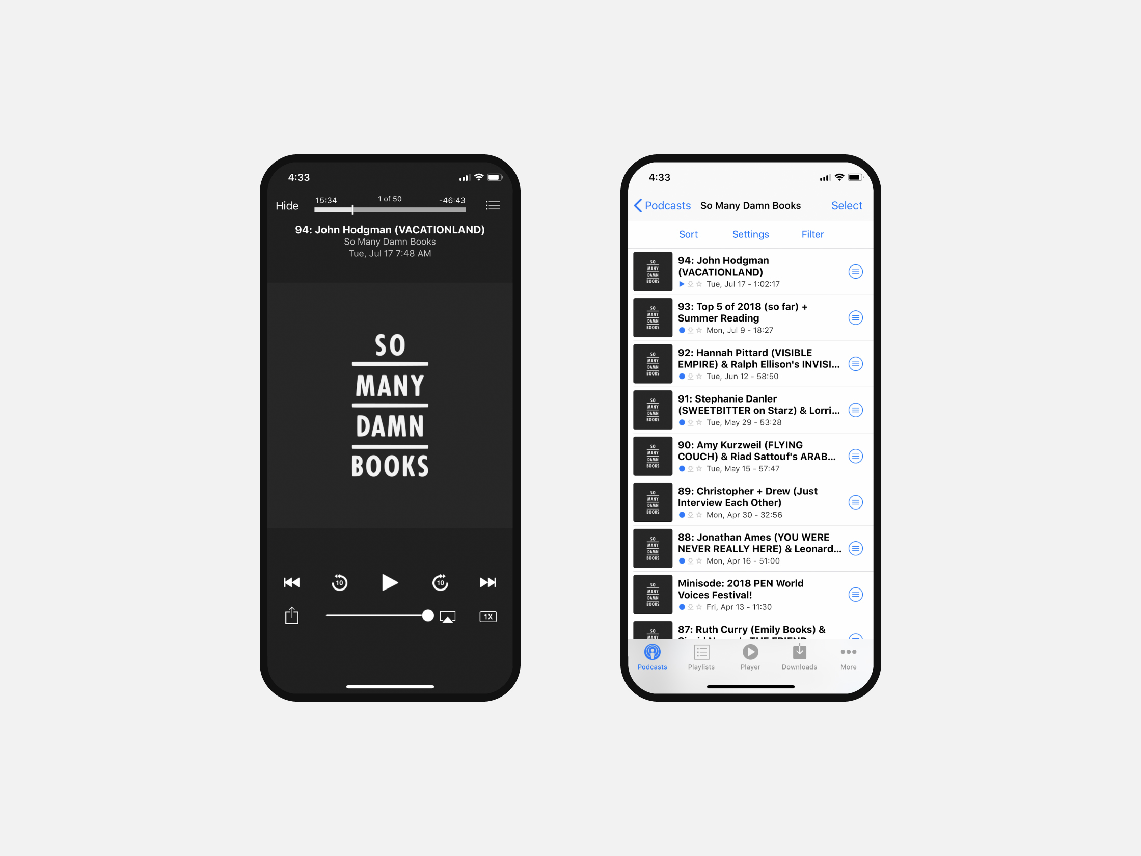
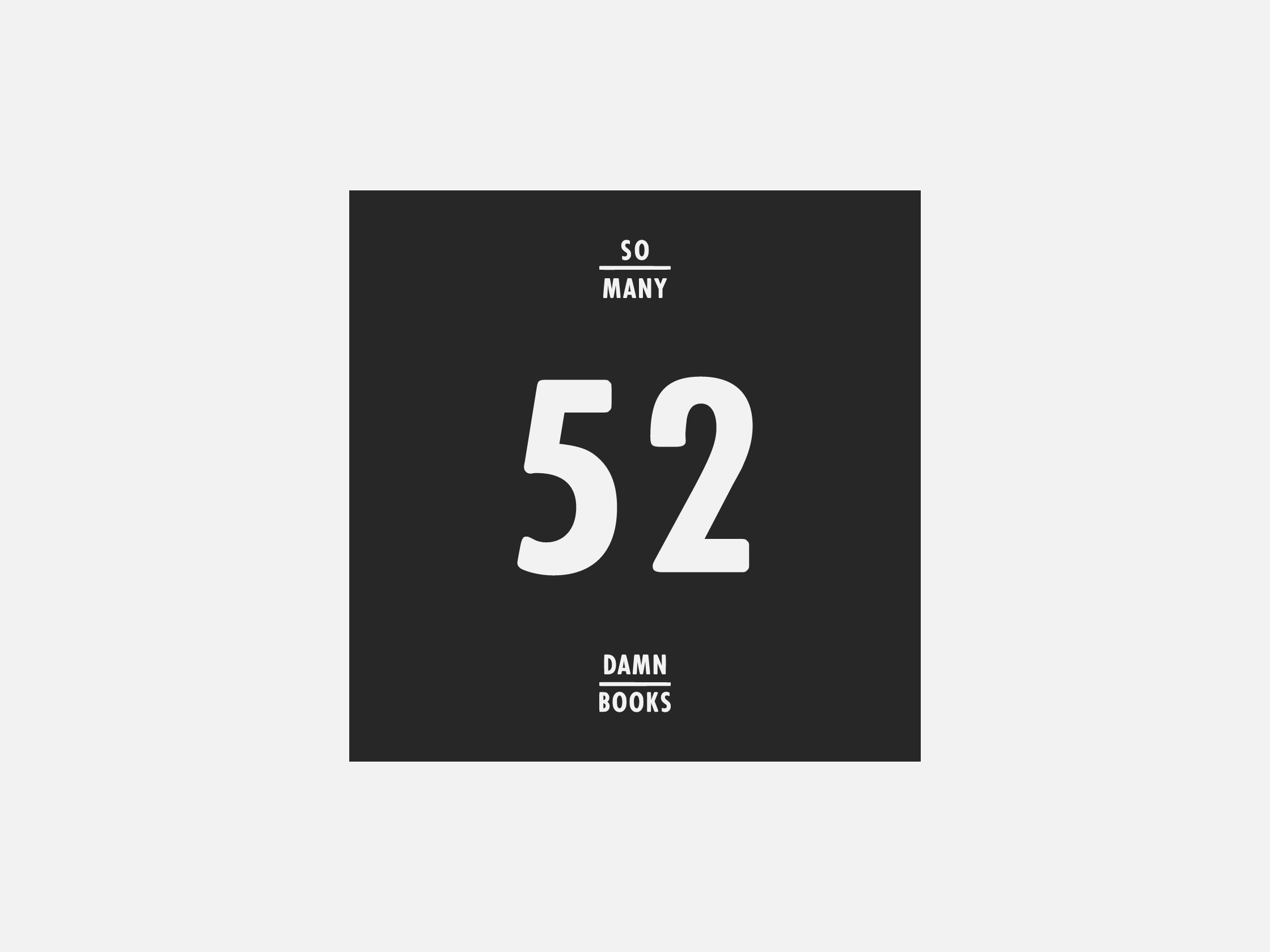
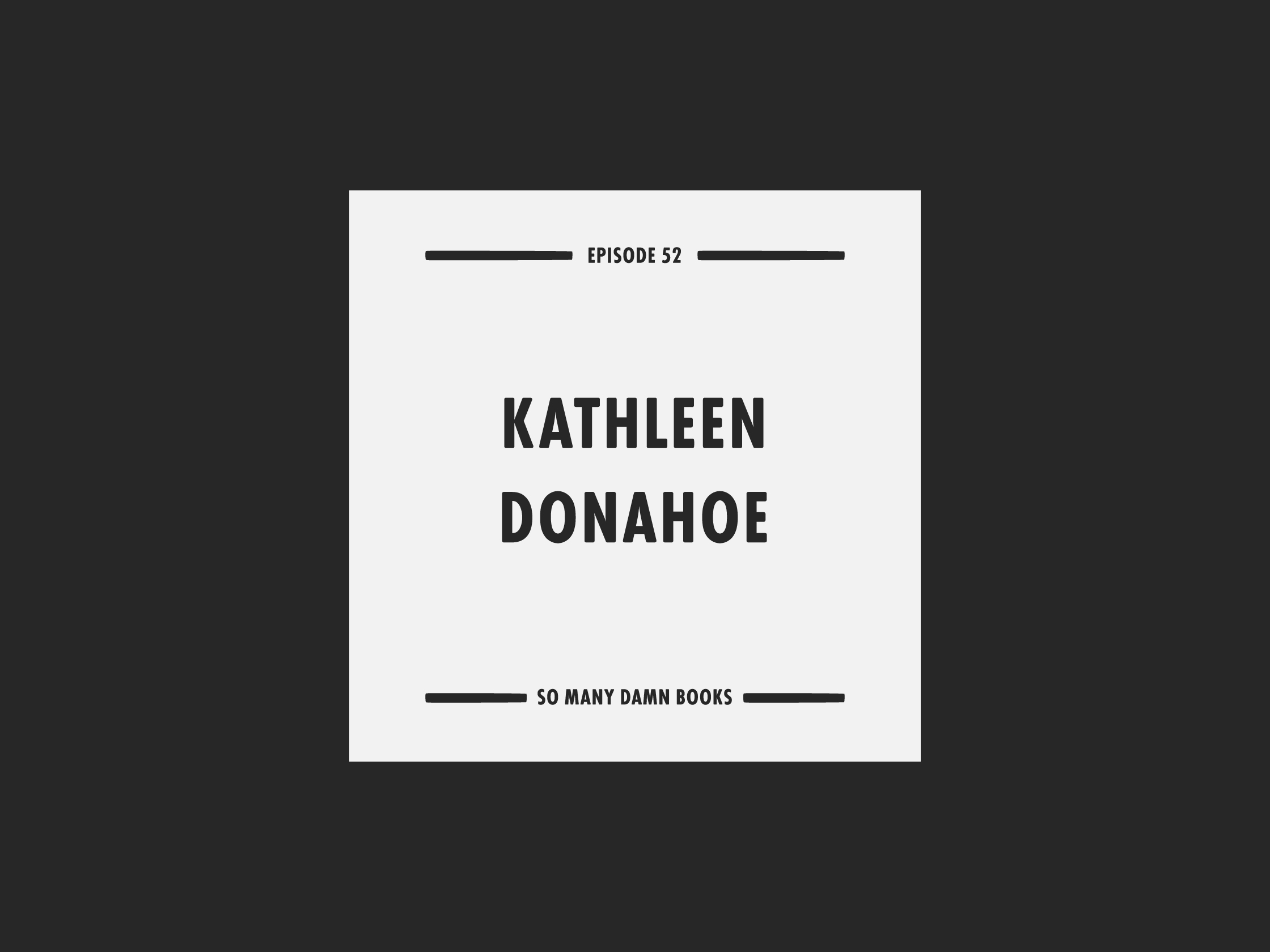
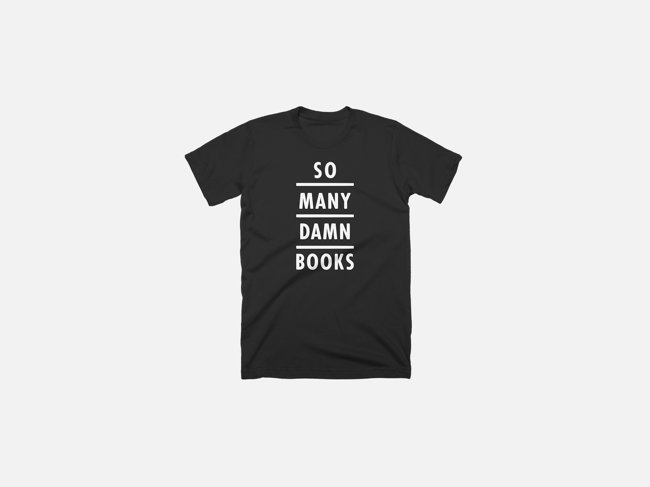
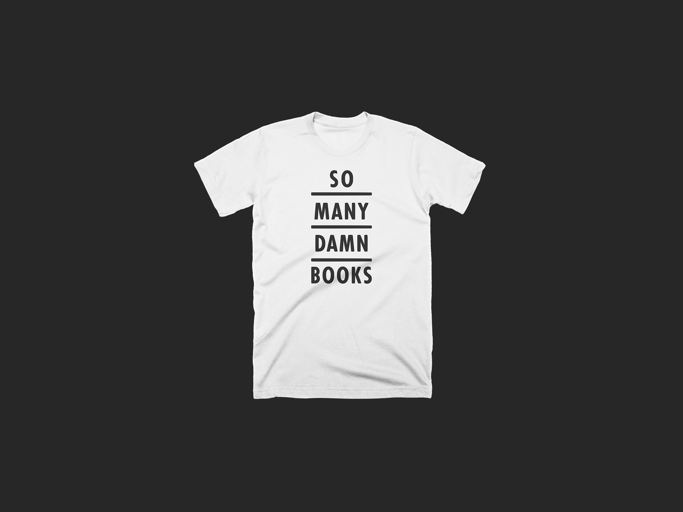
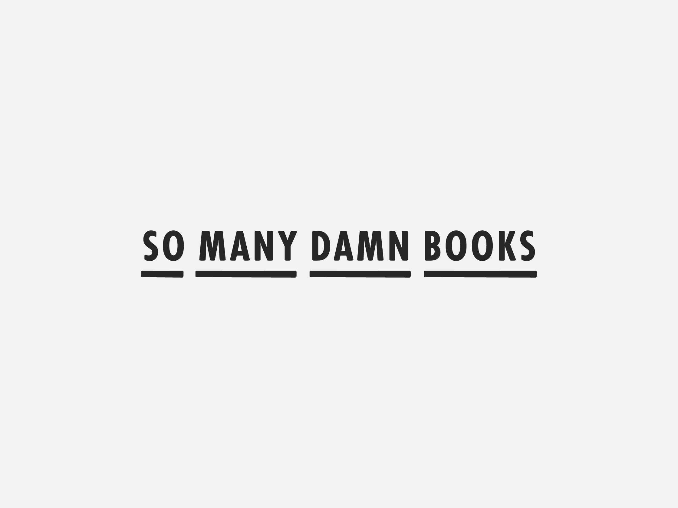
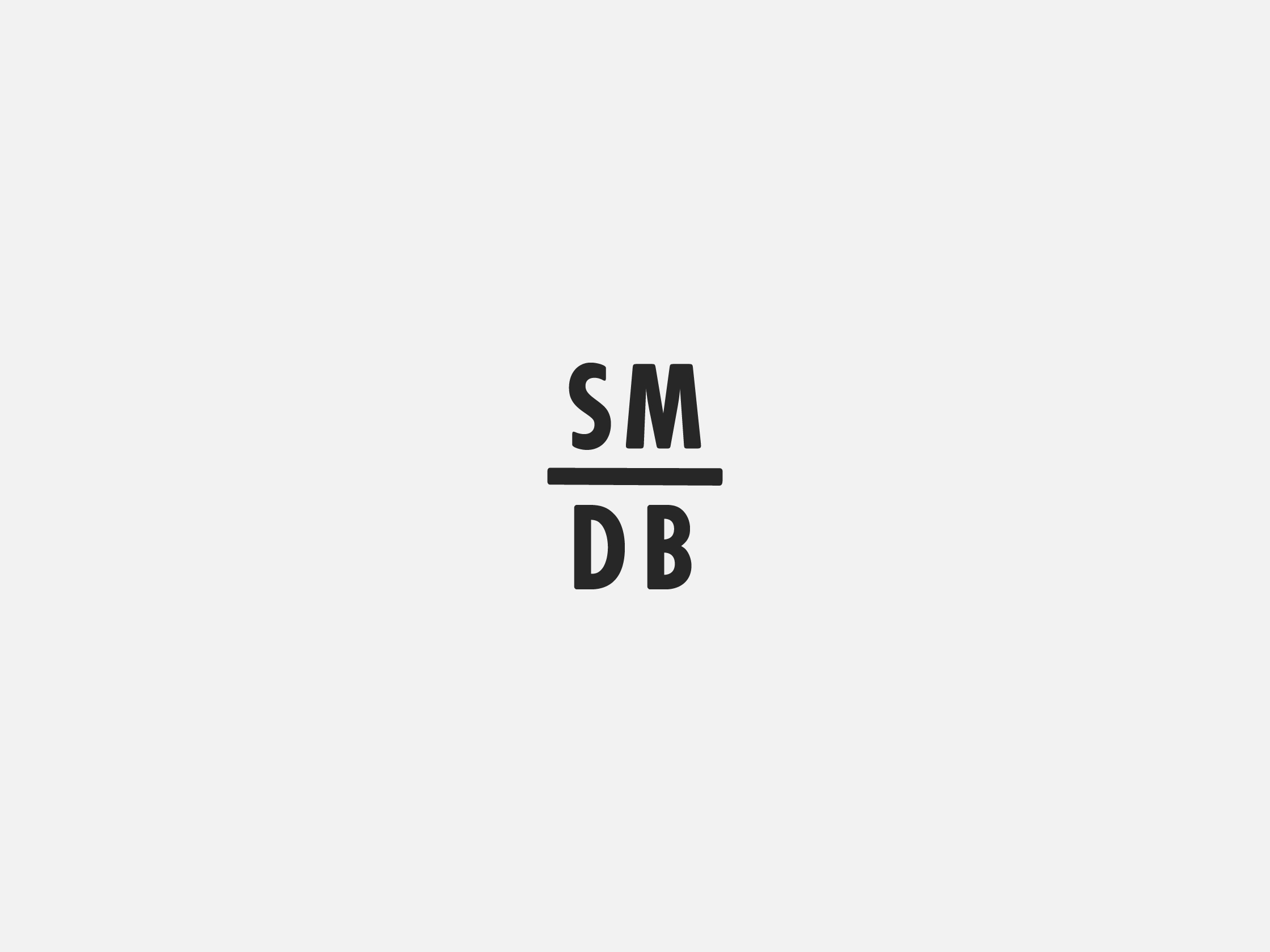
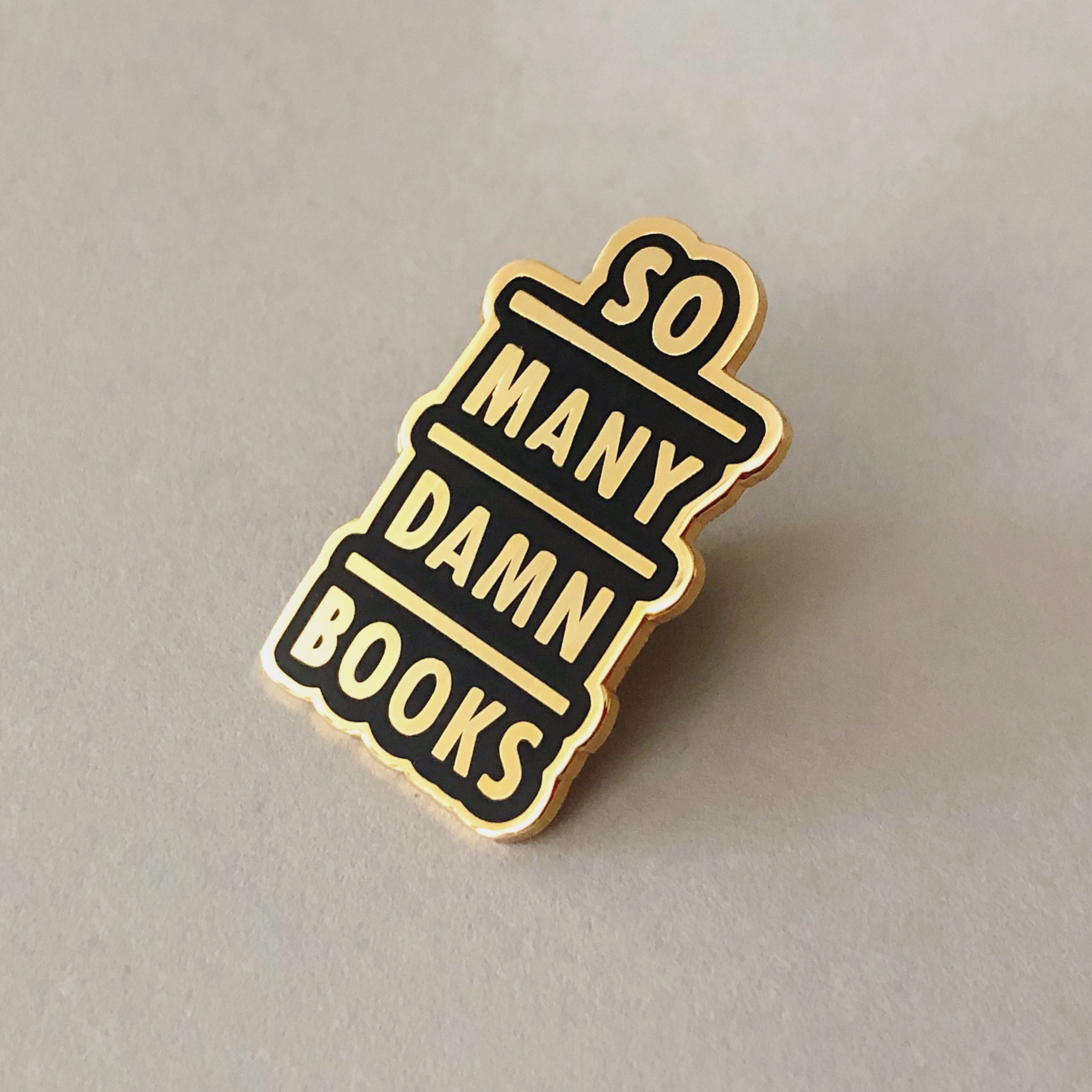
Logo and branding system for So Many Damn Books, a podcast that celebrates books and reading. The stacked shelf motif carried through to the logo (which is adaptable depending on use case), podcast episode art, and apparel.The show is ongoing and can be supported on Patreon.

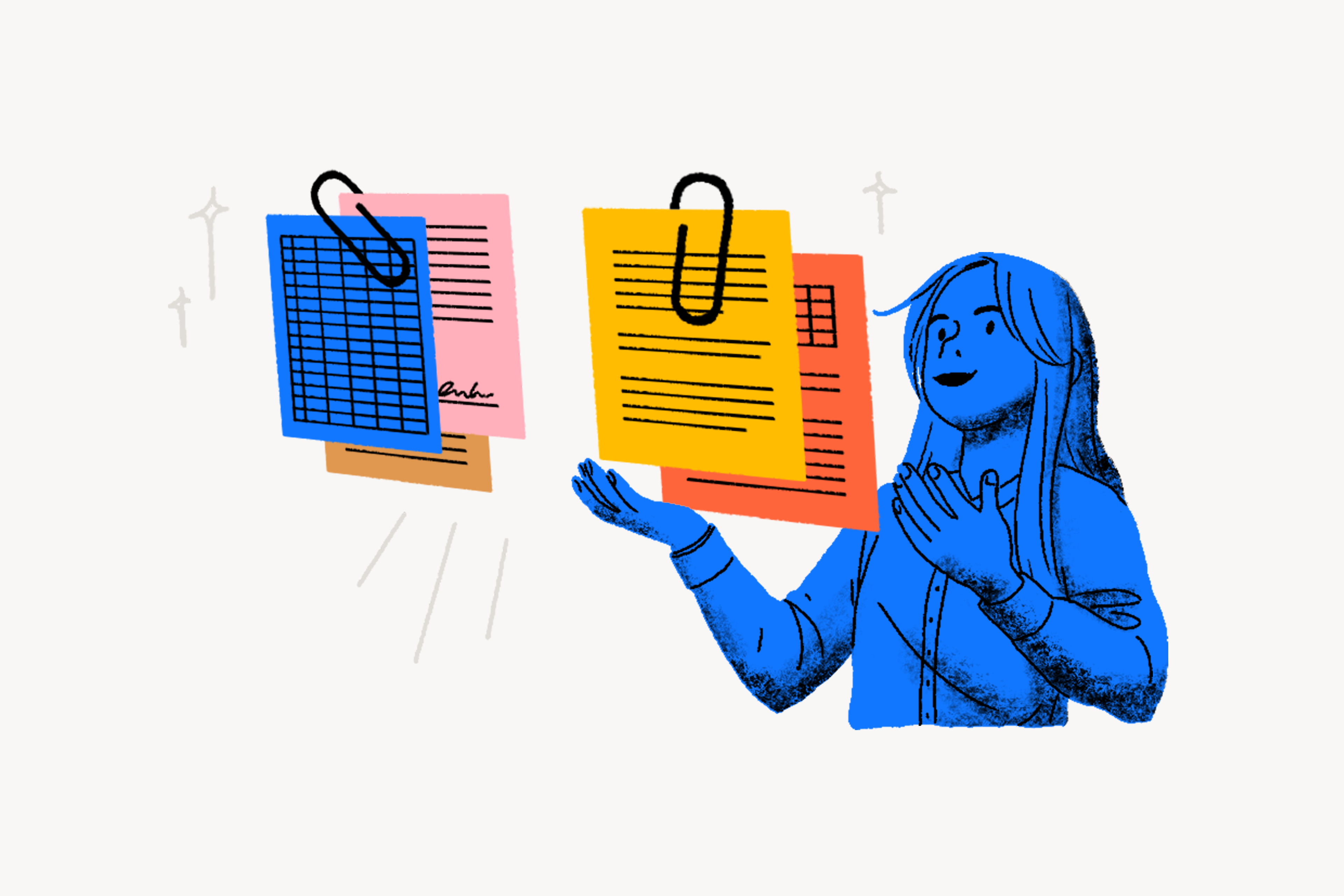
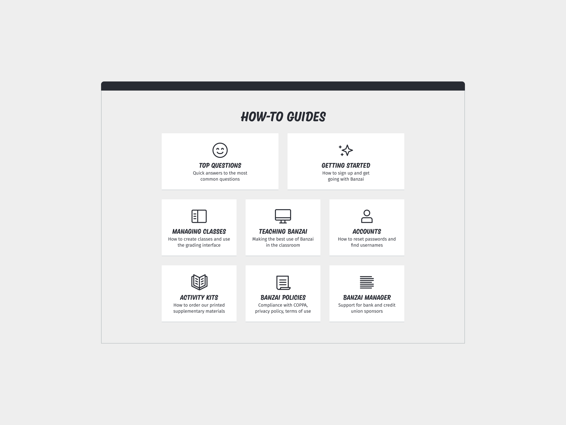
Brand guidelines for Banzai. The guidelines cover each facet of Banzai’s brand, including proper logo usage, typography, and colors. It also outlines how to create illustrations and icons in accordance with Banzai’s style, so future designers could easily add to the brand without breaking consistency.When I began work at Banzai, the company’s brand was fragmented. Banzai had never employed a full-time in-house designer before, so various contracted designers’ takes on the brand over the years had diluted its impact. I standardized a color palette and typographic system based on work that was done previously. The goal was to refine and unify, rather than reinvent.View some sample pages below, or download the PDF.Banzai’s logo drawn by Kyle Wayne Benson.


My Tumblr
Client: Self-initiated
2015 → Ongoing
Client: Self-initiated
2015 → Ongoing
Ongoing Tumblr blog collecting images I discover on the internet. I use my Tumblr to gather images that might inspire the mood of my future design work, as well as to offer inspiration to other artists and designers.


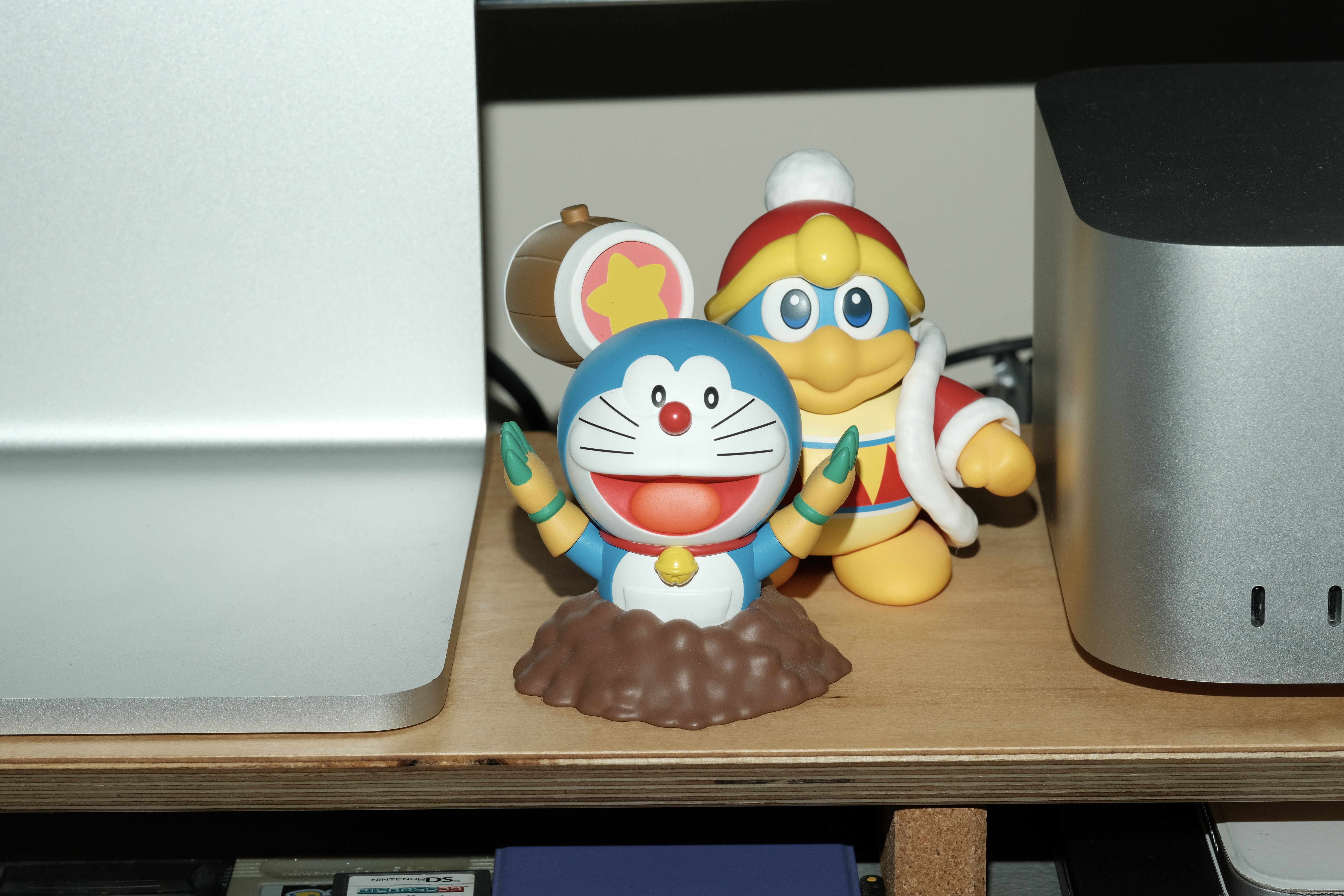
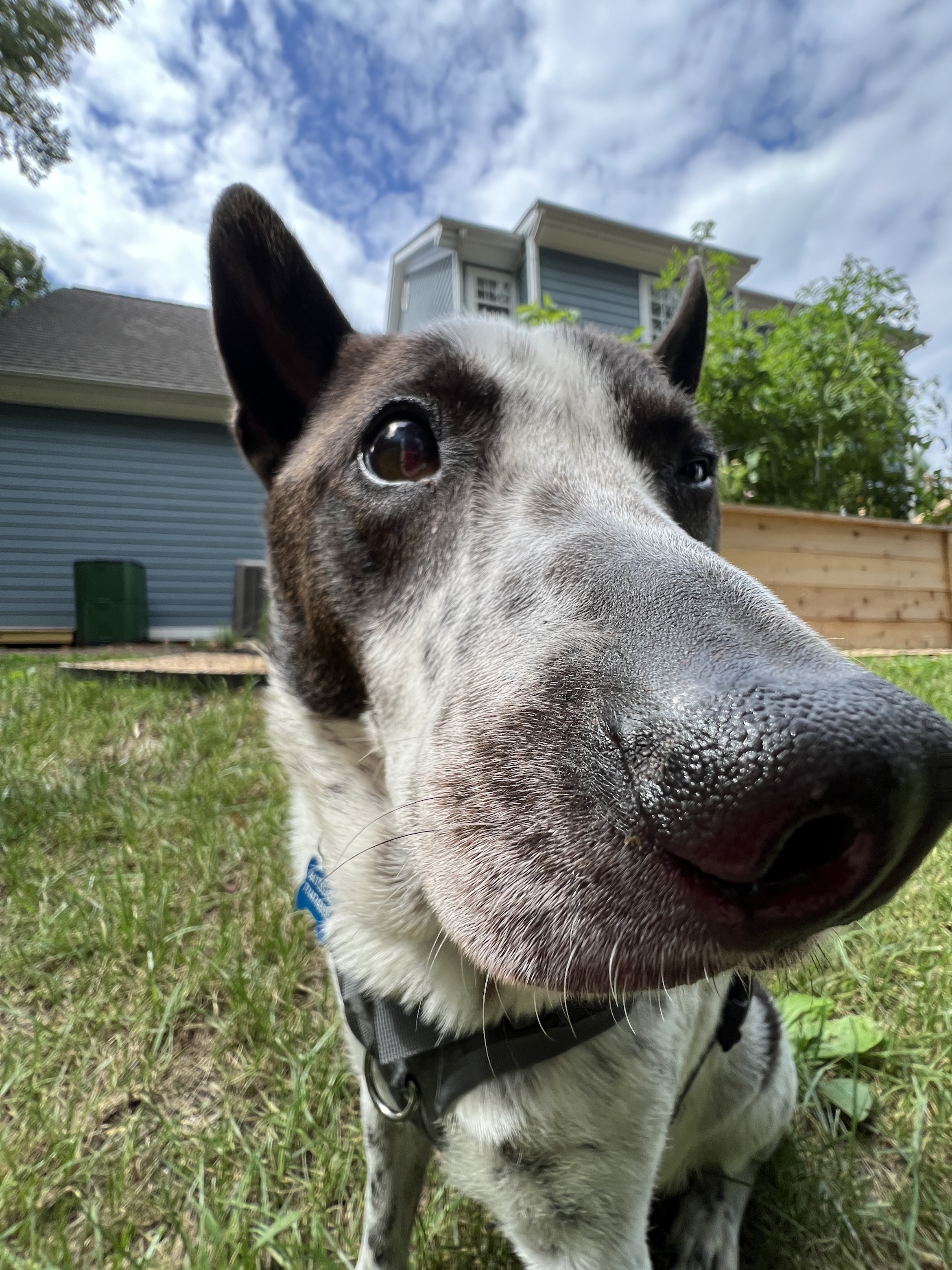
Misc
Client: Self-initiated
2015 → Ongoing
Client: Self-initiated
2015 → Ongoing
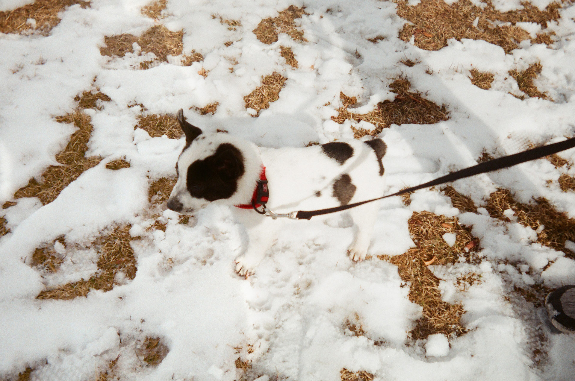
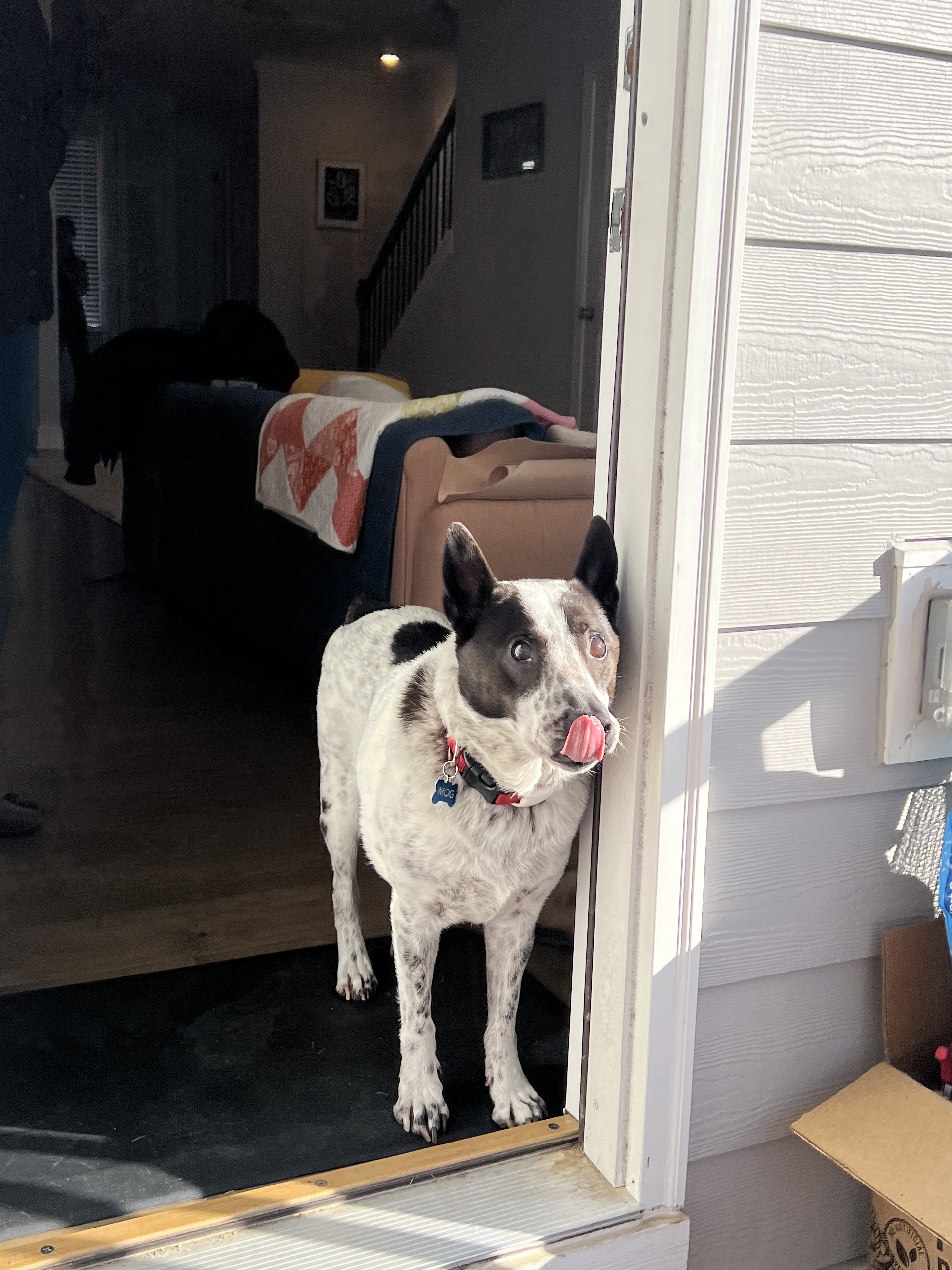
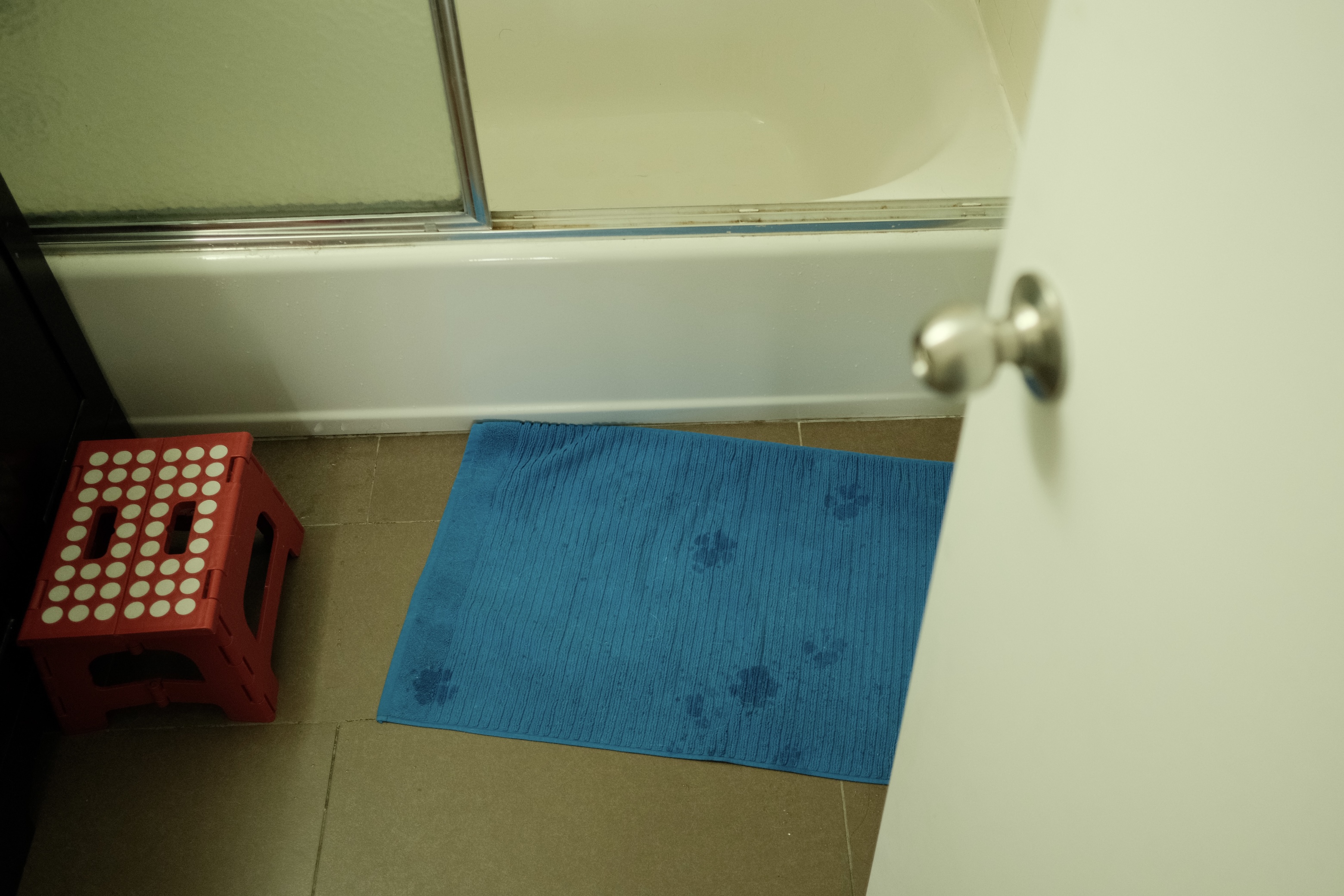
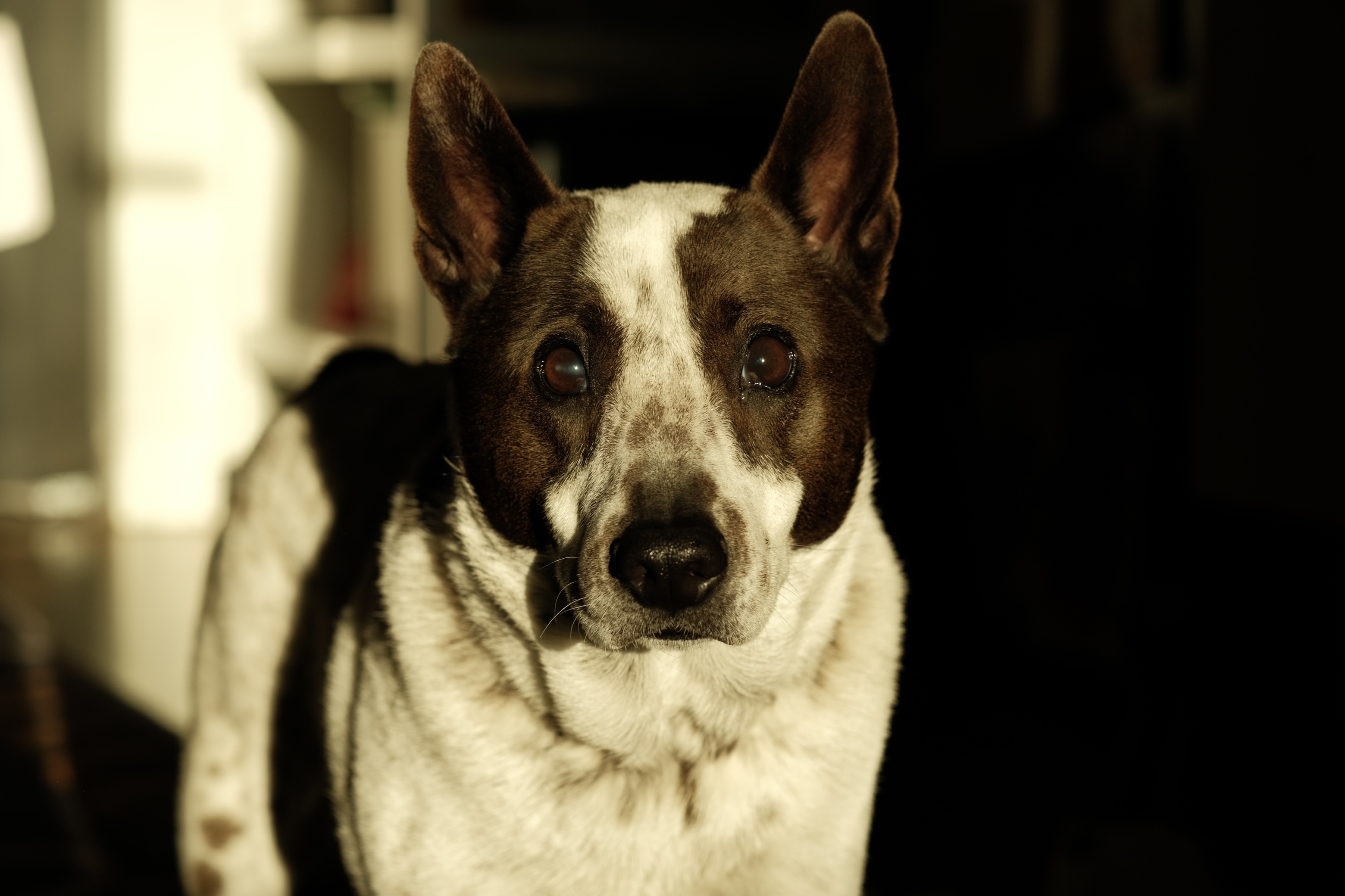
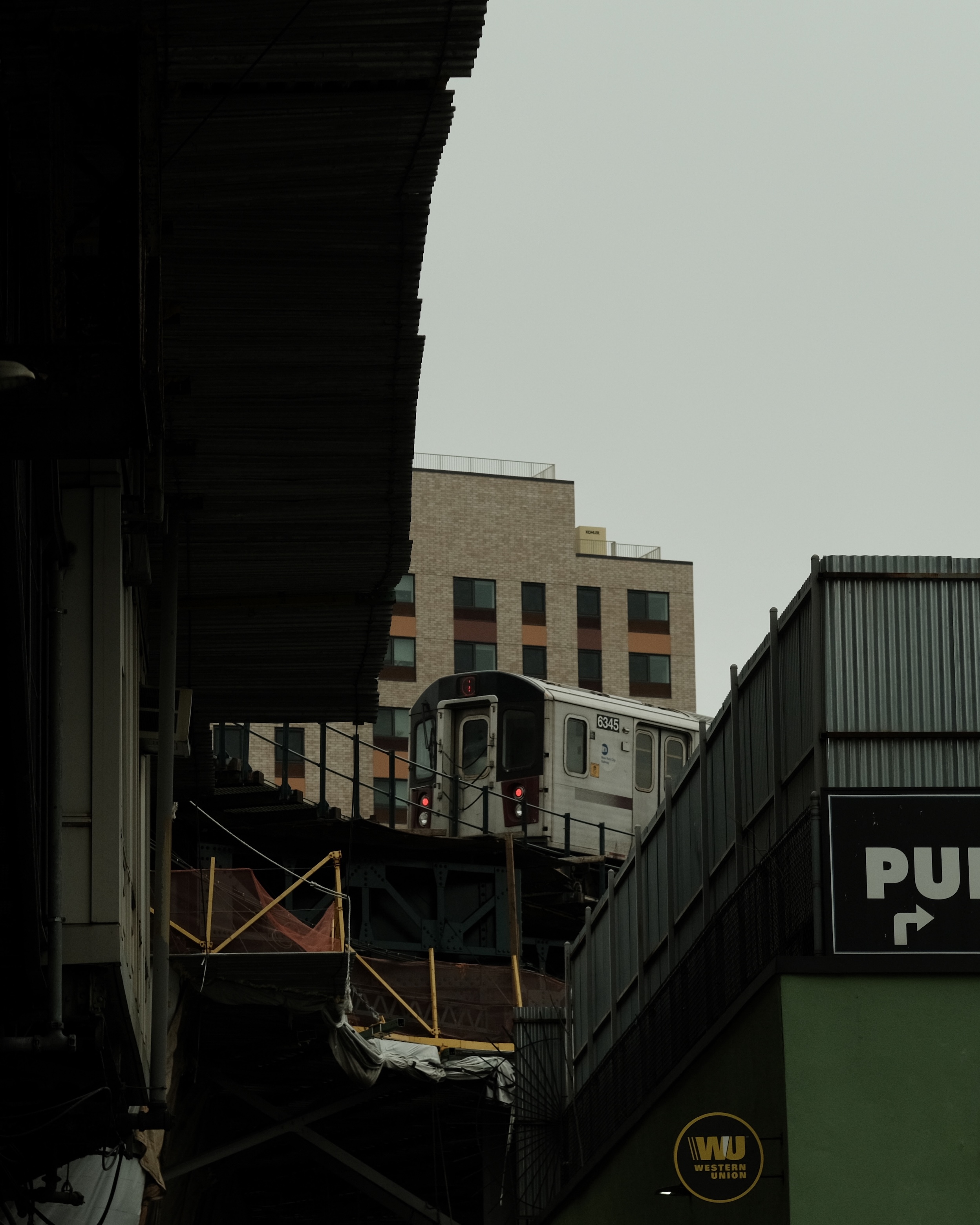
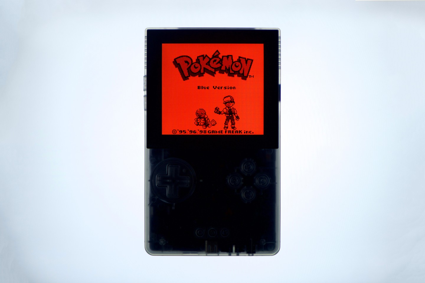
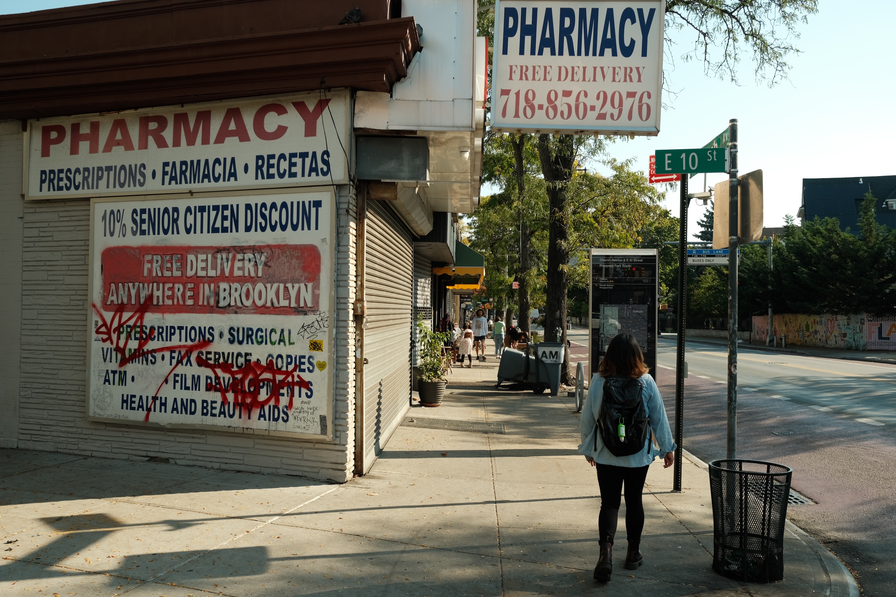
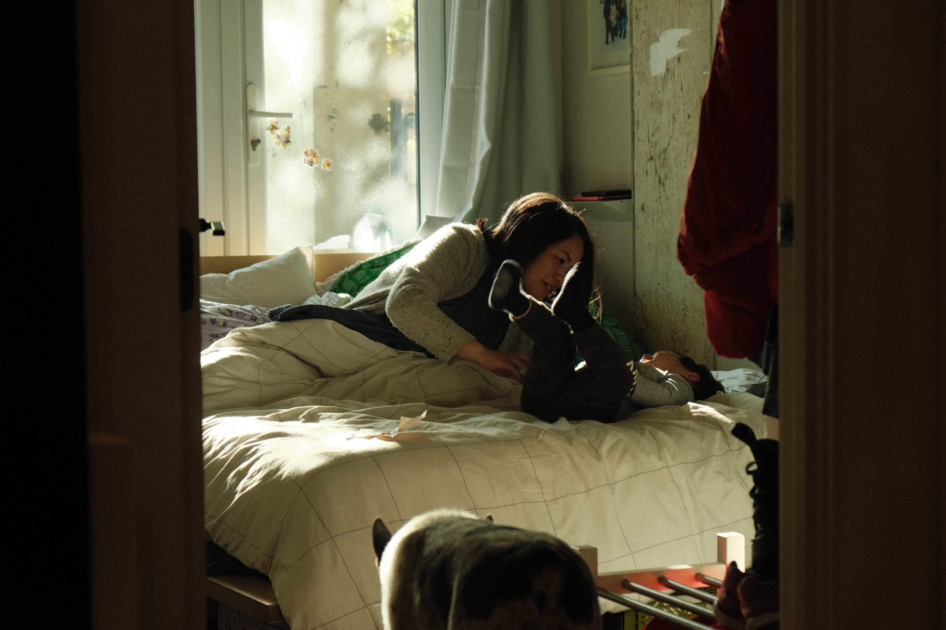
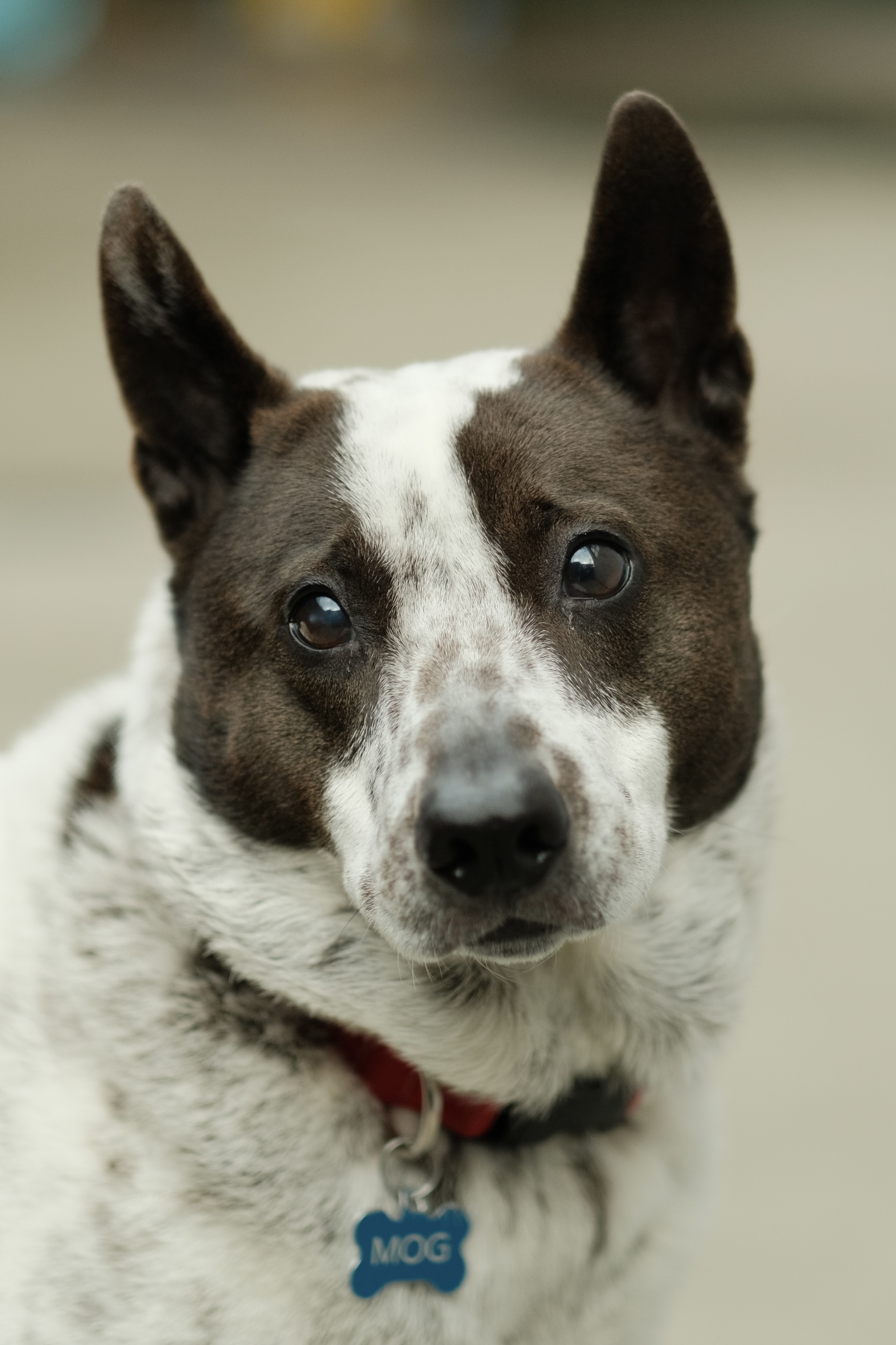
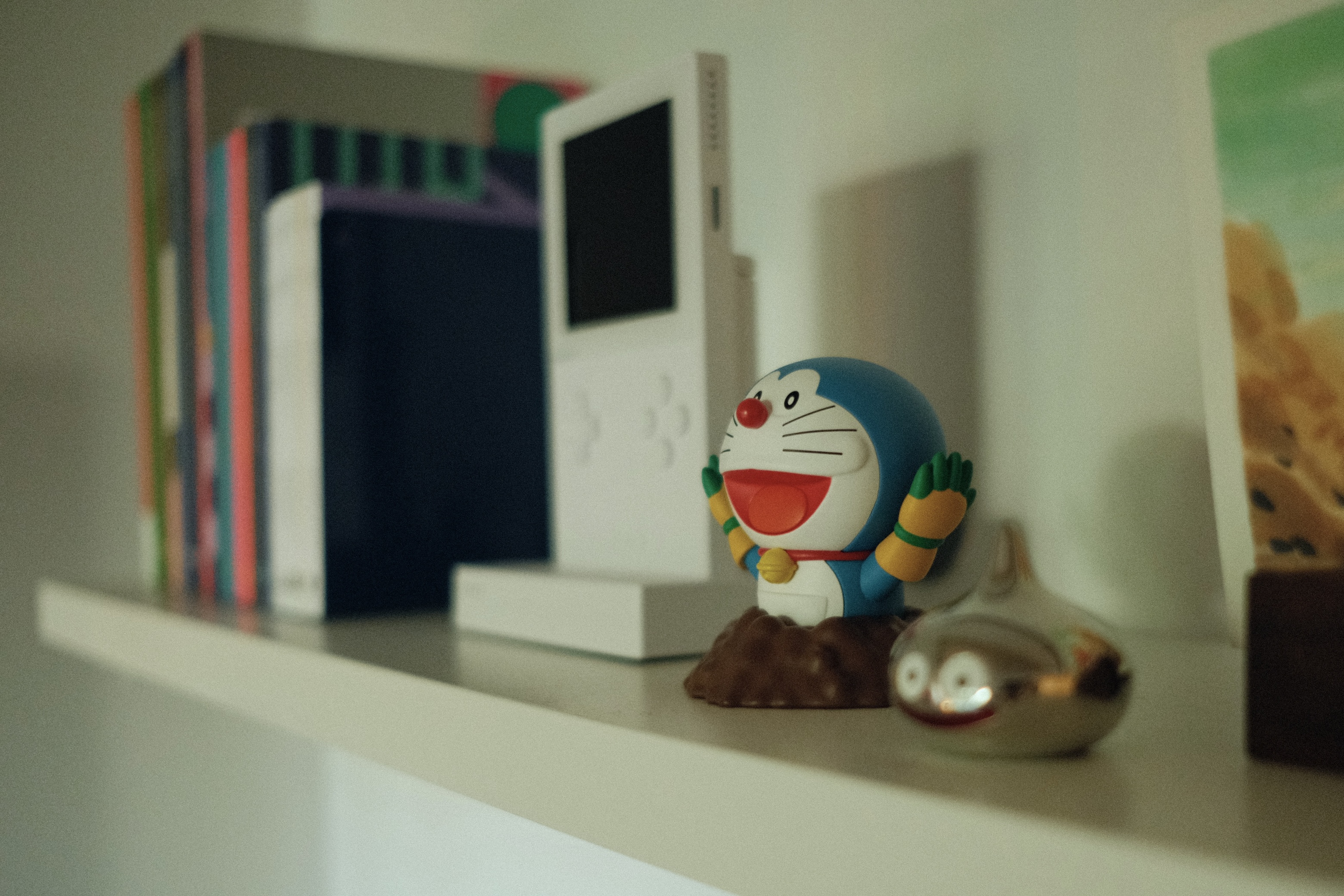
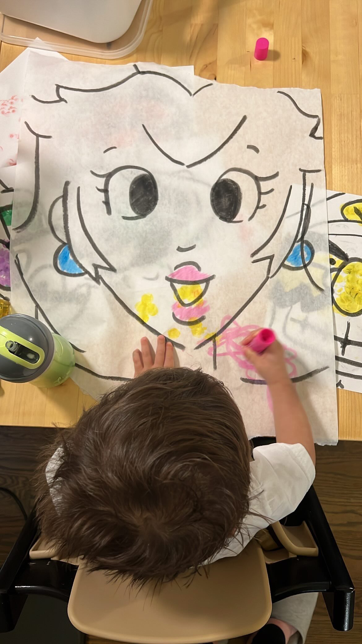
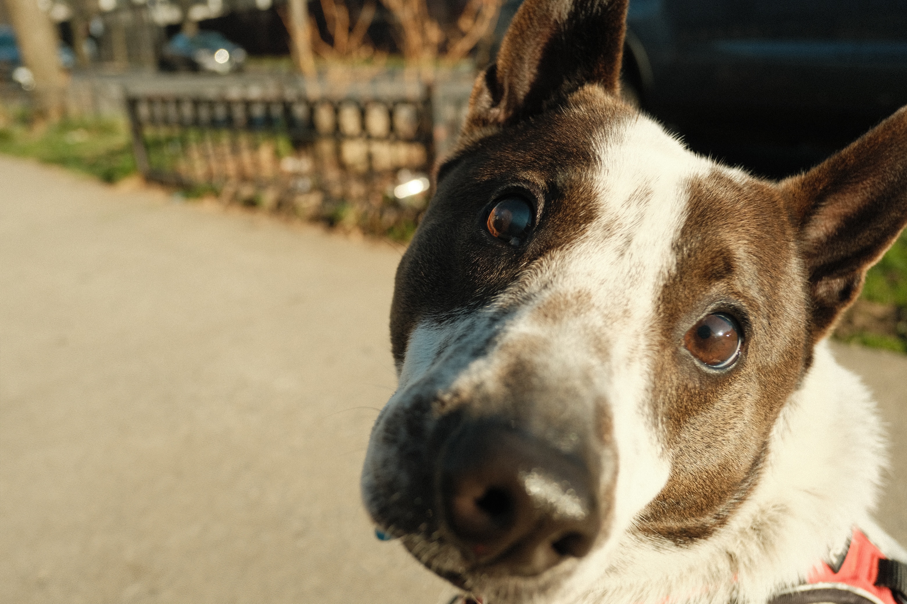
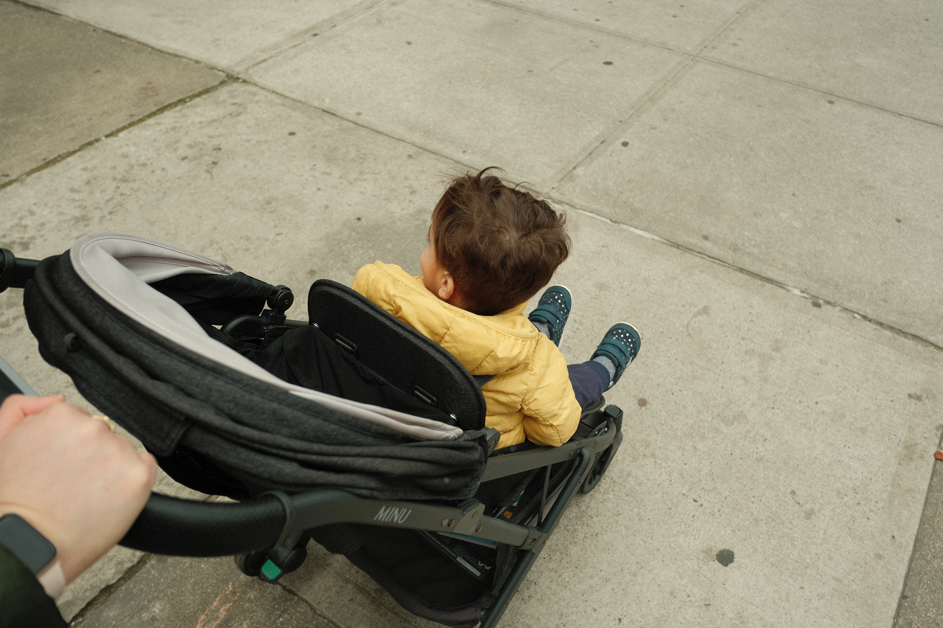
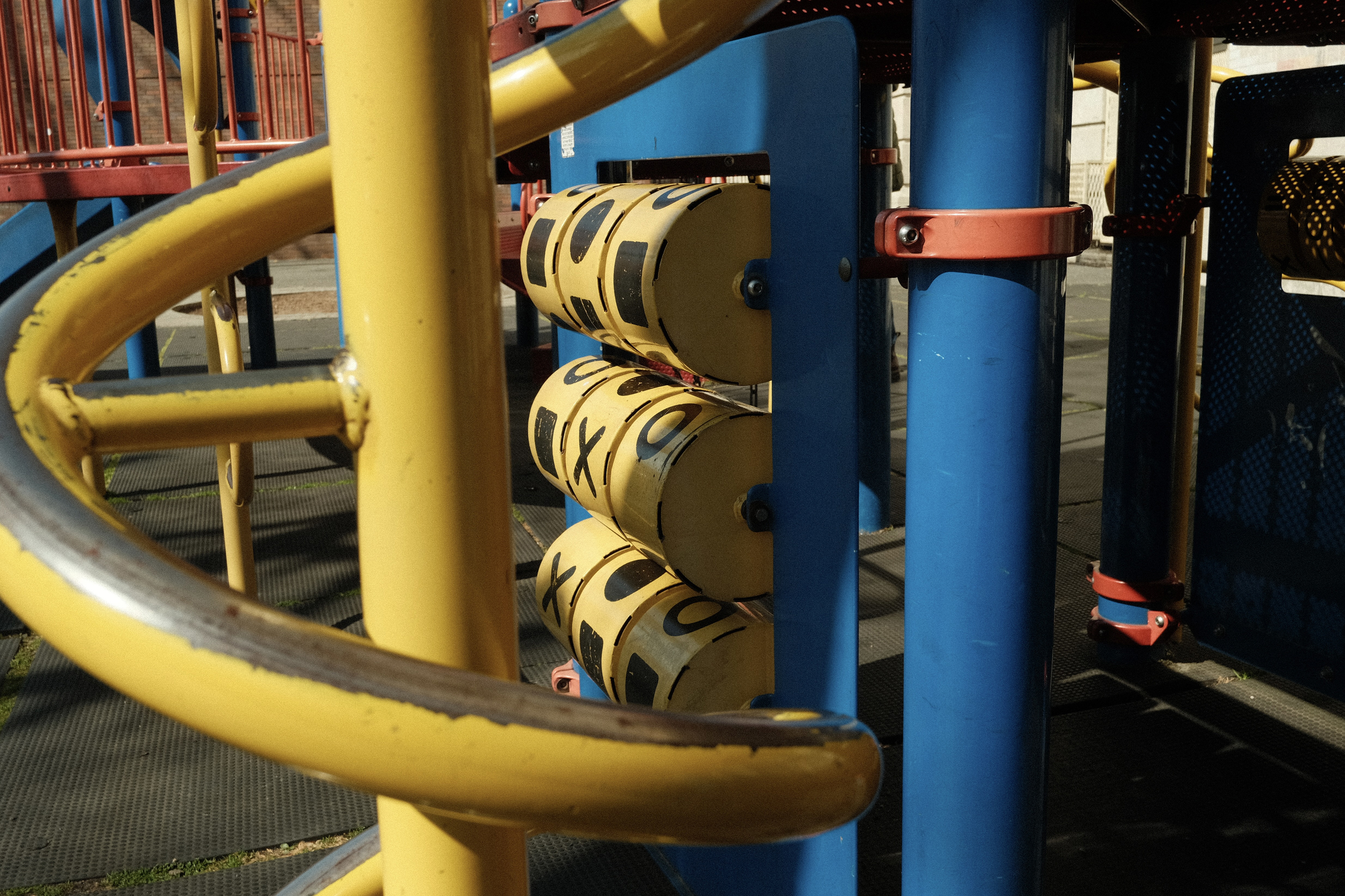
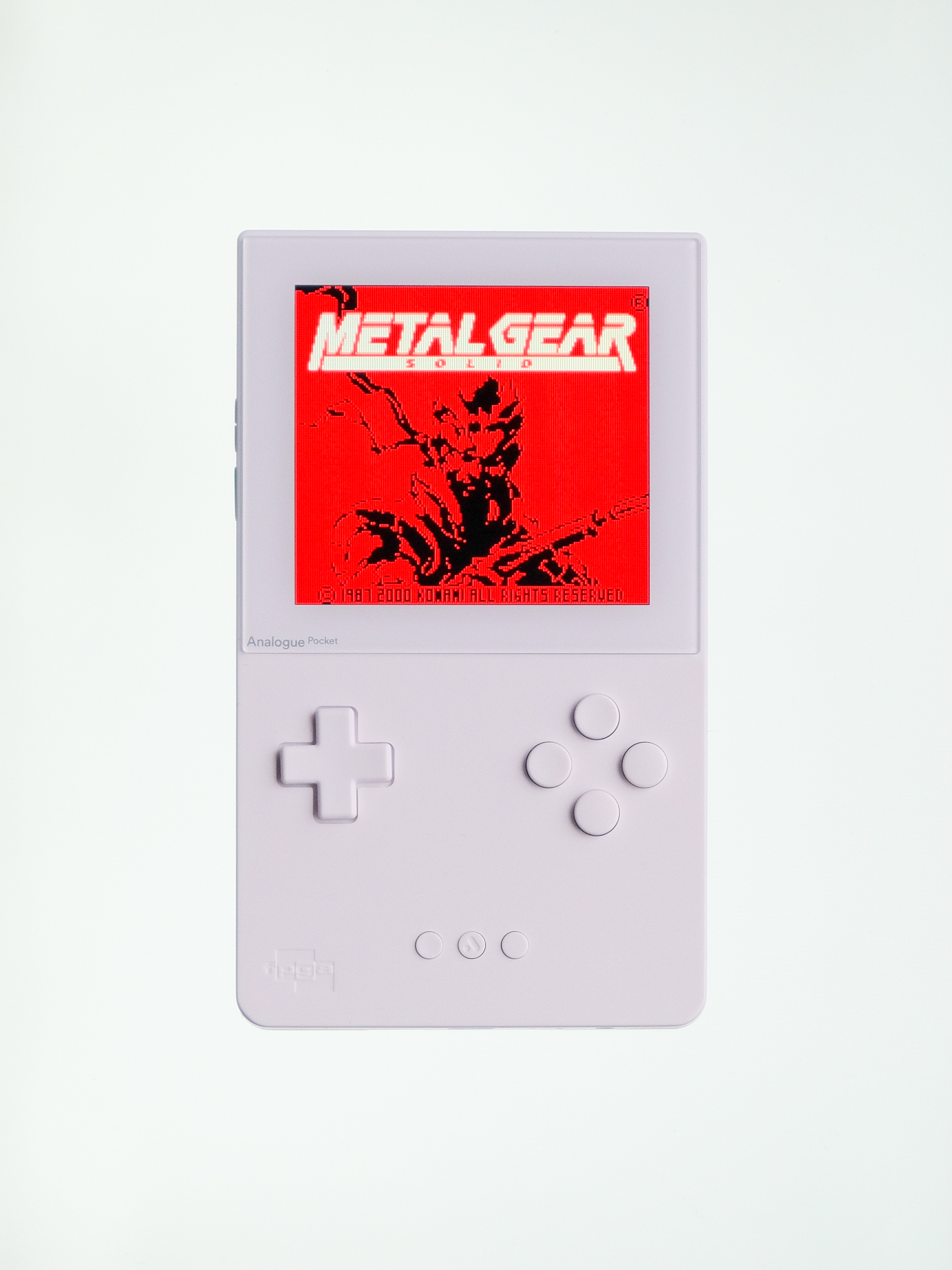
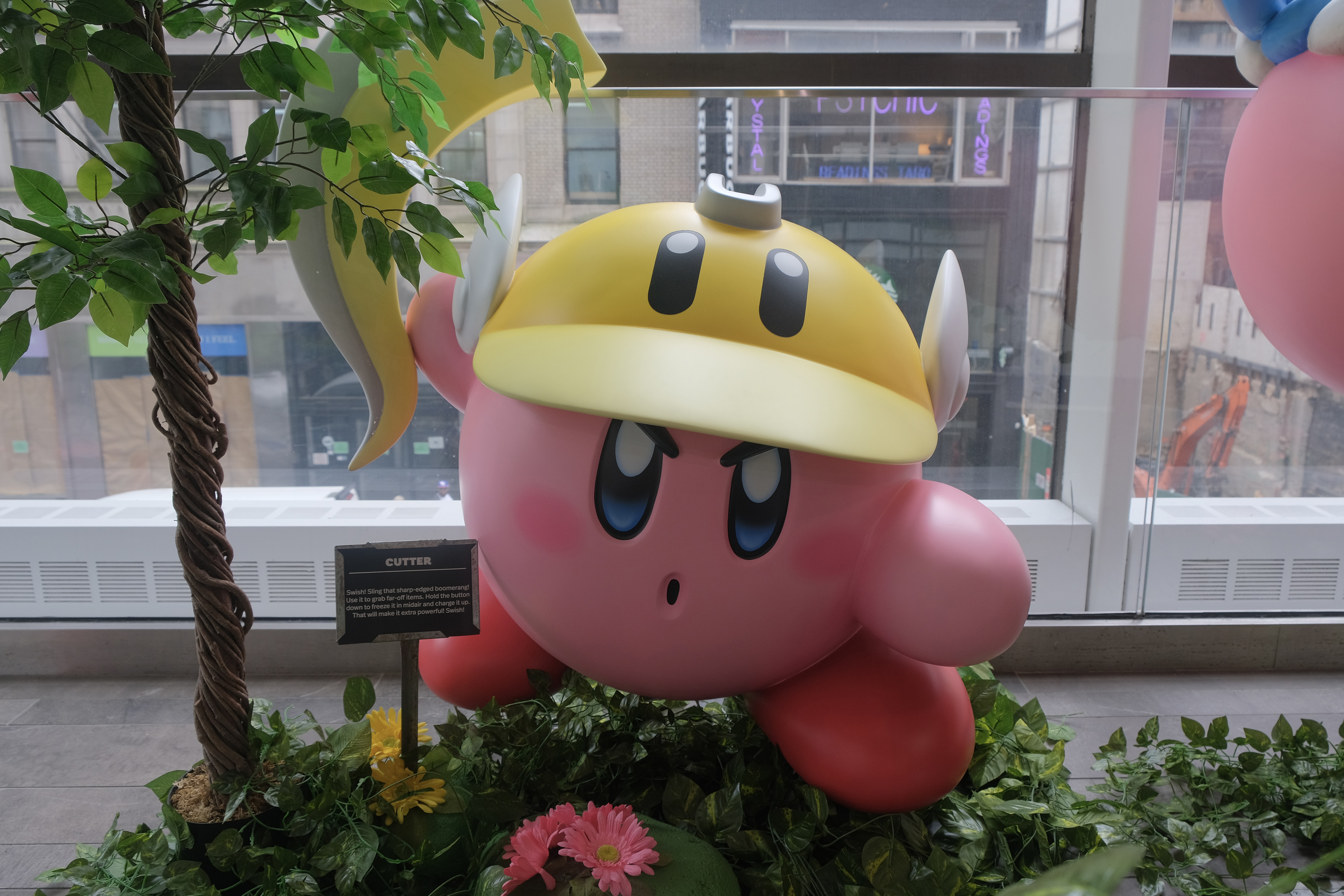
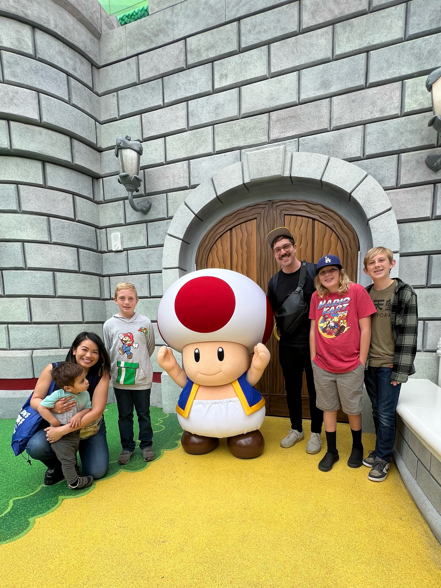
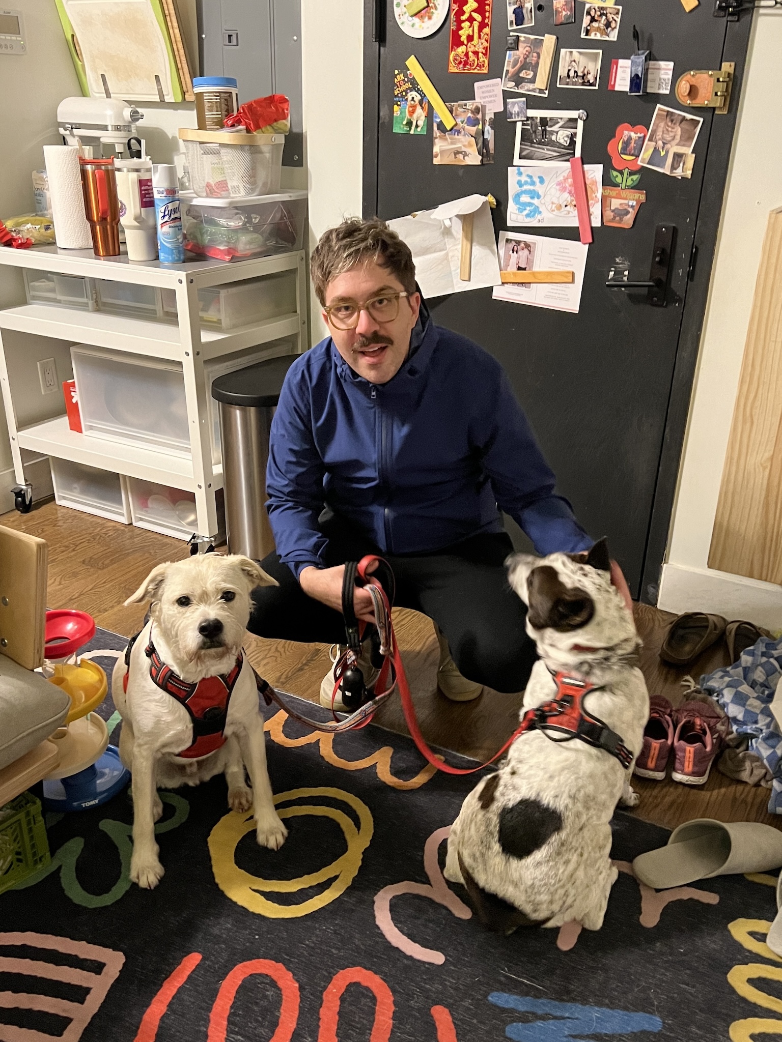
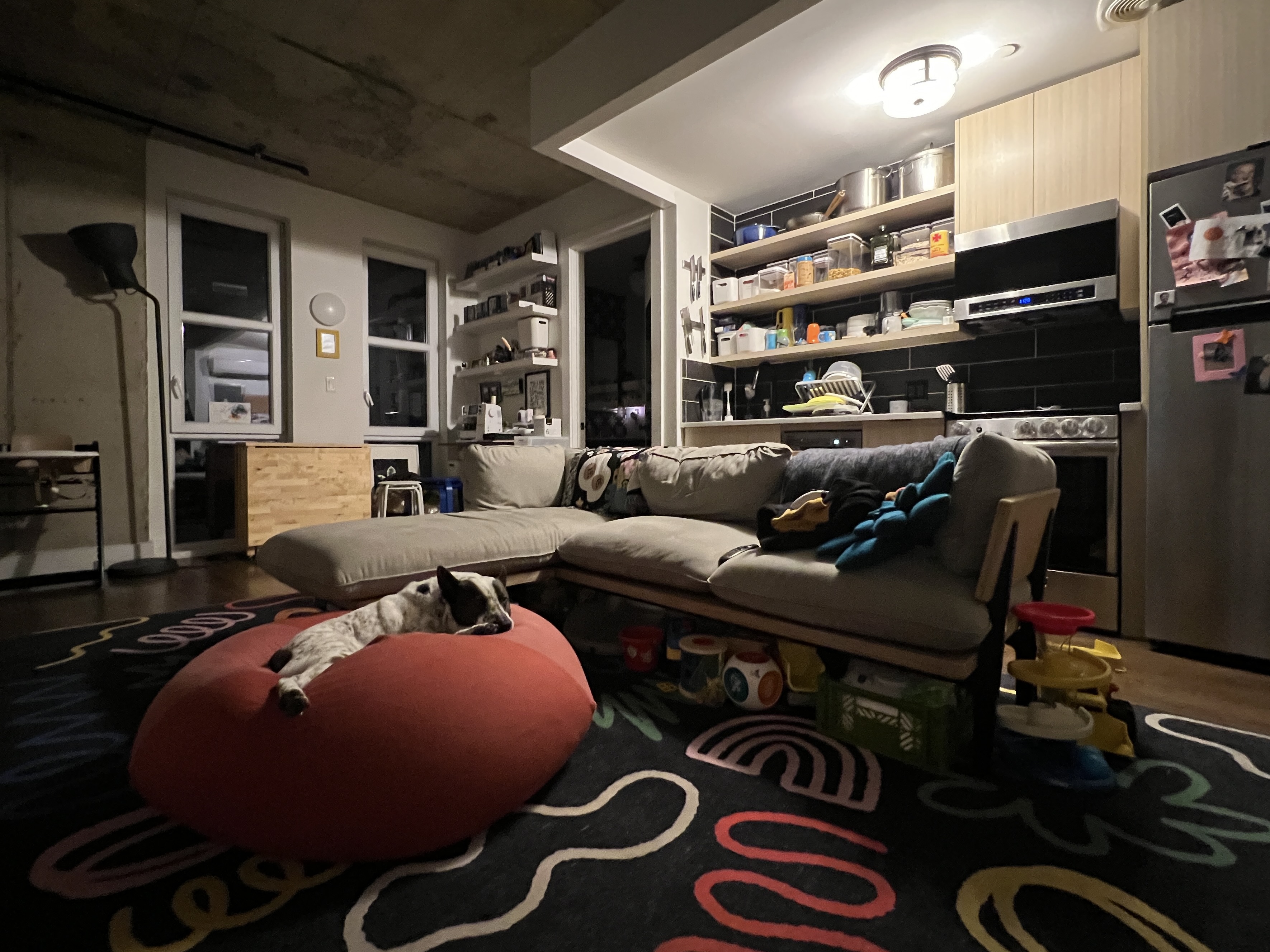
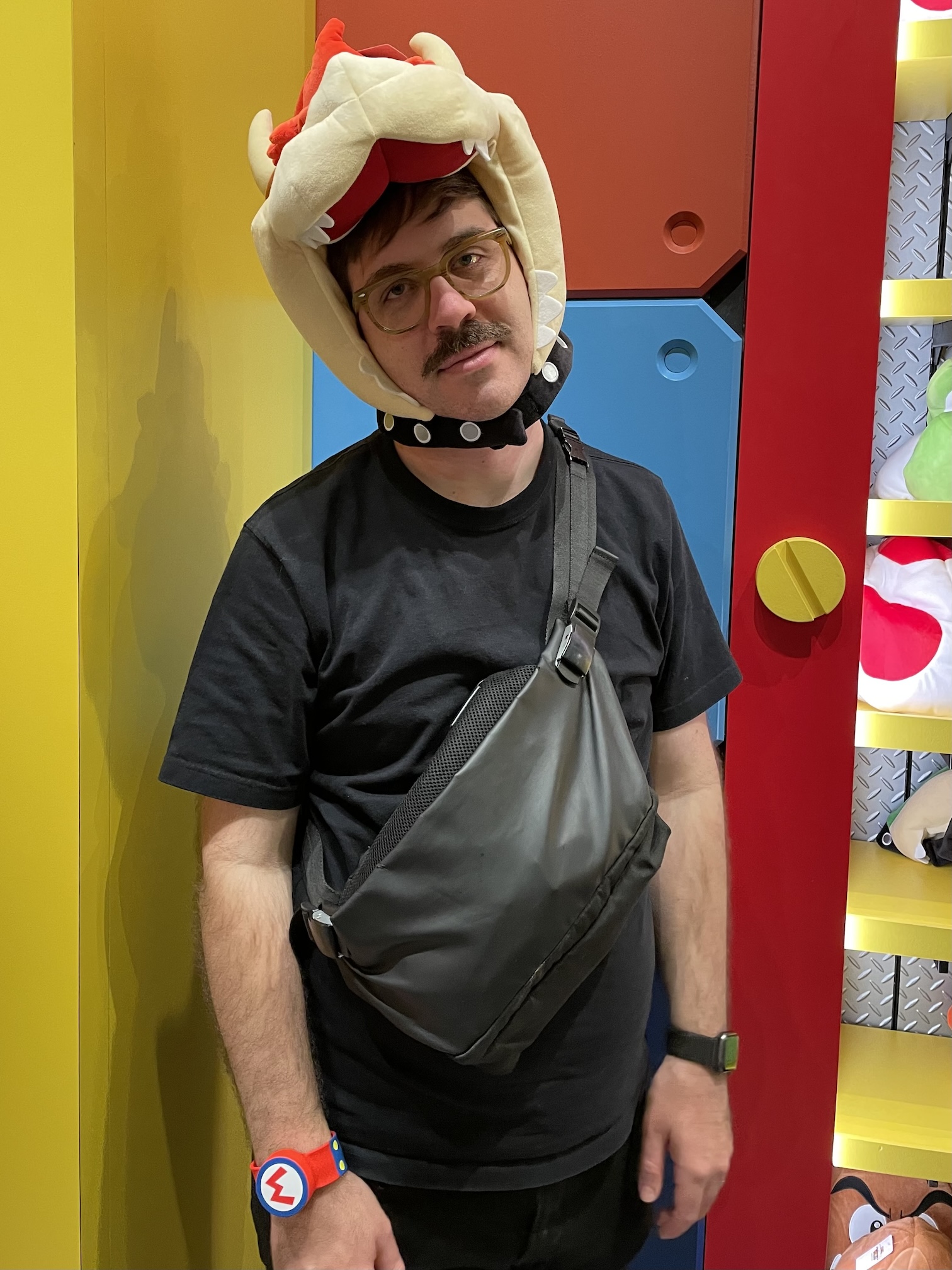
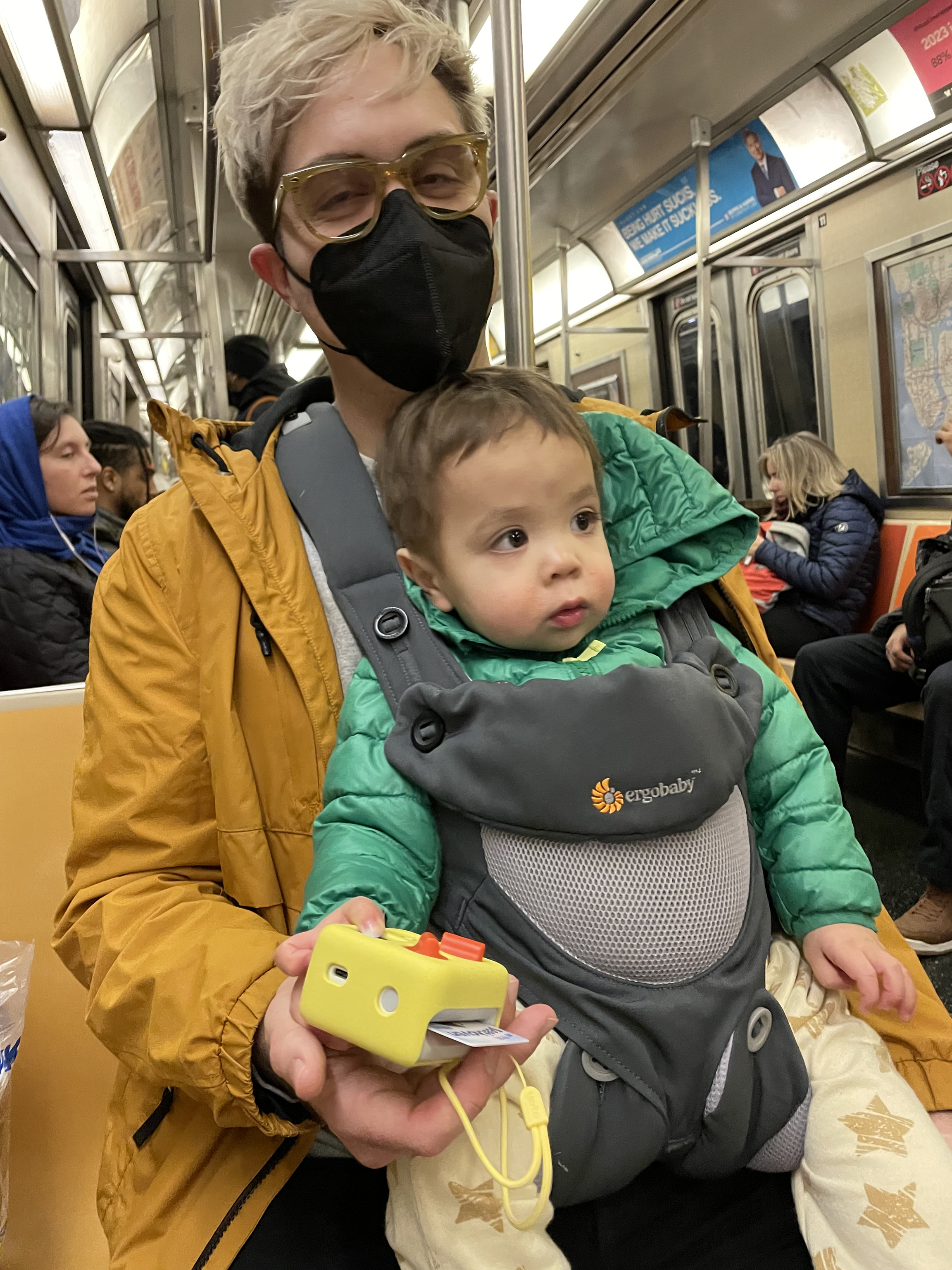
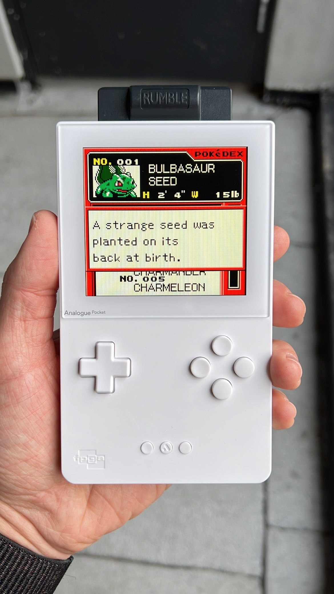
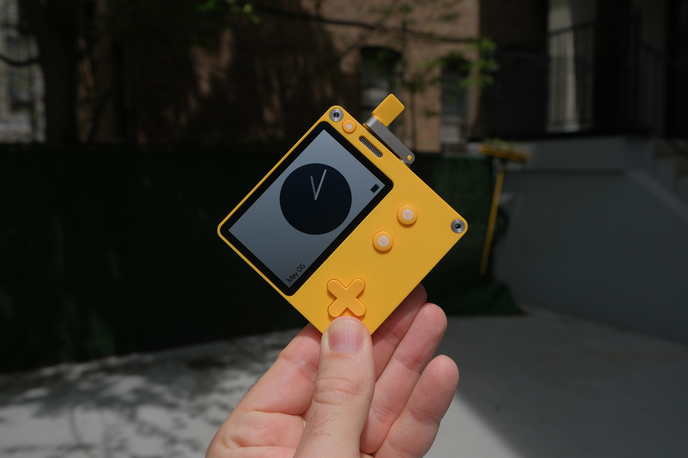
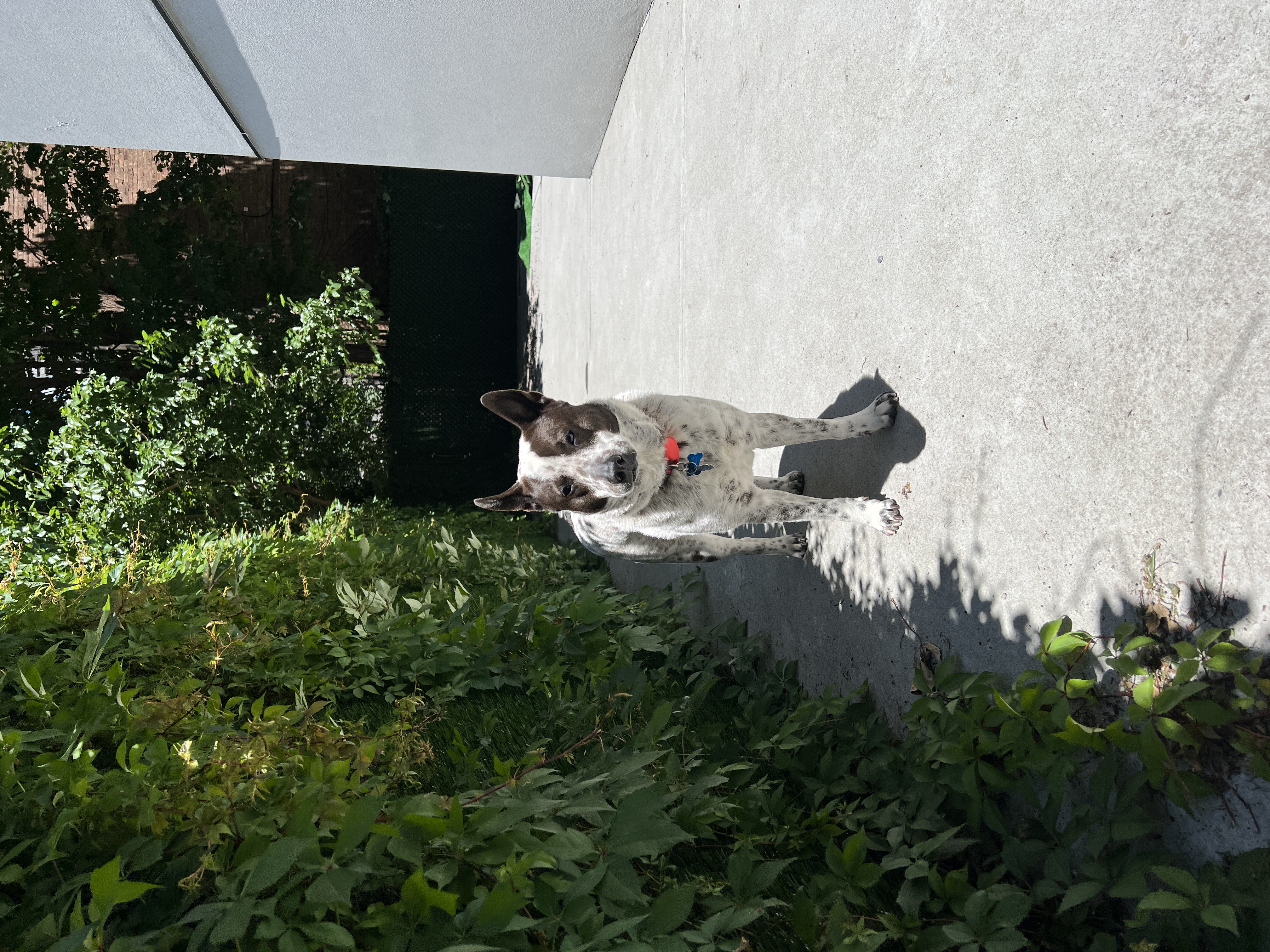
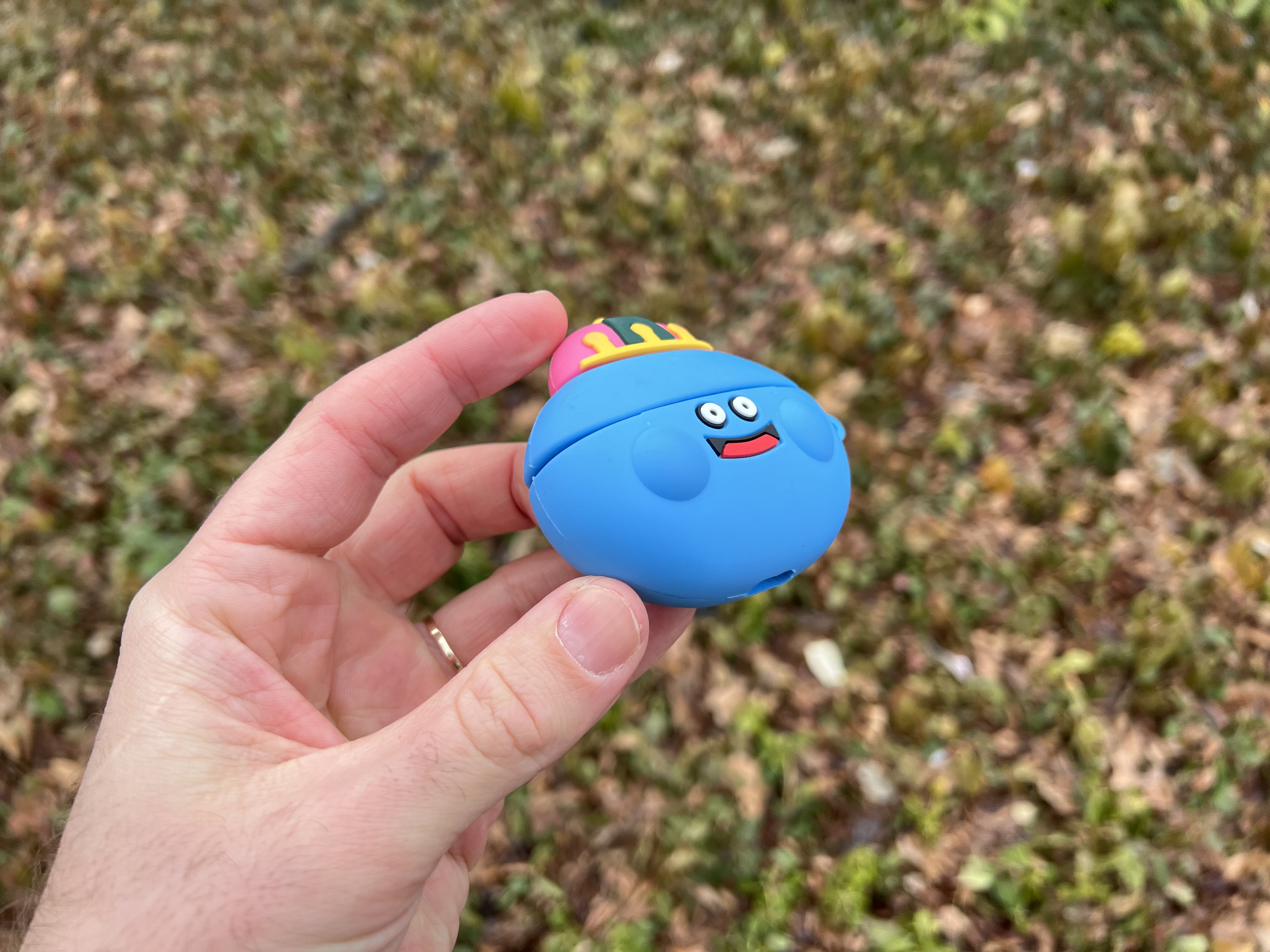
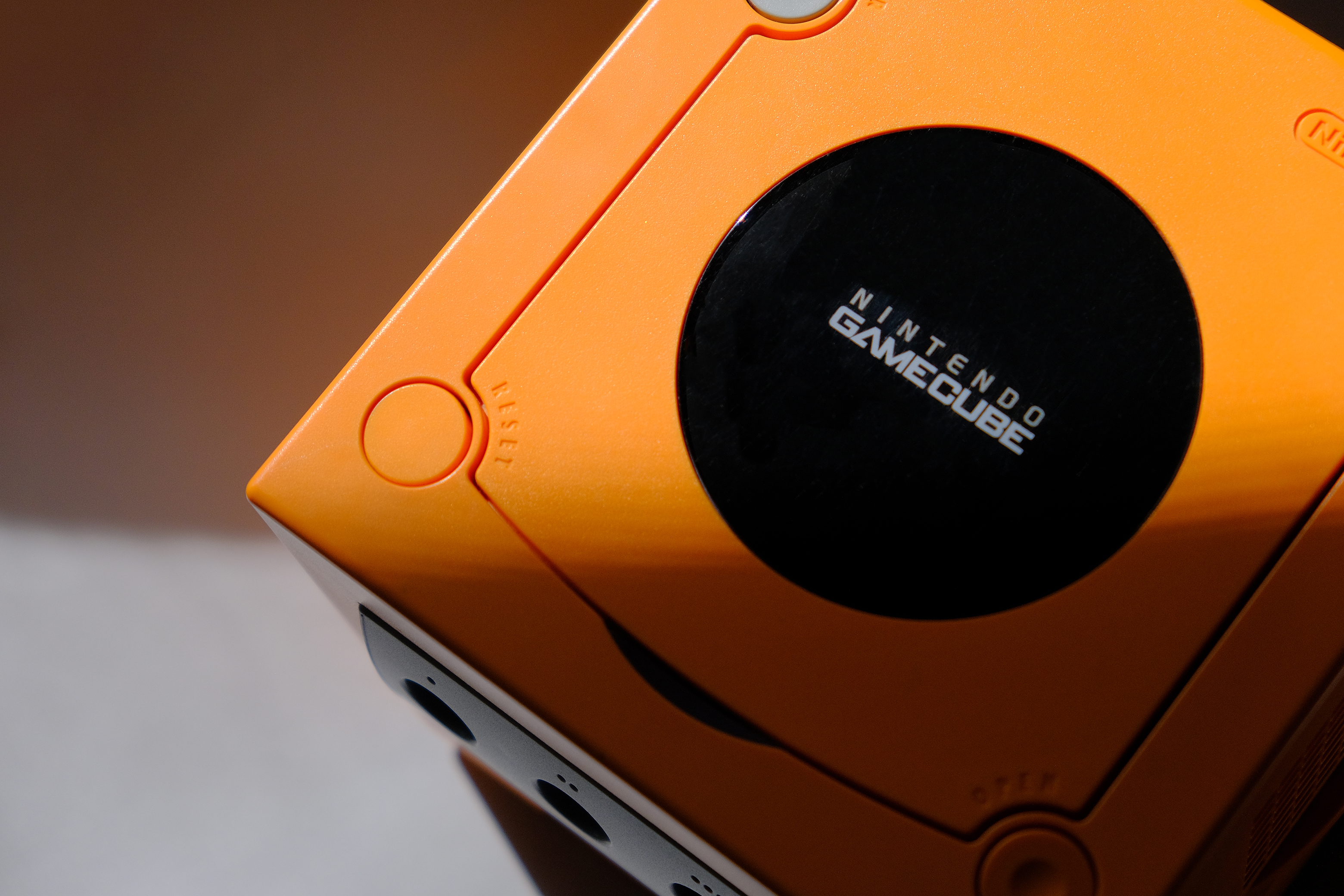
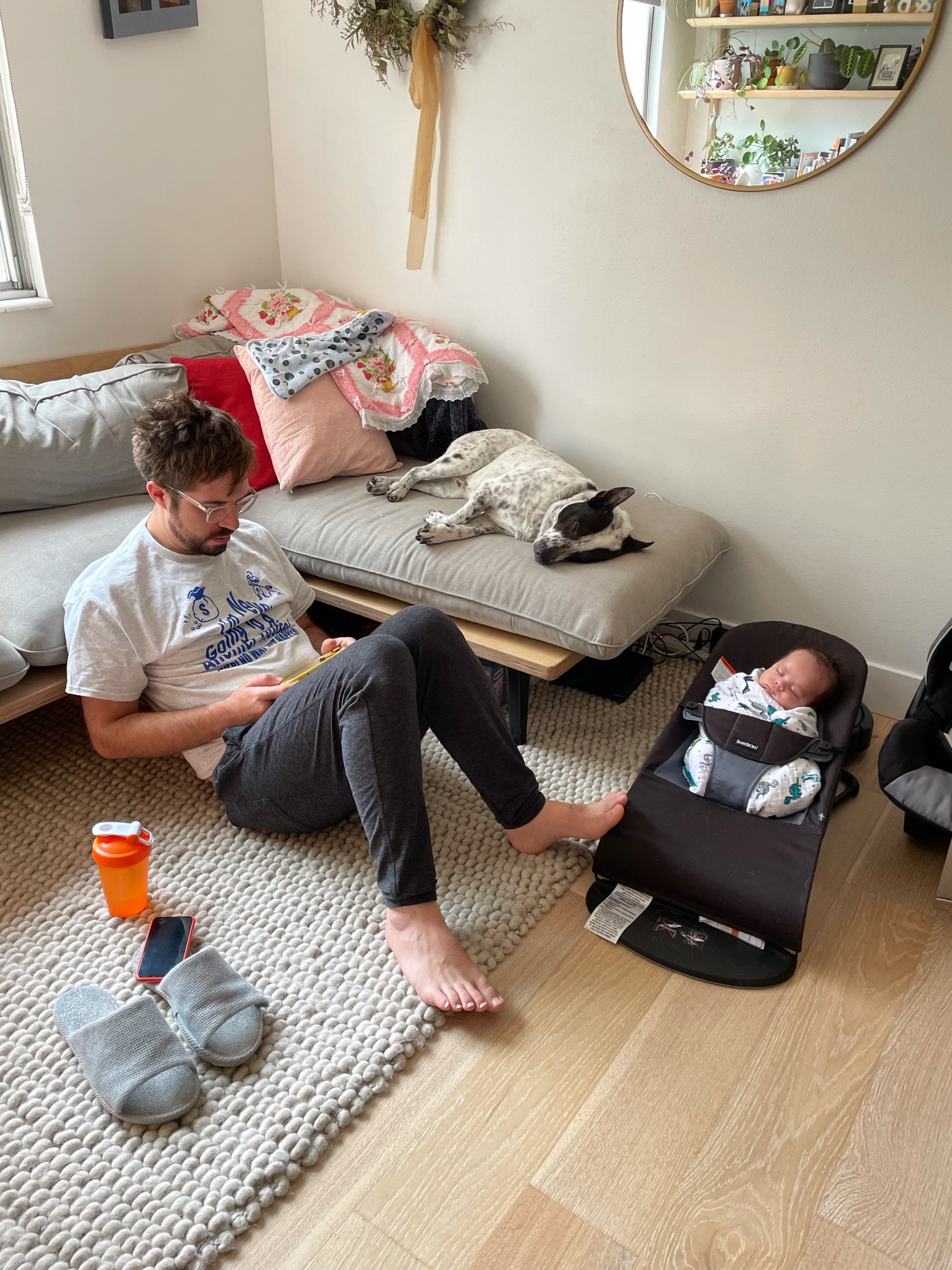
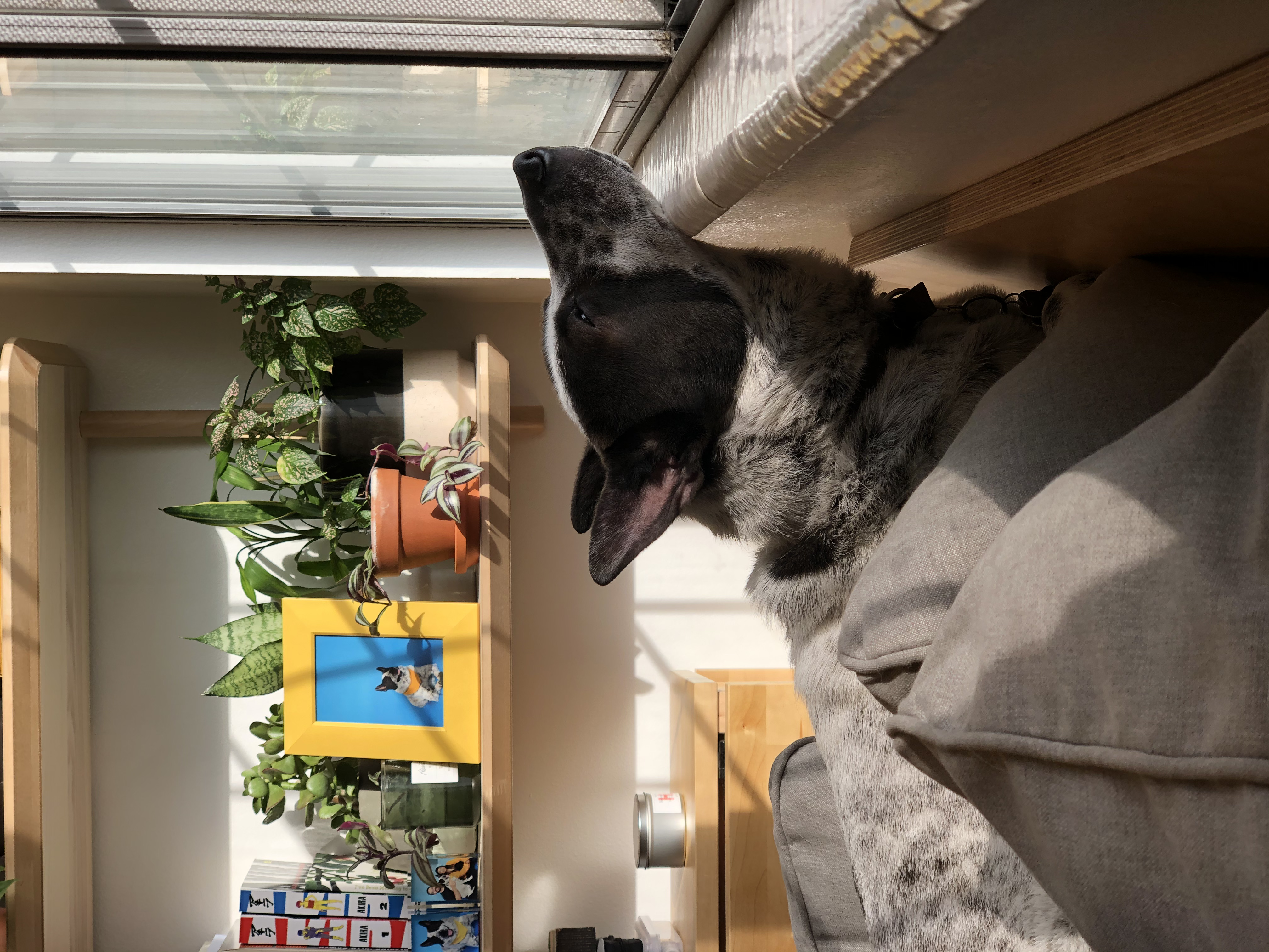
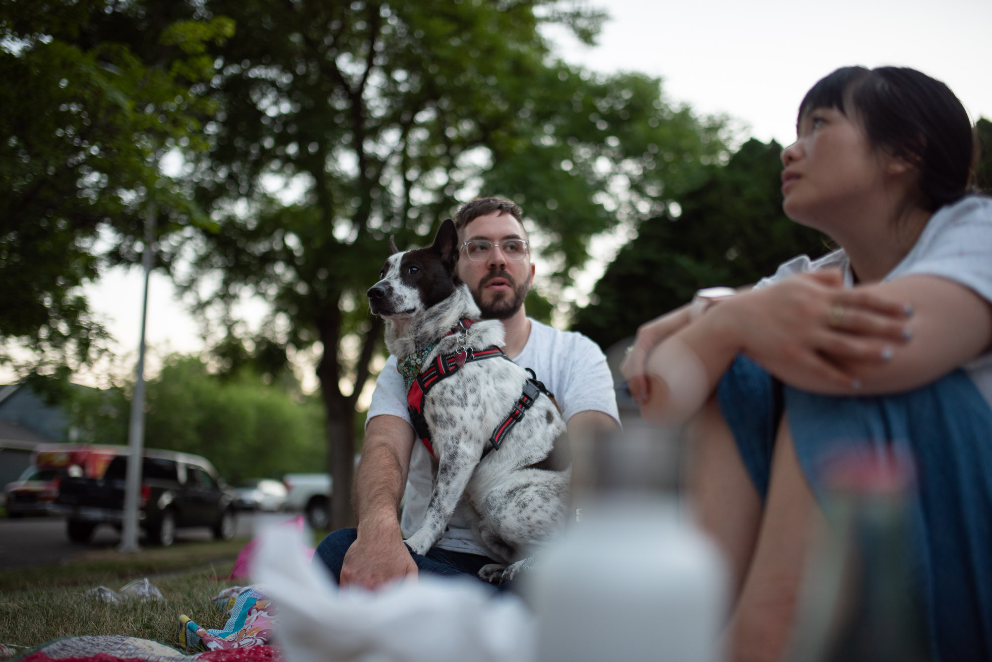
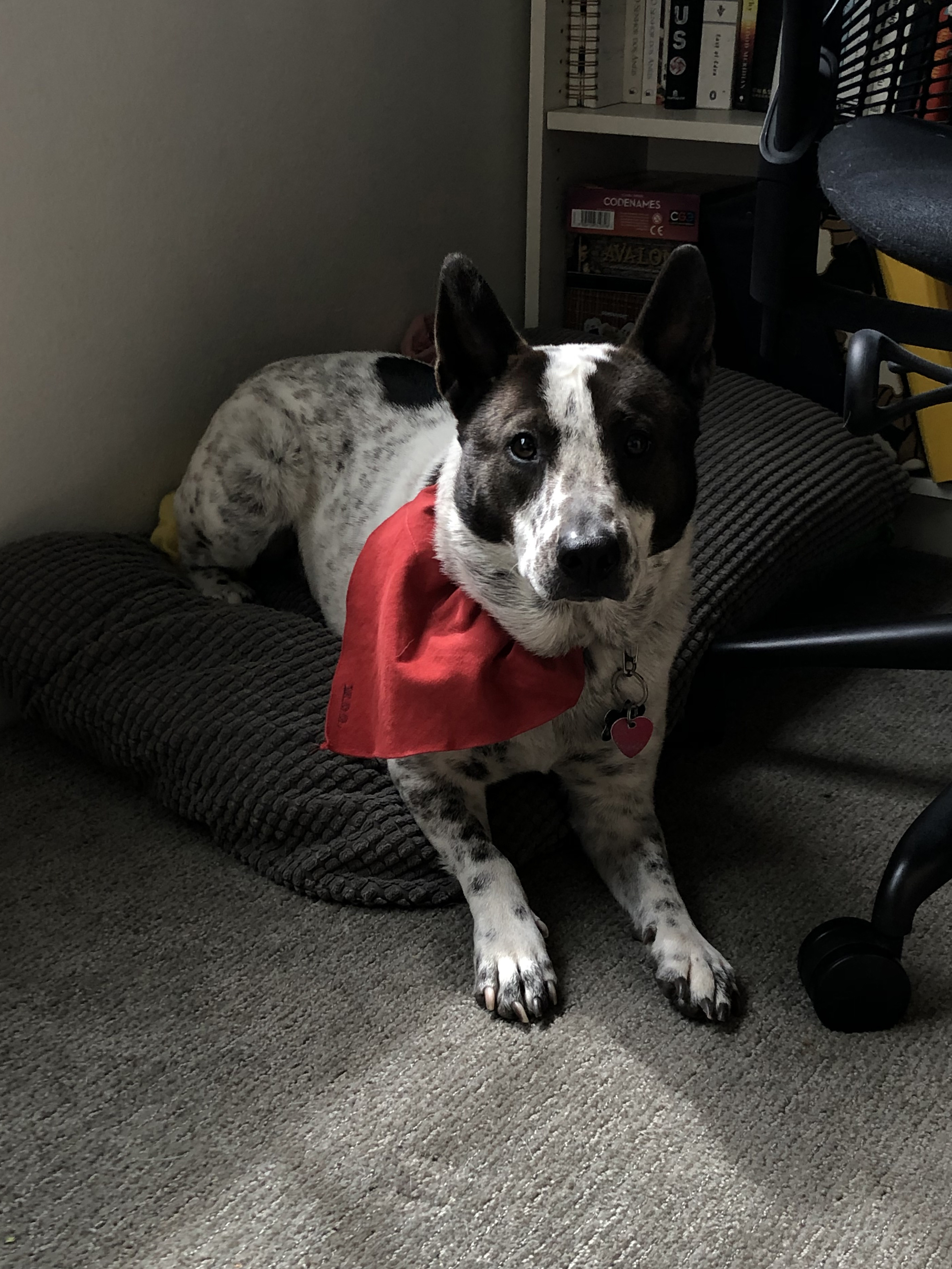
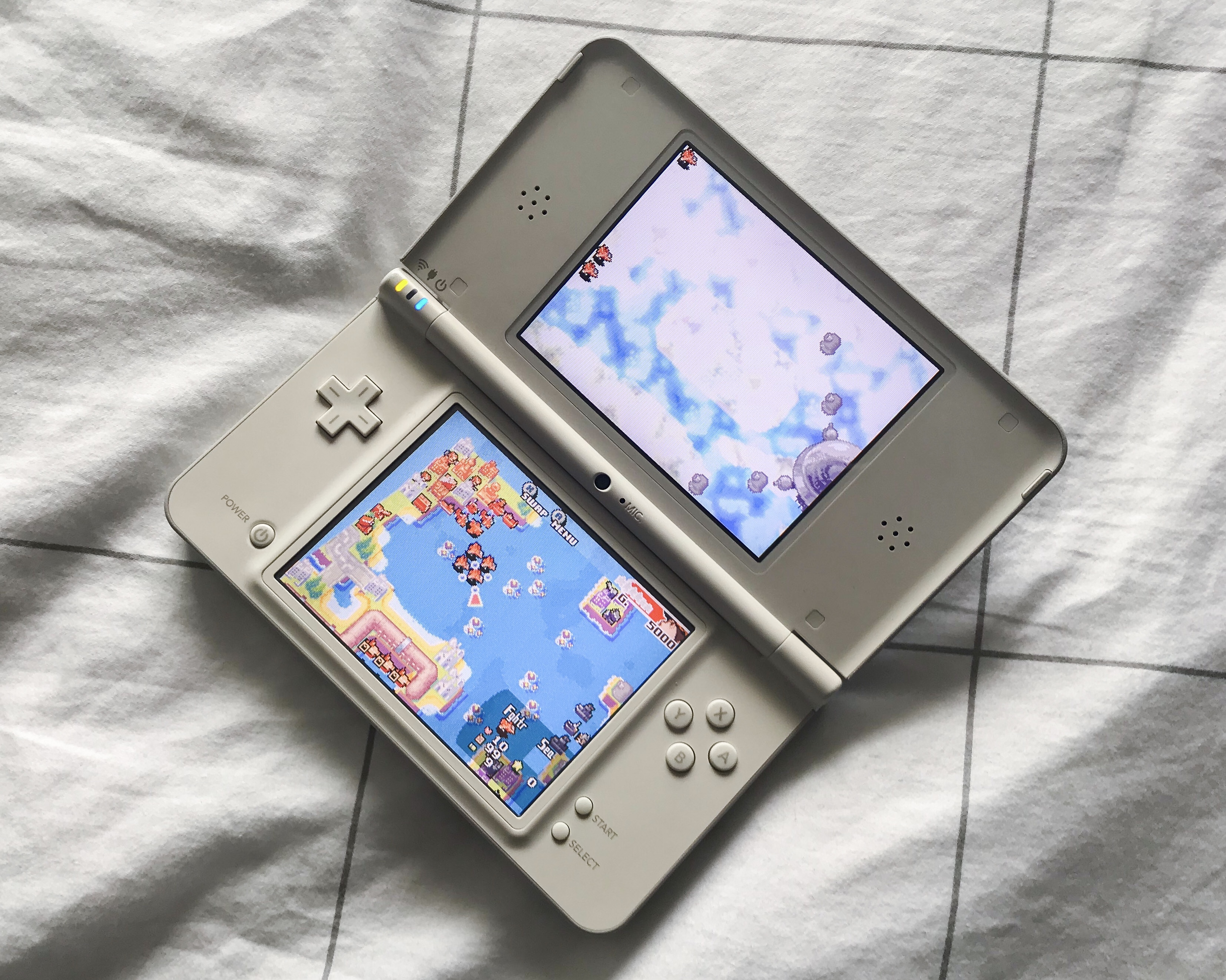
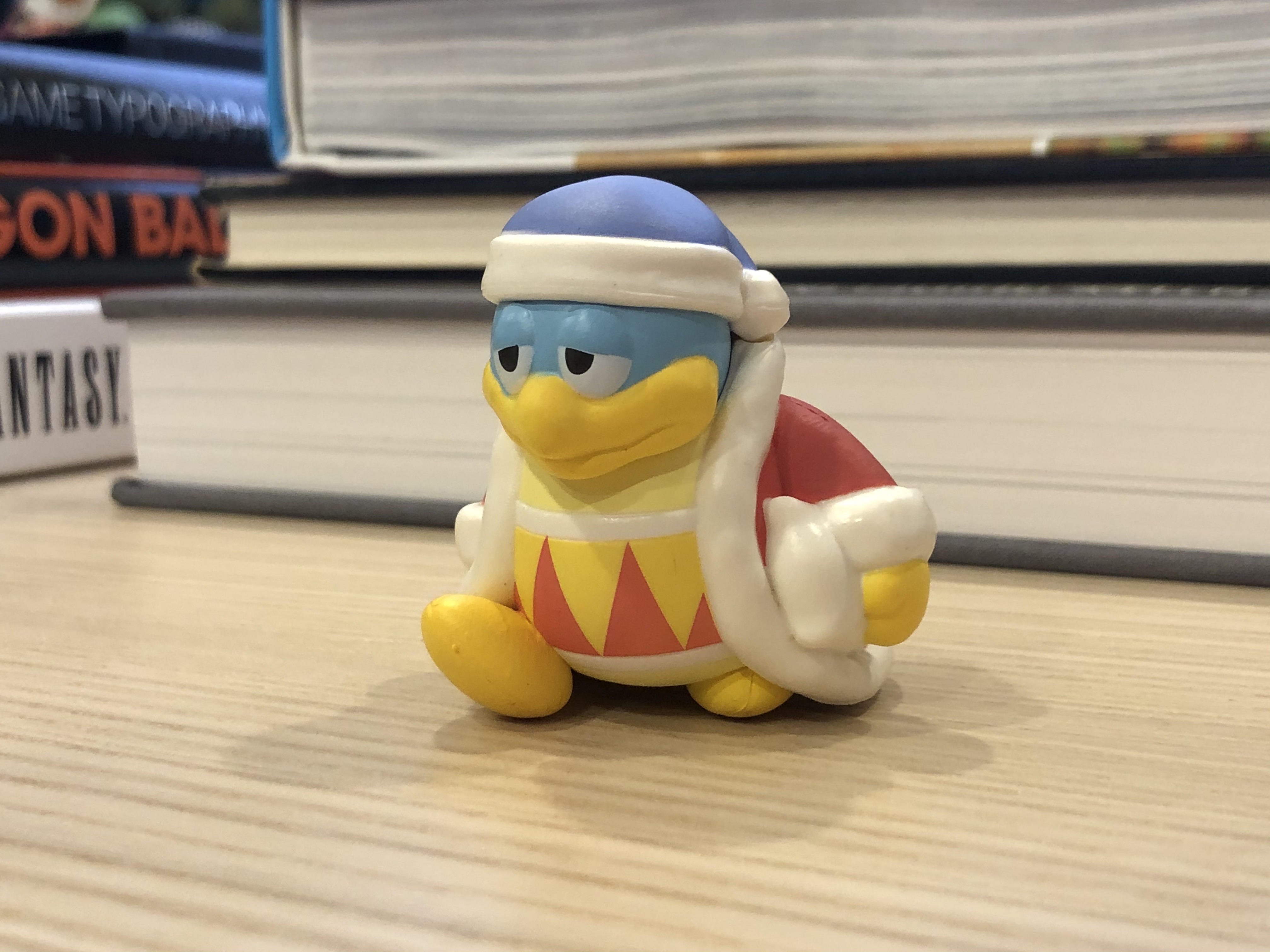
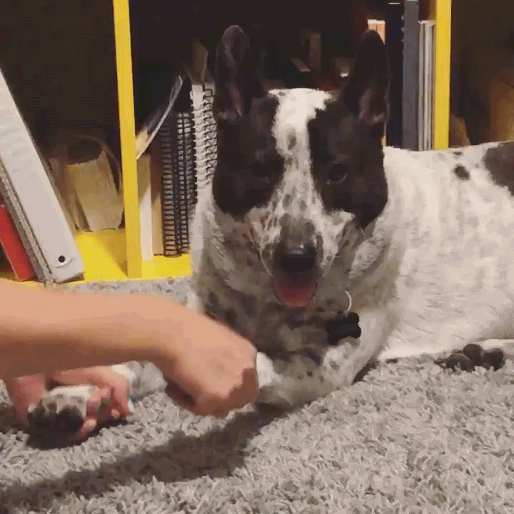
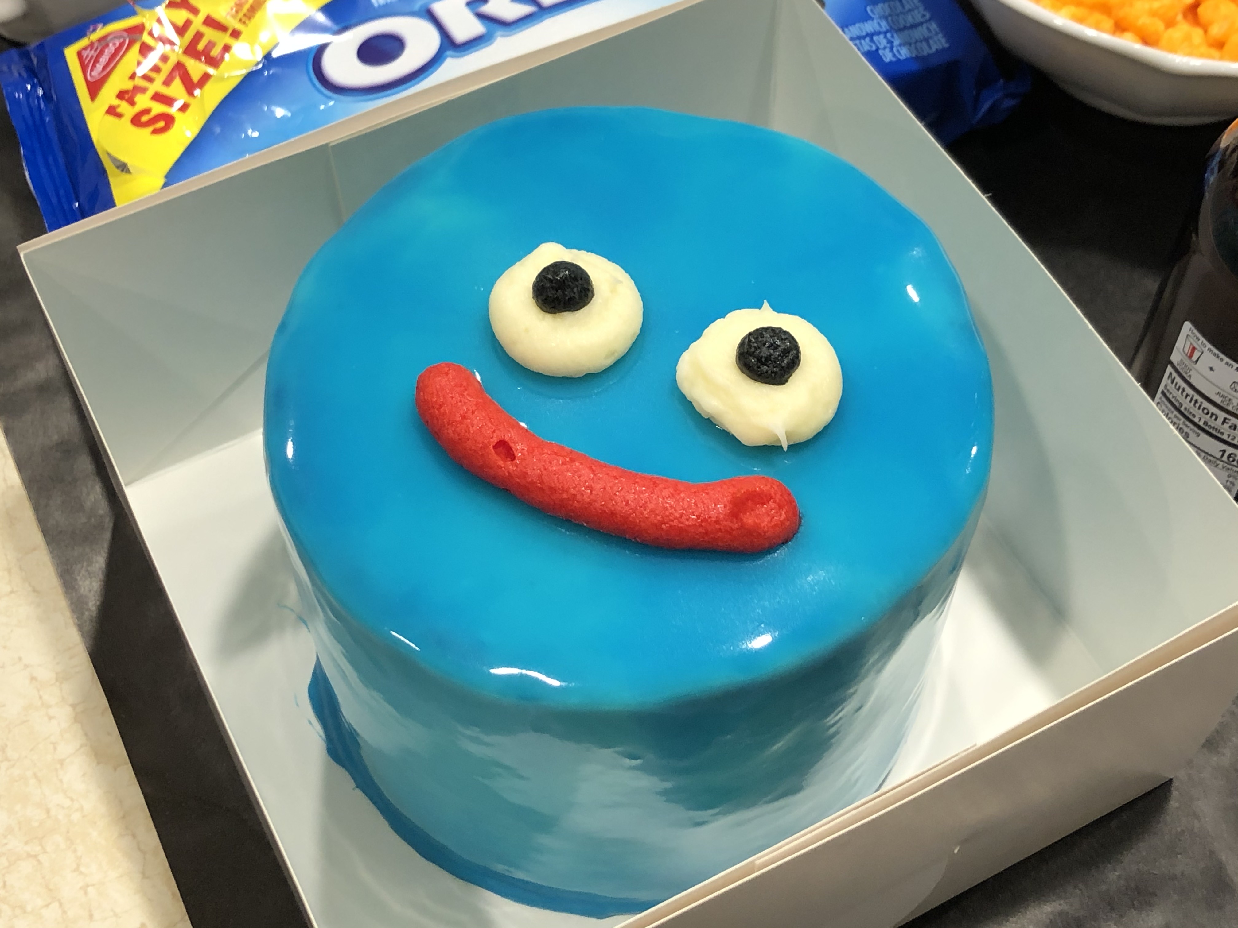
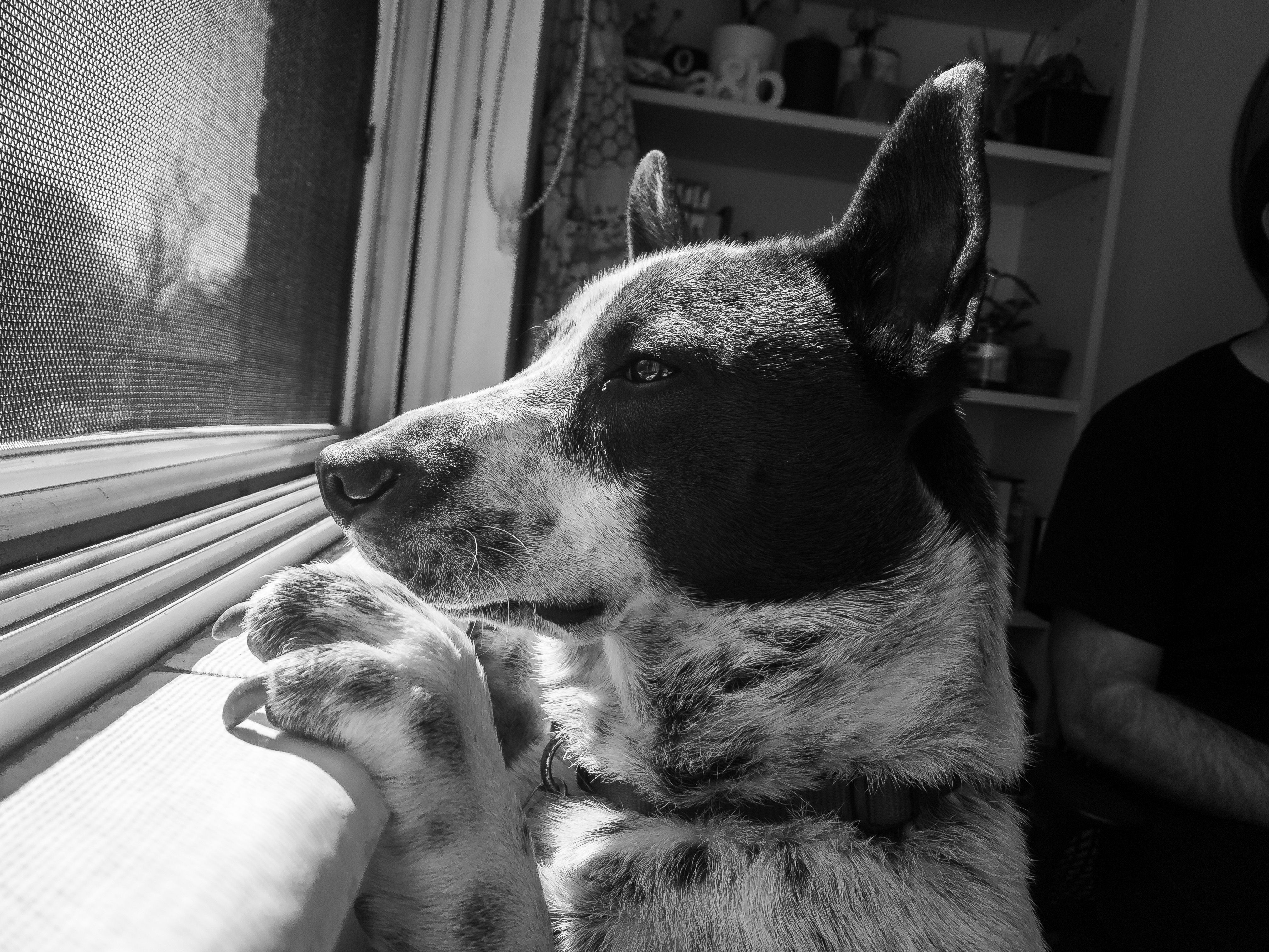
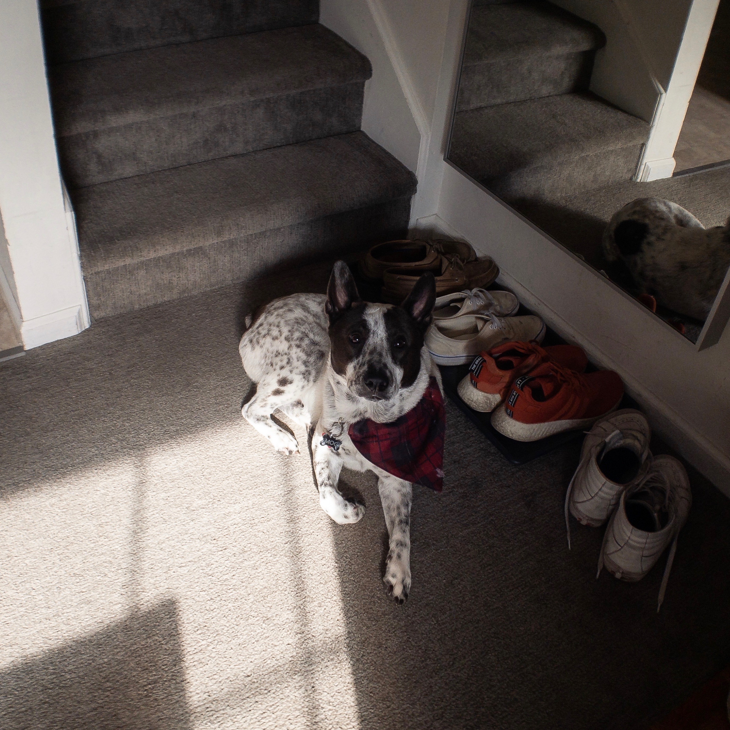
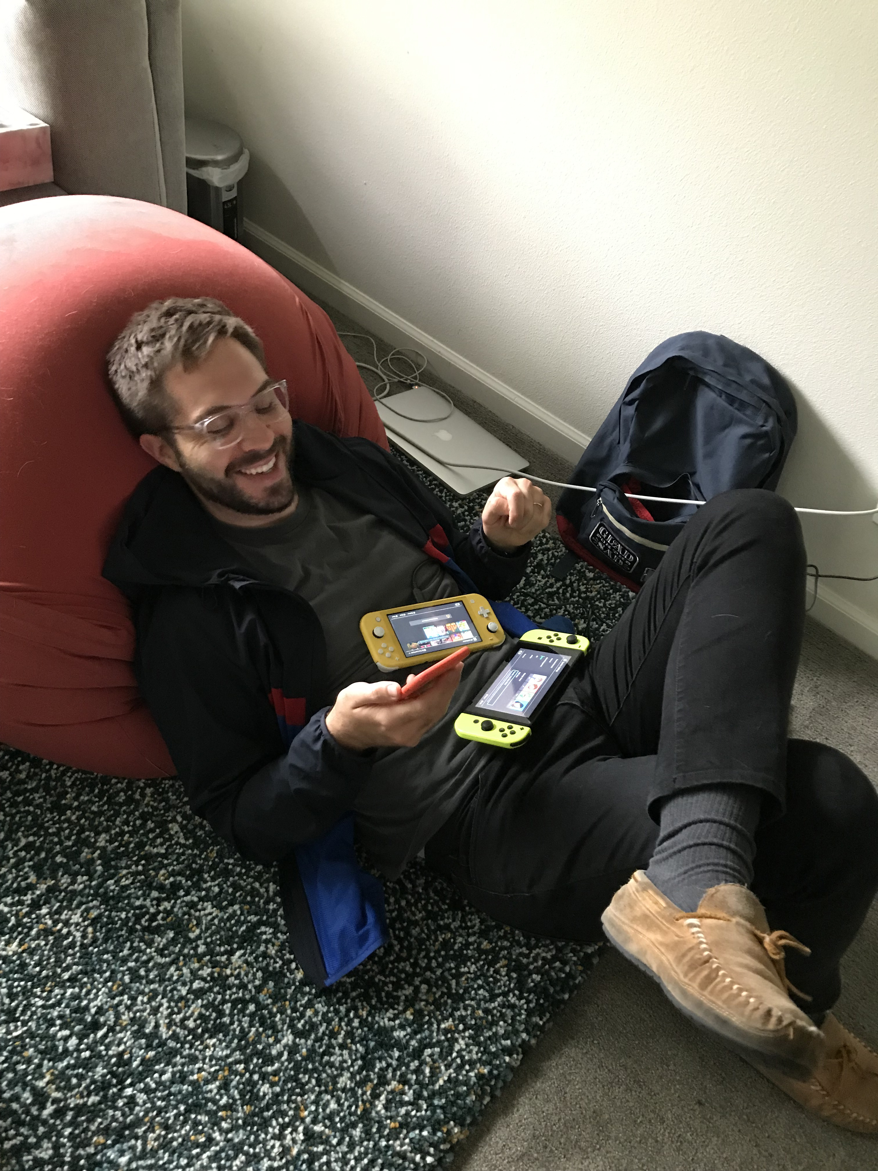
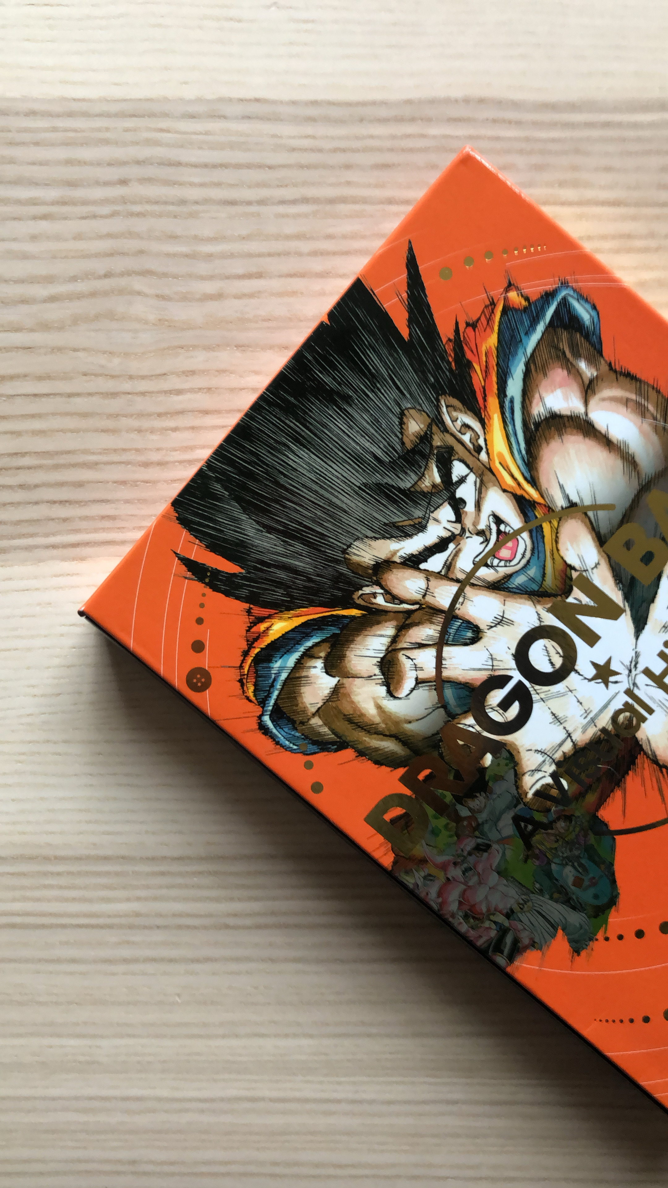
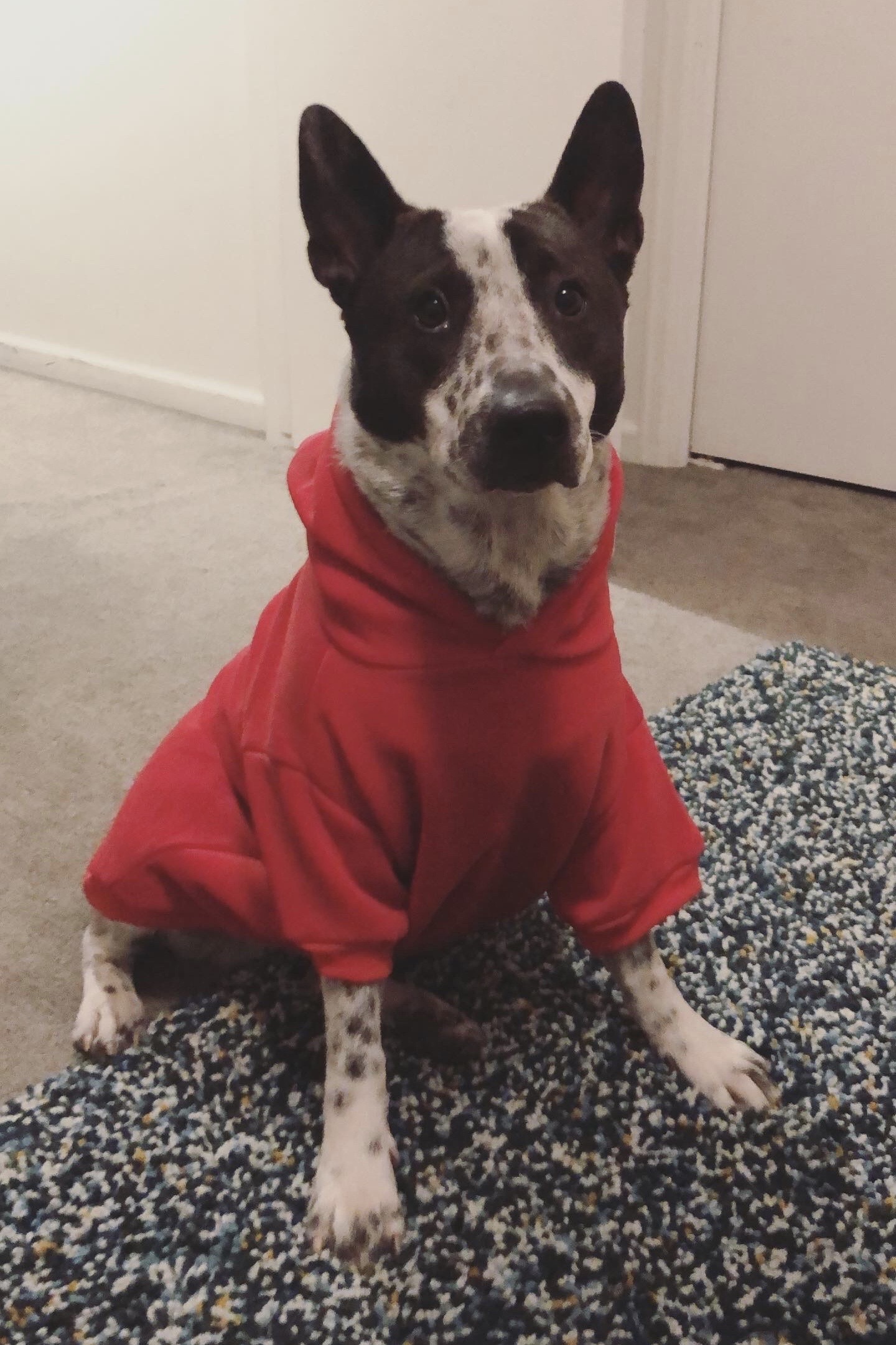
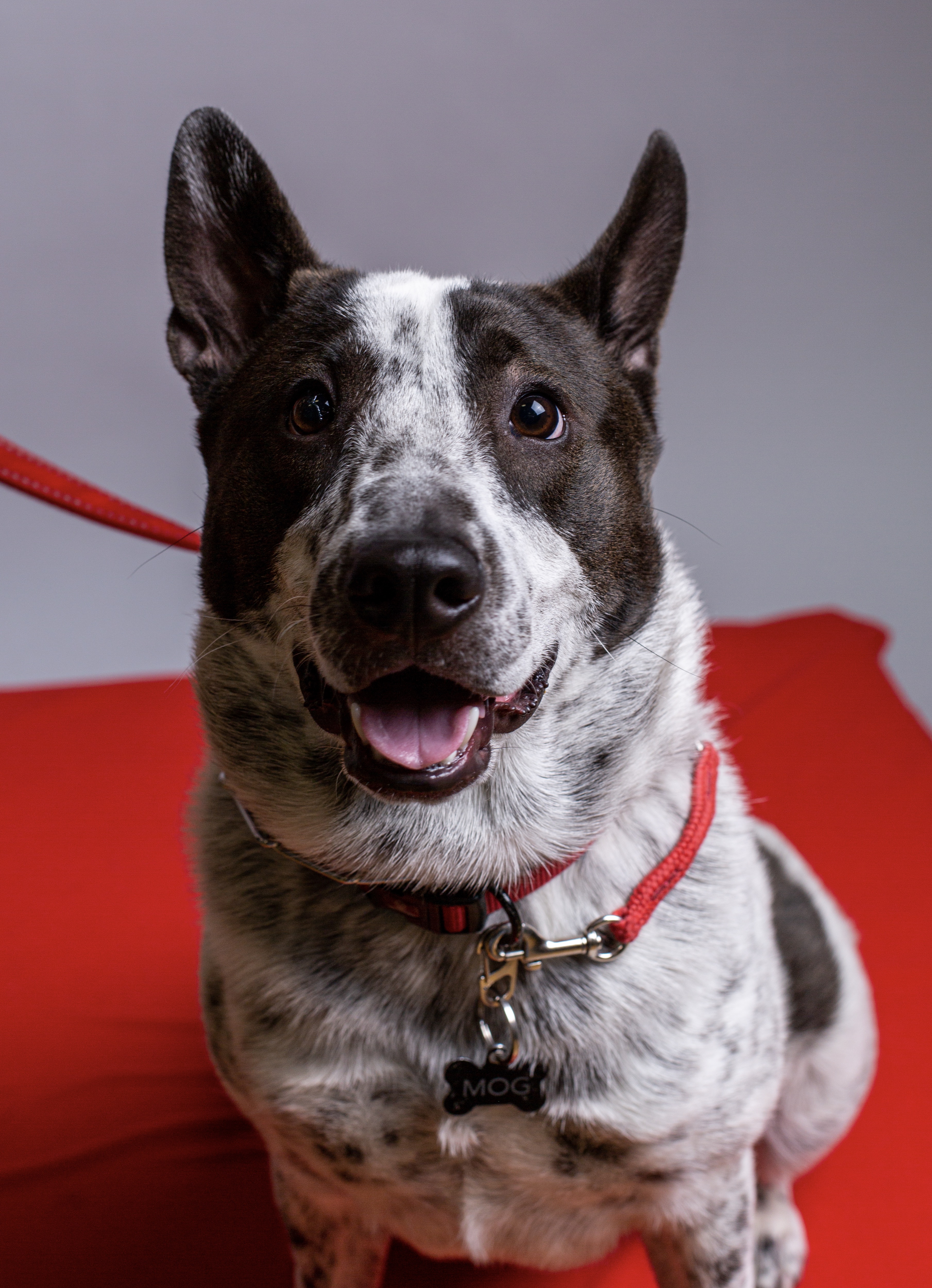
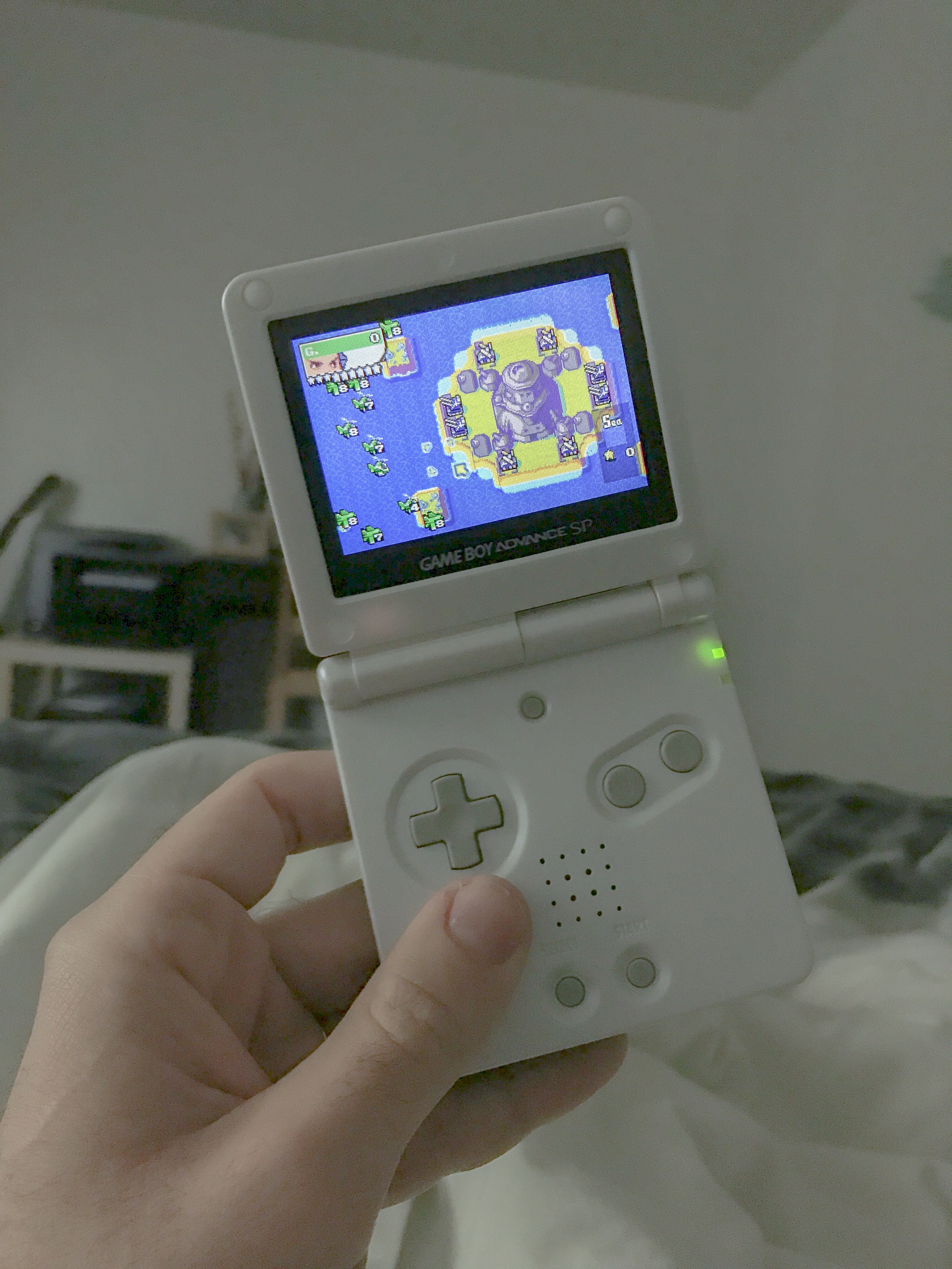
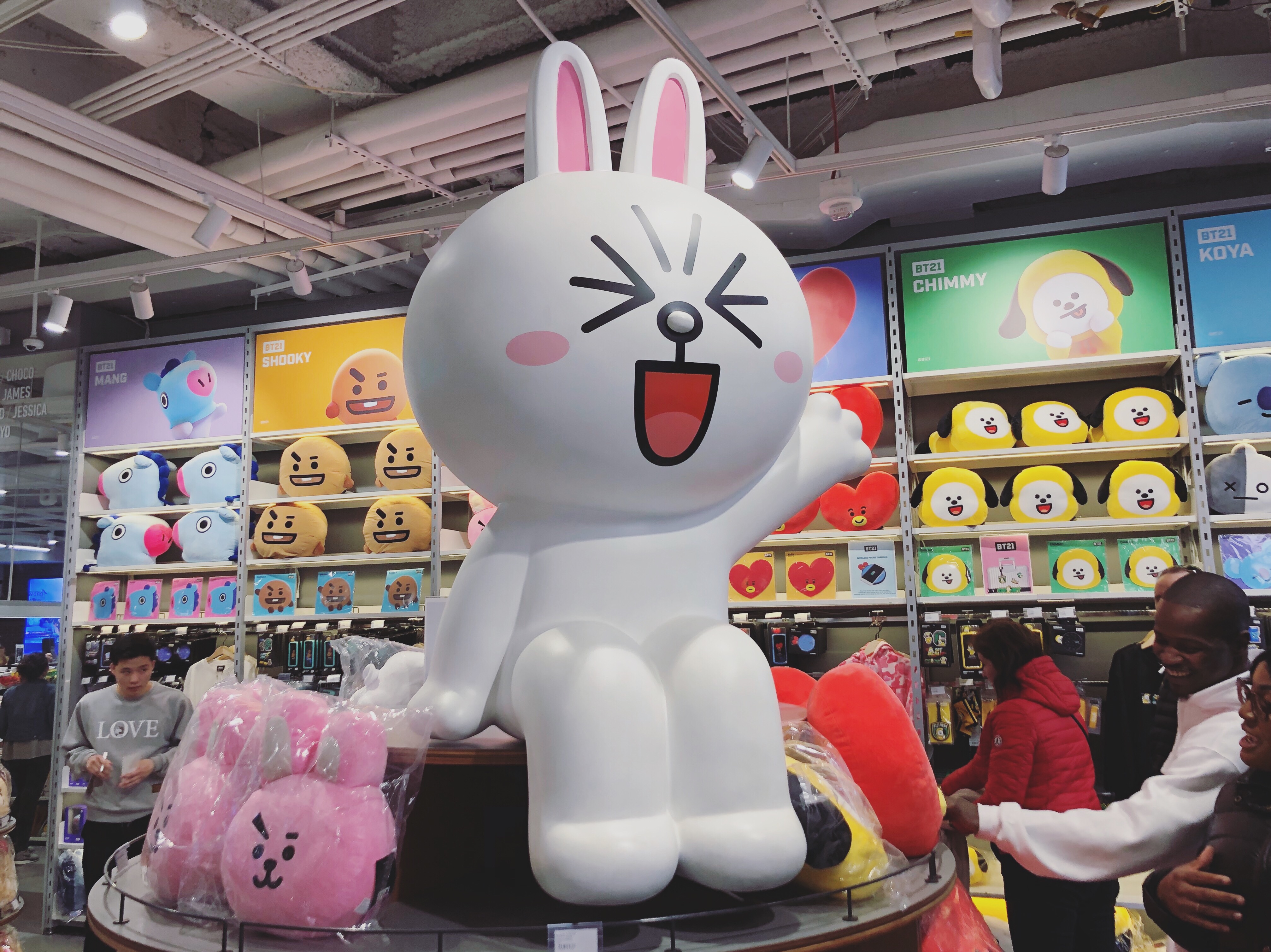
Miscellaneous personal images. Work spotted in the wild, things I like, gameboys, and my dog Mog.
Updated periodically.Note: this page contains some photos not taken by me.


Related Project
Archive ↗

Archive
Various Clients
2014 → Ongoing
Various Clients
2014 → Ongoing
Archived design and illustration work. These images come from work I’ve done for various clients and for myself.
Updated periodically.


Related Project
Misc ↗